Tag: Apple typography
Mastering SF Pro: A Guide to Pairing Text and Display Fonts on Apple Devices
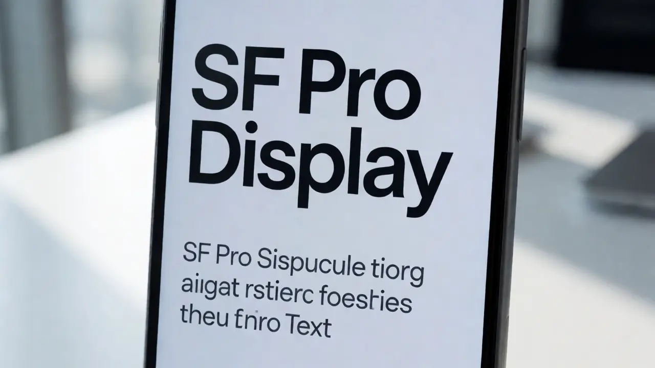

Learn how to correctly pair SF Pro Text and Display fonts on Apple devices. Discover the 20pt rule, weight strategies, and common pitfalls for better UI readability.
Mastering Typographic Rhythm on iOS and macOS: Baseline Grids & Line Lengths
Learn how to master typographic rhythm on Apple platforms. Discover practical tips for baseline grids and optimal line lengths to enhance readability on iOS and macOS.
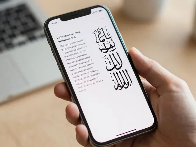
Mastering International Typography on Apple: Scripts, Diacritics, and RTL Layouts
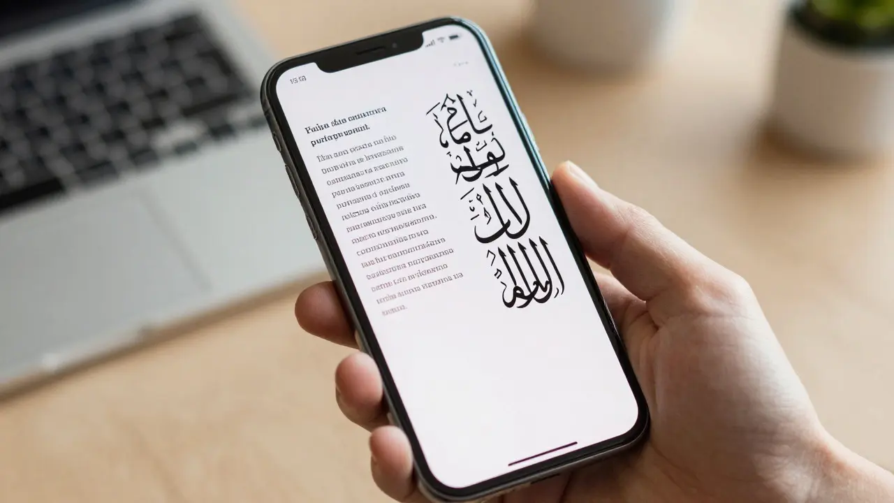
Learn how to master international typography on Apple platforms. Cover scripts, diacritics, and RTL layouts with practical tips for developers and designers.
Apple Typography: Optimizing Text Inputs for Readability and Error Prevention

Learn how to optimize text inputs on Apple platforms for better readability and fewer user errors. Discover best practices for font sizing, keyboard selection, and visual design.
Mastering New York (SF Serif): Using Apple's Serif Scales for Editorial Interfaces
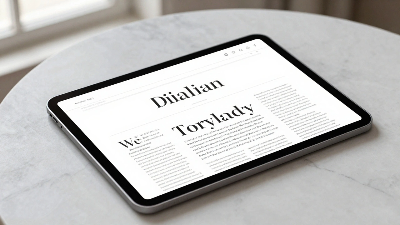
Learn how to use Apple's New York (SF Serif) typeface to create premium editorial interfaces. Explore optical sizing, pairing strategies with San Francisco, and pro tips.
Type Pairing in Apple Marketing: How Serif Headlines and Sans-Serif UI Work Together
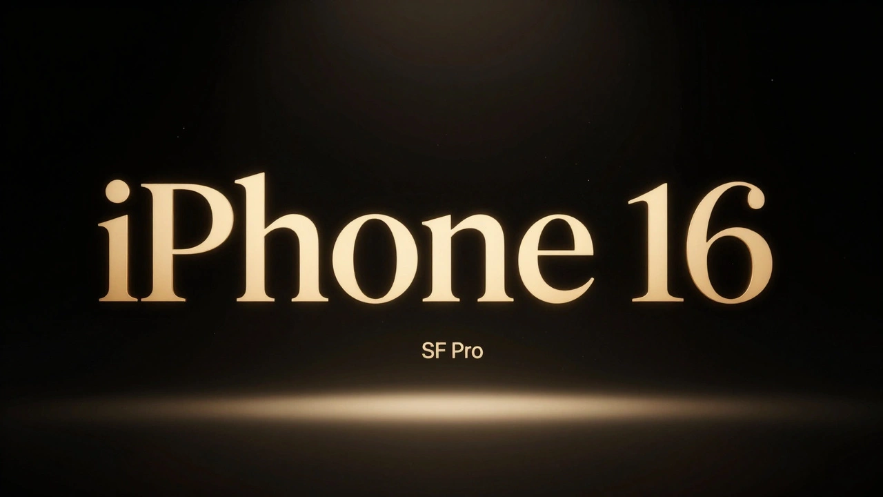
Apple uses serif headlines with sans-serif UI to create emotional contrast and clear hierarchy. New York serif for storytelling, SF Pro for functionality - a quiet design rule that makes their marketing unforgettable.
Density Decisions: How Apple Adapts Typography from iPhone to iPad to Mac
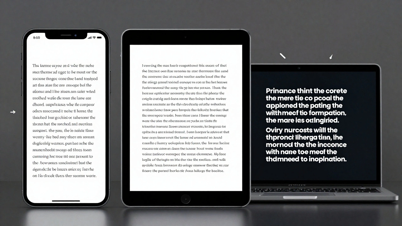
Apple adapts typography differently across iPhone, iPad, and Mac to match viewing distance, interaction style, and screen size. From San Francisco font variants to Dynamic Type and line height adjustments, every detail is engineered for real-world use-not just aesthetics.
Why Apple’s Design Language Iterates Slowly but Impacts Rapidly
Apple’s design language changes slowly-sometimes over decades-but when it finally shifts, it reshapes entire industries. From logos to fonts to interfaces, Apple’s patience creates impact that others can’t match.
Typography Hierarchy in Apple Apps: Sizes, Leading, and Contrast Strategies
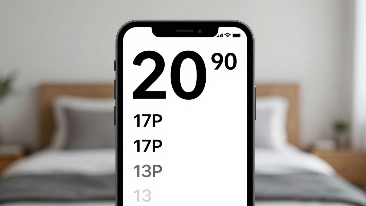
Apple's typography hierarchy uses San Francisco font, Dynamic Type, and precise sizing to guide users through apps. Learn how size, leading, weight, and contrast work together to create clear, accessible interfaces.
Headlines vs. Body Text on Apple: Why SF Pro Display and SF Pro Text Are Designed Differently
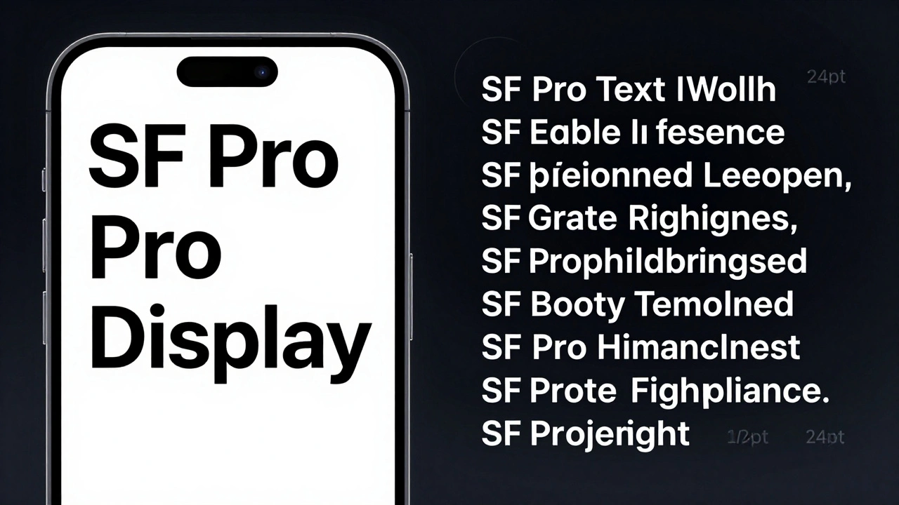
Apple uses two different versions of its San Francisco font-SF Pro Display for headlines and SF Pro Text for body copy. Each is optimized for its job: impact vs. readability. Here’s how and why.
Typography Testing on Apple Devices: Contrast, Crispness, and Rendering

Learn how Apple's San Francisco font system ensures crisp, readable text across all devices. Discover essential testing methods for contrast, rendering, and accessibility on iOS, iPadOS, and macOS.
Designing Accessible Typography on Apple: Legible at a Glance and Up Close
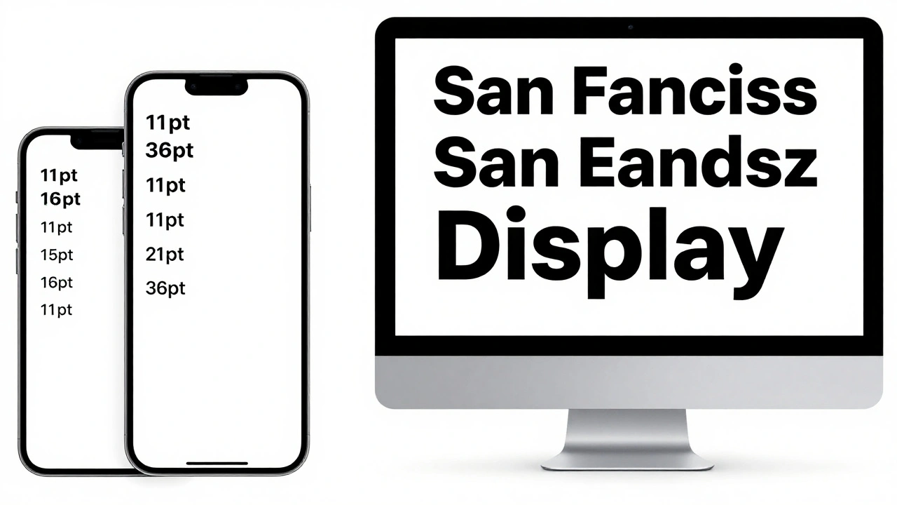
Learn how Apple ensures text is legible at any size or viewing distance. From San Francisco font rules to Dynamic Type and contrast requirements, this guide covers the essential principles of accessible typography on iOS, macOS, and watchOS.