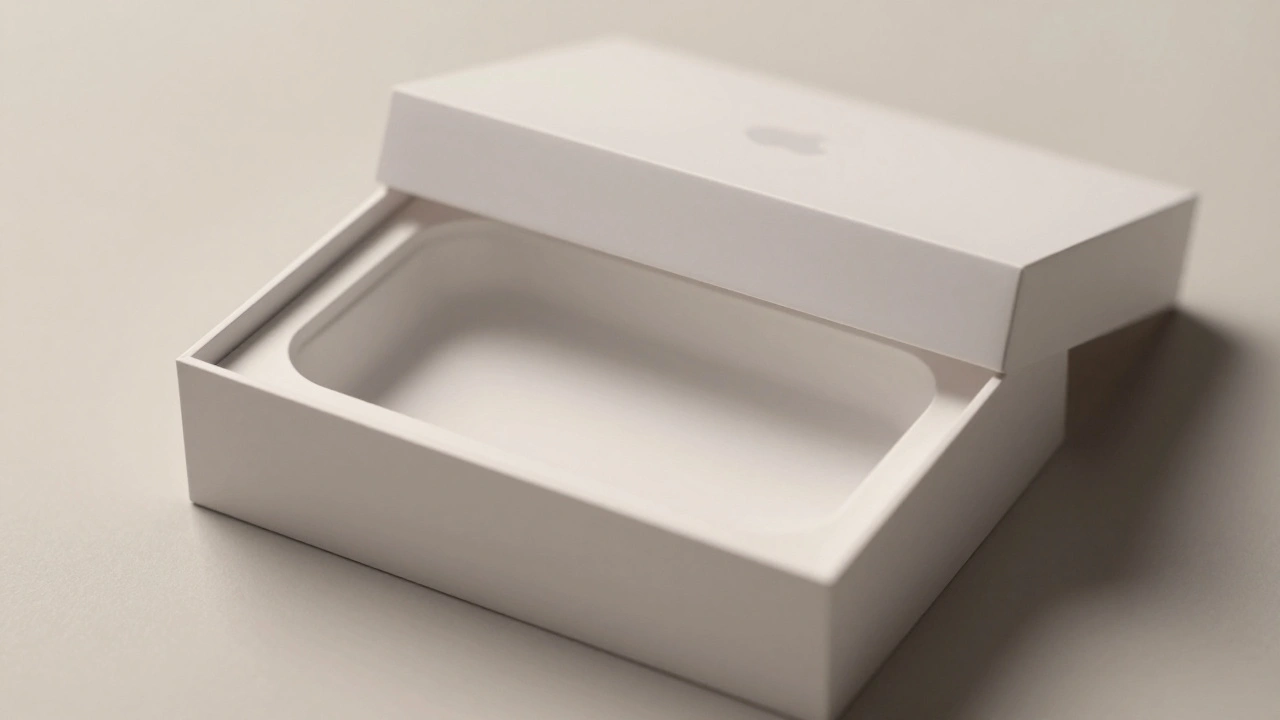

When you open an Apple product box, you don’t just unwrap a phone or a tablet. You enter a carefully crafted moment-one that starts before you even touch the product. The lid lifts with a quiet resistance. The material feels substantial, not cheap. The product sits centered, perfectly cradled, as if it’s been waiting for you. There’s no instruction manual. No plastic wrap. No clutter. Just the device, the charger, and a sense that this was made for you, not just sold to you.
This isn’t luck. It’s packaging as UX.
Most companies treat packaging as a cost center: something to shrink, simplify, or cut corners on. Apple treats it as the first touchpoint in a user’s journey. And it’s not just about looks. It’s about how the box moves, how it feels, how it makes you feel. Every fold, every seam, every millimeter of space is designed to create continuity-from the moment you pick up the box to the second you tap the screen for the first time.
The Box That Feels Like a Promise
Apple’s packaging doesn’t just protect the product. It amplifies it. In a patent filed years ago, Apple made it clear: "It may diminish from the aura of a well-designed product to present it to consumers in a standard cardboard box." That’s not a design preference. It’s a core belief.
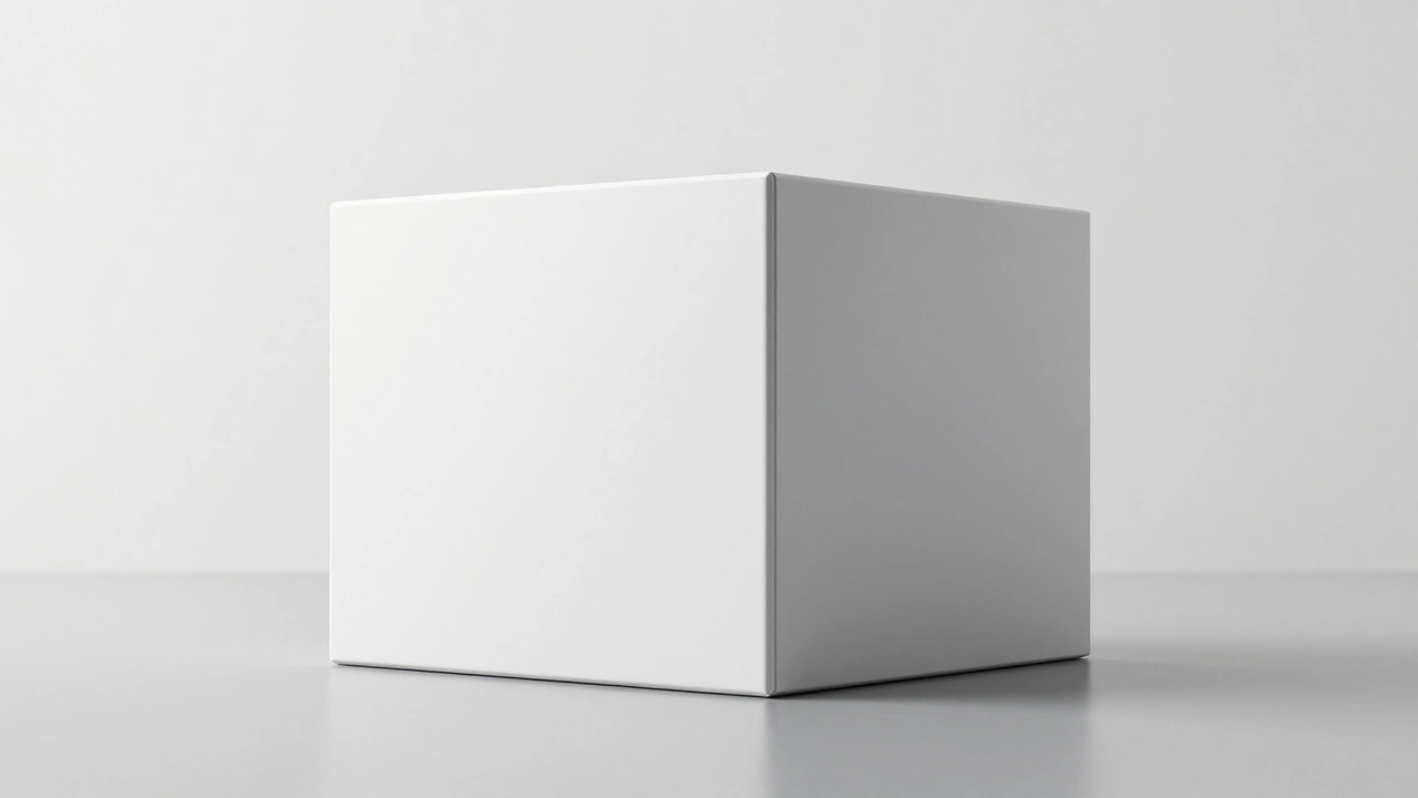
Think about it. You’ve seen a thousand Amazon boxes. Flimsy, taped, filled with air pillows and receipts. Now picture an Apple box. White. Clean. No logo. No barcodes on the outside. Just a subtle, perfectly aligned seal. You don’t need to read anything to know this is different. The box itself becomes a signal: this thing inside is worth your attention.
That’s emotional design in action. It’s not about making you feel excited-it’s about making you feel respected. You didn’t just buy a gadget. You were invited into a system that values precision, care, and quiet confidence.
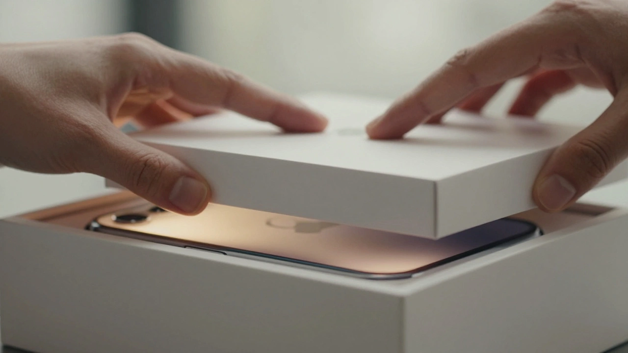
The Anatomy of a Ritual
The unboxing experience isn’t accidental. It’s choreographed.
Here’s how it works:
- The outer box is stiff, like a hardcover book. It doesn’t flop. It holds its shape.
- The lid lifts slowly, with just enough resistance to build anticipation. No snap. No flimsy hinge. It feels deliberate.
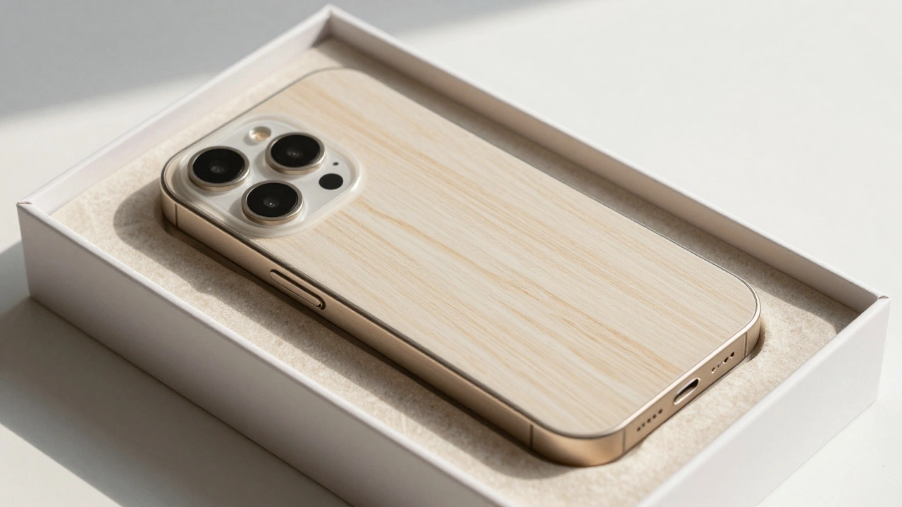
- Inside, the product tray is molded from recycled fiber-not plastic. It cradles the device like a custom glove, with exact cutouts for buttons, ports, and curves.
- There’s no foam. No plastic clamshell. No unnecessary layers. Just the product, the cable, and maybe a small paper insert.
- The materials smell clean. Not chemical. Not plastic. Just paper and ink.
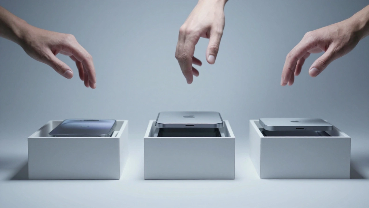
This isn’t marketing fluff. It’s the result of hundreds of prototypes tested in Apple’s secret packaging room. Designers spend months tweaking the angle of the lid, the thickness of the paper, the way the box opens. They test it with real people. They watch how hands move. They measure how long it takes to reveal the product. They adjust for friction, sound, and even scent.
And here’s the kicker: if the device changes by just 1-2 millimeters, the entire tray has to be remade. A new mold. New tools. New production line adjustments. That’s how seriously Apple takes this.
Why 87% of People Keep the Box
Most electronics boxes end up in the trash within hours. Not Apple’s.
Research shows that 87% of Apple customers keep their original packaging. Not because they’re hoarders. Because the box has become part of the product’s identity.
People keep it to resell. They keep it to gift. They keep it because it feels valuable. And that’s the point. Apple has turned a disposable container into a collectible artifact. A white box with minimal branding is now a global symbol of quality.
Think about it: you can spot an Apple box from across a room. You don’t need to see the logo. You know. That’s brand power built through design, not advertising.
From Box to Setup: The Seamless Handoff
Unboxing doesn’t end when you take the device out. It flows into setup.
Apple’s digital interface mirrors the packaging. Clean lines. Soft curves. White space. The same San Francisco font. The same rounded corners. The same quiet confidence.
When you power on your new iPhone, it doesn’t bombard you with ads, upsells, or setup screens. It asks one question: "Do you want to transfer your data?" That’s it. No clutter. No pressure. Just a smooth, silent transition from physical to digital.
This continuity is intentional. The packaging prepares you for the interface. The interface confirms the packaging was right. Together, they create a loop of trust. You don’t question whether the phone will work. You just know it will.
That’s the magic of UX continuity. It removes friction before it exists.
Material Science as Design
Apple didn’t just switch from plastic to paper. It reinvented how paper behaves.
Paper absorbs moisture. It expands unevenly. It varies in thickness. Plastic doesn’t. So when Apple decided to remove plastic from its packaging, it didn’t just swap materials. It rebuilt its entire supply chain.
Over 70 packaging vendors worldwide had to adapt. Production tools were redesigned. Quality control systems were reengineered. Even the way boxes are stacked in shipping containers changed.
Why? Because a fiber tray that’s too loose ruins the unboxing experience. Too tight, and you can’t get the device out. Just 1% variation in material behavior can break the ritual.
Apple’s success here isn’t about being eco-friendly. It’s about being precise. Sustainability became a constraint that forced better design-not a marketing add-on.
The Bigger Lesson: Packaging Is the First Interaction
Apple’s packaging isn’t about being fancy. It’s about being intentional.
Most companies design products, then slap on a box. Apple designs the box as part of the product. It’s not an afterthought. It’s the first screen.
This approach works because it respects the user. It doesn’t assume you need instructions. It doesn’t assume you’re dumb. It assumes you care about detail. That you notice. That you feel.
And when you do, you trust the brand more. You’re more likely to buy again. You’re more likely to recommend it.
The lesson for designers? Stop treating packaging as a container. Treat it as a conversation starter. The first word of your product’s story. The opening line of the user’s experience.
It’s not about how much you spend. It’s about how much you care.
What Other Brands Could Learn
Apple doesn’t have a monopoly on good design. But it has a monopoly on consistency.
Most brands try to copy the look-the white box, the minimalist style. But they miss the deeper discipline: the testing, the prototyping, the obsession with micro-details.
You can’t fake the feeling.
Real packaging as UX requires:
- Designers who treat the box as part of the product
- Manufacturers who prioritize precision over cost
- Supply chains that adapt to material behavior, not the other way around
- A willingness to spend more upfront to reduce friction later
It’s not about being Apple. It’s about thinking like Apple: every touchpoint matters. Every sensation counts. Every millimeter has a reason.
Why This Matters Beyond Apple
People don’t buy products. They buy experiences.
And the first experience? It’s not when you use the device. It’s when you open the box.
That moment sets the tone. It creates expectations. It builds emotional memory.
When done right, packaging doesn’t just protect the product. It elevates it. It turns a transaction into a ritual. A purchase into a moment.
Apple didn’t invent unboxing. But it turned it into a benchmark. And now, whether you’re selling headphones, smart home gear, or even software subscriptions, the question isn’t "How do we ship this?" It’s "How do we make the first touch feel like magic?"
Why does Apple’s packaging feel so different from other brands?
Apple’s packaging feels different because it’s designed as part of the product experience, not just a container. Every material, dimension, and opening motion is tested and refined to create a specific sensory response-calm, premium, and intentional. Other brands focus on cost and protection. Apple focuses on emotion and continuity.
Is Apple’s packaging really more sustainable?
Yes. Apple has replaced nearly all plastic components-trays, films, cushioning-with fiber-based materials sourced from recycled or responsibly managed forests. This shift required redesigning production tools and supply chains, because paper behaves differently than plastic. The result is packaging that’s not only better for the environment but also more tactile and premium-feeling.
Why do people keep Apple boxes instead of throwing them away?
Because the packaging itself has become a symbol of quality. The clean, minimalist design feels valuable. Many users keep boxes to resell devices, gift them, or simply because they associate the box with the product’s premium feel. Studies show 87% of Apple customers retain the original packaging-unheard of in most consumer electronics.
How does Apple ensure consistency across millions of boxes?
By treating packaging as a precision-engineered system. If a device changes by even 1-2 millimeters, the entire fiber tray mold must be replaced. This forces extreme design accuracy. Quality control is built into production, not checked afterward. Vendors must meet exact material and dimensional specs, and Apple’s global supply chain is aligned to maintain that consistency.
Can other companies copy Apple’s packaging design?
You can copy the look, but not the depth. Apple’s packaging works because it’s backed by years of prototyping, material science, supply chain coordination, and design discipline. Most companies lack the patience, budget, or systems to replicate that. It’s not about aesthetics-it’s about a mindset that treats every detail as part of the experience.
Next Steps for Designers
If you’re designing packaging today, ask yourself:
- Is this box designed for the user-or just for shipping?
- Does it feel like an extension of the product-or a barrier to it?
- Have you tested how it opens? How it sounds? How it smells?
- Are you optimizing for cost-or for emotional connection?
The best packaging doesn’t shout. It whispers. And when it does, people listen.