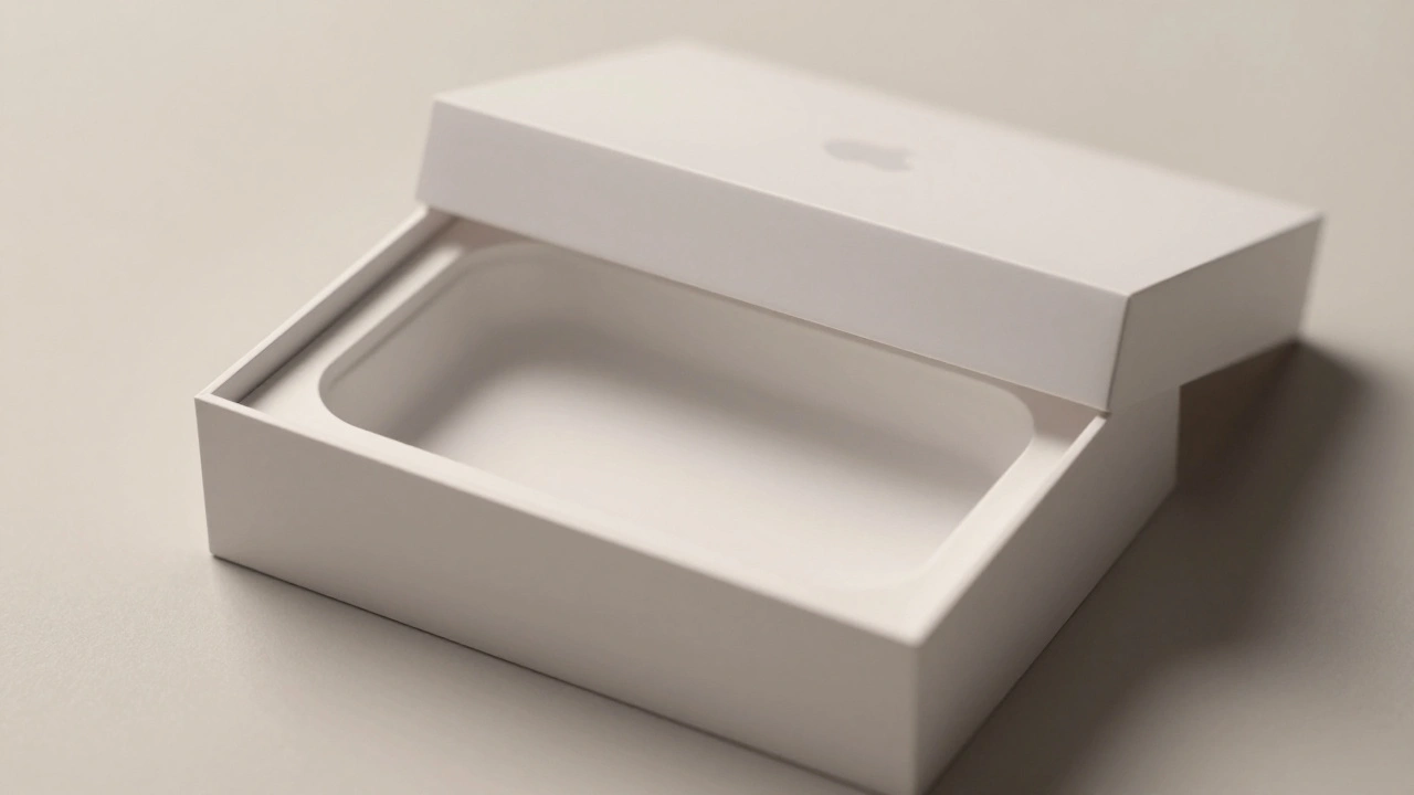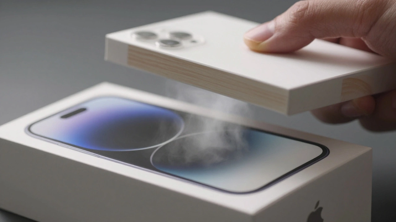

Open any Apple box-iPhone, iPad, AirPods, or MacBook-and you’ll feel it before you even touch the device. There’s a quiet precision in how the lid lifts, a satisfying resistance in the pull, a perfect centering of the product beneath a clean white surface. No clutter. No logos screaming for attention. Just the Apple logo, the product image, and a sense that everything in this box was meant to be here. This isn’t luck. It’s strategy. And it’s the same across every product line, every country, every year.
The Box That Speaks Before the Device Does
Most companies treat packaging as a container. Apple treats it as a conversation starter. When you buy an iPhone, you don’t just get a phone. You get a ritual. The same ritual you had with your last iPad. The same one you’ll have with your next AirPods. That repetition isn’t accidental. It’s engineered. Every box follows the same rules: white or black, no color gradients, no flaps, no plastic windows. The product is shown in high-resolution, centered, with no extra text beyond the name. Even the font is consistent-San Francisco, thin, subtle. This isn’t just design. It’s a signal.
Think about it. If you’ve owned one Apple product, you already know how to open the next one. You don’t need instructions. You don’t need to guess where the tab is. You know the lid lifts from the top. You know the tray slides out smoothly. You know the charger, the cable, the documentation are all in the exact right place. That familiarity builds trust. Not because the product inside is better than Samsung’s or Google’s, but because the experience feels predictable. And predictability, in a world full of chaos, becomes a luxury.
Materials That Feel Like Quality
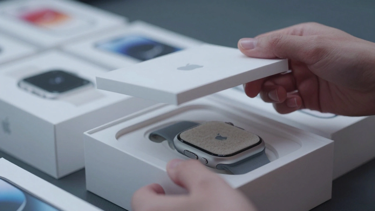
Look closer. The box isn’t just white-it’s a specific shade of off-white, like high-grade paper. The material isn’t cardboard you’d find at a grocery store. It’s a rigid fiberboard with a matte finish that doesn’t scratch easily. The inner tray? Not molded plastic. It’s made from fiber pulp, pressed into shape, recycled, and durable. Apple switched to this across all product lines by 2020. No more foam inserts. No more plastic trays. Even the smallest AirPods case now sits in a fiber inlay that holds it perfectly in place.
This shift wasn’t just about sustainability. It was about consistency. The same material is used for the iPhone 15, the MacBook Air, and the Apple Watch Ultra. The same thickness. The same texture. The same weight. When you hold a box from 2023 and one from 2026, you feel the same quality. That’s intentional. It tells you: this isn’t a one-time purchase. This is part of a system. And systems demand uniformity.
Structure as a Silent Language
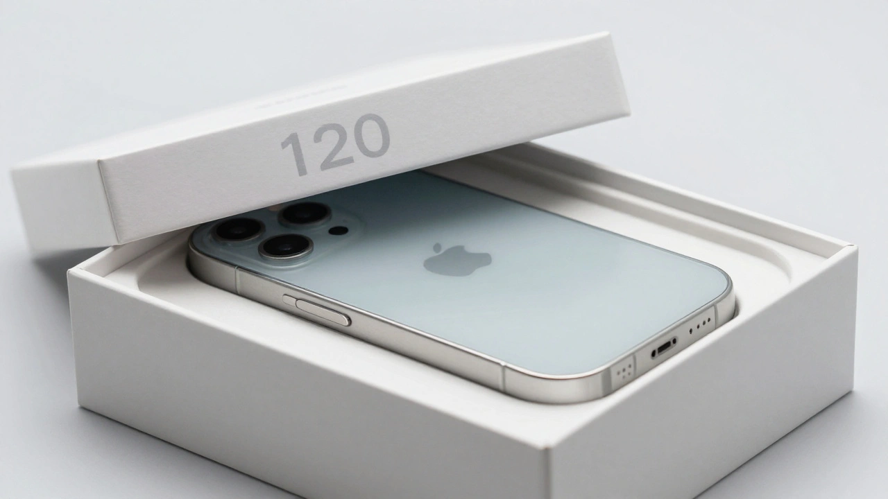
Here’s something most people never notice: every Apple box has the same opening angle. The lid lifts to about 120 degrees. Not 110. Not 130. Exactly 120. Why? Because that’s the angle that lets you see the product without tipping the box. It’s the same for every device. The MacBook box? Same. The iPad box? Same. Even the HomePod mini box, which is tiny, opens the same way. This isn’t a coincidence. It’s a specification.
Apple’s packaging engineers have documented dimensional tolerances down to the millimeter. A box that’s 0.5mm too tall? Rejected. A lid that doesn’t lift with the same resistance? Recalled. They test these boxes under extreme heat, humidity, and rough handling. Why? Because the unboxing experience must be identical whether you open it in Tokyo, Berlin, or Portland. That level of control doesn’t exist for most brands. It’s why Apple packaging feels like a premium product-even before you unbox the device.
Minimalism as a Psychological Tool
Why no colors? Why no text? Why no icons? Because clutter creates noise. And noise distracts. Apple’s packaging removes everything that doesn’t serve the product. No marketing slogans. No bullet points. No fake urgency like “Limited Time Offer!” Just the device. That’s powerful. It says: this is enough. You don’t need more. You don’t need explanations. The product speaks for itself.
Studies in cognitive psychology show that minimalist environments reduce mental load. When your brain isn’t processing ads, logos, or claims, it’s free to focus on the object. That’s why Apple’s unboxing feels so calm. It’s not just clean-it’s therapeutic. You’re not being sold to. You’re being invited in. And that invitation feels personal. Because it’s consistent. You’ve had it before. You’ll have it again.
The Ecosystem Signal
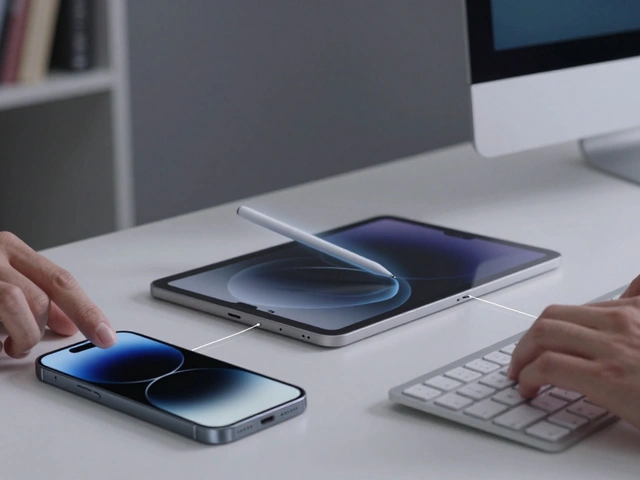
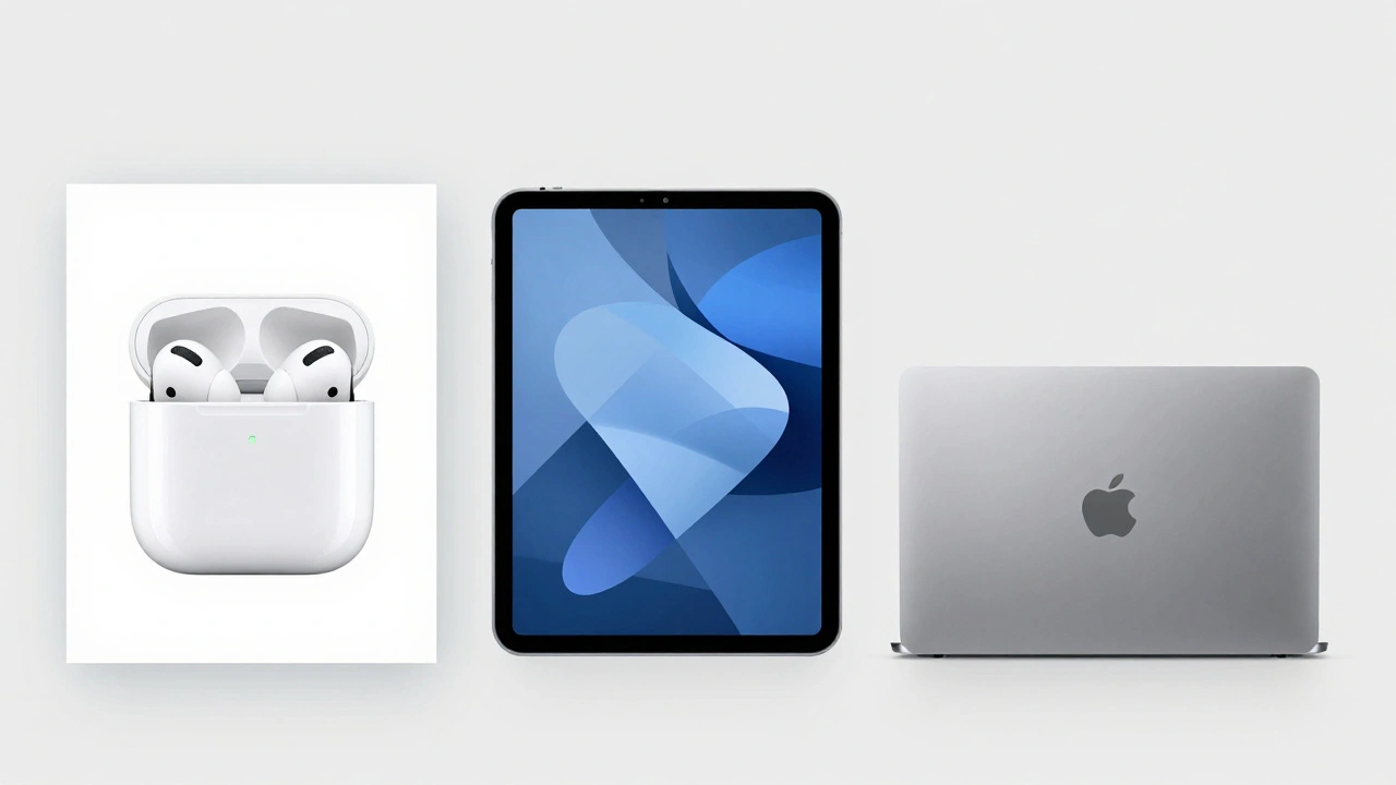
Here’s the real magic: Apple doesn’t just sell products. It sells belonging. When you buy an iPhone, you’re not just getting a phone. You’re joining a world. A world where your AirPods fit perfectly in your pocket. Where your Apple Watch charges on the same pad as your iPhone. Where your MacBook opens with the same gesture as your iPad. The packaging reinforces that. It’s the first touchpoint of that world.
Think about it. If you’ve ever opened a Samsung Galaxy box, you know how different it feels. Multiple layers. Plastic trays. colorful inserts. Instructions everywhere. It’s functional, yes. But it doesn’t feel like a system. It feels like a transaction. Apple’s packaging says: you’re part of something bigger. And that’s why people keep buying. Not because one device is better. But because the whole experience fits together.
Sustainability Without Sacrifice
Apple’s packaging hasn’t just stayed consistent-it’s evolved. The shift away from plastic was one of the most visible changes in recent years. But here’s the thing: it didn’t ruin the experience. In fact, it improved it. The fiber trays are more durable. They feel more premium. They’re easier to recycle. And they’re used across every product, from the cheapest AirPods to the most expensive Mac Pro.
This matters. Consumers don’t just want eco-friendly packaging. They want eco-friendly packaging that still feels luxurious. Apple proved it’s possible. You can reduce plastic, eliminate foam, and still deliver a box that feels like a gift. That’s not easy. And it’s why other brands are trying to copy it. But they can’t. Because it’s not about the material. It’s about the philosophy behind it.
Why This Matters More Than You Think
Most companies think packaging is a cost center. Apple treats it as a brand asset. Every box is a billboard. Every unboxing is a moment of truth. And because it’s consistent, it becomes a memory. People save Apple boxes. They photograph them. They post them online. They compare them. That’s free marketing. That’s loyalty. That’s trust.
When Apple releases a new product, it doesn’t need to explain why it’s premium. The box already did that. The same box that held your iPhone 12 holds your iPhone 16. The same feel. The same weight. The same lift. That continuity means customers don’t question the quality. They assume it. And that assumption is worth more than any ad campaign.
This is why Apple doesn’t need to shout. It doesn’t need to offer discounts. It doesn’t need to flood stores with flashy displays. The box does all the talking. And because it’s consistent, it never stops talking.