
When you pick up an Apple product box, you don’t just see packaging-you feel it. The weight. The matte surface. The way the lid lifts with quiet resistance. The clean white background with just a single raised image of the device. No logos, no flashy colors, no clutter. It’s deliberate. And it’s not an accident. Every detail, from the shade of white to the texture of the paper, is engineered to shape your expectations before you even open the box.
Why White? It’s Not Just a Color, It’s a Statement
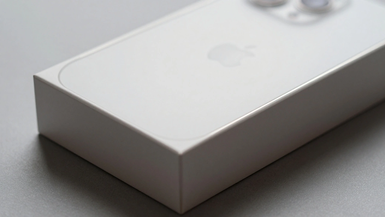
Apple’s signature packaging white isn’t just "white." It’s a specific, high-purity titanium dioxide-based finish that’s been refined over decades. This isn’t the off-white of a budget product. It’s a bright, opaque white that reads as clean, safe, and premium. Studies in color psychology show that white triggers associations with purity, simplicity, and trust-exactly the qualities Apple wants customers to feel before touching the product inside. This white isn’t easy to produce. Plastic components in packaging must match this exact tone across different materials and batches. Even slight variations from UV exposure, moisture, or resin composition can make the box look cheap. Apple’s manufacturing teams spend months perfecting this. The result? A box that looks identical whether it’s shipped from China, Germany, or Brazil.The Matte Finish: Luxury Without Flash
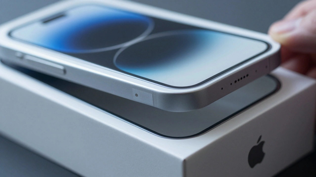
Look closely at the surface of an Apple box. It’s not glossy. It’s matte. And that’s intentional. Glossy finishes scream "sale" or "discount." Matte screams "premium." Apple wraps its rigid paperboard boxes in a high-grade matte-finish paper, treated to feel smooth and substantial. This isn’t just about looks-it’s about touch. Your fingers register the texture before your eyes even process the image. To add depth without clutter, Apple uses embossing. Product images aren’t printed-they’re raised. You can feel the outline of the iPhone, the curve of the AirPods. This tactile layer turns a visual experience into a physical one. In earlier versions, Apple even removed all color from the box, leaving only the embossed shape against pure white. No text. No branding. Just form. That’s how confident they are in their design.Color on the Product, Not the Box
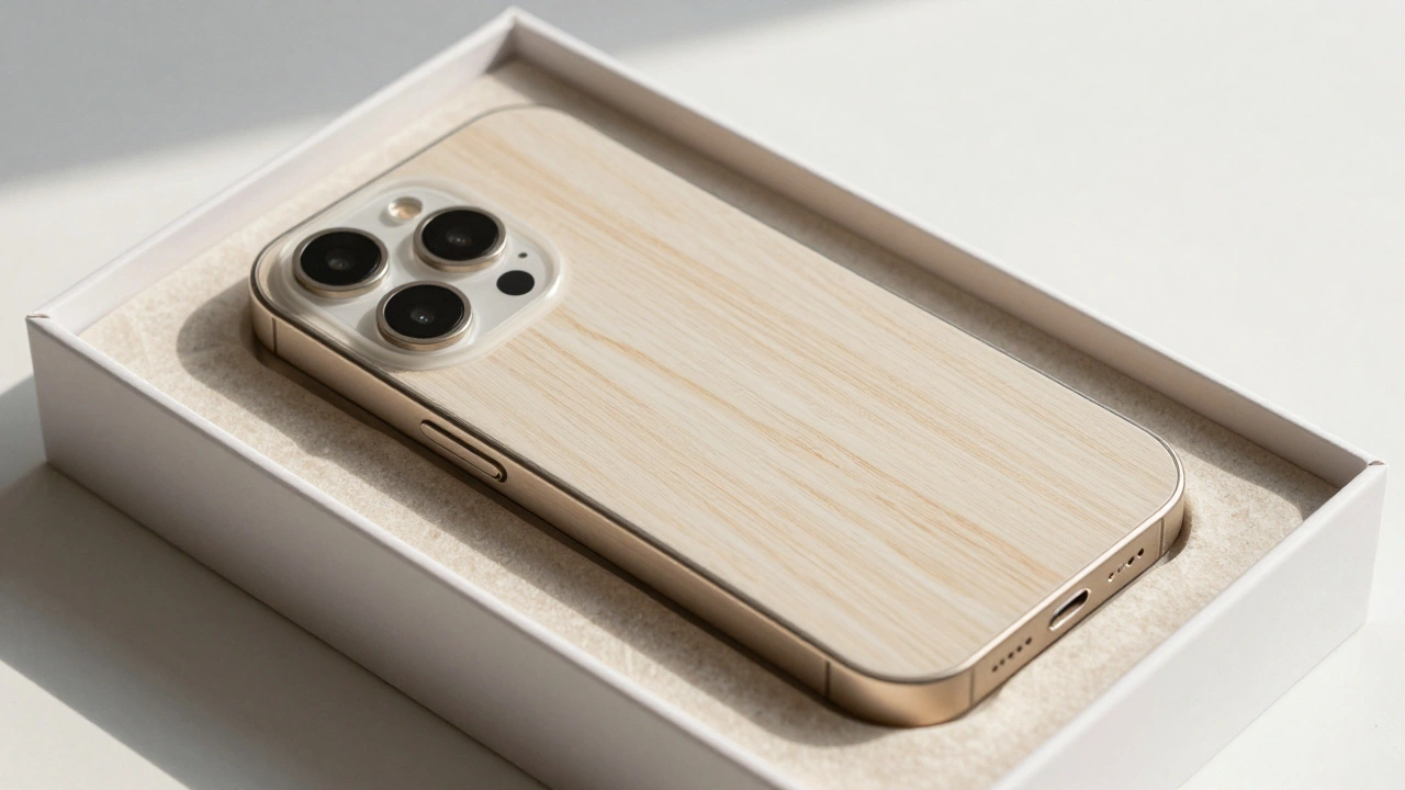
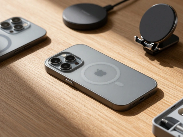
Apple’s packaging doesn’t change color to match the product inside. A black iPhone still ships in white. A gold Apple Watch? Still white. Why? Because the packaging isn’t selling the color-it’s selling the experience. The product’s color is part of its identity. The box is part of the ritual. There are exceptions. The iPod mini, released in 2004, came in pastel and jewel tones. Each color was anodized aluminum, and each box matched it. But that was a marketing experiment. Apple learned that when consumers buy professional gear-like a MacBook Pro or Mac Pro-they care less about color and more about function. So Apple sticks to black and silver for those, and keeps the box white.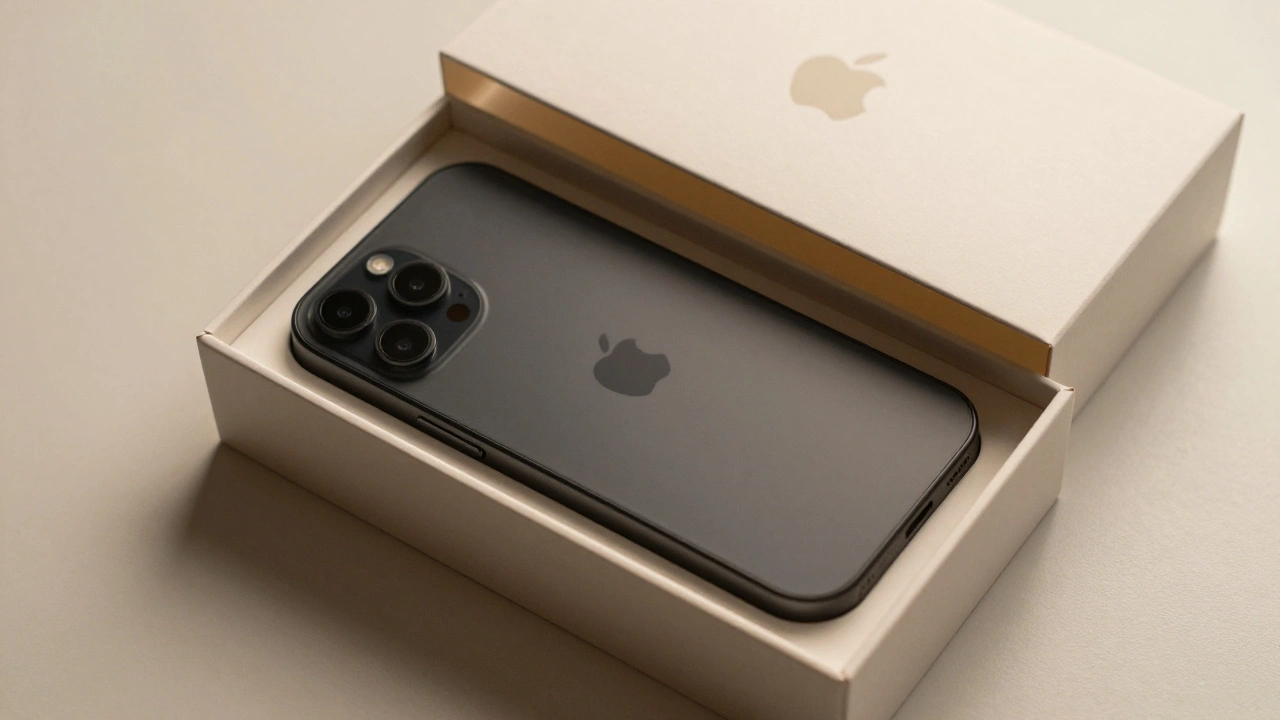
Material Matters: Plastic Is Gone
Apple’s packaging has changed more than just color and finish-it’s changed what it’s made of. In 2023, 99% of Apple’s packaging was fiber-based. Plastic was reduced to 4%. That means the trays inside? Not polystyrene anymore. They’re molded pulp, made from recycled paper and plant-based binders. The bands holding cables? No longer clear polyethylene. They’re bio-polymers derived from cornstarch. This shift isn’t just eco-friendly. It’s premium. Recycled pulp feels more natural. It’s textured. It’s warm. It doesn’t slide around like plastic. The box itself is thicker, heavier, and more durable. When you hold it, you know it’s built to last-even if the product inside isn’t. Apple’s goal? Zero plastic in packaging by 2025. And carbon neutrality by 2030. They’re not just reducing waste-they’re redefining what luxury packaging can be.The Unboxing Ritual: Designed to Slow You Down
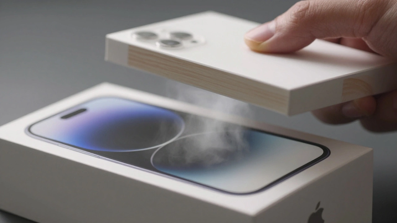
Open an Apple box and you’ll notice something odd: it doesn’t pop open. It lifts slowly. The lid fits with such precision that air resistance creates a slight vacuum. You have to pull gently. That’s not a flaw. It’s a feature. This slow reveal extends the moment. It makes you pause. It builds anticipation. It turns opening a box into a small ceremony. Combine that with the matte texture, the embossed image, the absence of text, and the quiet weight of the box-and you’re not just unboxing a phone. You’re experiencing a carefully crafted moment. No instructions. No fluff. Just the product, perfectly centered. No plastic wrap. No Styrofoam. No excess. Apple doesn’t just package products. It packages attention.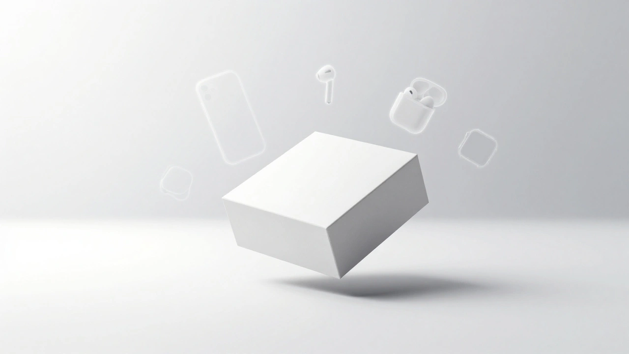
Why This Works: The Psychology of Minimalism
Most brands overload packaging with logos, barcodes, features, and slogans. Apple strips it all away. Why? Because less tells more. When you see a white box with a single raised image, your brain fills in the gaps. You assume quality. You assume precision. You assume the inside matches the outside. That’s the power of minimalism. It doesn’t shout. It whispers-and you lean in to listen. Apple’s packaging doesn’t try to convince you. It assumes you already know the product is good. It just makes you feel like you’re part of something refined. That’s why so many other brands-luxury watches, skincare lines, high-end headphones-now copy Apple’s style. White. Matte. Embossed. Minimal. It’s become the universal language of premium.What You Can Steal From Apple’s CMF Strategy
You don’t need to be Apple to use these principles. Here’s what works, no matter your budget:- Choose one dominant color. White, black, or a single muted tone. Avoid mixing three or more colors.
- Use matte finishes. Glossy feels cheap. Matte feels expensive. Even on cardboard, the texture matters.
- Emboss, don’t print. If you can’t afford embossing, use spot UV coating to create subtle shine on key elements.
- Reduce text. Your product name and logo are enough. Let the design speak.
- Think tactile. How does the box feel in the hand? Does it have weight? Does it open slowly? These details build perception.
- Go plastic-free. Even small swaps-paper bands instead of plastic, molded pulp instead of foam-signal care and responsibility.
Apple didn’t invent packaging. But they redefined what it could feel like. And that’s the real lesson: packaging isn’t a container. It’s the first impression. The first touch. The first promise.
Why doesn’t Apple use color on packaging to match the product?
Apple keeps packaging white to maintain consistency and focus on the product itself. The box is meant to be a neutral, premium canvas that doesn’t distract. Product color is part of the device’s identity, not the packaging’s. This approach works because it builds trust-customers know they’ll get the exact color they ordered, without visual noise. Exceptions like the iPod mini proved that color-matched packaging works for fun, personal products, but not for professional or high-end devices where clarity matters more than flair.
Is Apple’s packaging really more sustainable than others?
Yes. As of 2023, Apple’s packaging is 99% fiber-based, with plastic reduced to just 4%. They’ve replaced polystyrene trays with molded pulp made from recycled paper and plant-based binders. Even the lamination on boxes uses bio-polymers instead of petroleum-based films. Competitors still rely heavily on plastic inserts and glossy laminates. Apple’s shift isn’t just marketing-it’s a full redesign of material supply chains to eliminate plastic entirely by 2025.
Can small brands replicate Apple’s packaging look without high costs?
Absolutely. You don’t need embossing or custom-molded pulp to start. Begin with matte-finish paperboard, reduce text to just your logo and product name, and eliminate plastic inserts. Use paper bands instead of polyethylene. Choose one color-white or black-and stick to it. Even small changes like thicker paper or a slower-opening lid (using tighter fit) can elevate perception. Apple’s design isn’t about budget-it’s about intention.
What’s the difference between matte and glossy finishes in packaging?
Matte finishes absorb light, creating a soft, premium feel. They hide fingerprints, scratches, and imperfections. Glossy finishes reflect light, which can make packaging look shiny and cheap, especially under bright lights. Glossy also shows dust and smudges easily. Apple uses matte because it feels more tactile, more refined, and more durable. It’s the difference between a luxury watch and a plastic toy.
How does Apple ensure color consistency across millions of boxes?
Apple uses strict color standards based on Pantone and proprietary white specifications. Every supplier must match the exact titanium dioxide-based white. They test batches under controlled lighting and temperature. Even slight shifts in resin composition or UV exposure are flagged. This level of control isn’t common in consumer packaging-it’s why Apple’s boxes look identical whether bought in Tokyo or Toronto.