
When you open the News app on your iPhone or scroll through Maps on your Mac, have you ever noticed how some text feels bold and punchy while other text feels smooth and easy to read? That’s not an accident. Apple doesn’t use one font for everything. It uses two different versions of the same family-SF Pro Display for headlines and SF Pro Text for body text-and they’re built to do completely different jobs.
Why Apple Split Its Font into Two Styles
Back in 2015, Apple replaced Helvetica Neue with a new system font called San Francisco. At first, it was just one font. But as screens got bigger and interfaces got more complex, Apple realized something: a font that works great for a button label doesn’t work well for a paragraph of text. And vice versa. So they split it. SF Pro Display is for when you want to grab attention. SF Pro Text is for when you want people to read for minutes, not seconds. They look similar at a glance, but up close, their shapes are tuned for different purposes.What Makes SF Pro Display Work for Headlines
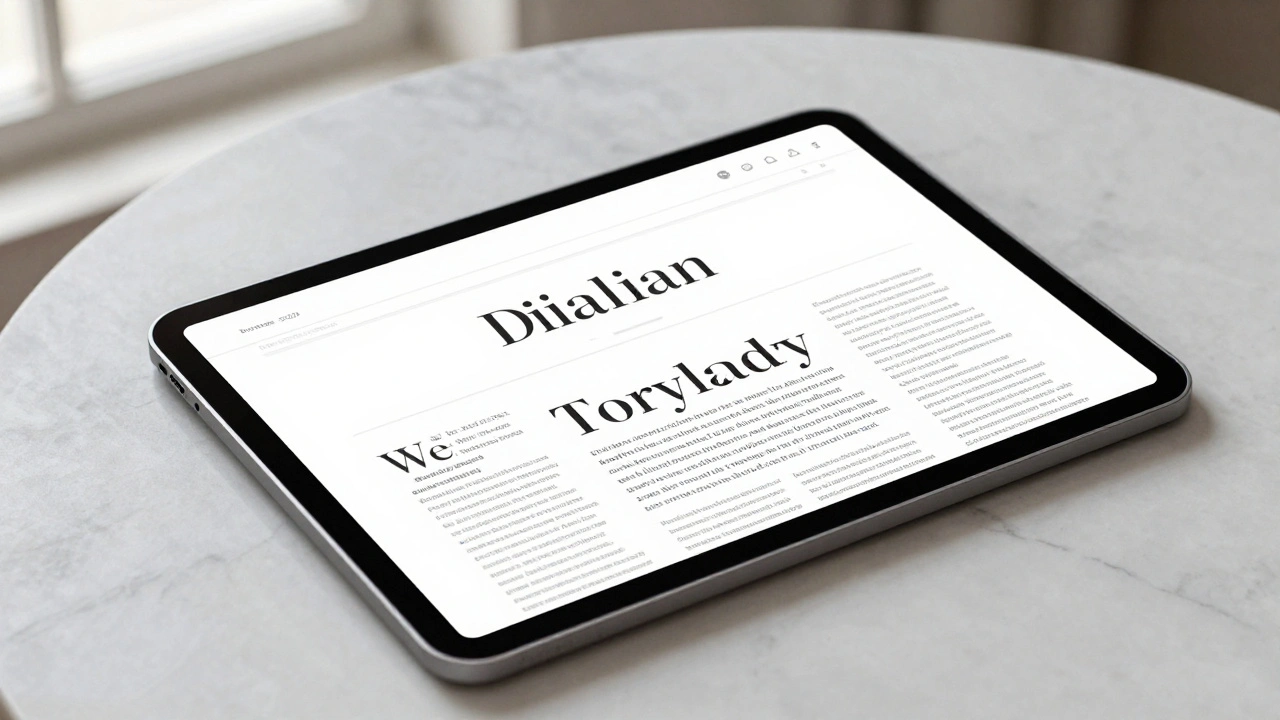
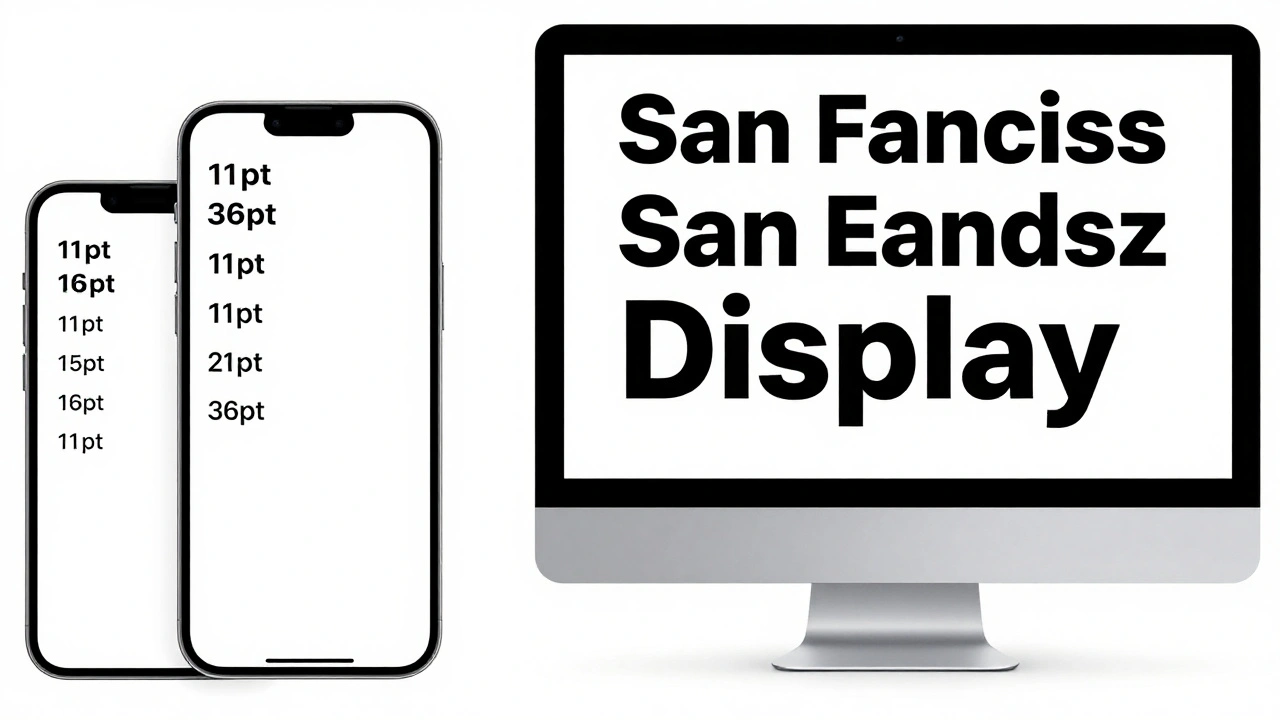
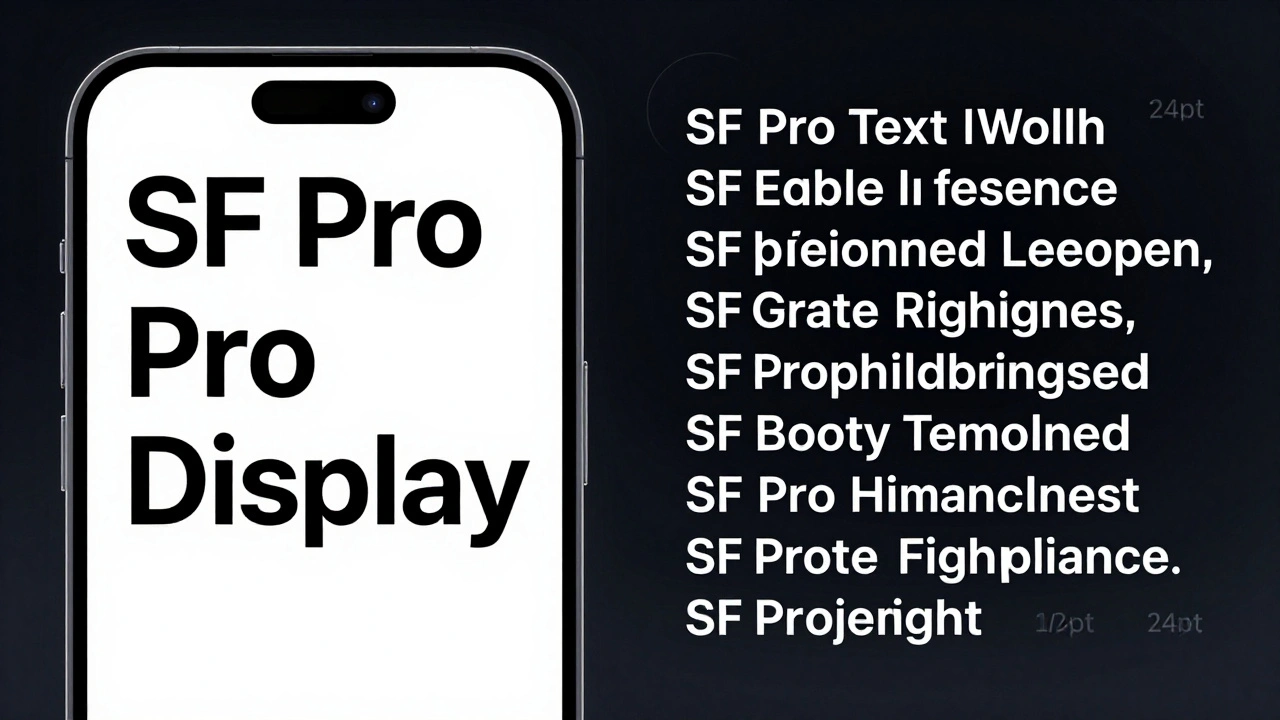
Think of SF Pro Display as the spotlight. It’s designed for sizes above 19 points-titles, app names, menu bars, large captions. Its design is simpler. The curves are cleaner. The counters (the open spaces inside letters like ‘o’ or ‘e’) are wider. That’s not a mistake. It’s intentional. At large sizes, your eyes don’t need fine details to recognize letters. What matters is impact. SF Pro Display has a slightly shorter x-height than its Text counterpart, which makes it look taller and more imposing. The strokes are more uniform, reducing visual noise. This lets headlines stand out without shouting. Apple also uses SF Pro Display with bold weights and expanded widths to make titles feel bigger than they are. In the News app, a headline set in Expanded width can stretch across the screen while still feeling balanced. In Maps, a landmark name in Condensed width fits neatly into a small space without crowding the map.Why SF Pro Text Is Built for Reading
Now flip to the body text in Apple’s Mail app, Notes, or Safari. That’s SF Pro Text. It’s made for reading. And reading means staying comfortable for minutes at a time. Text has a higher x-height-meaning the lowercase letters are taller relative to the capitals. That gives each word more shape, helping your brain recognize them faster. The spacing between letters is slightly wider, too. This prevents letters from visually sticking together on lower-resolution screens. The counters are larger. The terminals (the ends of strokes) are more open. These small changes reduce eye strain. On dark mode, where text is white on black, a tight counter can look like a smudge. SF Pro Text avoids that. It’s designed to stay clear even at 13-point size on a 12-inch screen. Apple’s engineers tested these designs with real users. They found that people read 5-8% faster with SF Pro Text compared to a version of SF Pro Display at the same size. That’s not just a design preference-it’s a usability win.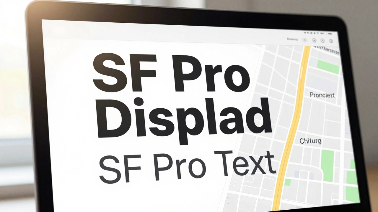
The New Width Styles: Condensed, Compressed, Expanded
In 2022, Apple added three new Width styles to SF Pro: Condensed, Compressed, and Expanded. These aren’t just thinner or wider versions. They’re fully re-engineered to maintain legibility at extreme proportions. - Condensed squeezes text into less space. Useful for long headlines that need to fit in two lines instead of three. In Apple’s Podcasts app, episode titles use Condensed to avoid wrapping awkwardly. - Compressed is even tighter. It’s not for body text. It’s for UI elements where space is tight-like a status bar or a button label on a watch. It keeps the letterforms recognizable even when squished. - Expanded opens up. Letters stretch out, creating a light, airy feel. Apple uses this in advertising banners and title screens to make text feel more dynamic and less rigid. These Width styles work with both Display and Text versions. You can have SF Pro Display Condensed for a bold headline, or SF Pro Text Expanded for a caption that needs to stand out without being loud.How Optical Sizing Makes It All Work
Here’s the smart part: you don’t have to pick which version to use. The system does it for you. SF Pro includes optical sizing. That means when you set text to 12 points, it automatically switches to SF Pro Text. At 24 points, it flips to SF Pro Display. No manual switching. No guesswork. This isn’t just a feature. It’s a philosophy. Apple believes typography should adapt to the context, not the other way around. Designers don’t need to be type experts. The font handles it.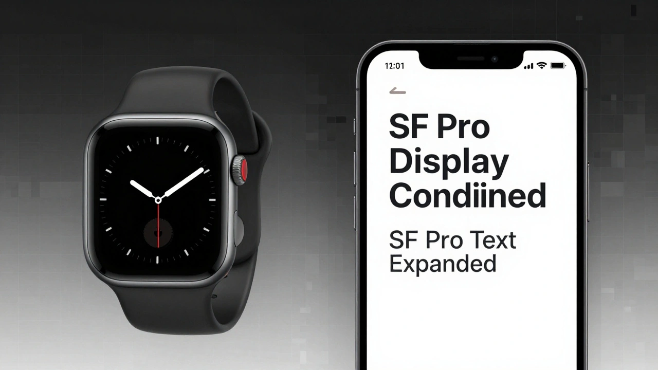
Real-World Examples in Apple Apps
Look at Apple’s own apps to see this in action: - In News, headlines use SF Pro Display Condensed. Bylines use SF Pro Text Expanded. The contrast makes it clear what’s the story and what’s the source. - In Maps, street names use SF Pro Text. Landmark labels use SF Pro Display Expanded. One guides you. The other points you. - In Settings, section headers are SF Pro Display Black. Subtle descriptions underneath? SF Pro Text Regular. The hierarchy is instant. Even the Apple Watch uses this logic. On the watch face, the time is in SF Compact-its own optimized version of SF Pro. The smaller the screen, the more the font adapts.Why This Matters Beyond Apple
Apple didn’t just make a pretty font. They solved a real problem: one-size-fits-all typography doesn’t work. Other companies still use one font for everything. They scale it up and down. The result? Headlines look weak. Body text looks blurry. Readers get tired. Apple’s approach shows that typography is engineering. It’s not just about looks. It’s about how the human eye works, how light hits a screen, how contrast affects perception. SF Pro Display and SF Pro Text are two tools for two jobs. And using the right one makes all the difference.What You Can Learn From This
If you’re designing anything with text-whether it’s a website, an app, or a poster-ask yourself:- Is this text meant to be seen quickly or read deeply?
- Does it need to stand out, or blend in for comfort?
- Are you using the same font for headlines and paragraphs? If yes, you might be making it harder to read.
Can I use SF Pro Display for body text?
Technically, yes-but it’s not ideal. SF Pro Display has tighter spacing and smaller counters, which can make paragraphs feel cramped and harder to read at sizes below 18 points. Apple’s own apps avoid this because it increases eye strain over time. Stick to SF Pro Text for anything longer than a sentence or two.
Is SF Pro Text only for small text?
No. SF Pro Text works beautifully from 10-point up to 18-point. Above that, SF Pro Display takes over. But if you’re designing a long-form article on a tablet, even 16-point text benefits from SF Pro Text’s wider counters and open spacing. It’s not about size alone-it’s about reading duration.
Do I need to buy SF Pro fonts to use them?
No. SF Pro is built into all Apple devices running iOS 11 or later, macOS 10.12 or later, and watchOS 4 or later. Developers can access it through system APIs. Designers can download it from Apple’s developer site for use in mockups, but it’s not meant for public web use outside Apple’s ecosystem.
Why doesn’t Apple use a serif font for body text?
Serif fonts like New York (Apple’s other system font) are great for print, but on digital screens, especially at small sizes, serifs can blur or disappear. Sans-serif fonts like SF Pro Text have cleaner lines that render sharply on pixel grids. For screens, clarity beats tradition.
Can I mix SF Pro Display and SF Pro Text in the same design?
Absolutely-and Apple does it constantly. The key is contrast. Use Display for headlines, Text for body. Add weight or width changes to create hierarchy. Mixing them intentionally creates rhythm. Mixing them accidentally creates confusion.