Tag: Apple Watch design
Glanceable Interfaces on Apple Watch: Designing Data for the Wrist
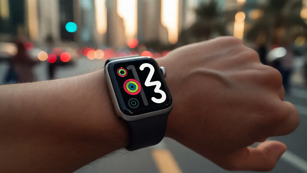

Discover how to design glanceable interfaces for Apple Watch. Learn the six-second rule, visual hierarchy techniques, and best practices for data visualization on small screens.
From 2015 Launch to Today: How Apple Watch Design Evolved with Users
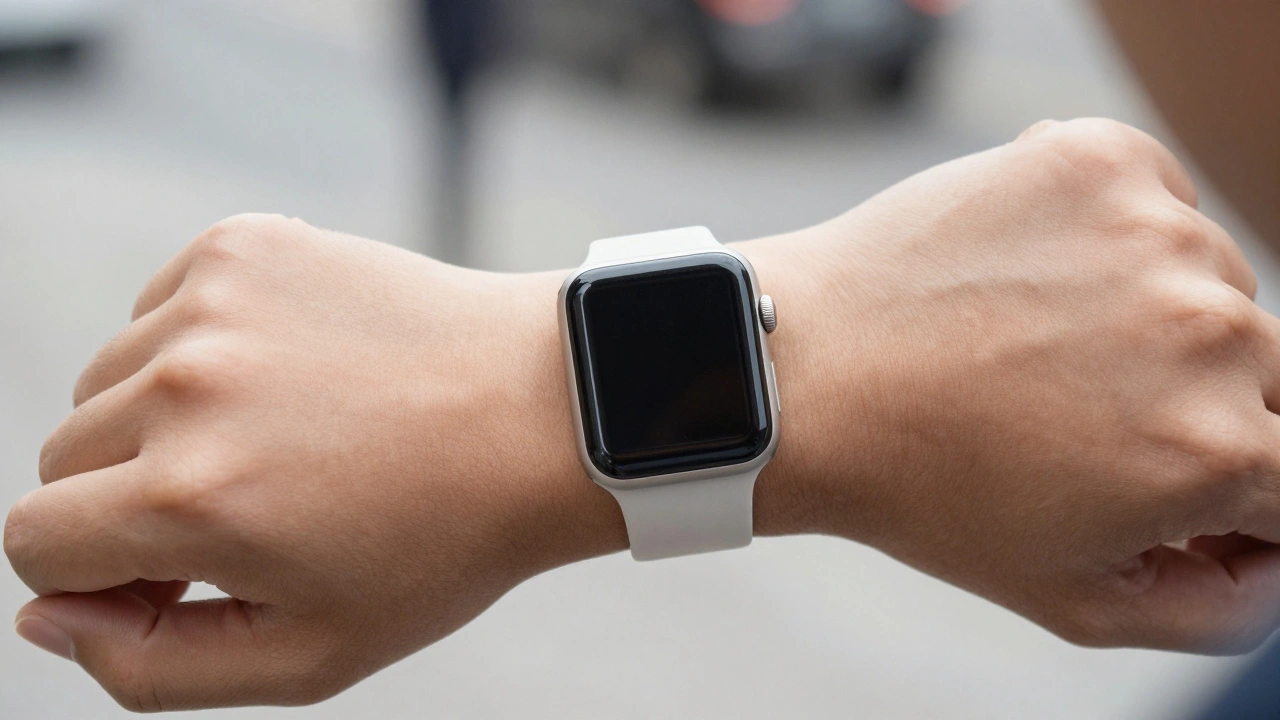
From its 2015 launch to today, the Apple Watch evolved not by chasing trends, but by listening to users. Every design change-larger screens, always-on displays, double-tap gestures-was driven by real needs. This is how a smartwatch became essential.
Apple Watch Design: How Style and Utility Work Together
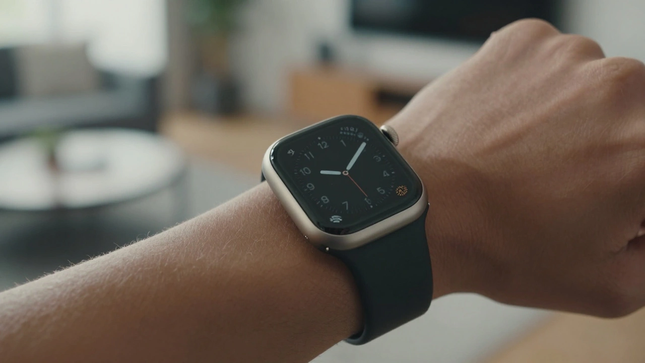
Apple Watch design balances personal style through customizable bands and sleek form with wearable utility via always-on screens, gesture controls, and rugged variants like the Ultra. It's not about flashy tech-it's about seamless integration into daily life.
Square vs. Round Watch Displays: Why Apple Chose Rectangular for Better Readability
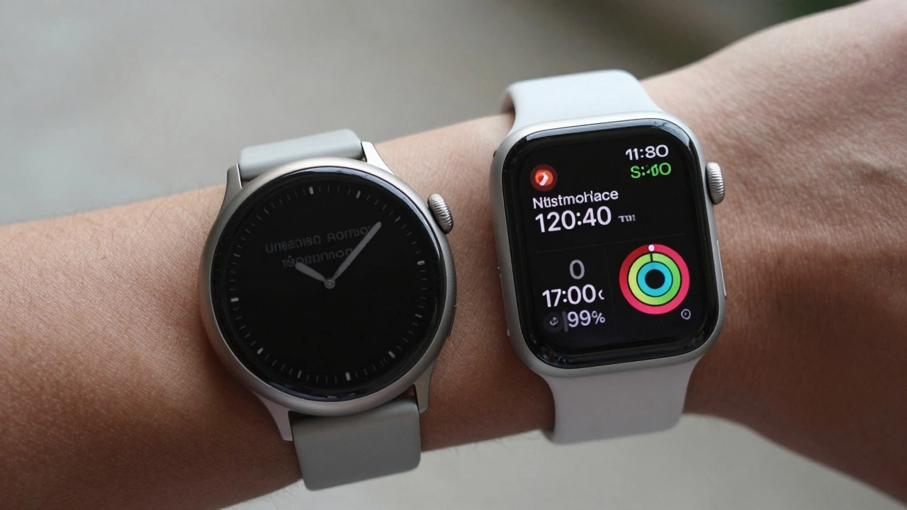
Apple chose a rectangular watch face not for style, but because it shows more information clearly, uses screen space efficiently, and works better with real-world data like messages, calendars, and health stats. Round watches waste pixels and force scrolling. The math doesn’t lie.
Typography in watchOS: How Compact Scales and Tap-Target Alignment Shape Usability
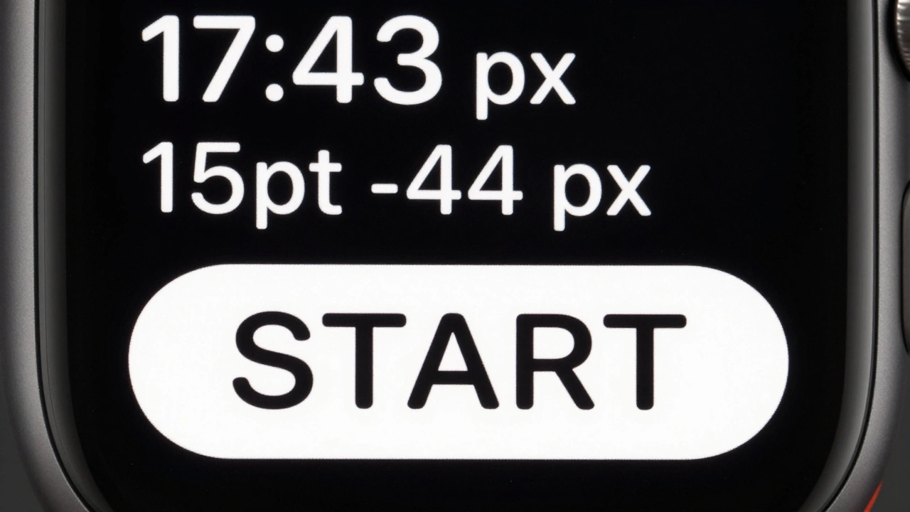
Typography on the Apple Watch isn't about aesthetics-it's about survival. Learn how SF Compact, precise tracking, and 44-pixel tap targets create interfaces that users actually read and use.