
You have exactly six seconds. That’s how long a typical user spends looking at their Apple Watch when checking a notification or health metric. If your interface doesn’t communicate its core message within that window, it fails. This isn’t about aesthetics; it’s about cognitive load and physical constraints. When you design for the wrist, you aren’t just shrinking a phone screen-you’re rethinking how humans interact with data in motion.
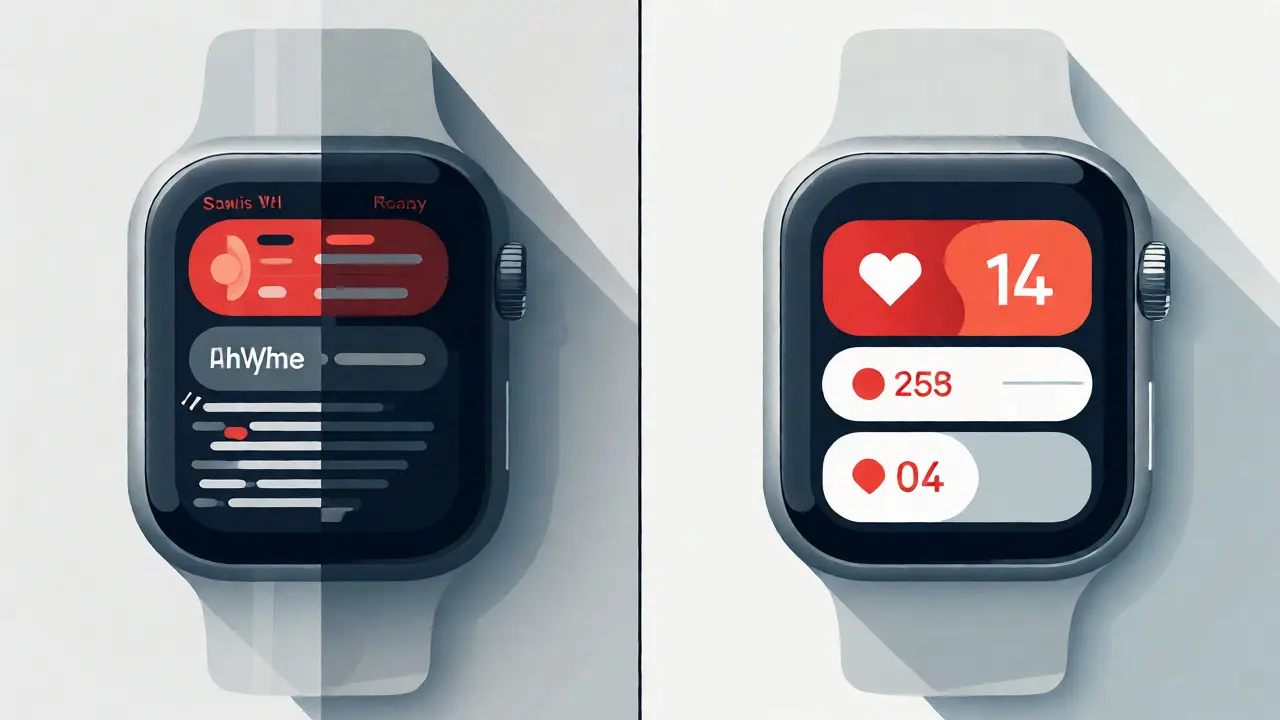
Most designers make the mistake of treating the watch as a miniature iPhone. They cram lists, dense text, and complex navigation into a 45mm canvas. The result? Users squint, tap repeatedly, and eventually ignore the device. True glanceability requires stripping information down to its absolute essence. It demands a shift from "read" to "recognize." Let’s break down how to achieve this without sacrificing utility.
The Six-Second Rule and Cognitive Limits
Why six seconds? Research in human-computer interaction suggests that users check wearable devices during micro-moments-waiting for an elevator, walking between meetings, or mid-exercise. In these contexts, attention is fragmented. Your interface must compete with environmental distractions. If a user has to decode a chart or read three lines of copy, they’ve already lost interest.
Consider the difference between reading a sentence and recognizing a color. The former requires linguistic processing; the latter is pre-attentive. Glanceable design leverages pre-attentive attributes like color, size, and shape to convey meaning instantly. For example, a red dot means "alert," while a green ring means "goal met." No words needed. This speed is critical because the Apple Watch is a companion device designed for quick interactions rather than deep engagement.
Hierarchy Through Visual Weight
On a small screen, hierarchy isn’t optional-it’s survival. You can’t rely on layout alone to guide the eye. Instead, use visual weight to tell users what matters most. This involves three key levers:
- Size: Make the primary metric significantly larger than secondary data. If heart rate is the focus, it should dominate the view.
- Color: Use brand colors sparingly but strategically. Reserve high-saturation hues for actionable items or alerts. Neutral tones handle background context.
- Contrast: Ensure sufficient contrast between text and background. Dark mode on OLED screens helps here, but don’t assume users always use it. Test for legibility in bright sunlight too.
A common pitfall is equal weighting. If every element looks equally important, none are. Pick one hero element per screen. Everything else supports it. For instance, in a weather app, the current temperature is the hero. Wind speed and humidity are supporting actors. They shouldn’t compete for attention.
Data Visualization vs. Textual Information
Text is slow. Charts are fast-if done right. But not all charts work on a watch face. A detailed line graph with axes and legends is useless on a 1.9-inch display. Simplify. Use sparklines, progress rings, or simple bar comparisons. These visual metaphors allow users to grasp trends instantly.
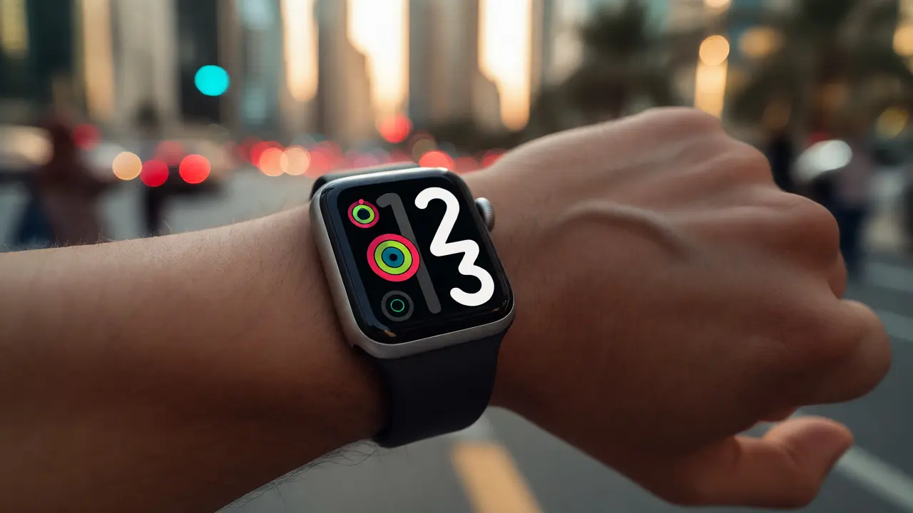
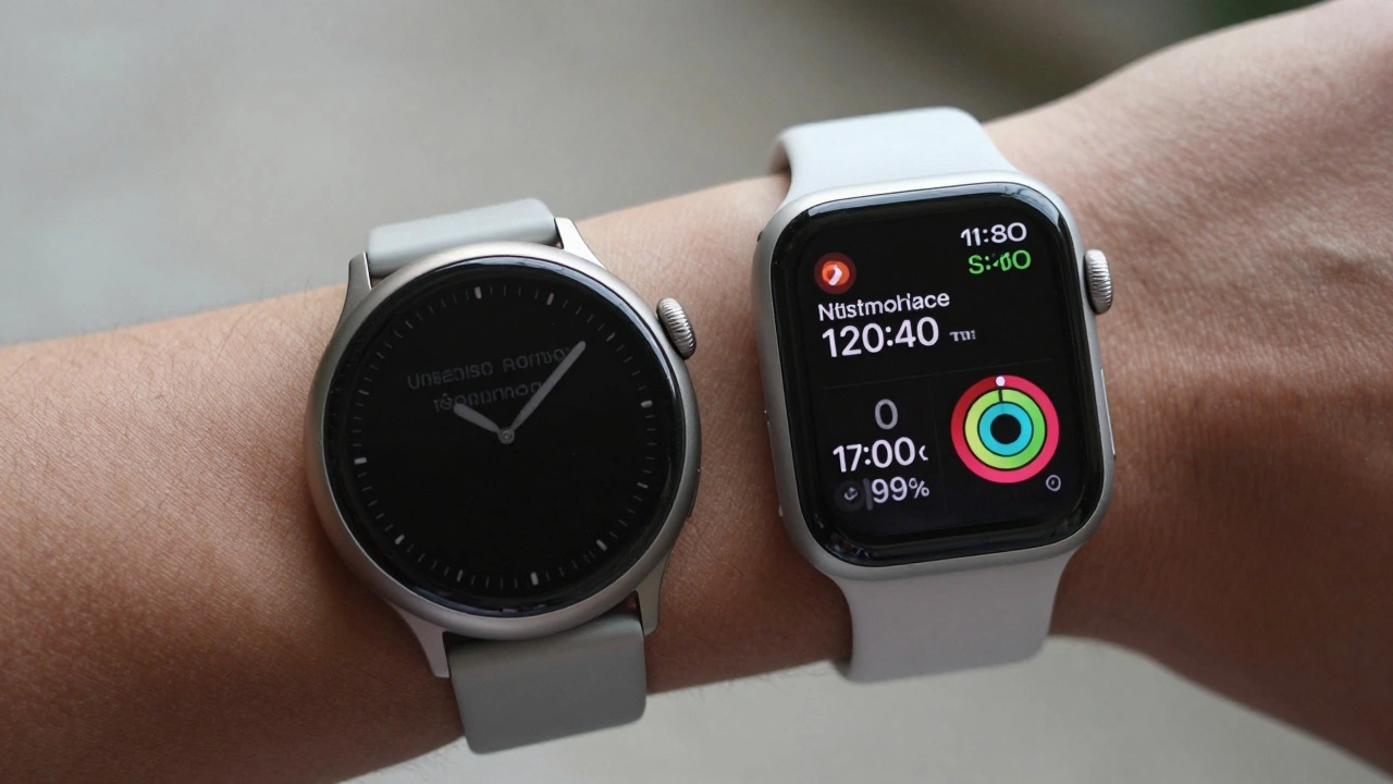
Take activity tracking. The iconic Activity Rings are a masterclass in glanceability. Three concentric circles represent Move, Exercise, and Stand goals. The fill percentage shows progress. The color indicates completion status. No numbers needed unless the user taps deeper. This design works because it maps abstract concepts (calories, minutes) to concrete visual states (full circle, partial circle).
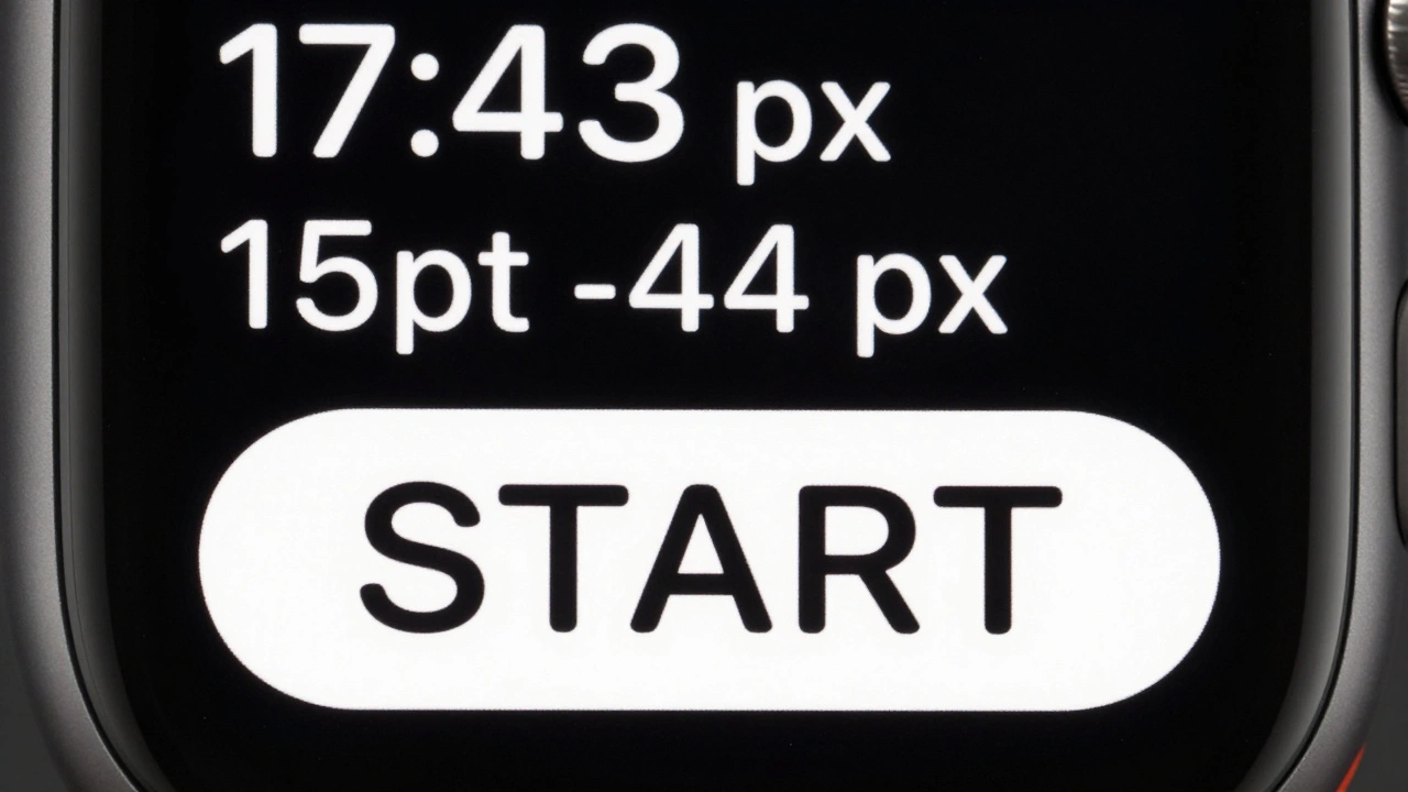
When you must use text, keep it terse. Abbreviate where possible without losing clarity. "7:30 AM" becomes "7:30" if the context implies AM. "Steps: 8,500" becomes "8.5k Steps." Every character saved reduces cognitive friction.
Navigational Friction and Input Methods
Interacting with a watch is harder than tapping a phone. Fingers are clumsy on small targets. Scrolling is tedious. Therefore, minimize input requirements. Favor passive consumption over active manipulation. If a user needs to scroll through ten items to find one, redesign the flow.
Digital Crown rotation offers precision, but it’s slower than a tap. Use it for fine-tuning settings, not browsing content. Force Touch (or Long Press in newer models) reveals contextual actions, keeping the main view clean. Haptic feedback plays a crucial role here. A subtle tap on the wrist confirms an action, reducing the need for visual verification. This frees up the eyes for other tasks.
| Input Method | Speed | Precision | Best Use Case |
|---|---|---|---|
| Tap | Fast | Low | Selecting list items, opening apps |
| Digital Crown | Medium | High | Adjusting volume, scrolling lists |
| Long Press | Slow | Medium | Context menus, editing complications |
| Voice (Siri) | Variable | Low | Hands-free queries, starting workouts |
Complications: The Gateway to Glanceability
Complications are mini-widgets on the watch face. They are the first thing users see. Treat them as prime real estate. A good complication answers one question clearly. Don’t try to fit a dashboard into a 40x40 pixel square. Choose one metric. Maybe it’s the next meeting time. Or the current heart rate zone. Or battery level.
Dynamic complications adapt to context. If you’re running, show pace. If you’re sitting, show steps. This intelligence reduces decision fatigue. Users don’t have to configure different faces for different activities. The system anticipates needs. Implementing this logic requires understanding user behavior patterns, not just technical capabilities.
Accessibility and Contextual Awareness
Glanceability isn’t universal. Vision impairments, motor control issues, and environmental factors affect usability. High contrast modes help low-vision users. Larger text options assist those with presbyopia. VoiceOver support ensures blind users can access data audibly. But true accessibility goes beyond compliance.
Consider the context of use. Are users likely to be sweating? Moving? In bright light? Design for these scenarios. Avoid thin fonts that disappear in glare. Ensure touch targets are large enough for gloved fingers. Test your designs in real-world conditions, not just in a quiet office. A design that works on a desk might fail on a treadmill.
Testing for Glanceability
How do you know if your interface is truly glanceable? Measure it. Conduct quick usability tests. Show participants a screen for five seconds. Then ask them to recall the primary information. If they miss the key metric, simplify further. Track error rates during task completion. High errors indicate unclear hierarchy.
Analyze usage logs. If users frequently open an app but leave immediately, they didn’t find what they needed. Or they found it too slowly. Optimize the path. Reduce clicks. Increase visibility. Iterate based on data, not assumptions.
Future Trends in Wearable UI
The future of glanceable interfaces lies in predictive intelligence and ambient computing. Devices will anticipate needs before users ask. Imagine a watch that highlights a calendar conflict only when you’re free to address it. Or one that dims notifications during sleep automatically. Less interaction, more intuition.
Augmented reality overlays may merge digital data with physical views. But until then, mastering the basics of glanceability remains paramount. Focus on clarity, brevity, and relevance. Respect the user’s time and attention. That’s the hallmark of great wearable design.
What is glanceability in UI design?
Glanceability refers to the ability of a user interface to convey essential information quickly and easily with minimal effort. On devices like the Apple Watch, it means users can understand the core message within a few seconds, often without needing to interact deeply with the screen.
Why is the six-second rule important for wearables?
The six-second rule reflects the average time users spend glancing at wearable devices during micro-interactions. Exceeding this duration increases cognitive load and decreases usability, leading users to abandon the interaction or ignore the device entirely.
How do complications improve glanceability?
Complications provide immediate access to specific data points directly on the watch face. By displaying one key metric clearly, they eliminate the need to open an app, allowing users to get information with a single glance.
Should I use charts or text on Apple Watch?
Prefer simplified visualizations like progress rings or sparklines over complex charts. Text should be used sparingly and kept concise. Visuals process faster than text, making them ideal for glanceable experiences.
How does haptic feedback aid glanceability?
Haptic feedback provides tactile confirmation of actions, reducing the need for users to visually verify outcomes. This allows them to keep their eyes on their environment while still interacting effectively with the device.
Categories
Popular Articles