
Most companies think innovation means adding more features. Apple does the opposite. Their success isn't about having the best technology in the room; it's about deciding what *not* to include. This approach, often called design-led product definition, relies on a radical act of subtraction. By saying "no" to good ideas, they protect the clarity of their core products.
When you hold an iPhone or use a Mac, you notice a distinct lack of clutter. There are no physical buttons for every function. The interface is clean. This isn't accidental. It is the result of a rigorous process where design leads engineering, not the other way around. Understanding this mechanism reveals why Apple remains a benchmark for user experience while competitors struggle with feature bloat.
The Core Philosophy: Subtraction Over Addition
Design-led product definition is a strategic approach where aesthetic and functional simplicity drive technical decisions rather than market trends. At Apple, this philosophy dictates that if a feature doesn't serve the primary user journey, it gets cut. This stands in stark contrast to the "kitchen sink" approach used by many tech giants, where every new sensor or software update adds another layer of complexity.
The human brain processes visual information quickly, but cognitive load increases with every additional element on a screen. When a product has too many options, users hesitate. They worry about making the wrong choice. Apple’s designers understand that friction kills engagement. By removing non-essential elements, they reduce decision fatigue. This creates a sense of ease that feels almost magical to the end-user, even though it is simply the absence of noise.
This mindset requires a different kind of leadership. Engineers often want to show off what their code can do. Designers ask what the user actually needs. In Apple’s hierarchy, the designer’s question usually wins. If the answer to "does this make the product easier to use?" is no, the feature dies. This brutal efficiency protects the product's identity.
The Role of Jony Ive and Industrial Design
You cannot talk about Apple’s design culture without mentioning Jony Ive, who served as Apple's chief design officer from 1997 until his departure in 2019, fundamentally shaping the company's modern aesthetic. Under his influence, industrial design became a boardroom issue, not just a cosmetic one. He argued that how a product feels in your hand is as important as what it does on a screen.
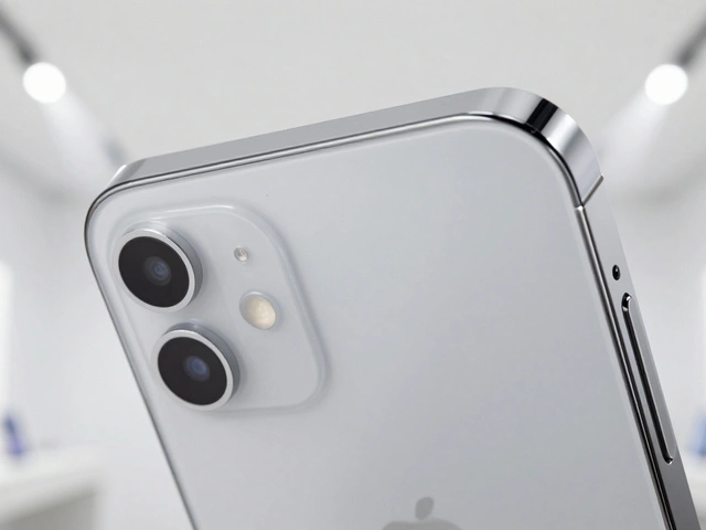
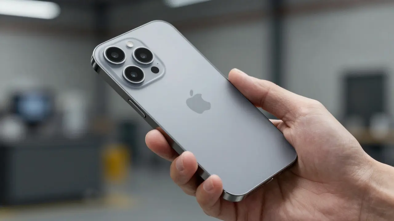
Ive pushed for materials that felt premium-aluminum unibodies, glass backs, precise tolerances. These choices weren't just for looks. They signaled durability and attention to detail. When a device feels solid, users trust it more. This psychological effect reinforces the clarity of the product. You don't need a manual to understand a well-designed object; its form suggests its function.
His legacy is visible in the seamless integration of hardware and software. The transition from plastic laptops to aluminum ones wasn't just a style shift. It allowed for thinner bezels, larger screens, and better heat dissipation. Every physical change served a functional purpose, proving that beauty and utility are not mutually exclusive.
Saying No: The Art of Feature Culling
The most powerful tool in Apple’s arsenal is the ability to say no. Consider the history of the iPhone. For years, rumors swirled about split-screen multitasking, external storage slots, or customizable home screens. Competitors offered all these features early on. Apple waited. They asked if these features improved the core experience of calling, messaging, and browsing. Often, the answer was no. Or at least, not yet.
When Apple finally introduced iPadOS multitasking, it was refined and integrated deeply into the system. It didn't feel like a bolted-on add-on. It felt native. This delay allowed them to solve underlying architectural problems first. By saying no to premature features, they protected the stability and speed of the operating system.
This strategy extends to accessories, too. Look at the AirPods. They have no buttons. No touch controls initially. Just a simple squeeze. Why? Because complex controls lead to accidental inputs. A single, intuitive gesture reduces error rates. Users learn it instantly. This is clarity in action. The product tells you exactly what it can do, and nothing else.
| Aspect | Feature-First Approach | Apple's Design-Led Approach |
|---|---|---|
| Primary Goal | Maximize capability list | Minimize cognitive load |
| Decision Criteria | Market demand and competitor parity | User intuition and brand consistency |
| Resulting UX | Complex, requires training | Intuitive, immediate adoption |
| Long-term Value | Rapid obsolescence due to bloat | Durable relevance through simplicity |

Protecting Clarity Through Ecosystem Lock-in
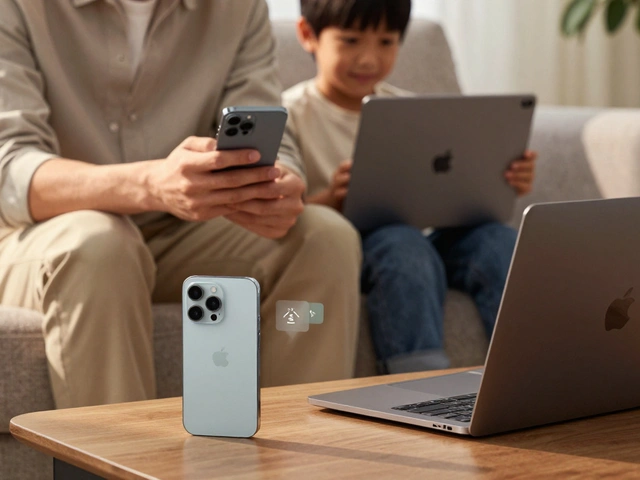
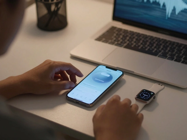
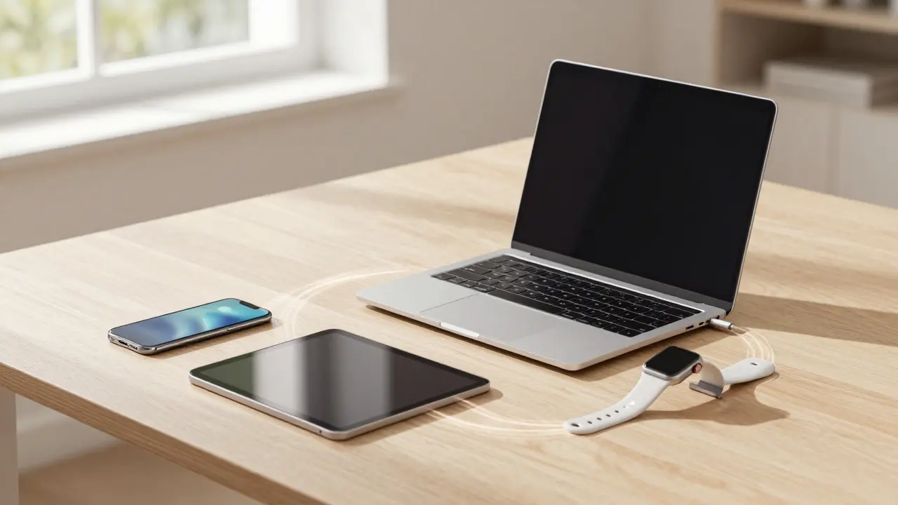
Clarity isn't just about a single device. It's about the entire ecosystem. When your phone, watch, laptop, and tablet work together seamlessly, the mental model becomes simpler. You don't need to figure out how to transfer files between an Android phone and a Windows PC because the tools are built for each other.
AirDrop is a proprietary wireless file-sharing protocol developed by Apple that allows iOS and macOS devices to exchange data automatically when nearby. It works because every Apple device speaks the same language. There are no settings menus to configure. It just happens. This frictionless interaction reinforces the idea that Apple products are a cohesive unit, not a collection of separate gadgets.
This ecosystem lock-in protects clarity by reducing context switching. Users stay within one environment. The learning curve flattens over time. Each new device feels familiar because it follows the same design patterns. The dark mode toggle works the same way on the Watch as it does on the MacBook. This consistency builds confidence.
The Cost of Clarity: Criticism and Trade-offs
Naturally, this strategy has critics. Purists argue that Apple limits user freedom. No root access. No custom launchers. Limited file management compared to open systems. For power users, this can be frustrating. You might want to organize your photos by date and location simultaneously, and Apple’s library forces a specific view.
However, this trade-off is intentional. Apple targets the majority, not the minority. Most users don't know how to customize their OS. They just want it to work. By restricting options, Apple ensures that the default experience is polished. It’s a gamble, but one that has paid off financially and reputationally.
There is also the risk of stagnation. If you wait too long to adopt a popular feature, you lose market share. Samsung adopted foldable screens before Apple. Android phones had styluses for years. Apple eventually responded, but often later. This lag is the price of maintaining high standards. You move slower, but you move with more certainty.
Lessons for Other Brands
Can other companies copy this? Yes, but it requires cultural change. Most organizations reward addition. Sales teams love new features because they give them something to pitch. Marketing loves buzzwords. Engineering loves solving hard problems. Design is often seen as the final polish step, not the starting point.
To implement design-led definition, leaders must empower designers to veto features. This is rare. It requires trust in subjective judgment. It means accepting that some great technologies will never ship. It means prioritizing the user's mental model over the engineer's technical pride.
Start small. Audit your current product. Identify the three features that cause the most support tickets. Ask if those features are necessary. Can they be simplified? Can they be hidden behind advanced settings? The goal isn't to remove everything. It's to ensure that what remains serves a clear purpose.
Frequently Asked Questions
Why does Apple resist adding features that competitors already have?
Apple waits until a feature can be implemented in a way that feels native and doesn't compromise the overall user experience. They prefer to own a category with a superior execution rather than match competitors with a mediocre implementation. This patience helps maintain brand prestige and reduces customer confusion.
Is saying no to features always the right business strategy?
Not always. It works best for consumer brands targeting mass markets where simplicity drives adoption. For B2B or enterprise tools, flexibility and customization are often critical. In those cases, a modular approach might be better than a rigid, minimalist one. Context matters significantly when applying this strategy.
How did Jony Ive influence Apple's product decisions?
Jony Ive elevated design to a strategic level, ensuring that aesthetics and functionality were considered from the earliest stages of development. He championed material quality and seamless integration, which led to iconic products like the original iPod and iPhone. His presence ensured that 'good enough' was never the standard for shipping products.
What is the difference between minimalism and design-led definition?
Minimalism is a visual style characterized by simplicity. Design-led definition is a process where design principles guide all product decisions, including engineering and marketing. A product can look minimalist but still be confusing if the underlying logic is poor. Design-led definition ensures both the look and the logic are aligned with user needs.
How can a startup apply Apple's approach without huge resources?
Focus on one core value proposition and ruthlessly cut anything that distracts from it. Use user testing to validate assumptions about what is essential. Keep your navigation simple and your onboarding short. You don't need expensive materials; you need consistent, thoughtful interactions that respect the user's time and attention.


Categories
Popular Articles