
There is a specific weight to an aluminum enclosure. It’s not just about the metal; it’s about the silence that follows when you close the lid. For decades, Apple has sold this sensation. But how did a company known for loud marketing and disruptive tech maintain such a consistent visual language across two different eras of leadership? The answer lies not in a single person, but in a shared obsession with reduction. From Steve Jobs's garage beginnings to Jony Ive's studio in Cupertino, the core ethos has remained stubbornly intact: if it doesn't help the user, remove it.
The Garage Origins: Function as Form
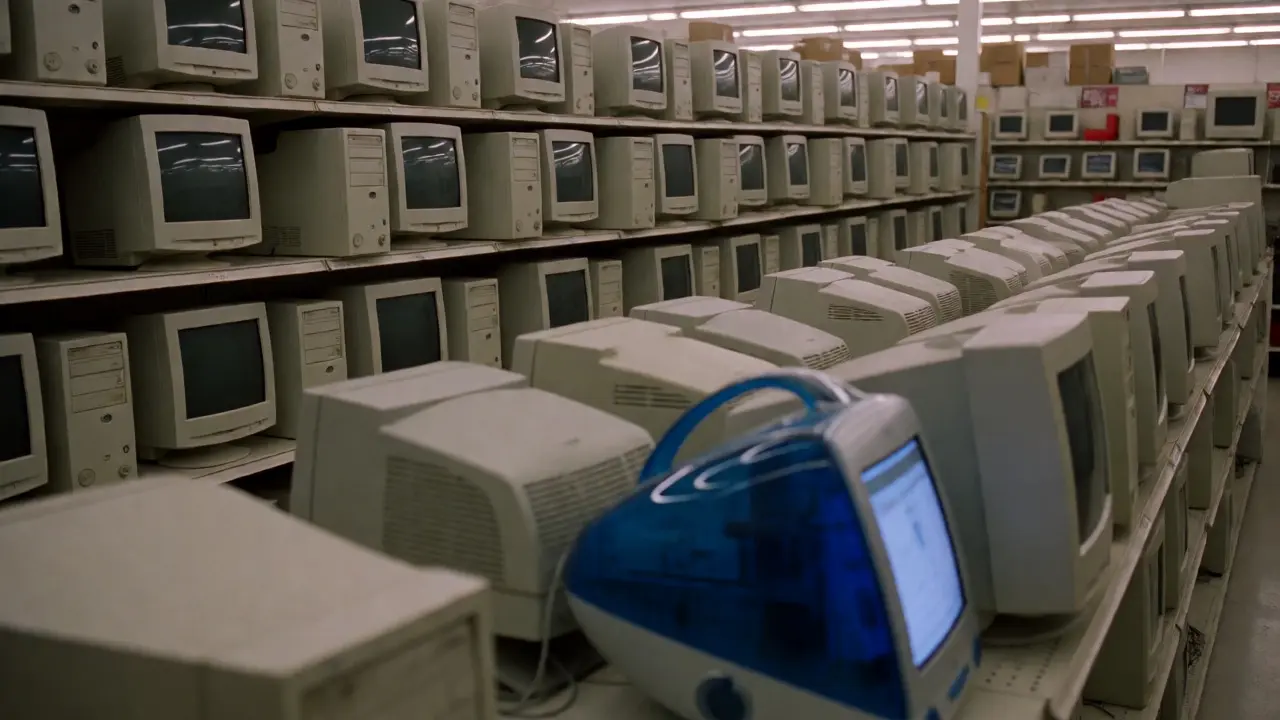
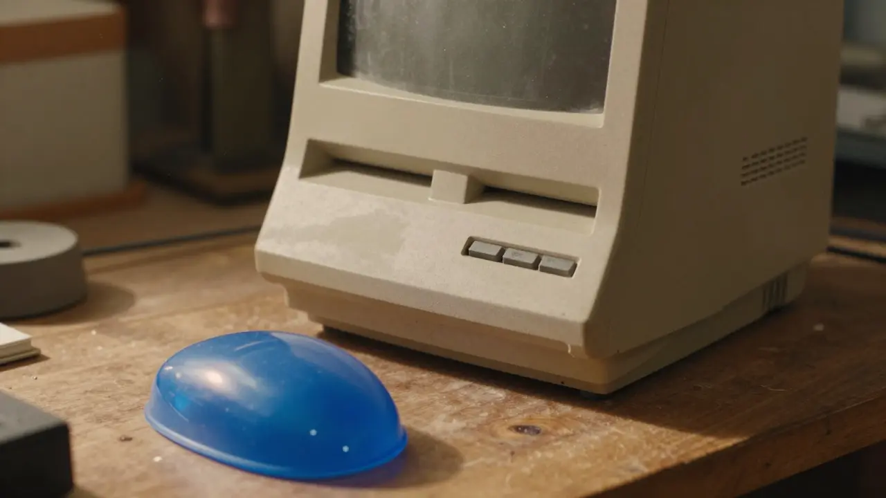
To understand the continuity, we have to look at what was missing. In the early days of personal computing, hardware was often an afterthought. Cases were beige plastic boxes designed to house components, not to be touched. The Macintosh 128K, released in 1984, changed the game. It wasn't just the interface inside; it was the semi-translucent blue case that hinted at the future. It signaled that the computer was a consumer object, something you could hold, something that had personality. This was the first major shift from "industrial utility" to "personal companion."
Steve Jobs brought a background in calligraphy and Zen Buddhism to the table. He didn't see design as decoration. He saw it as the intersection of art and science. His famous quote, "Design is not just what it looks like and feels like. Design is how it works," wasn't just a slogan; it was a directive. Every screw, every hinge, every pixel had to serve a purpose. If a button was hard to press, it was a failure. If a cable dangled awkwardly, it was a sin. This mindset established the baseline for everything that followed.
The Return and the White Plastic Revolution
When Jobs returned to Apple in 1997, the company was weeks away from bankruptcy. The product lineup was a mess of confusing models and clunky designs. Jobs stripped it down to four quadrants: desktop/prosumer and laptop/consumer. But he also brought back a focus on physical integrity. The iMac G3, launched in 1998, is perhaps the most significant object in modern design history. Its translucent Bondi Blue shell solved a practical problem (cables) by hiding them inside the chassis, while simultaneously making the computer look like a piece of furniture rather than office equipment.
This era introduced the concept of the "unibody" aesthetic before the term existed. The white plastic of the iPod, the MacBook Air, and the iPhone all shared a common trait: they felt seamless. There were no visible seams where panels met. The devices looked like they were carved from a single block of material. This wasn't just about looks; it was about durability and tactile satisfaction. When you picked up an iPod Nano, it didn't feel like a collection of parts glued together. It felt like one thing. That unity became the new standard for premium technology.
Jony Ive: The Architect of Simplicity
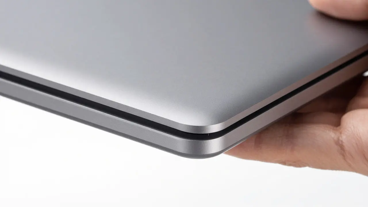
Jony Ive joined Apple in 1992, but his true influence began under Jobs' return. While Jobs was the visionary who set the direction, Ive was the engineer who made it possible. He didn't just draw lines; he obsessed over tolerances. A gap of 0.5 millimeters between a screen and its frame would keep him up at night. Why? Because humans are incredibly sensitive to imperfection. We notice when things don't align, even if we can't articulate why.
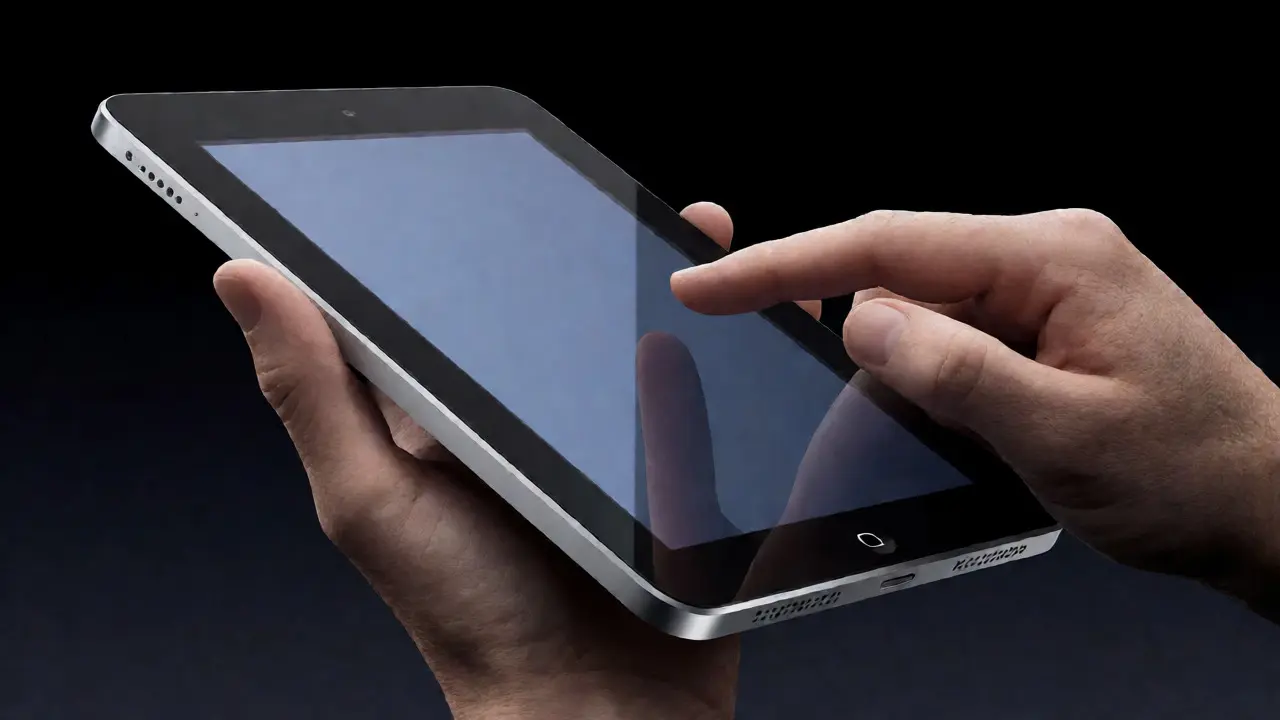
Ive's approach was radical subtraction. Look at the original iPhone. No home button. No keyboard. Just glass and aluminum. Critics called it incomplete. Users called it magical. The design forced a new way of interacting with technology. By removing physical keys, the device became a canvas for software. This is the key to understanding Apple's continuity: the hardware serves the software, but the hardware must never distract from it. Ive understood that simplicity isn't about having less; it's about having only what matters. Every curve on the Apple Watch, every angle on the iPad Pro, exists to guide your hand or eye to the next logical step.
The Shared Language: Materiality and Silence
What ties Jobs' era to Ive's era is the treatment of materials. Both leaders preferred natural, honest materials over synthetic ones that tried to mimic other things. Aluminum, glass, and ceramic became the vocabulary of Apple products. These materials age well. They develop a patina. They feel cool to the touch. This sensory experience creates an emotional connection that plastic simply cannot replicate.
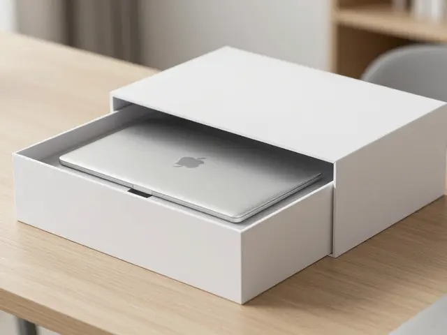
Consider the transition from the unibody MacBook to the space gray finish. It wasn't a change in shape; it was a refinement of texture. The matte finish reduced fingerprints and gave the device a softer, more organic feel. This attention to surface detail is a hallmark of the Apple design ethos. It’s the difference between a product that looks good in a photo and one that feels right in your hand. Jobs wanted the computer to be a bicycle for the mind; Ive wanted the phone to be an extension of the hand. Both goals required a level of craftsmanship that few companies were willing to invest in.
| Era | Key Leader | Primary Material Focus | Core Design Principle |
|---|---|---|---|
| Early Macintosh | Steve Jobs | Translucent Plastic | Accessibility and Personality |
| iPod/iPhone Era | Jony Ive | Anodized Aluminum & Glass | Seamlessness and Tactile Precision |
| Modern Ecosystem | Apple Industrial Design Team | Ceramic & Recycled Metals | Sustainability and Integration |
Beyond the Individual: The Systemic Approach
A common misconception is that Apple's design success rests solely on the shoulders of one genius. In reality, it is a systemic achievement. The Industrial Design team operates with a level of autonomy that is rare in corporate environments. They work closely with engineering, marketing, and retail teams from day one. This cross-functional collaboration ensures that design decisions are feasible and marketable. If a designer wants a curved edge, the engineers need to know if it can be manufactured at scale without breaking the product. If a marketer wants a new color, the designers need to ensure it fits the existing palette.
This system allows for consistency even as leadership changes. When Jobs passed away in 2011, many predicted a decline in design quality. Instead, the team continued to refine their process. The introduction of the Touch ID sensor, the shift to OLED displays, and the development of the M-series chips all reflect the same underlying principles: integration, performance, and elegance. The design team doesn't just make things look nice; they solve complex technical problems through form. For example, the heat dissipation in the iPhone is managed not just by internal fans (which there aren't) but by the thermal properties of the aluminum chassis itself. The design is the cooling system.
The Future: Sustainability as the New Minimalism
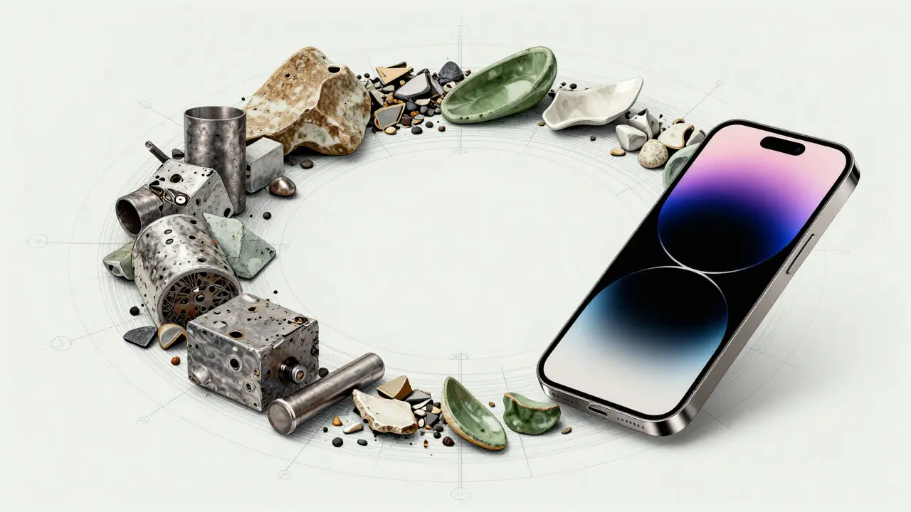
Today, the conversation around Apple's design ethos has evolved. The new frontier is sustainability. Recycled aluminum and ceramic shield glass are no longer just marketing terms; they are structural requirements. The design team now has to balance aesthetics with environmental impact. This adds a new layer of complexity to the traditional minimalist approach. How do you reduce waste without compromising the seamless look? How do you use recycled materials that may have different textures or colors?
The answer, so far, has been to embrace the imperfections of natural materials. The titanium used in recent iPhones has a slightly rougher texture than previous alloys, but it is lighter and stronger. It feels more authentic. This shift suggests that the next chapter of Apple's design history will focus on longevity. Products that last longer require better design. Better design means fewer replacements. Fewer replacements mean less e-waste. It’s a circular logic that aligns perfectly with the original ethos: do less, but do it better. The thread from the garage to the global ecosystem remains unbroken, woven through generations of innovators who believe that simplicity is the ultimate sophistication.
Did Jony Ive invent the minimalist style at Apple?
No, the foundation was laid by Steve Jobs in the 1980s with the Macintosh. However, Jony Ive refined and scaled this philosophy during the iPod and iPhone eras, introducing the unibody construction and extreme attention to tactile details that defined modern Apple products.
Why does Apple prefer aluminum and glass over plastic?
Aluminum and glass offer superior durability, better thermal conductivity, and a premium tactile feel. They allow for thinner, lighter devices and support wireless charging technologies. Additionally, these materials age more gracefully than plastic, maintaining their aesthetic appeal over time.
How does the design team collaborate with engineers?
The collaboration happens from the very beginning of the product cycle. Designers and engineers work side-by-side to ensure that aesthetic choices are technically feasible. This integrated approach prevents late-stage compromises that could ruin the final product's look or function.
Is Apple's design philosophy changing due to sustainability goals?
Yes, sustainability is becoming a core design constraint. The team is increasingly using recycled materials and designing for repairability and longevity. This adds complexity to the traditional minimalist approach but reinforces the idea of creating products that last.
What role does the 'unibody' design play in Apple's brand identity?
The unibody design signals precision and quality. By eliminating visible seams and screws, the device appears as a single, cohesive object. This reinforces the brand promise of seamless integration between hardware and software, making the technology feel intuitive and effortless.