
You pick up your iPhone and swipe left to go back. It’s muscle memory at this point. Then you grab your iPad, try the same swipe, and nothing happens. Or worse, you accidentally close an app because you didn’t realize the gesture logic shifted entirely when the screen got bigger. This isn’t a bug; it’s a deliberate evolution in how humans interact with glass.
The transition from phone to tablet isn’t just about scaling pixels. It’s about rethinking physics, reachability, and intent. When Apple introduced iPadOS as a distinct operating system separate from iOS in 2019, they weren’t just changing the name. They were acknowledging that a 12.9-inch canvas requires a different set of rules than a 6.1-inch one. If you’re designing for tablets or just trying to stop fighting your device, understanding these shifts is crucial. Let’s break down exactly how touch conventions changed and why your fingers need new instructions.
The Physics of Reachability
On an iPhone, your thumb covers most of the screen. You can reach the top corner with relative ease, though it might require a slight grip adjustment. On an iPad, especially the Pro models, your thumb is useless for anything above the middle third of the display. The center of gravity shifts. Your hand becomes an anchor, not a tool for exploration.
This physical reality drove the first major change in iPadOS. Early iPad versions mimicked the iPhone too closely. Buttons were small, targets were tiny, and navigation relied on taps that required precision. Today, the interface prioritizes the bottom half of the screen. Look at the Dock. It sits permanently at the bottom, within easy thumb reach. The status bar moved? No, but the interaction layer did. Critical actions like switching apps or accessing the Control Center are now anchored to edges or corners that are naturally accessible without contorting your wrist.
Think about the "Reachability" feature on iPhones. It drops the UI down so you can tap the top. iPads don’t have this. Why? Because dropping the UI doesn’t solve the problem-it just moves it. Instead, iPadOS uses larger hit targets and edge-based gestures. You don’t tap a tiny menu button in the top right. You swipe from the right edge to open the Notification Center. You swipe from the bottom to switch apps. The geometry of the hand dictates the geometry of the software.
Multitasking Changes Everything
On an iPhone, multitasking is mostly theoretical. You switch apps by swiping up from the bottom (on Face ID models) or double-pressing the Home button (on older ones). There’s no true split-screen experience where two apps share equal weight simultaneously. The screen is too narrow. On an iPad, however, Multitasking is the core value proposition. And this changed gesture language more than any other feature.
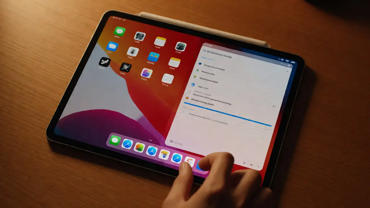
Remember when splitting screens required pinching inwards with three fingers? That was Split View’s early days. It was clever but clunky. Three-finger gestures are hard to execute precisely on a large surface. You often triggered them accidentally. So, Apple simplified it. Now, you drag an app icon from the Dock to the side of the screen. That’s it. One finger. Drag and drop. The complexity moved from the gesture itself to the visual affordance.
| Feature | iPhone Convention | iPadOS Convention | Rationale |
|---|---|---|---|
| App Switching | Swipe up + pause | Swipe up + pause OR Swipe left/right along bottom edge | Horizontal swipe leverages wider screen real estate. |
| Split Screen | Not supported | Drag from Dock or Slide Over handle | Direct manipulation replaces abstract multi-touch codes. |
| Quick Note | N/A | Swipe from bottom-right corner inward | Corners become dedicated action zones on large devices. |
| Home Access | Swipe up from bottom | Swipe up from bottom OR Click Trackpad | Hybrid input methods accommodate keyboard/mouse users. |
The introduction of Slide Over also altered how we think about overlays. On mobile, notifications push content down or appear as banners. On iPad, you can pull a second app into a floating window. To dismiss it, you don’t tap an "X." You flick it off the screen to the right. This mimics the physical act of tossing a sticky note aside. It’s intuitive because it aligns with spatial reasoning, not just symbolic tapping.
The Pointer Paradox: Mouse Meets Touch
Here’s where things get really interesting. For years, the iPad was strictly a touch-first device. Then came support for Bluetooth mice and trackpads. Did this break the gesture model? Surprisingly, no. It enhanced it. iPadOS introduced a circular pointer that morphs depending on what’s under it. Hover over a button, and the circle grows. Hover over text, and it turns into a caret. Hover over an image, and it expands slightly.
This hybrid approach created a new convention: hover state feedback. On iPhone, there is no hover. You either tap or you don’t. On iPad with a pointer, you get pre-tap feedback. This reduces errors. You know before you click if you’re hitting the link or the ad next to it. But here’s the catch: the gestures still work. You can ignore the mouse entirely. The system adapts to you, not the other way around. This flexibility is rare in computing. Most OSs force you to choose between touch and cursor. iPadOS lets you mix them seamlessly.
If you use a Magic Keyboard, the trackpad gestures mirror macOS almost exactly. Two-finger scroll, three-finger swipe to switch spaces. But on the touchscreen, those same three-finger swipes do something different-they switch full-screen apps. The context determines the meaning. This contextual sensitivity is the hallmark of mature user interface design.
Apple Pencil: The Third Hand
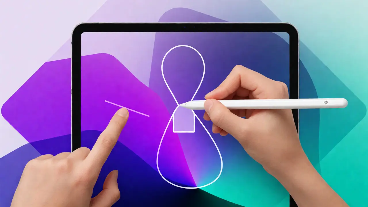
No discussion of iPad gestures is complete without the Apple Pencil. Initially, it was just a stylus for drawing. Now, it’s a primary input method that changes how you navigate. Double-tapping the Pencil (on Gen 2 and USB-C models) toggles between tools. But beyond drawing, it enables direct manipulation of text and objects in ways fingers can’t match.
Fingers are blunt instruments. A pencil tip is precise. This precision allowed Apple to introduce features like Scribble, where you write directly into text fields. But it also changed navigation. In some apps, you can use the Pencil to select multiple items by drawing a lasso around them. Try doing that with your finger. You’d obscure the view. With the Pencil, you see what you’re selecting. This led to a new convention: precision selection via outline.
Furthermore, the Pencil introduced pressure-sensitive gestures. Harder presses trigger different actions than light taps. This adds a depth dimension to interaction that simply doesn’t exist on iPhone. On iPhone, a tap is binary: yes or no. On iPad with Pencil, a press is analog: soft, medium, hard. This allows for richer interactions without cluttering the screen with extra buttons.
Edge Swipes and Hidden Menus
Because the iPad screen is so wide, designers stopped putting menus at the top. Top-edge interactions are awkward. You have to lift your hand high, losing stability. Instead, iPadOS pushed critical functions to the sides and bottom. The Control Center opens with a swipe from the top-right corner. Not the top-center. The corner. Why? Because the corner is easier to target accurately than a thin strip across the entire width.
Similarly, the App Library is accessed by swiping left past the last home screen page. On iPhone, this is deep navigation. On iPad, it’s a lateral move. The horizontal axis became more important than the vertical one. This shift reflects how we read and organize information on wide canvases. We scan left-to-right, then top-to-bottom. The OS followed this cognitive pattern.
Another subtle change: long-press behavior. On iPhone, long-pressing an app icon brings up quick actions. On iPad, long-pressing often initiates drag-and-drop mode immediately. You don’t wait for a menu to pop up; you start moving the icon. This reduces friction. It assumes intent. If you hold an icon, you probably want to move it. The system trusts you. This trust-based design reduces the number of steps needed to accomplish tasks.
Why This Matters for Designers
If you’re building apps for both platforms, copying iPhone layouts to iPad fails. Users hate stretched interfaces. They hate giant white space. They hate having to reach across the screen. Successful iPad apps redesign their navigation for the larger canvas. They use sidebars instead of hamburger menus. They use split views instead of modal sheets. They leverage gestures that take advantage of the extra space.
Consider email. On iPhone, opening an email takes you to a new screen. Back button returns you. On iPad, opening an email keeps the list visible on the left. The detail pane slides in from the right. No navigation away. No back button needed. Just tap another message. This fluidity relies on the hardware’s capabilities. It respects the form factor.
The lesson? Don’t scale up. Rethink. Ask yourself: What can I do here that I couldn’t do on a phone? Can I show more data? Can I allow simultaneous editing? Can I use the Pencil for markup? These questions drive better gesture design than simply asking, "How do I make this button bigger?"
Common Pitfalls to Avoid
Even seasoned developers mess this up. Here are the most common mistakes:
- Ignoring Edge Zones: Placing interactive elements within 40 points of the screen edge causes accidental triggers. Keep controls away from swipe zones.
- Small Hit Targets: Fingers are fat. Even on high-res displays, buttons should be at least 44x44 points. On iPad, aim for 50x50 or larger for primary actions.
- Assuming Thumb Reach: Never put critical info in the top-left or top-right corners unless it’s passive (like time or battery). Active controls belong in the lower two-thirds.
- Overusing Multi-Touch: Three-finger gestures are cool but unreliable. Prefer single-finger drags or taps whenever possible.
By respecting these boundaries, you create experiences that feel natural rather than forced. Users shouldn’t have to think about how to interact. They should just flow.
Why does swiping from the bottom do different things on iPhone and iPad?
On iPhone, the bottom swipe primarily handles app switching and going home because the screen is vertically constrained. On iPad, the bottom area is reserved for the Dock and multitasking controls. Swiping up goes home, but swiping left/right along the bottom edge switches recent apps horizontally, leveraging the wider screen width for faster access.
Can I use mouse gestures on iPad without a trackpad?
Yes, if you connect a Bluetooth mouse. The pointer will appear, and you can click and scroll. However, complex gestures like three-finger swipes usually require a trackpad or touchscreen. The mouse supports basic clicks and scrolling, but the full gesture suite is optimized for touch and trackpad inputs.
How do I enable Split View if my app doesn't support it?
If an app doesn't support Split View natively, you can still use Slide Over. Drag the app from the Dock to the side of the screen to create a floating overlay. Alternatively, check if the developer has updated the app to support multitasking. Some legacy apps may never gain this capability due to technical constraints.
Does the Apple Pencil change standard touch gestures?
The Apple Pencil operates alongside touch gestures, not replacing them. You can still use fingers for navigation while using the Pencil for drawing or writing. However, certain apps disable palm rejection settings differently, so ensure your hand position doesn't accidentally trigger touch events while drawing.
Why is the Control Center accessed from the top-right corner on iPad?
This placement avoids conflict with the notch or camera housing on newer models and provides a distinct, easy-to-target zone. On iPhone, it's also top-right, but on iPad, the larger screen makes a full-width swipe impractical. The corner ensures precision and prevents accidental activation during regular usage.