Wolf and Hare
How Apple Recruits Designers: The Process for Global Talent and Team Cohesion


Explore Apple's rigorous design recruiting process, focusing on global talent acquisition and long-term team cohesion. Learn about the interview stages, portfolio expectations, and compensation for UX and Industrial Design roles.
Designing Apple Pairing Flows: Instant Recognition and Low-Friction Setup

Explore how Apple designs instant recognition and low-friction pairing flows using Nearby Interaction, DockKit, and spatial cues to minimize user effort.
The Cost of Simplicity: Why Apple Pays to Hide Complexity

Explore why Apple invests billions to hide technical complexity. Learn how Ken Segall's insights reveal the high cost of simplicity in design, engineering, and organizational discipline.
Shared iPad Setup: Privacy, Accounts, and Classroom Management Guide
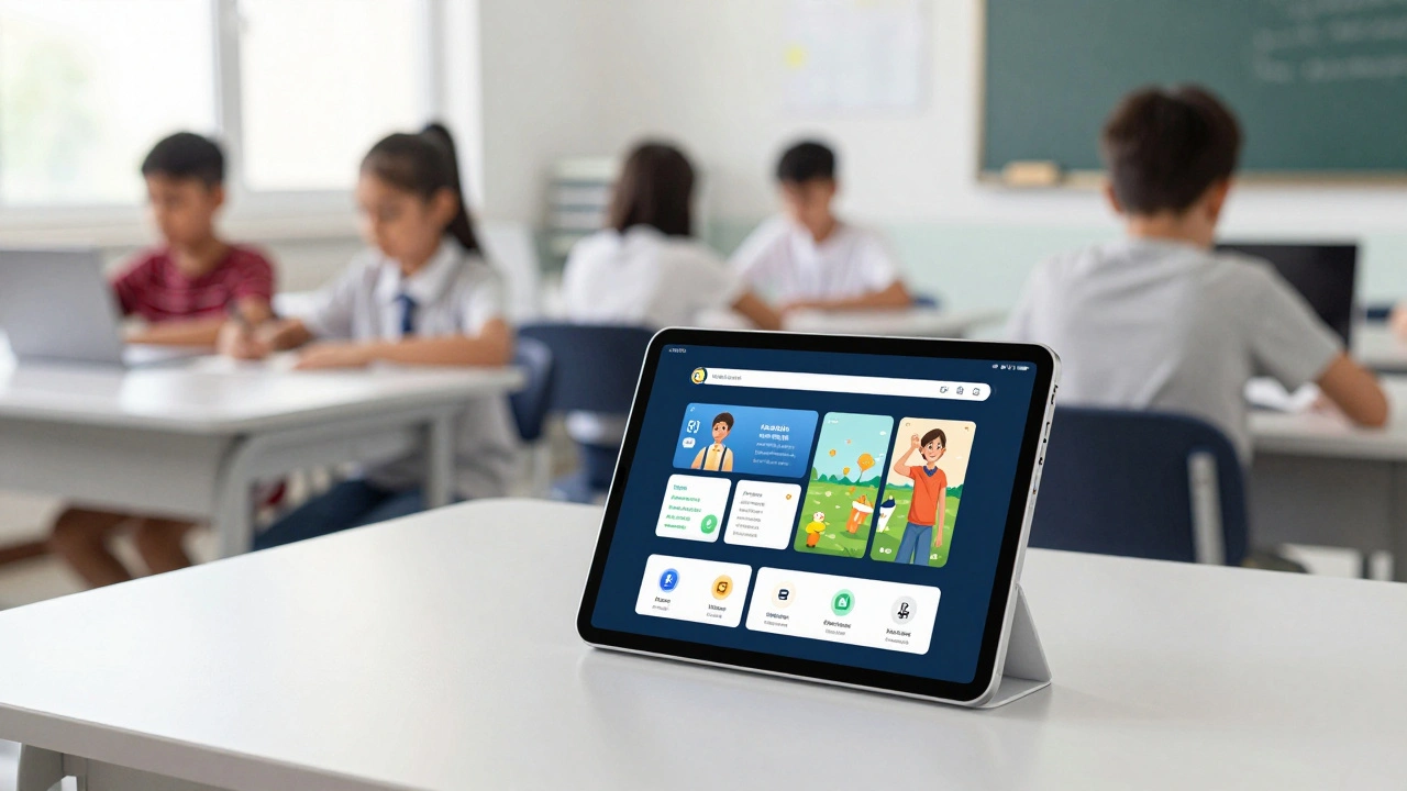
A guide to setting up Shared iPad for classrooms, covering Managed Apple IDs, MDM configuration, privacy safeguards, and using the Classroom app for effective student management.
Activity Rings by Design: Why Gamified Health Metrics Stay Intuitive
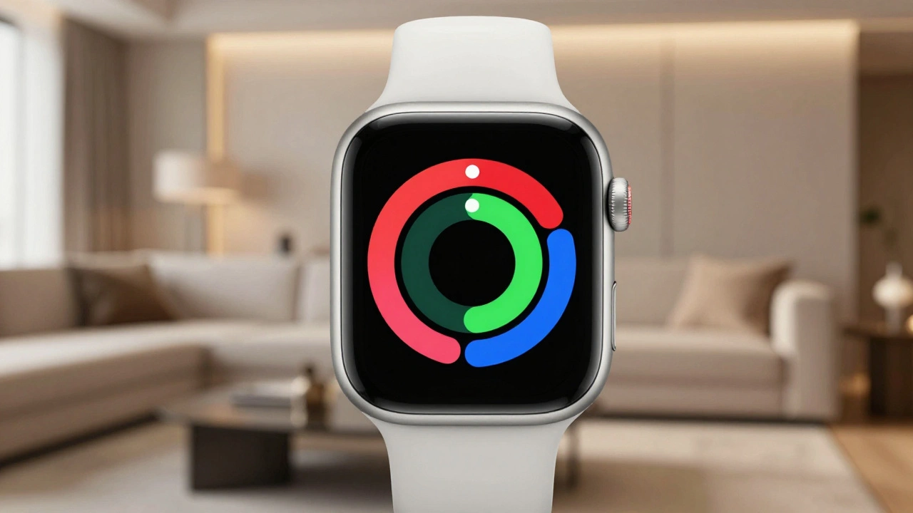
Explore why Apple's Activity Rings succeed as a UX design masterpiece. Learn how gamification, simplicity, and psychology combine to create intuitive health metrics that drive real behavioral change.
Evans Hankey’s Exit: How Apple’s Design Leadership Shifted from Jony Ive to Jeff Williams

Explore Evans Hankey's short tenure as Apple's VP of Industrial Design and the surprising decision to eliminate her role, shifting design leadership to COO Jeff Williams.
WatchOS Navigation Evolution: Why Apple Dropped Force Touch for Gestures
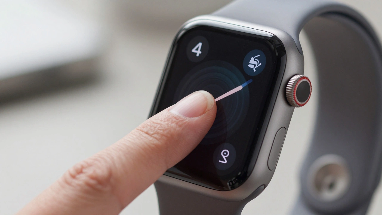
Explore how watchOS navigation evolved from Force Touch to simplified gestures. Learn why Apple made this change and how to adapt.
Animating SF Symbols on Apple: Mastering Draw and Variable Rendering
Learn how to animate SF Symbols in iOS 18 using the new Draw effect and Variable Rendering modes. Discover how to create organic stroke animations and data-driven icons with SwiftUI.
How to Use Apple’s Product Bezels and Color Guides for Accurate UI Mockups
Learn how to use Apple’s official product bezels and semantic color guides to create pixel-perfect UI mockups in Figma and Sketch. Follow App Store marketing guidelines for accurate, compliant designs.
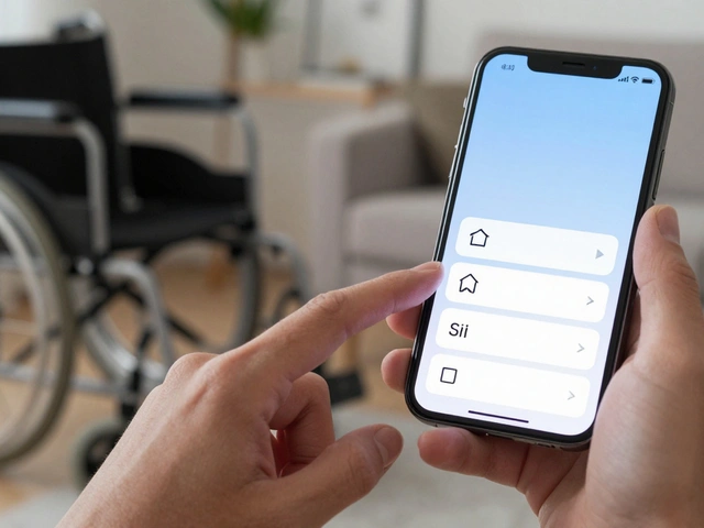
Apple Watch Accessibility Guide: VoiceOver, Taptic Time, and High-Contrast Settings
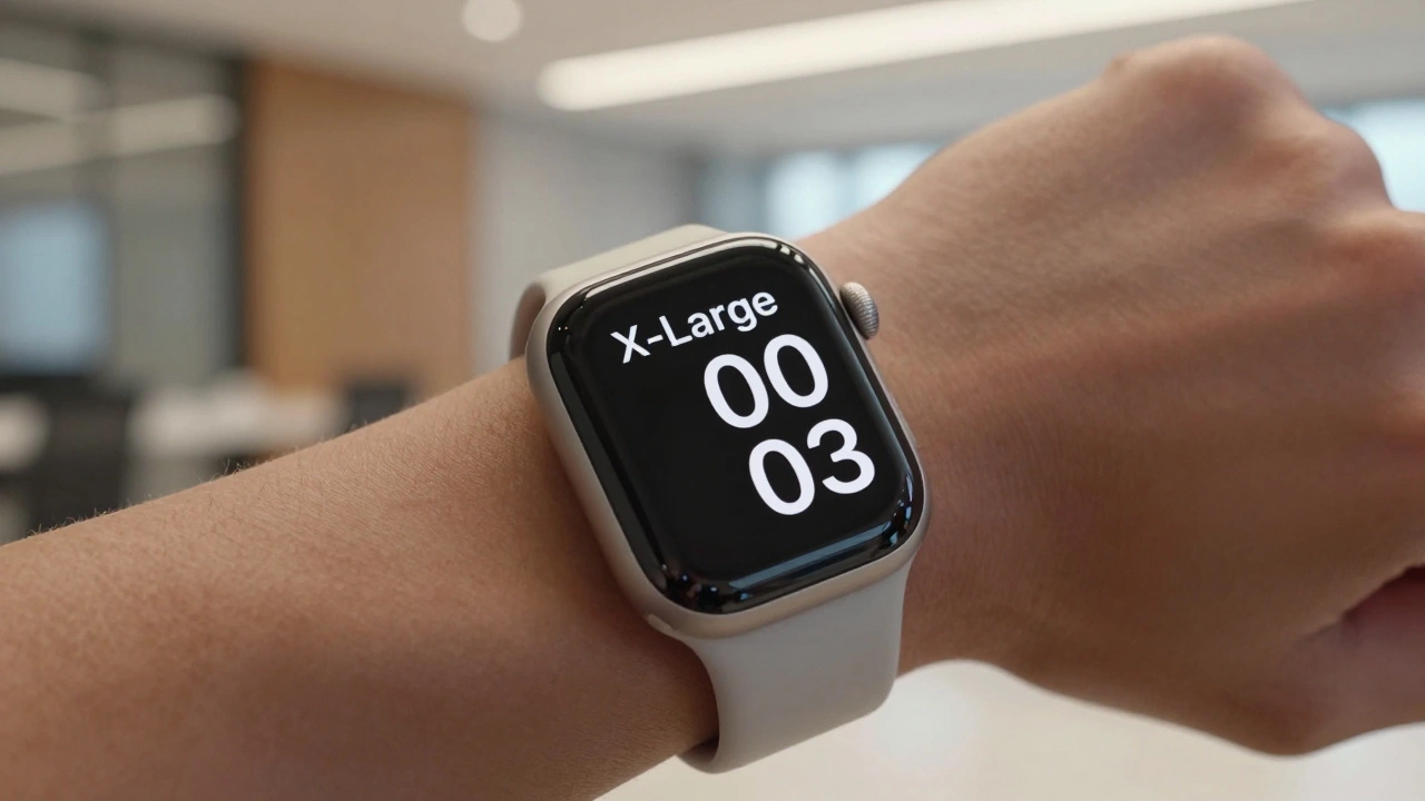
Learn how to use Apple Watch accessibility features like VoiceOver, Taptic Time, and high-contrast design. A practical guide for blind and low-vision users to navigate watchOS effectively.
Apple Touch Target Design: The 44-Point Rule for Comfortable Taps
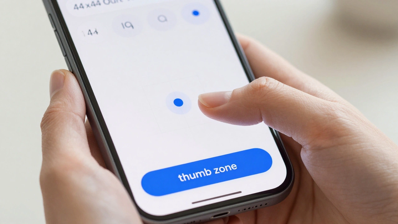
Master Apple touch target design with the 44-point rule. Learn how to create comfortable, inclusive taps for every hand using iOS accessibility best practices.
iPad Home Screen Design: Mastering Widget Density and Information Hierarchy
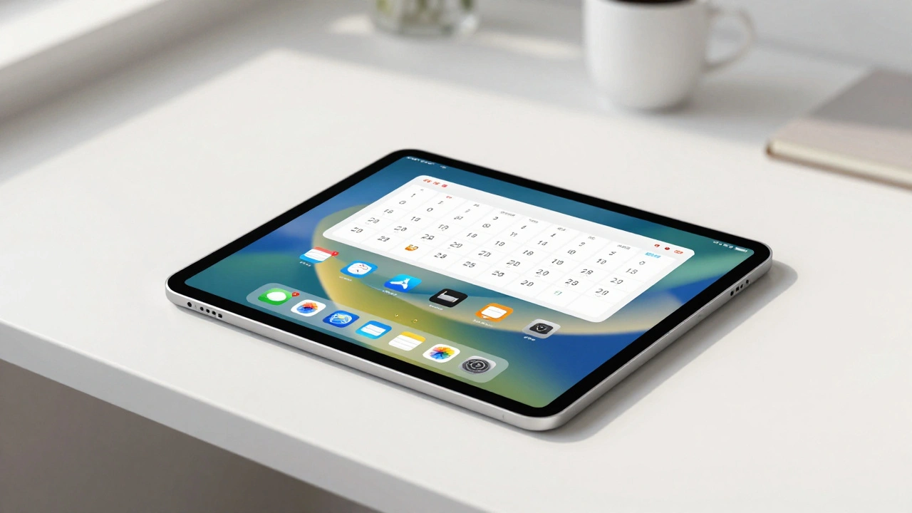
Master iPad home screen design by balancing widget density and information hierarchy. Learn practical layouts, focus modes, and cognitive principles to create a productive, clutter-free interface.