
On an Apple Watch, every pixel counts. With screens as small as 38mm, there’s no room for guesswork. If a number is too faint, a button too tight, or a letter too cramped, users won’t just miss the info-they’ll stop using the app. That’s why typography in watchOS isn’t about style. It’s about survival. And the system that makes it all work? SF Compact.
Why SF Compact Isn’t Just Another Font
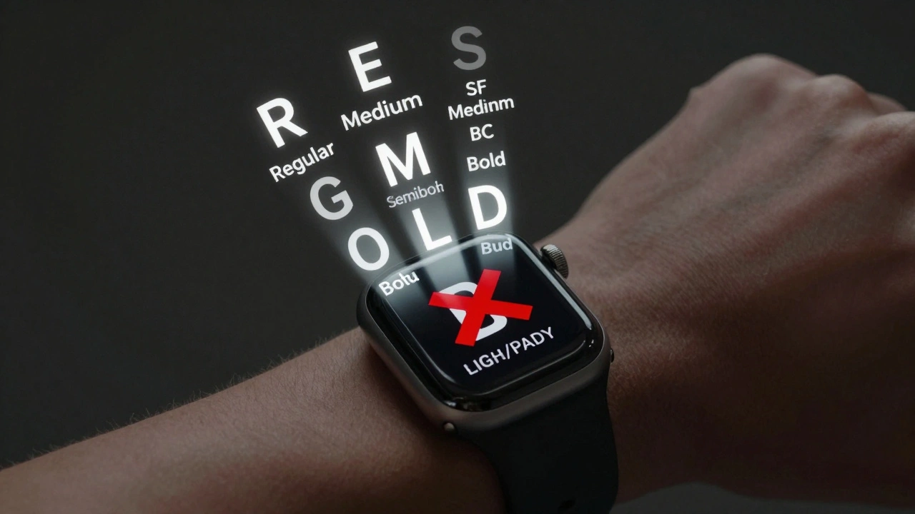
Apple didn’t just pick a font and shrink it. They built SF Compact is a custom variant of the San Francisco typeface family, specifically engineered for the extreme constraints of the Apple Watch. It’s the only system font you should use in watchOS apps. It’s not SF Pro from iOS. It’s not SF Display from macOS. It’s SF Compact-designed from the ground up for 200 PPI screens worn on your wrist.Here’s the trick: at 17 points, SF Compact looks bigger than a 17-point font on your phone. Why? Because Apple’s optical sizing adjusts the letterforms. The same point size gets slightly wider spacing and taller x-heights when rendered small. This isn’t magic. It’s math. SF Text (for 19pt and below) and SF Display (20pt and up) are two separate font files with different tracking values. On watchOS, SF Compact combines both into one seamless system.
For example, body text at 17pt uses -0.43px of tracking. That’s negative spacing-letters pulled closer together. Why? To prevent them from looking too airy on a low-res display. Callout text at 16pt? -0.32px. Subhead at 15pt? 0px. Each value is exact. Figma’s default tracking won’t cut it. If you’re designing for Apple Watch, you need to input these numbers manually. No shortcuts.
Line Height: Tighter Than You Think
On iOS, a 17pt line might have 24pt of vertical space. On watchOS? It’s 22pt. That’s a 2-point reduction. Why? Because every millimeter of screen real estate is borrowed from the next thing you need to show.Look at the numbers:
- Body (17pt): 22pt line height
- Callout (16pt): 20pt line height
- Subhead (15pt): 19pt line height
- Footnote (13pt): 16pt line height
These aren’t suggestions. They’re hard limits. Apple’s system uses these values to pack more data into a single screen without making text feel cramped. Too much space? You lose information. Too little? Text blurs together. The sweet spot is razor-thin-and it’s documented in WWDC sessions from 2020 through 2025.
And don’t forget: Dynamic Type must be supported. If a user increases their text size in Accessibility settings, your app can’t break. SF Compact scales cleanly. Custom fonts? They must respond to system-wide scaling or they’ll fail accessibility checks.
Font Weights: What Each One Means
Weight isn’t just about boldness. It’s hierarchy. On a watch, you don’t have menus. You don’t have sidebars. You have one screen. So weight tells users what matters.- Regular - Body text. Default. Everything you’re reading right now.
- Medium - Secondary labels. Like "Steps" under your step count.
- Semibold - Section headers. "Today". "Workout". "Notifications".
- Bold - Primary actions. "Start". "Pause". "End".
Never use Light or Black weights. They don’t exist in watchOS. Apple doesn’t provide them. And if you try to force them, the text will render poorly on OLED screens, especially under bright sunlight.
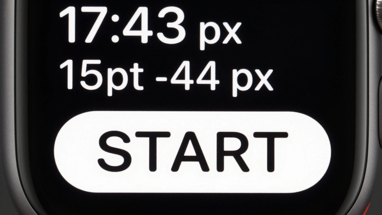
Tap Targets: The 44-Pixel Rule
Typography doesn’t stop at letters. It ends where fingers touch.Apple’s rule is simple: tap targets must be at least 44x44 pixels. That’s the minimum size for reliable touch input on a wrist. But here’s the catch: the text inside that button can’t be bigger than 17pt. Why? Because 17pt SF Compact at 44px width fills the space perfectly. Anything larger overflows. Anything smaller looks lost.
Button layout? Strict rules:
- Max three glyph-only buttons in a row (like play, pause, skip).
- Max two text buttons side by side-and only if the text is short. "OK" and "Cancel"? Fine. "View Details" and "Edit Profile"? Too long.
- Full-width text buttons? The gold standard. Always preferred.
Why? Because scrolling on a watch is slow. If you force users to swipe left to find a button, they’ll quit. You have one shot. Make it obvious.
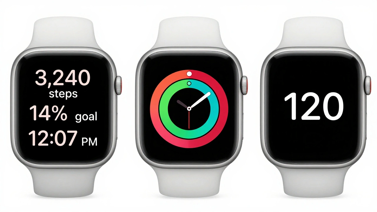
Layout Patterns That Actually Work
watchOS has five proven layout patterns. They’re not optional. They’re the only things that pass Apple’s review.- Three-line text - Perfect for fitness stats: "3,240 steps", "14% goal", "12:07 PM".
- Color-coded - Red for low battery, green for active, gray for paused. Uses system colors only.
- Bar gauge - A thin horizontal bar with a number beside it. Used for heart rate zones, hydration levels.
- Circular graphic - Activity rings. The most copied pattern on the App Store. Works because it’s iconic.
- Large text - One word. One number. "HIGH". "120". "10:00". Used for urgent alerts.
These patterns aren’t templates. They’re constraints. If your design doesn’t fit one of these, it’s too complex. And complexity kills usability on a watch.
Color, Contrast, and Accessibility
Dark mode isn’t a preference on Apple Watch-it’s a requirement. OLED screens turn off pixels when black. That saves battery. It also makes text pop.Contrast ratios? Minimum 4.5:1 for body text. Apple’s own system text on dark backgrounds hits 8:1. That’s intentional. You don’t need to be fancy. You need to be readable.
Color blindness? Test your interface with grayscale. If your "high" and "low" labels rely on red/green alone, you’re failing. Use icons. Use text. Use shape. Don’t just use color.
And always add accessibility labels. "Heart rate: 72 bpm" isn’t enough. The VoiceOver label should say: "Current heart rate is 72 beats per minute." Clarity beats brevity here.
What Happens If You Ignore the Rules?
You’ll get rejected.Apple’s App Review team checks for:
- Incorrect tracking values
- Line heights that exceed 22pt for body text
- Buttons smaller than 44px
- Custom fonts that don’t scale with Dynamic Type
- Text that overflows or gets cut off on 38mm screens
One developer I know spent three months redesigning their fitness app after their first rejection. They thought their custom font looked "premium." Apple said it was unreadable at 13pt. They switched to SF Compact. Got approved in 48 hours.
Final Rule: Less Is More
The Apple Watch isn’t a mini-phone. It’s a glanceable device. People don’t open apps to scroll. They open them to read one thing. Then they’re done.Typography is your only tool to make that one thing clear. No decorative fonts. No gradients. No shadows. No unnecessary icons. Just SF Compact, exact spacing, and a clear hierarchy.
Every character you add costs attention. Every pixel you waste costs battery. Every second you make users wait costs retention.
Design for the wrist. Not the screen.
Why can’t I use SF Pro on watchOS?
SF Pro is designed for larger screens like iPhone and iPad. Its letter spacing and proportions are optimized for 300+ PPI displays viewed at arm’s length. On a 200 PPI watch screen, SF Pro appears too loose and too thin, making text harder to read. SF Compact fixes this by adjusting optical sizing, tracking, and line height specifically for the wrist.
Can I use custom fonts in my watchOS app?
Yes-but only if they fully support Dynamic Type and scale correctly across all sizes. Most custom fonts fail because they don’t handle small sizes well. Even if they look good in Figma, they’ll blur or distort on Apple Watch hardware. Apple strongly recommends SF Compact for all apps. It’s the only font guaranteed to pass review and deliver optimal readability.
What’s the difference between SF Text and SF Display?
SF Text is optimized for sizes 19pt and below. It has slightly wider letterforms and more generous spacing to improve legibility at small sizes. SF Display is for 20pt and above, with tighter spacing and taller vertical proportions. On watchOS, SF Compact blends these into one font family, automatically switching based on the text size you use in your code.
Why are tap targets limited to three glyphs or two text buttons?
The Apple Watch screen is too small to handle clutter. Three glyph buttons (like play, pause, next) fit side by side without crowding. But text buttons need more space. Two text buttons side by side is the maximum before text becomes unreadable or fingers accidentally tap the wrong one. Full-width buttons are always preferred because they’re easier to hit and don’t require precise aiming.
Do I need to design for both 38mm and 42mm screens?
Yes. Even though 42mm is larger, many users still use 38mm models. Your layout must work on both. Use autoscaling assets and test on both sizes. Apple recommends designing for 38mm first-it’s the harder constraint. If it looks good on the smaller screen, it’ll look great on the larger one.