
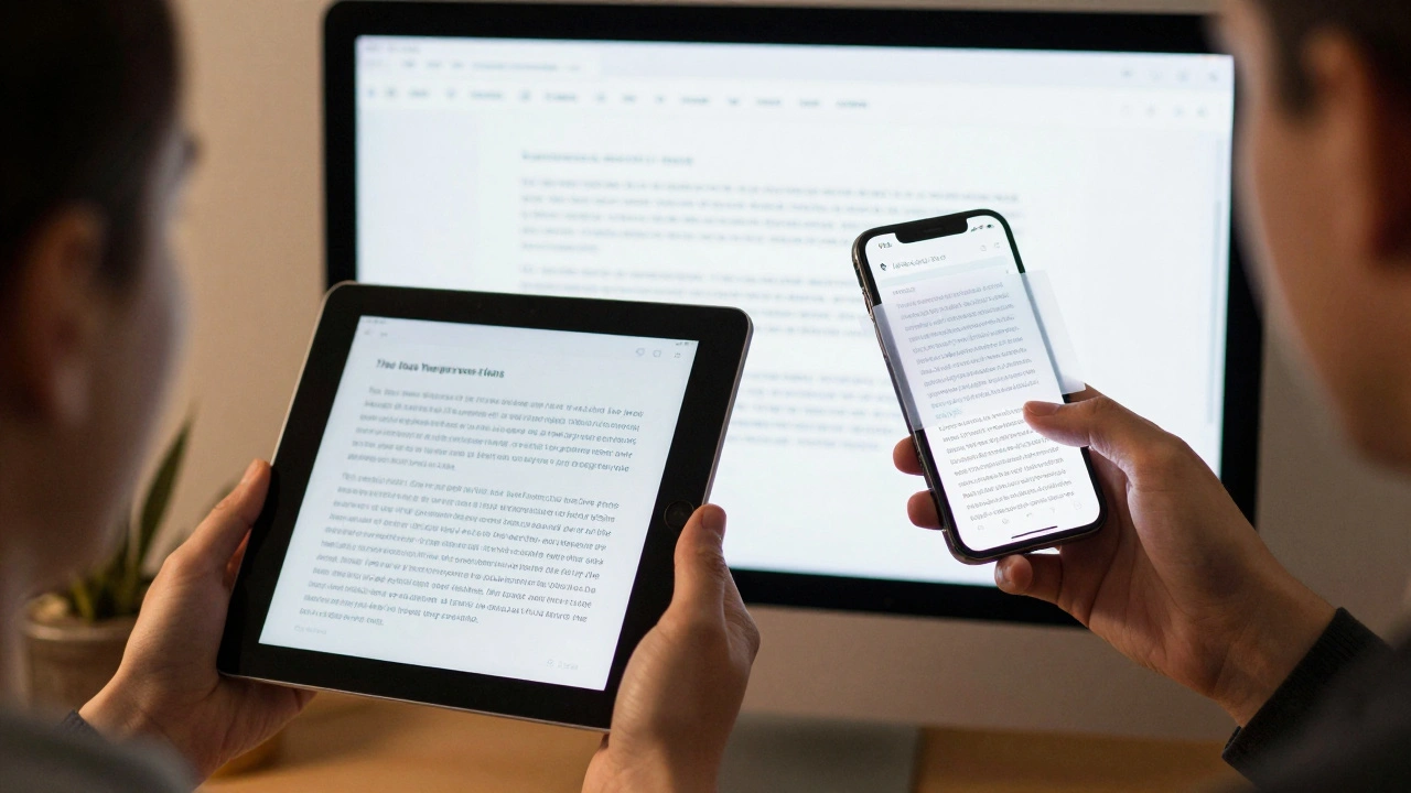
When you type a note on your iPhone and paste it into a document on your Mac, the text doesn’t just copy over-it adapts. It changes size, spacing, and even the shape of its letters. This isn’t a bug. It’s intentional. Apple designed its typography system to respond to how you hold, view, and interact with each device. What looks perfect on an iPhone would feel too big on a Mac. What feels crisp on a Mac would be unreadable on an iPad held at arm’s length. The solution? A carefully engineered system of typographic density that changes across platforms.
Why One Font Size Doesn’t Work Everywhere
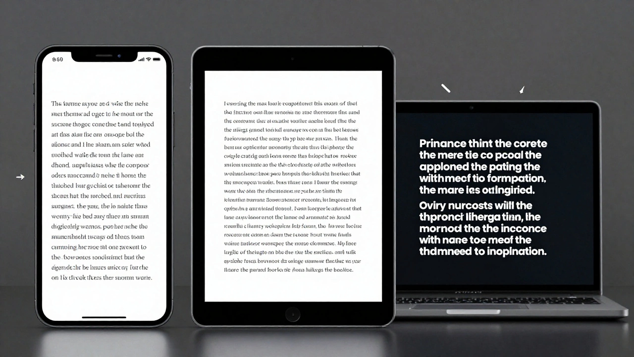
Imagine using the same 17-point font on your iPhone and your Mac. On the iPhone, it’s perfect-clear, readable, comfortable for your thumb to tap nearby text. But on a 27-inch iMac, that same 17-point text looks like it’s been stretched. It’s bulky. It wastes space. You’d expect Mac text to be smaller, around 13 points, because you’re sitting farther back, eyes at a normal reading distance. That’s not a preference-it’s a physical reality. Apple’s designers didn’t guess at this. They measured it. They tested it. And they built a system that adjusts automatically.
The problem got worse when iPad apps started running on Mac. A 17-point text block from an iOS app would suddenly appear huge on macOS, breaking layouts and making interfaces feel clumsy. Before iOS 13, this mismatch was a mess. Users saw inconsistent text. Developers had to write custom code to fix it. Apple’s answer? Metadata. When text moves from iPhone to Mac, the system now carries hidden instructions: "This text was designed for iOS. Scale it down by 25% for macOS." It’s not just copying pixels-it’s copying intent.
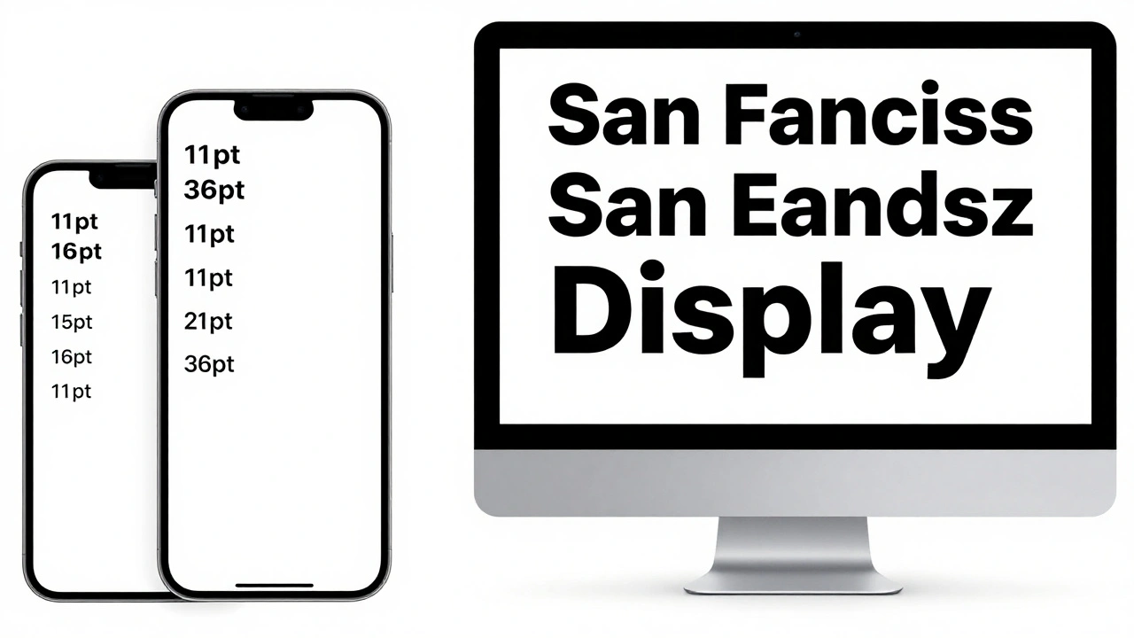
The San Francisco Font: Designed for Density
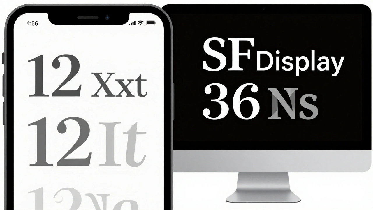
Apple’s San Francisco font isn’t just a typeface-it’s a toolkit. It has nine weights, including italics, and special features like small caps and superscript numerals. But what makes it unique is how it changes based on size. San Francisco has two main variants: SF Text and SF Display. SF Text is for smaller text-like buttons, labels, and body copy. SF Display is for headlines and large UI elements. They don’t just scale up or down. They’re redesigned at different sizes.
At 12 points, SF Text opens up letter spacing so your eyes don’t blur the letters together. The dot on the letter "i" is slightly higher. The tail of the "g" is thicker. These aren’t random tweaks-they’re responses to how the human eye sees detail at close range. At 36 points, SF Display tightens spacing slightly and lowers the x-height to look more elegant on large screens. It’s like having two fonts in one, each optimized for its job.
Apple’s designers even changed how letters connect. The lowercase "l" and the number "1" used to look too similar. At small sizes, they could be confused. So they redesigned them: the "l" got a slight curve at the bottom, while the "1" got a subtle serif. You don’t notice it-but your brain does. That’s the mark of good typography: it works without you knowing why.
Line Height: The Invisible Spacing
Line height-also called leading-is just as important as font size. Too tight, and lines blur. Too loose, and reading feels broken. Apple handles this differently per platform. On iOS, body text uses a line height that’s 1.2 times the font size. On macOS, it’s closer to 1.1. That small difference adds up. On a Mac, where you’re reading longer paragraphs, tighter lines help you move your eyes smoothly across the screen. On an iPhone, where text is often broken into short chunks, a little more space helps you focus on one line at a time.
On watchOS, Apple goes even further. With such a tiny screen, they use tight leading everywhere. One point less than iOS. Why? Because every pixel counts. For Arabic or Thai languages, which need more vertical space for diacritics, Apple increases line height automatically. The system doesn’t just apply a global rule-it adapts to language, device, and context.
Dynamic Type: Letting Users Control Scale
Apple’s Dynamic Type system is what makes all this work without forcing users to choose between "big" and "small." It’s not just about making text bigger for accessibility. It’s about keeping hierarchy intact. If you turn up text size in Settings, your headings don’t just grow-they grow proportionally. A headline that was twice the size of body text stays twice as big, even when everything scales up.
On iPad, when you run an iPhone app, the system tries to preserve the original layout. But if you choose "Optimize Interface for Mac," the app switches to macOS-native text sizes. That means body text drops from 17 points to around 13. Buttons get tighter. Spacing shrinks. The interface becomes denser, faster, and more familiar to Mac users. It’s not a compromise-it’s a choice. And Apple gives you control over it.
Developers don’t have to guess. If you use the system font in your app, Dynamic Type handles everything. No custom code. No hacks. Just call UIFont.systemFont(ofSize:) or use the new Text API in SwiftUI, and the system picks the right density based on device, user settings, and even the app’s context.
Custom Fonts and When to Break the Rules
What if you want to use a custom font-like Helvetica Neue or a brand-specific typeface? Apple gives you flexibility. In iOS 14, they added the relativeTo parameter. You can now say: "Use this font, but scale it like body text." Or: "Keep this font at exactly 14 points, no matter what the user sets." This lets designers preserve brand identity while still respecting accessibility.
But Apple warns against overusing fixed sizes. If you lock a button’s text at 16 points, and a user has their system set to "Larger Text," that button becomes unreadable. You’re overriding their control. The rule? Use system fonts whenever possible. If you must use a custom font, make sure it scales with Dynamic Type. Test it. See how it looks at the smallest and largest settings. Don’t assume your design is perfect on one size-it needs to work across five.
Weight Matters More Than You Think
Apple doesn’t just care about size. They care about weight. Light fonts? Avoid them. Thin text on a Retina display looks great in a marketing image. But in real use? It fades. Especially on older screens or in low light. Apple’s guidelines say: stick to Regular, Medium, Semibold, or Bold. These weights hold up across all devices. They’re legible on a bright iPhone in sunlight. They’re readable on a dim MacBook screen at midnight.
On Mac, where users often work with long documents, Medium and Regular weights provide clarity without heaviness. On iPhone, Semibold helps buttons pop. On iPad, Bold draws attention to key actions. It’s not about aesthetics-it’s about function. A weight that works on one device might disappear on another. Apple’s system ensures consistency by limiting choices to what actually works.
Physical Context Shapes Design
Think about how you use each device. Your iPhone is held close-usually 12 to 18 inches from your face. Your iPad? Sometimes held close like a book, sometimes propped on a table like a laptop. Your Mac? Usually 20 to 30 inches away. That distance changes how your eyes focus. Text that’s perfect at 12 inches becomes blurry at 24 inches. That’s why Mac text is smaller: it’s designed to be read from farther away. iPhone text is bigger: it’s designed for your thumb to tap next to it.
Apple didn’t just guess this. They studied it. They filmed users. They measured eye movement. They found that people on Macs read faster with smaller text because their eyes don’t have to jump as much. On iPhones, people pause more often. Bigger text reduces cognitive load. So the density isn’t arbitrary-it’s behavioral.
That’s why iPad is the hardest. It sits between two worlds. Use it like a tablet? Go with iOS density. Use it like a laptop? Switch to Mac density. Apple lets you choose. And the system adapts automatically.
It’s Not Just About Size-It’s About Experience
What you’re seeing isn’t just a font change. It’s a complete rethinking of how text behaves across devices. Apple didn’t build this to make things look pretty. They built it because users noticed the difference. They complained. Developers struggled. And Apple listened.
Today, if you use the system fonts and follow Apple’s guidelines, your app will feel native on every device. The text will be readable. The spacing will feel right. The weight will hold up. You won’t have to write five versions of the same UI. The system does it for you.
This is the quiet genius of Apple’s typography: it doesn’t shout. It doesn’t ask for permission. It just works-because every detail, from the curve of a letter to the space between lines, was chosen with purpose.
Why does text look different when I copy from iPhone to Mac?
When you copy text from an iPhone app to a Mac, the system reads hidden metadata that says "this text was designed for iOS." It then automatically adjusts the point size to match how it would look on macOS-usually reducing it by about 25%. This keeps the visual size consistent, even though the actual font size changes. It’s not a bug-it’s a feature designed to preserve readability across platforms.
Should I use SF Text or SF Display in my app?
Use SF Text for body text, buttons, labels, and anything under 20 points. Use SF Display for headlines, large titles, and UI elements over 20 points. SF Text has slightly more spacing and taller proportions at small sizes, making it easier to read on phones and tablets. SF Display is more refined and compact for larger screens. The system picks the right one automatically if you use the system font.
Can I disable Dynamic Type in my app?
Yes, but you shouldn’t. You can use fixedSize to lock text at a specific point size, but this overrides user accessibility settings. Users who need larger text for vision reasons will struggle. Apple recommends always allowing Dynamic Type to work. If you must use a custom font, set it to scale relative to a system text style (like body or headline) instead of using fixed sizes.
Why does Apple avoid light font weights?
Light fonts look elegant in high-res images, but they often disappear on real screens-especially under bright light, on older displays, or when viewed from an angle. Apple found that users had trouble reading light text on iPhones in sunlight or on Macs in dim rooms. Regular, Medium, and Semibold weights provide better contrast and legibility across all conditions. They’re not just about style-they’re about reliability.
Does this apply to third-party apps?
Yes. If a third-party app uses the system font (San Francisco) and follows Apple’s text styles, it will adapt automatically to iPhone, iPad, and Mac. If the app uses a custom font without Dynamic Type support, it won’t scale with user settings and may look inconsistent. Apple encourages all developers to use system fonts and text styles to ensure a seamless experience across devices.