When you look at text on your iPhone, MacBook, or Apple Watch, it doesn’t just sit there-it breathes. Every letter is positioned with care, not by accident, but by a system built over decades. This isn’t just about fonts. It’s about micro-typography: the invisible rules that make text feel right. On Apple devices, three techniques work together-kerning, tracking, and optical alignment-to create that clean, effortless look you never notice until it’s gone.
What Is Kerning? It’s Not What You Think
Kerning is the subtle adjustment between two specific letters. Not all letters sit the same way next to each other. Take the pair "AV". If you leave them at default spacing, the pointy bottom of the "A" and the top of the "V" create a weird gap that looks like a hole. Kerning fixes that by pulling them closer. But here’s the catch: kerning isn’t just about two letters. It’s context-sensitive. Apple’s system looks at what’s before and after. A quotation mark between two capital letters? It gets raised slightly. Same character, different position-different treatment.There are two types: metric and optical. Metric kerning uses pre-built spacing rules stored inside the font file. Optical kerning? It calculates spacing based on the actual shapes of the letters. That’s why mixing fonts-like using a serif headline with a sans-serif body-can look off if you don’t use optical kerning. Apple’s San Francisco font uses both. Most of the time, you don’t need to touch it. The system handles it automatically. But if you turn kerning off? Suddenly, everything feels loose, awkward, wrong. You don’t notice kerning when it’s working. You notice it when it’s broken.
And here’s the big mistake developers make: using kerning to fix layout issues. If a button text is too long and cuts off? Don’t crank up the kerning to squeeze it in. That breaks ligatures, warps letter shapes, and messes with the font’s rhythm. Apple’s 2020 WWDC talk called this "semantically incorrect." Kerning is for fine-tuning letter pairs, not fixing bad UI design.
Tracking: The Global Spacing Tool
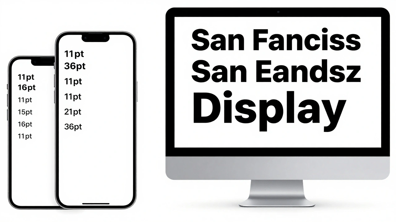
If kerning tweaks pairs, tracking tweaks everything. Tracking is like turning a dial that adjusts spacing across an entire block of text. Positive tracking? Letters spread out. Negative tracking? They crowd together. Simple. But Apple’s system doesn’t just apply tracking blindly. It’s smart.Take the San Francisco font. It has different tracking tables for different sizes. Text at 12 points gets one spacing value. At 36 points? Another. At 100 points? Another still. Why? Because letters behave differently at different sizes. A tiny "i" needs more breathing room than a giant "H". Apple’s tracking tables account for this. The system automatically applies the right amount based on your text size-no manual tweaking needed.
Here’s the key difference: tracking doesn’t interfere with ligatures. If you use tracking to tighten text, the "fi" and "fl" ligatures stay intact. If you use kerning to do the same? The ligatures break. That’s why Apple recommends tracking for general spacing adjustments. It’s the right tool for the job. Designers don’t need to calculate spacing manually. They just pick a text size category-like "text" or "display"-and the system does the rest.
And it’s not just about aesthetics. Tracking affects readability. MartianCraft’s analysis showed that 18-point text and 100-point text, each with their own tracking values, have the same visual density. The grey tone-the overall darkness of the text block-stays consistent. That’s why reading long passages on Apple devices feels smooth. It’s not magic. It’s math, built into the font.
Optical Alignment: Why Text Looks Misaligned (Even When It’s Not)
Ever notice how uppercase letters like "O," "H," and "T" don’t seem to line up perfectly at the edge of a text block? Even though their left edges are mathematically aligned, they look off. That’s because glyphs have sidebearings-extra space built into each letter to prevent collisions. But that space isn’t uniform. The left side of "O" has more white space than the left side of "T." So when you flush-align them, "O" looks like it’s floating to the right.Apple’s solution? Optical alignment. It doesn’t move the letters mathematically. It moves them visually. The font contains data that tells the system: "The true left edge of this glyph is 2 points to the right of its bounding box." The system shifts the glyph slightly to compensate. The result? All uppercase letters appear to line up, even though their actual shapes are wildly different.
This isn’t just for edges. It works for tab stops, line starts, and even centered text. Without optical alignment, centered text looks uneven. One word might appear slightly left, another slightly right. With it? Everything feels balanced. Apple’s Advanced Typography system stores this data in optical bounds tables inside the font. Developers don’t need to do anything. The system reads it and applies the correction automatically.
How Apple’s System Works Together
These three techniques don’t work in isolation. They’re layered. San Francisco, Apple’s system font since 2015, is built for this. It’s a variable font that changes its shape based on size. At small sizes, it’s chunkier and more open. At large sizes, it’s leaner and tighter. Tracking adjusts to match. Kerning refines letter pairs within each size. Optical alignment ensures edges look straight.The magic? You don’t control any of this manually. Apple’s frameworks-SwiftUI, AppKit, UIKit-handle it all. You write Text("Hello World") and the system does the rest. But if you try to override it? You risk breaking the rhythm. Use .kerning(2) to force spacing? You might disable ligatures. Use .tracking(-1) to tighten text? The system knows to keep ligatures alive. It’s designed to protect typographic integrity.
Apple’s WWDC 2020 demo showed this clearly. Two lines of text: one adjusted with kerning, one with tracking. The kerning version broke ligatures. The tracking version didn’t. The message? Let the system do the heavy lifting. Your job is to pick the right text size. The font handles the rest.
Why This Matters for Designers and Developers
This isn’t academic. It’s practical. If you’re designing for Apple platforms, ignoring micro-typography means your UI will feel "off." Text might look too loose, too tight, or uneven. Users won’t know why. They’ll just feel like something’s wrong.For designers: Use Apple’s Design Resources. They include the official tracking tables for San Francisco. Don’t guess. Don’t eyeball. Use the numbers. If you’re making a custom font? Include optical bounds and kerning pairs. Otherwise, your font won’t behave right on iOS or macOS.
For developers: Never use kerning to fix layout issues. Use tracking. Use dynamic text sizes. Let the system adapt. If you’re building a UI with truncated text, use the tight tracking table-not manual kerning. It’s cleaner, more reliable, and preserves typographic features.
And if you’re wondering why Apple’s text looks so good? It’s not because they use a "beautiful font." It’s because they’ve spent years building a system that understands how letters behave in real life-not just in theory.
What’s Next for Apple Typography
The future is in variable fonts and optical sizing. Apple’s already there. San Francisco supports continuous weight and size adjustments. That means text can morph smoothly from 12 points to 72 points without jumping between preset styles. Optical sizing will get smarter. Kerning will become more context-aware. Tracking will adapt to screen resolution and viewing distance.For now, the system is stable. The tools are in place. The guidelines are clear. The goal? Make text disappear. Not because it’s invisible-but because it feels natural. That’s the real achievement.
What’s the difference between kerning and tracking?
Kerning adjusts spacing between specific letter pairs, like "A" and "V," to fix visual gaps. Tracking changes spacing uniformly across an entire block of text. Kerning is for fine-tuning; tracking is for global adjustments. Apple recommends tracking for general spacing changes because it doesn’t break ligatures or interfere with font features.
Does Apple use optical kerning or metric kerning?
Apple uses both. Metric kerning relies on spacing data built into the font file. Optical kerning calculates spacing based on the actual shape of letters, especially useful when mixing fonts or using irregular glyphs. The San Francisco font combines both to ensure consistent visual rhythm across all sizes and contexts.
Why does text look misaligned even when it’s mathematically centered?
Because of sidebearings-the invisible space around each glyph. Letters like "O" have more white space on the left than "T," so when aligned mathematically, "O" appears shifted right. Optical alignment corrects this by shifting glyphs slightly to create the illusion of perfect alignment, even if the underlying coordinates aren’t exact.
Should I manually adjust kerning in my iOS app?
No-not unless you’re doing fine-tuned type design. For layout fixes like fitting truncated text, use tracking instead. Manually adjusting kerning can disable ligatures, break font behavior, and create inconsistent spacing. Apple’s system is designed to handle spacing automatically. Trust it.
How does tracking change with text size?
Apple’s San Francisco font has separate tracking tables for different optical sizes. Text at 8-12 points gets more open spacing than text at 15-36 points. This isn’t linear-it’s optimized for readability. Smaller text needs more breathing room; larger text can be tighter. The system applies the right tracking value automatically based on the text size you choose.
Apple’s typography isn’t about fancy fonts. It’s about precision. Every letter, every space, every edge is tuned for how humans actually see. You don’t need to understand the math. But if you’re building for Apple, you need to respect the system.