Wolf and Hare

Tag: optical alignment

Micro-Typography on Apple: Kerning, Tracking, and Optical Alignment Explained
Micro-Typography on Apple: Kerning, Tracking, and Optical Alignment Explained
  • Elias Voss
  • Elias Voss

25/12
0

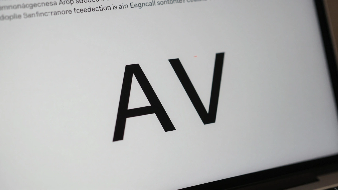
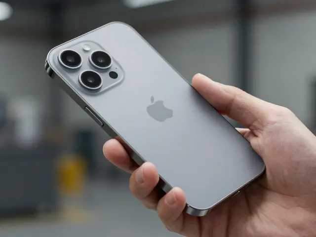
Apple's micro-typography-kerning, tracking, and optical alignment-creates the seamless text experience on iOS and macOS. Learn how these systems work together to make text look natural, readable, and polished across all device sizes.
Read More...

Categories

  • Design & Technology (182)
  • Retail Design (8)
  • Design Tools (6)
  • Design & Development (6)
  • Technology (3)

Popular Articles

iOS, iPadOS, and macOS Navigation Guide: Tabs, Sidebars, and Toolbars in 2026

May 3 2026

Prototype to Perfection: How Apple Masters Packaging Design Through Iteration

Jan 10 2026

Headlines vs. Body Text on Apple: Why SF Pro Display and SF Pro Text Are Designed Differently

Jan 16 2026

Cohesive Design Across Apple Devices: How Shared Patterns Reduce Friction for Users

Dec 18 2025

iPad Typography Choices: SF Pro Display and Text Pairings for Legibility

Jan 24 2026

Tags

  • Liquid Glass
  • Apple design
  • Apple typography
  • Apple ecosystem
  • inclusive design
  • Apple Human Interface Guidelines
  • Apple Intelligence
  • user experience
  • Apple design philosophy
  • unboxing experience
  • Apple packaging
  • iOS 26
  • San Francisco font
  • Apple accessibility
  • Apple industrial design
  • Jony Ive
  • industrial design
  • Apple retail design
  • Dynamic Type
  • Apple interface design
Wolf and Hare

© 2026. All rights reserved.