
Ever tried to long-press a photo in your gallery only to get overwhelmed by ten options you didn’t ask for? That’s the trap of bad context menu design. On iOS and iPadOS, a context menu is a transient overlay that appears after a specific user action, usually a long press or right-click, offering relevant commands without navigating away from the current view. The goal isn’t just to show actions; it’s to surface the *right* actions at the *right* time. If you’ve ever shipped an app where users complained about hidden features or accidental taps, this is your fix. Apple’s Human Interface Guidelines (HIG) have evolved significantly since the introduction of the standard context menu in iOS 3.2. Today, with the addition of "Quick Look" previews and dynamic layout adjustments, the stakes are higher. You need to balance power-user efficiency with casual-user simplicity. Here is how you do it without making your interface feel like a cockpit.
Understanding the Anatomy of a Native Context Menu
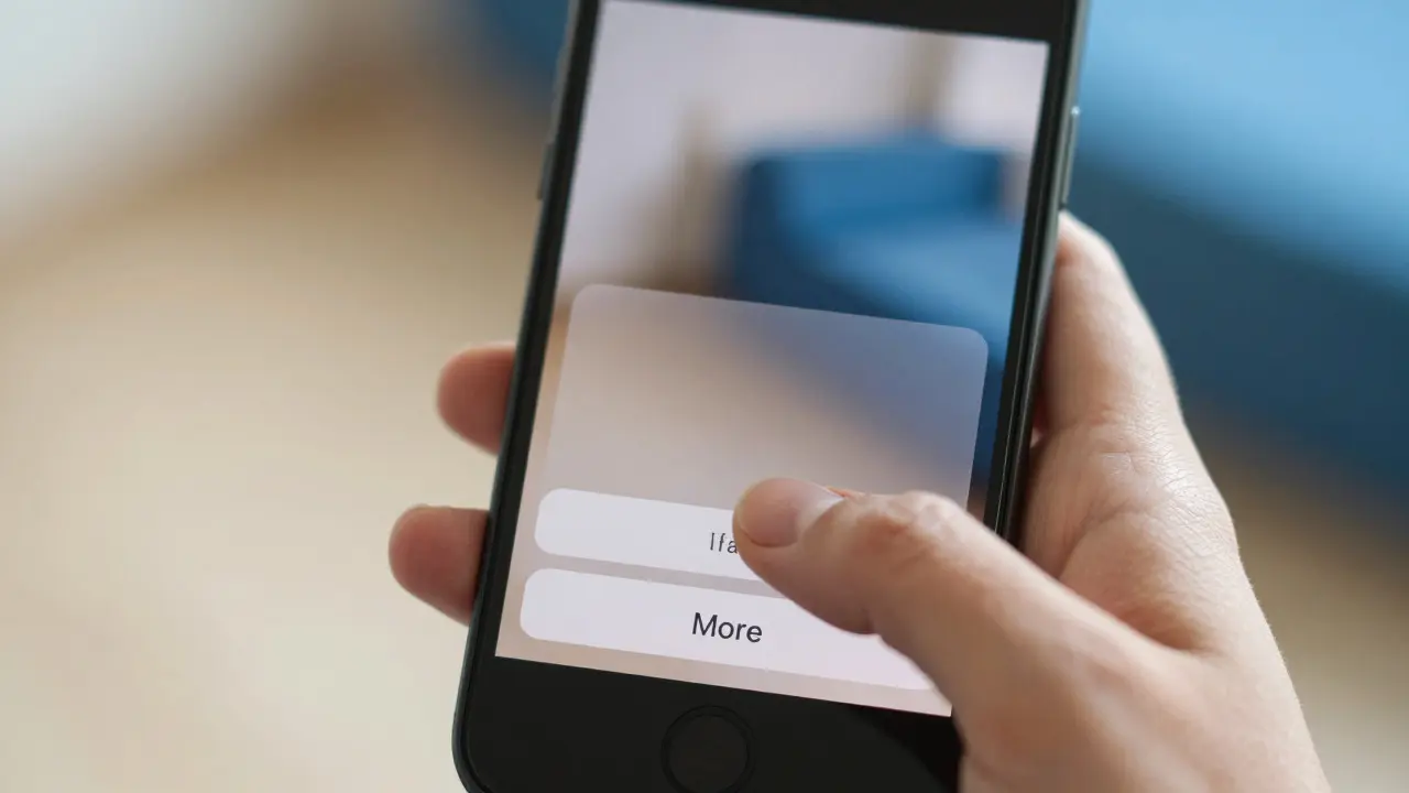
A native context menu on Apple platforms consists of three distinct visual layers: the preview image, the title/subtitle text, and the action buttons. Unlike desktop operating systems where lists can be long and scrollable, mobile context menus are constrained by screen real estate and thumb reachability. The preview element is crucial. It provides immediate visual confirmation that the user has selected the correct object. For example, if you long-press a contact in a messaging app, the avatar should appear in the menu. This reduces cognitive load because the user doesn't have to verify their selection against a list of names. Action buttons follow a strict hierarchy. Primary actions (like "Copy" or "Share") should be prominent, often larger or positioned closer to the bottom edge where thumbs naturally rest. Secondary actions (like "Move to Favorites") should be smaller or grouped under a "More" option if space is tight. Apple recommends limiting visible actions to five or six maximum. If you have more, you’re forcing the user to make a decision they aren’t ready to make yet.
The Long Press Trigger: Timing Is Everything
The trigger for most context menus is the long press gesture. But not all long presses are created equal. The system waits for a specific duration before firing the event. Historically, this was around 500 milliseconds, but modern devices handle haptic feedback and animation timing differently. You need to tune this sensitivity. If the delay is too short, users will accidentally trigger menus when they just want to select text or drag an item. If it’s too long, the interaction feels sluggish. A good rule of thumb is to align your custom implementation with the system default behavior unless you have a strong reason to deviate. Use haptic feedback (a subtle tick) to signal that the press has been registered. This auditory/tactile cue tells the user, "We see you," preventing them from pressing harder out of frustration.
Layout Strategies for iPhone vs. iPad
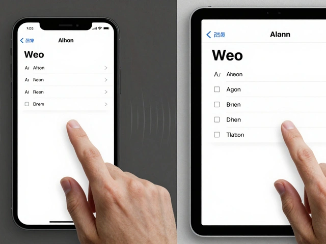
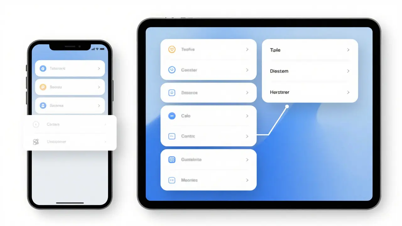
One size does not fit all. An iPhone screen is roughly 6 inches diagonally, while an iPad Pro can be over 13 inches. Designing a context menu that works identically on both is a recipe for disaster. On iPhone, vertical space is premium. Your menu should expand upward from the touch point, staying within the safe area. Avoid placing critical actions at the very top of the screen, as that requires awkward finger stretching. On iPad, you have more room. You can afford horizontal expansion or even split-view layouts. However, don’t waste the space with tiny buttons. Larger tap targets (minimum 44x44 points) are non-negotiable for accessibility. Consider the orientation. In landscape mode on iPhone, the context menu might obscure important content. Test your layouts in both portrait and landscape modes. If the menu covers the main subject, consider anchoring it to the side rather than the center.
Handling Edge Cases and Dynamic Content
What happens when the user long-presses near the edge of the screen? The context menu shouldn’t cut off. It needs to shift position dynamically to stay fully visible. This is called "clamping." Implement logic that checks the distance from the touch point to the screen edges. If the menu would extend beyond the boundary, offset it inward. Dynamic content adds another layer of complexity. Imagine a news app where the article headline changes based on user history. If the context menu displays a preview of the article, ensure the preview updates instantly. Stale data in a context menu breaks trust. Users expect the menu to reflect the current state of the object, not a cached version from five seconds ago. Also, consider multi-select scenarios. If a user selects multiple images, the context menu should aggregate actions. Instead of showing "Delete" for each image, show "Delete (3 Items)." This aggregation saves space and clarifies the scope of the action.
Accessibility and VoiceOver Integration
Context menus are invisible to VoiceOver users until they explicitly activate them. This creates a disconnect between sighted and blind users. To fix this, ensure your custom actions are exposed correctly via the Accessibility API. When a context menu appears, VoiceOver should announce the available actions clearly. Don’t just read out button labels; provide context. For example, instead of saying "Copy," say "Copy text from Article Title." This helps users understand what will happen when they double-tap the action. Additionally, support keyboard navigation for iPad users who use external keyboards. Arrow keys should move focus between actions, and Enter should execute them. If you ignore this, you’re locking out a significant portion of professional users who work on iPads with Magic Keyboards.

Common Pitfalls to Avoid
Even experienced designers fall into these traps:
- Overloading the Menu: Adding every possible action makes the menu useless. Prioritize the top 20% of actions that cover 80% of use cases. Put the rest in a secondary sheet or modal.
- Inconsistent Triggers: If long-press works on photos but not on videos, users get confused. Standardize your triggers across similar content types.
- Ignoring Animation: Snappy transitions matter. If the menu pops in abruptly, it feels jarring. Use smooth scaling and fade effects that match the system aesthetic.
- Blocking Interaction: While the menu is open, should the background be interactive? Usually, no. Dim the background slightly to indicate that the context menu is the active layer. This prevents accidental taps behind the menu.
Testing Your Implementation
You can’t guess if your context menu works. You have to test it with real hands. Start with the extremes: small fingers, large gloves, one-handed use, two-handed use. Does the primary action land within thumb reach? Use Xcode’s Accessibility Inspector to audit your VoiceOver labels. Check for contrast issues if you’re using custom colors for the menu background. And finally, test on older devices. Not everyone has the latest iPhone 16 Pro Max. Ensure your animations run smoothly on an iPhone SE, which has less processing power. Laggy context menus kill user confidence faster than anything else.