
When Apple releases a new iPhone, MacBook, or Apple Watch, it doesn’t feel like a leap into the unknown. It feels like an upgrade you already understand. That’s not an accident. It’s the result of a deliberate, decades-long strategy: Apple design doesn’t just innovate - it makes innovation feel familiar. This balance between the new and the known is what keeps millions of users loyal, even as the technology under the hood changes dramatically.
Keeping the Shape, Changing the Soul
Think about the iPhone. Since 2007, its basic shape hasn’t changed much. A rectangle with rounded corners, a screen taking up most of the front, a single button (then Touch ID, then Face ID) - these haven’t vanished. But inside? The processor has gotten 20 times faster, the battery lasts longer, the camera system can shoot cinematic video in low light, and the screen now refreshes at 120Hz. Apple didn’t ask users to relearn how to hold their phone. They just made it better, quietly. This pattern shows up everywhere. The MacBook Air still looks like the thin, light laptop it was in 2008. But now it runs on Apple Silicon, has a 10-hour battery life, and doesn’t need a fan. The design stayed the same. The performance changed everything. Users didn’t need a tutorial. They just opened it and worked.Jobs’ Rule: Simplicity Is the Ultimate Sophistication
Steve Jobs didn’t believe in adding features just because they were possible. He believed in removing everything that didn’t serve the core experience. The original iMac G3 in 1998 was a shock - translucent plastic, bright colors, no floppy drive. But it still had a keyboard, a mouse, and a screen. It was still a computer. The innovation wasn’t in what it did - it was in how it made you feel. Jobs’ design team, led by Jony Ive, treated every surface, every edge, every button as part of a single experience. The iMac didn’t just look different - it felt different. The plastic had weight. The color wasn’t just paint; it was part of the material. That emotional connection mattered. People didn’t buy the iMac because it had more ports. They bought it because it made them smile. That philosophy carried into the iPod, iPhone, and iPad. Each product looked simple. But under the surface, Apple was building something no one else could: hardware, software, and services that worked together like one machine. That’s what made the iPhone feel so intuitive. You didn’t need instructions. You just knew how to swipe, tap, and pinch. The innovation wasn’t in the gestures - it was in how perfectly they matched human intuition.Cook’s Shift: Innovation You Can’t See
After Tim Cook took over, Apple didn’t stop innovating - it just changed where the innovation happened. Instead of making flashy new products, Cook focused on making existing ones better, smarter, and more connected. The big change? Moving innovation from the outside to the inside. The M1 chip in 2020 was the perfect example. No one could tell the difference between a 2019 MacBook Pro and a 2020 one just by looking at it. Same aluminum body. Same keyboard. Same trackpad. But the M1 made it faster, quieter, and lasted twice as long on battery. The innovation wasn’t visible - it was in the silicon, in the thermal design, in the way the operating system talked to the hardware. Users didn’t need to learn anything new. They just got more. This shift extended to the ecosystem. Apple didn’t invent Bluetooth or Wi-Fi. But it made them work better than anyone else. Your iPhone connects to your AirPods. Your Apple Watch tracks your heart rate and sends it to your iPhone. Your iPad opens files from your Mac. None of this is obvious. But once you experience it, you can’t go back.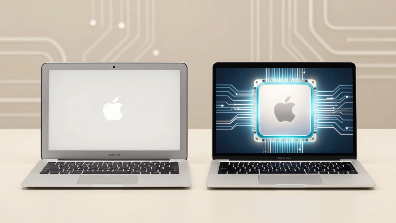
The iOS 7 Revolution: Flattening the Interface
One of the most visible changes came in 2013 with iOS 7. Gone were the skeuomorphic designs - the leather stitching on the Notes app, the wooden bookshelf in iBooks. In their place: clean lines, flat colors, bold typography. It was a radical visual shift. But here’s what people missed: the navigation didn’t change. Swiping left to right to go back? Still there. The home button? Still there. The app icons? Still tap-to-open. The innovation was in the look, not the logic. Users didn’t get lost. They just saw a cleaner, faster interface. Apple proved you could redesign the surface without breaking the foundation.Materials: From Emotion to Engineering
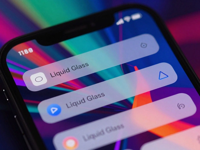
Jobs obsessed over how things felt. The iMac’s translucent shell wasn’t just for looks - it was meant to spark joy. The aluminum on the MacBook wasn’t just durable - it was polished to reflect light in a way that made it feel alive. Cook’s team still uses premium materials, but now with different goals. The aluminum on newer MacBooks is anodized for scratch resistance. The glass on the iPhone is chemically strengthened to survive drops. The new liquid glass on the Apple Watch face isn’t just pretty - it reduces glare and improves readability in sunlight. The shift isn’t from beautiful to boring. It’s from emotional impact to lasting performance. Apple still cares about how things feel - it just measures that feeling in durability, clarity, and reliability now.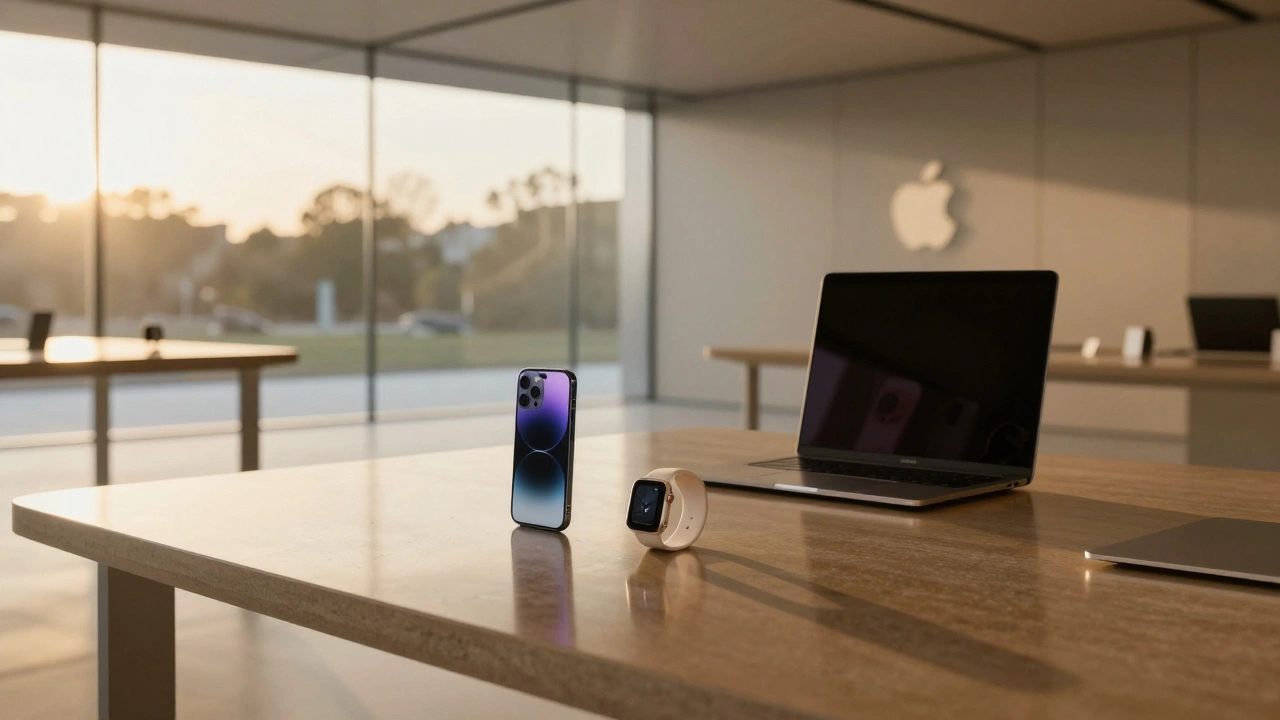
The Retail Experience: Designing Trust
Apple’s stores aren’t just places to buy products. They’re design experiments in human behavior. The glass staircases, the open floor plans, the lack of walls - it all feels calm. There’s no pressure. No clutter. Just space to explore. This mirrors the product design. You walk in expecting a tech store. You leave feeling like you’ve experienced something simpler, more thoughtful. The innovation isn’t in the products on display - it’s in how the space makes you feel. You’re not being sold to. You’re being invited in.Why This Balance Works
Most companies try to surprise users. Apple tries to make users feel understood. That’s the difference. When Apple introduces a new feature - like Live Text or Focus Mode - it doesn’t come out of nowhere. It builds on habits users already have. You already know how to tap. Now you can tap to copy text from a photo. You already know how to silence your phone. Now you can silence everything except your family. This approach reduces friction. It builds trust. It makes innovation feel like a natural evolution, not a disruption. Users don’t have to relearn how to live with their devices. They just live better.The Future: Invisible Innovation
Apple’s next big leap won’t be a new form factor. It won’t be a foldable screen or a floating display. It’ll be something quieter: better battery life, deeper integration with health sensors, smarter AI that works without asking. The design will stay familiar. The experience will feel effortless. That’s the real trick. Apple doesn’t chase trends. It builds systems that outlast them. And as long as users feel like they’re getting more - without having to learn anything new - Apple will keep winning.Why doesn’t Apple change the iPhone’s design more often?
Apple avoids major design changes because users form habits around how a device feels and works. A familiar shape, button layout, or swipe gesture reduces learning time and builds trust. Instead of redesigning the phone, Apple focuses on improving what’s inside - like the chip, camera, or battery - so users get better performance without needing to relearn how to use their device.
How did iOS 7 change Apple’s design direction?
iOS 7 marked Apple’s shift from skeuomorphic design - where interfaces mimicked real-world objects like leather and wood - to a flat, minimalist style. This wasn’t just a visual update. It signaled a deeper philosophy: clarity over decoration. The icons became simpler, the typography bolder, and the interface more functional. But crucially, navigation stayed the same. Users could still swipe, tap, and pinch the same way - the innovation was in the look, not the logic.
What’s the difference between Jobs’ and Cook’s design philosophies?
Steve Jobs focused on emotional breakthroughs - products that surprised and delighted users with bold aesthetics and new categories. Tim Cook focuses on operational harmony - refining existing products to work better together, with invisible improvements in performance, battery life, and integration. Jobs wanted users to say, ‘Wow.’ Cook wants them to say, ‘This just works.’
Why does Apple use the same materials across so many products?
Using consistent materials - like aluminum, glass, and ceramic - helps Apple control quality, reduce manufacturing complexity, and improve durability. It also creates a unified brand language. When your iPhone, Apple Watch, and MacBook all feel like they belong together, you’re not just using gadgets - you’re living inside a system. That cohesion builds loyalty.
Can Apple keep balancing familiarity and innovation forever?
Yes - but only if they keep innovating in ways users don’t notice. The biggest threat isn’t competition - it’s stagnation. If Apple stops improving performance, battery life, or ecosystem integration, users will notice the lack of progress. As long as innovation stays hidden in the chip, the software, and the connections between devices, the familiar design will keep working. The real innovation isn’t what you see - it’s what you don’t.
Categories
Popular Articles