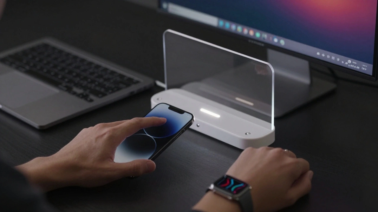

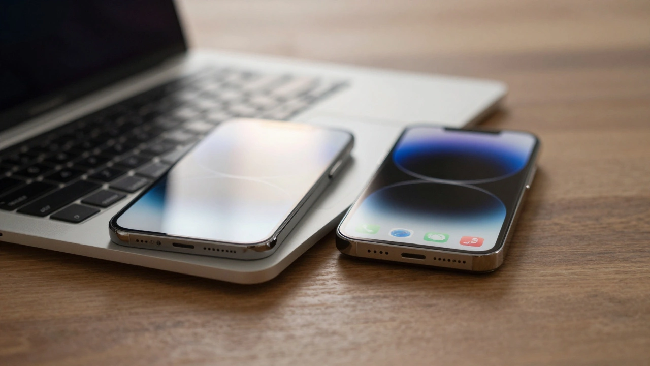
Have you ever switched from your iPhone to your Mac and felt like you’d stepped into the same room, just with a bigger screen? That’s not luck. It’s design. Apple doesn’t just make devices-they build systems. And the secret behind why switching between an iPhone, iPad, Apple Watch, or Mac feels so smooth isn’t one big feature. It’s hundreds of tiny, consistent choices. These aren’t just visual tweaks. They’re patterns that reduce friction, one tap, swipe, or glance at a time.
The Hidden Logic Behind Apple’s Design Unity
For years, people talked about Apple’s design as if it were magic. But magic doesn’t scale. What’s really happening is a deeply coordinated effort across hardware, software, and services. It started quietly. Back in 2013, iOS had a flat design. Then came Material Design from Android. Apple didn’t copy it. Instead, they built their own version-layered, subtle, grounded in physics. That was the start. But it wasn’t until 2025 that everything clicked into place.
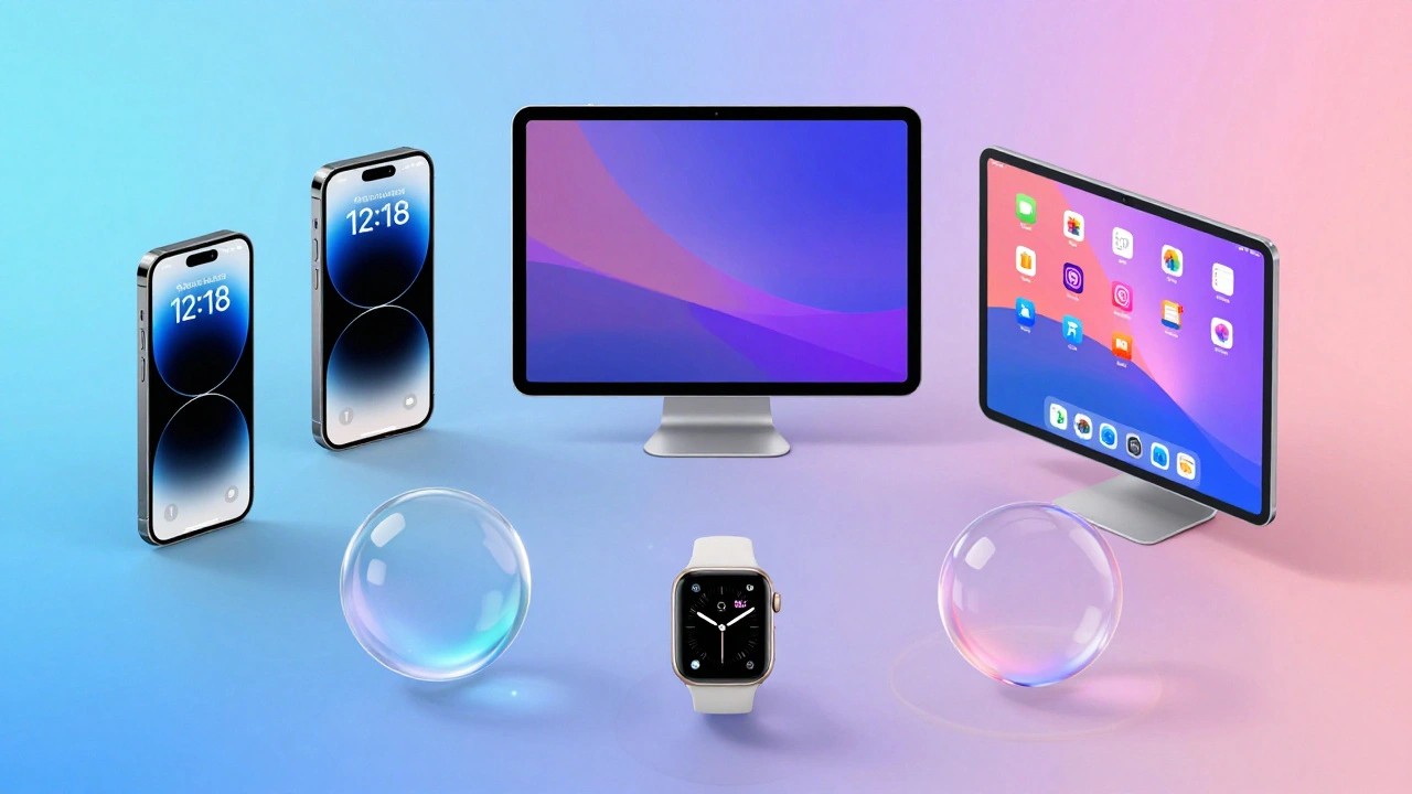
That’s when Apple introduced Liquid Glass a new software material that dynamically responds to light, content, and user interaction across all Apple operating systems. It wasn’t just a new look. It was a new language. Controls now feel like translucent layers floating above your content. They don’t block. They don’t compete. They adapt. On your iPhone, a tab bar shrinks as you scroll down, letting your photo fill the screen. On your Mac, the Dock glows faintly with your wallpaper, reflecting the world behind it. On your Apple Watch, the same translucent effect makes complications feel like part of your skin, not an overlay.
This isn’t decoration. It’s usability. When your brain doesn’t have to relearn how to open an app or find a button every time you switch devices, you move faster. You feel more in control. That’s the real win.
How Liquid Glass Works Across Devices
Liquid Glass isn’t a filter. It’s a system. It behaves differently depending on the device-but the rules stay the same. Here’s how:
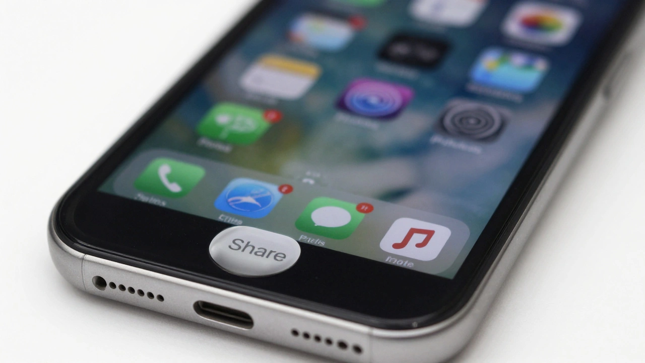
- On iPhone (iOS 26): The Lock Screen time is now made of Liquid Glass, blending into your photo without losing readability. App icons shimmer slightly when touched, giving tactile feedback without animation overload.
- On iPad (iPadOS 26): Split View and Slide Over use Liquid Glass sidebars that become semi-transparent when you’re focused on content. They don’t disappear-they soften, so you still know where to find them.
- On Mac (macOS Tahoe 26): The menu bar is now completely transparent. The Dock reflects your desktop wallpaper, and app icons have depth. You don’t just see your files-you feel their presence.
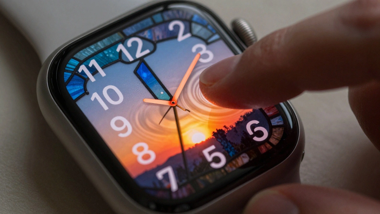
- On Apple Watch (watchOS 26): Complications use Liquid Glass to blend into the watch face. When you raise your wrist, they brighten. When you look away, they fade. No button presses needed.
- On Apple TV (tvOS 26): The home screen’s grid of apps now floats slightly above the background. As you scroll, the background subtly shifts color to match the app you’re hovering over. It’s not just pretty-it helps you find what you want faster.
These aren’t random changes. They’re part of a single design language. Apple calls it “depth with clarity.” That means: everything has a layer, but nothing feels cluttered. You don’t need a manual. You just know.
Why This Matters More Than New Features
Most companies chase headlines. A bigger camera. A faster chip. A foldable screen. Apple’s 2026 roadmap doesn’t lead with those. Instead, they’re quietly improving what already works. The iPhone’s Dynamic Island is smaller. The battery lasts longer. The aluminum frame blends into the glass back. No flashy name. No press release. Just better.
Why? Because Apple knows that users don’t want to learn something new every year. They want to feel like they’ve been here before-even if they’ve never used the device.
Take the Apple Watch. It’s not about adding more health sensors. It’s about making heart rate data feel as natural as checking the time. The same logic applies to the HomePod. It doesn’t need 10 new voice commands. It needs to respond the same way your iPhone does-calm, clear, and quiet.
This is why Apple’s ecosystem feels so sticky. It’s not because you’ve bought five devices. It’s because each one feels like a natural extension of the last. You don’t upgrade because you need to. You upgrade because everything just works better together.
The Role of Services in Holding It All Together
Hardware and software alone can’t create cohesion. You need glue. That’s where services come in.
Apple Music doesn’t just play songs. It remembers what you listened to on your iPhone, picks up where you left off on your Mac, and adjusts the volume based on your Apple Watch’s motion sensors. Photos syncs not just across devices-it adapts. On your iPad, it shows albums. On your Mac, it lets you edit in full-screen. On your Apple TV, it becomes a slideshow that fills the whole room.
FaceTime? It’s not just a video call. It’s a bridge. Your background blurs the same way on iPhone, iPad, and Mac. Your voice sounds the same. Your name appears in the same font. Even the way you end a call-swipe up-is identical.
These aren’t features. They’re rituals. And rituals create habit. Habit creates loyalty.
What Apple Isn’t Doing (And Why That’s Important)
Apple could’ve gone wild in 2026. They could’ve added AR glasses. Foldable phones. Holographic displays. But they didn’t. Why? Because those things would’ve broken the pattern.
Instead, they focused on refinement. The iPhone’s camera sensors got better, not bigger. The MacBook’s fans got quieter. The Apple Watch’s battery life increased by 18% without changing the shape. Even the new color options-Coffee Brown, Burgundy, Purple-were chosen to match existing design tones, not distract from them.
This restraint is the real genius. Most brands chase novelty. Apple chases continuity. They know that users don’t want to be amazed. They want to be comfortable.
How This Affects You as a User
If you own more than one Apple device, you’ve already felt this. You open an app on your iPad. You switch to your Mac. You don’t hunt for buttons. You don’t second-guess gestures. You just do.
That’s the goal. Not to impress. Not to wow. But to disappear. When design works perfectly, you stop noticing it. You notice the content. The photo. The song. The message. The moment.
That’s why Apple’s design isn’t about pixels or materials. It’s about trust. You trust that your phone will behave like your tablet. That your watch will respond like your Mac. That your TV will feel like your living room. And that trust? It’s built one tiny, consistent detail at a time.
Why does Apple’s design feel so different from Android or Windows?
Apple controls both the hardware and software, so they can design them together. Android and Windows rely on third-party manufacturers and developers, which leads to inconsistency. An app on one Android phone might look and behave completely differently on another. Apple ensures every device, from iPhone to Apple Watch, follows the same rules. That’s why switching between devices feels seamless.
Is Liquid Glass just a visual change, or does it affect performance?
It’s both. Liquid Glass isn’t just a new look-it’s a new way for the system to manage how elements interact with content. Because the controls are translucent and dynamic, they require less processing power to render than heavy shadows or rigid borders. This helps with battery life and responsiveness, especially on older devices. Apple optimized it to run smoothly even on the A16 chip, which means older iPhones still benefit.
Does this mean Apple will stop adding new features?
No. But they’re changing how they introduce them. Instead of one big feature per year, they’re layering improvements over time. For example, the smaller Dynamic Island on the 2026 iPhone isn’t a new feature-it’s a refinement. The same goes for the improved battery life or quieter fans. Apple’s focus now is on making existing features work better, not just adding more.
Can I turn off Liquid Glass if I don’t like it?
Not entirely. Liquid Glass is built into the core of iOS 26, iPadOS 26, and macOS Tahoe 26. But you can adjust how it behaves. You can turn off transparency in the Dock, choose a solid color for the menu bar, or disable dynamic reflections in Settings. The underlying material is still there-it’s just less visible. Apple designed it to be subtle, not overwhelming.
How does this affect third-party apps?
Apple provides design guidelines and tools so third-party apps can match the Liquid Glass aesthetic. Apps that follow these guidelines-like Spotify, Notion, and Instagram-look and feel native. Apps that don’t stand out, sometimes awkwardly. Apple doesn’t force developers to use it, but users notice the difference. That’s why most top apps have already updated to match the new system.
What Comes Next?
Apple’s 2026 roadmap isn’t about quantity. It’s about depth. They’re not launching 20 devices to fill shelves. They’re launching 20 pieces of a single puzzle. Each one reinforces the last. The iPhone gets quieter. The Mac gets thinner. The Watch gets smarter. The HomePod gets more private. And every single one uses Liquid Glass.
That’s the real story. Apple isn’t trying to dominate markets. They’re trying to eliminate friction. And in a world where technology feels broken, confusing, and overwhelming-that’s not just smart. It’s revolutionary.