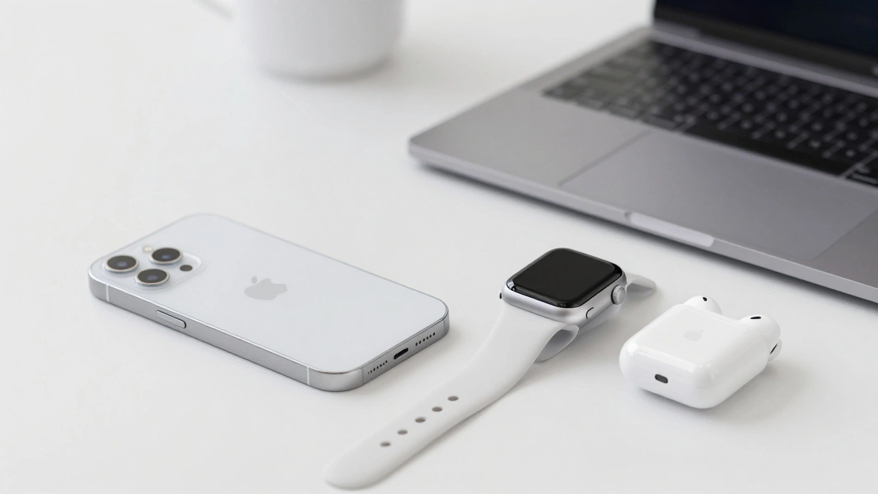

When you pick up an iPhone, open your Mac, or slip on an Apple Watch, you don’t just see a device-you feel a system. That’s not an accident. Apple doesn’t rely on ads or slogans to bind its products together. Instead, it uses quiet, consistent visual signals that whisper, "This is Apple," across every screen, button, and curve. These signals aren’t just pretty-they’re strategic. They turn separate gadgets into a single, seamless world.
The Logo That Never Changed
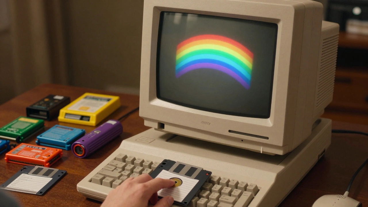
The Apple logo is one of the most recognizable symbols on the planet. But it wasn’t always just an apple. In 1977, Rob Janoff designed the original rainbow version to highlight the Apple II’s color display, a big deal back then when most computers showed only black and white. By 1984, Apple dropped the colors and the wordmark. Just the bitten apple remained. No text. No explanation. Just the shape.That’s rare in tech. Most companies need their name spelled out. Apple trusted its logo enough to stand alone. Today, it’s on AirPods smaller than a coin, on the back of a 27-inch iMac, and even etched into the case of an Apple Watch. It doesn’t change size or style. It doesn’t fade or stretch. It stays the same. That consistency builds trust. You know what you’re getting before you even turn it on.
Color That Works Everywhere
Apple’s color system isn’t just about picking shades. It’s about control. In 1988, Apple began developing ColorSync, the first operating system built to manage color across devices. Before this, a photo looked different on your monitor than on your printer. Designers hated that. Apple fixed it.By 1995, ColorSync 2.0 supported the International Color Consortium (ICC) standard, letting creatives trust that their colors stayed true from screen to print. Today, it’s invisible. You don’t see it. But you feel it. Your photos look the same on iPhone, iPad, and Mac. Your videos don’t shift hue when you switch devices. That’s not magic-it’s engineering. And it’s a silent promise: Apple makes things that work together.
The Font That Holds It All Together
In 1994, Apple adopted Apple Garamond as its corporate typeface. It wasn’t flashy. It was clean, readable, and calm. That font showed up in every brochure, every ad, every product box. It became the voice of Apple’s messaging-polished, quiet, confident.Today, that legacy lives in San Francisco, Apple’s current system font. It’s not just used on screens. It’s baked into every alert, every menu, every notification. Whether you’re checking your calendar on Apple Watch or reading an email on iPad, the font feels familiar. No jarring switch. No surprise style. Just one rhythm, one tone, one flow.
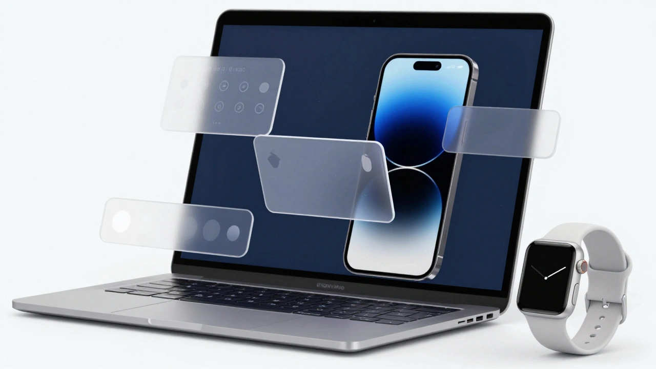
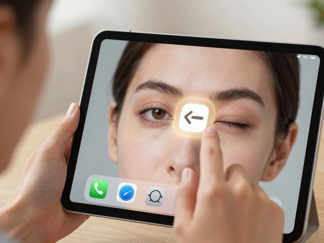
The Rise of Liquid Glass
The biggest shift in Apple’s visual strategy came in 2025 with Liquid Glass. It’s not a new logo. It’s not a new color. It’s a new way of thinking about depth, light, and movement across all devices.For years, Apple used flat design-clean, minimal, no shadows. Then came skeuomorphism, where buttons looked like leather or wood. Liquid Glass is neither. It’s subtle. It’s alive. Transparent cards float above blurred backgrounds. Icons gently shift as you move your finger. Light bends slightly around edges, like real glass catching sunlight.
What makes Liquid Glass revolutionary is that it’s the first time Apple applied the exact same visual language to iPhone, iPad, Mac, Watch, and TV. Before, each system had its own feel. Now, they all move the same way. A notification slides in the same arc. A menu opens with the same softness. A button responds with the same tactile feedback. It’s not about looking pretty. It’s about feeling connected.
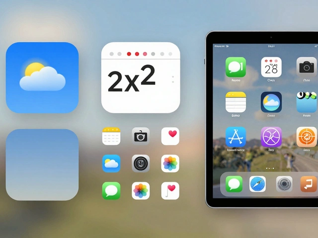
Design That Scales
Apple doesn’t redesign each app for each device. It designs once, then scales. The same button structure works on iPhone’s small screen and Mac’s wide one. The same icon set appears on Apple Watch and Apple TV. Text stays left-aligned. Spacing stays consistent. Animations match in timing and easing.This isn’t just convenience-it’s psychology. When you switch from your iPhone to your Mac, your brain doesn’t have to relearn how to tap, swipe, or scroll. That’s powerful. You don’t feel like you’re using two different tools. You feel like you’re using one system, just in different shapes.
Preparing for the Real World
Apple isn’t just designing for screens anymore. It’s designing for the space around them. With Apple Vision Pro, the line between digital and physical is fading. That’s why Liquid Glass includes depth cues, parallax effects, and ambient lighting-features that train your eyes to expect objects floating in space.Think about it: if your phone already shows shadows under icons and subtle light refraction, then when you put on AR glasses, the transition feels natural. You’re not being thrown into a new world. You’re being gently invited into a deeper one. That’s the goal. Apple’s visual signals aren’t just about today’s devices. They’re training you for tomorrow’s.
From Computers to Credit Cards
The Apple logo doesn’t just appear on phones anymore. It’s on Apple Card. On Apple TV+ shows. On fitness apps. On health dashboards. Each context is different-finance, entertainment, wellness-but the visual language stays the same. The same clean typography. The same soft shadows. The same restrained color palette.That’s brand power. It’s not about selling one product. It’s about selling a feeling: simplicity, control, elegance. You don’t need to be told Apple is premium. You feel it in the way a notification appears. In the way a slider moves. In the way a background blurs just enough to make text pop.
Why It Works
Most companies try to make their products look different. Apple makes them look the same. Not because they’re lazy. But because they know consistency builds loyalty. When every device feels like part of a family, you’re less likely to leave. You don’t just own an iPhone-you live inside an ecosystem.That’s why Apple’s visual signals matter. They’re not decoration. They’re architecture. Every pixel, every shadow, every transition is a brick in a wall that keeps users inside. And it’s working. People don’t switch from Apple to Android because they hate the phone. They stay because everything else just… fits.
The Future Is Fluid
Apple’s next step isn’t more features. It’s more flow. The future of ecosystem branding isn’t flat. It’s not even three-dimensional. It’s ambient. It’s responsive. It’s alive.Imagine your Apple Watch subtly changing its glow when your Mac detects you’re stressed. Or your TV dimming just enough to match the lighting in your room. Or your logo appearing as a floating hologram in your living room, not on a screen, but in the air.
That’s not sci-fi. It’s the next step in Apple’s visual strategy. And it’s already being trained by Liquid Glass.