
Have you ever opened a third-party app on your iPhone and immediately felt like something was off? The buttons don’t behave the same way. The back button hides in a weird spot. Swiping feels sluggish or unresponsive. It’s not broken-it just doesn’t belong. That’s not a bug. That’s a failure of ecosystem fit.
Apple doesn’t just make devices. It makes ecosystems. And for those ecosystems to work, every app-whether built by Apple or a tiny startup-needs to feel like it was born inside the same house. That’s where the Human Interface Guidelines (HIG) come in. Not as a rulebook. Not as a restriction. But as the shared language that lets users move between apps without thinking.
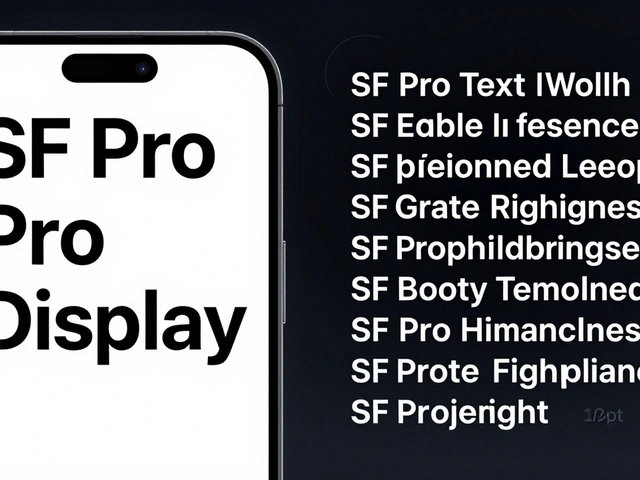
Why HIG Isn’t Just About Looks
Most developers think HIG is about colors, rounded corners, and font sizes. It’s not. Those things matter, yes. But HIG is really about behavior. It’s about how a button responds when tapped. How a menu slides in. How a list scrolls. How a user knows where they are and how to get back.
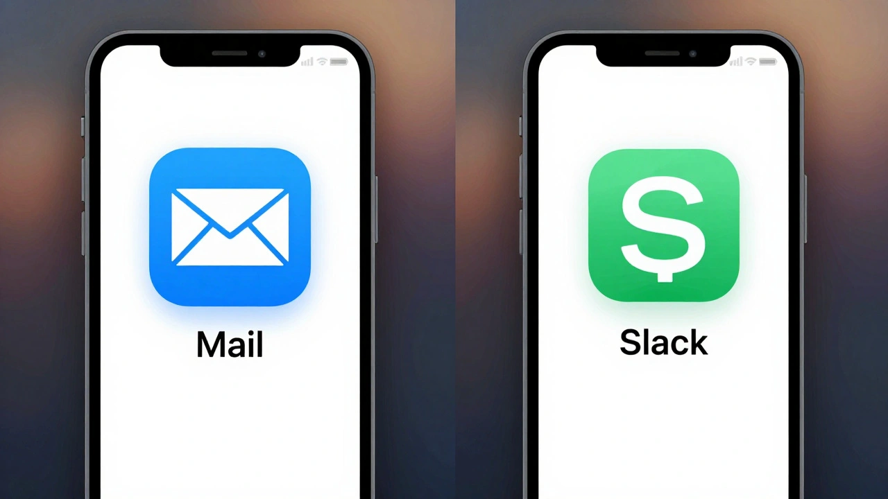
Think about it: if every app had its own way to go back, you’d have to relearn it every time. That’s mental fatigue. Apple’s goal is to remove that. HIG ensures that when you’ve used the back gesture in Mail, you can use it the same way in Spotify, in Notion, or in your dentist’s app. That’s not convenience-it’s invisible design. The best interfaces don’t make you notice they exist.
The iOS 26 HIG breaks this down into three core principles: Hierarchy, Harmony, and Consistency. Hierarchy isn’t just about making text bigger. It’s about guiding attention so users see what matters first. Harmony means your app doesn’t fight the device. If you’re on an iPad, your UI should respect the screen’s size and input style-not force a phone layout onto a tablet. Consistency? That’s the glue. It’s not copying Apple’s UI. It’s adopting the logic behind it.
The Cost of Ignoring HIG
There’s a myth that breaking HIG makes your app stand out. It doesn’t. It makes it feel like a foreign object. A 2024 usability study from Apple’s internal research team found that apps deviating from HIG had 47% higher drop-off rates in the first 30 seconds. Why? Users didn’t know how to navigate. They thought the app was broken.
Take navigation. Apple’s tab bar sits at the bottom on iPhone. It’s predictable. It’s thumb-friendly. If your app puts navigation at the top-because you think it looks "sleek"-you’re forcing users to stretch their fingers. That’s not innovation. That’s friction. And friction kills retention.
Or consider gestures. Swiping left to delete? That’s universal on iOS. Change it to a long press? You’ll get support tickets. Users don’t read manuals. They rely on patterns they’ve built over years of using iPhones. HIG codifies those patterns. When you ignore them, you’re asking users to unlearn what they already know.
How Third-Party Design Systems Work With HIG
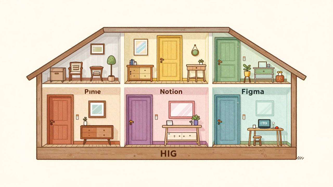
Let’s be clear: HIG doesn’t kill branding. It frames it. Think of HIG as the foundation of a house. Your brand is the paint, the furniture, the lighting. You can still make it unique-just don’t remove the load-bearing walls.
Take Slack on iOS. It has its own purple accents, custom icons, and tone of voice. But the back button? It’s in the top-left. The tab bar? Bottom. The swipe-to-delete? Same gesture. The app feels like Slack, but it doesn’t feel alien on an iPhone. That’s the sweet spot.
Third-party design systems-like those from Adobe, Notion, or Figma-don’t replace HIG. They translate it. They take Apple’s rules about spacing, touch targets, and accessibility and apply them to their own visual language. A button in Notion might be a different color, but it’s still 44x44 points. It still has haptic feedback. It still responds to VoiceOver. That’s not copying Apple. That’s respecting the user.
Building for All Devices-One Anatomy, Many Forms
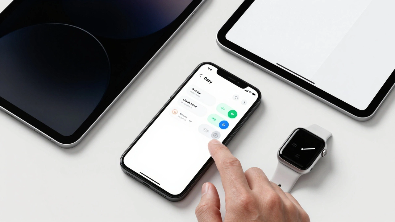
Apple’s ecosystem isn’t just iPhones. It’s iPads, Macs, Apple Watches, and even Apple TV. And users expect continuity. You open a document on your Mac. You pick it up on your iPad. You check a note on your Watch. It should feel like the same thing.
That’s where Apple’s "shared anatomy" approach comes in. Instead of building separate UIs for each device, you design one core structure and let it adapt. A sidebar on Mac becomes a collapsible panel on iPad. A toolbar on iPhone becomes a floating action button on Watch. The behavior stays the same. The layout shifts. The user doesn’t get confused.
SwiftUI makes this easier. With SwiftUI, you write a component once-say, a list with swipe actions-and it automatically adjusts for screen size, orientation, and input method. Third-party developers who use SwiftUI don’t just save time. They build apps that feel native across devices. Apps built with older UIKit frameworks often struggle here. They look fine on iPhone but feel clunky on iPad. That’s a missed opportunity.
Accessibility Isn’t a Feature-It’s a Requirement
Apple doesn’t treat accessibility as an afterthought. It’s baked into HIG. Dynamic Type? Yes. Color contrast? Mandatory. VoiceOver support? Required. If your app doesn’t support these, it’s not just excluding users-it’s violating Apple’s baseline standard.
Here’s the truth: accessibility isn’t charity. It’s smart design. Users with low vision benefit from larger text. People in bright sunlight benefit from high contrast. Parents with one hand holding a baby benefit from large tap targets. When you follow HIG, you’re not just checking a box. You’re making your app usable for millions more.
Apple’s guidelines give exact numbers: minimum 44x44 point tap targets, 4.5:1 contrast ratio for text, support for Dynamic Type scaling up to 96pt. These aren’t suggestions. They’re measurable thresholds. Apps that pass Apple’s App Review process have to meet them. And apps that don’t? They get rejected. No exceptions.
Why HIG Gives You More Freedom, Not Less
Here’s the paradox: following rules gives you more creative freedom. Why? Because you’re no longer solving the same problems over and over.
If you don’t have to figure out how to make a navigation bar work, you can focus on what makes your app special. Is it a new way to organize tasks? A unique animation? A clever workflow? HIG handles the "how do I get there?" part. You focus on the "why should they care?" part.
Look at Procreate. It’s wildly unique. The interface is dense, custom, and packed with tools. But the core interactions? Pinch to zoom. Swipe to undo. Tap to select. Those follow HIG. That’s why Procreate feels intuitive-even though it’s packed with features. The foundation is familiar. The magic is on top.
Apple gives you the rules for interaction. You get to invent the content. That’s the deal.
What Happens When You Don’t Follow HIG
There are real consequences. Apps that ignore HIG don’t just frustrate users-they get buried in the App Store. Apple’s algorithm favors apps with high retention, low crash rates, and consistent UX. Apps that feel "off" get lower rankings. They show up less in search. They’re less likely to be featured.
And then there’s the reputation hit. Users don’t say, "This app has bad HIG compliance." They say, "This app is clunky." "This app feels broken." "I don’t trust it." Those perceptions stick. And once you lose trust, it’s hard to win it back.
On the flip side, apps that nail HIG get praised. "This app just works." "It feels like it was made for iOS." "I didn’t have to learn anything." Those are the reviews that drive downloads.
How to Start Getting It Right
You don’t need to redesign everything tomorrow. Start small.
- Download the official HIG documentation and read the iOS section. Just the basics: navigation, controls, and layout.
- Open five top apps on your phone. Notice how the back button works. How the tab bar behaves. How the keyboard appears. Write down what’s the same.
- Pick one screen in your app. Compare it to Apple’s Mail app. Is the spacing the same? Are tap targets big enough? Is the hierarchy clear?
- Test with real users. Ask them: "How would you go back?" "What do you think this button does?" If they hesitate, you’ve found a HIG gap.
- Use SwiftUI. It enforces HIG by default. You’ll be surprised how much easier it is to build consistent UIs.
Don’t aim for perfection. Aim for familiarity. When users feel like they already know how to use your app, you’ve won.
Do I have to copy Apple’s exact UI design?
No. HIG doesn’t ask you to copy Apple’s colors, icons, or branding. It asks you to follow the same behavior patterns. A button can be any color, as long as it’s 44x44 points, gives haptic feedback, and responds the same way as other buttons on iOS. You can be unique-just not confusing.
Can I use custom gestures in my app?
Only if they don’t conflict with system gestures. Swiping up from the bottom to go home? That’s system-wide. Don’t override it. But if you create a new swipe gesture-like swiping left to archive a message-that’s fine, as long as it’s discoverable and consistent within your app. Apple encourages innovation within boundaries.
Is HIG only for iOS apps?
No. HIG covers iOS, iPadOS, macOS, watchOS, and visionOS. Each has its own guidelines, but the principles are the same: consistency, harmony, and hierarchy. If your app works across devices, you need to follow the HIG for each platform. SwiftUI helps here-it adapts your UI automatically.
What if my app is for professionals and needs a complex interface?
Complex doesn’t mean chaotic. Even professional apps like Procreate or Affinity follow HIG for core interactions. The difference is in density-not behavior. You can pack in more tools, but the way you select, navigate, and confirm actions should still match what users expect. HIG helps you organize complexity, not hide it.
Does following HIG make my app look like every other app?
Not at all. Think of HIG as the grammar of a language. You can write a poem, a novel, or a technical manual-all using the same grammar. Your brand, your content, your workflow-those are your voice. HIG gives you the structure so your voice can be heard clearly, not lost in confusion.
If you’re building for Apple, you’re not just making an app. You’re joining a conversation. And the conversation already has rules. Follow them. Then speak louder than anyone else.
Categories
Popular Articles