
When you open an app on your iPhone and instantly know how to get back to the home screen, or tap a button and feel confident it will do exactly what you expect - that’s not luck. That’s Apple HIG at work. The Human Interface Guidelines aren’t just a checklist of rules. They’re a hidden language, one that millions of users understand without ever reading a manual. And if you’re building an app, ignoring them means you’re forcing users to relearn everything - every time.
Why Predictable Behavior Matters More Than You Think
Think about the last time you used a poorly designed app. Maybe the back button was hidden. Or a toggle looked like a button. Or swiping left did something completely unexpected. You didn’t just get frustrated - you lost trust. That’s because humans rely on patterns. Our brains are wired to recognize rhythm, repetition, and structure. When an interface follows those patterns, we move through it without thinking. When it breaks them, we stop. And we don’t come back.
Apple’s HIG has been built around this idea since 1987. Back then, they wrote: "Consistency makes it easier for a user to learn new applications; it also makes it less likely that a user who follows habits learned from one application will make a disastrous mistake when using a different one." That’s still true today. A user who knows how to delete a message on iOS will expect the same gesture on a third-party email app. If it works differently, they’ll assume the app is broken - not that they just need to learn something new.
The Three Pillars of Apple’s Design Language
Apple doesn’t throw random rules at designers. Their entire system rests on three core principles: Hierarchy, Harmony, and Consistency. These aren’t buzzwords. They’re functional tools.
- Hierarchy tells users what matters most. A large title, bold text, or a centered button isn’t just aesthetic - it’s a signal. It says, "This is where you start." If you bury key actions under layers of menus, users won’t find them. They’ll quit.
- Harmony connects the app to the device. A button on an Apple Watch should feel different from one on an iPad. Why? Because the context is different. The watch is worn. The iPad is held. The iPhone is used one-handed. Apple’s guidelines reflect that. You don’t force a tablet-style menu onto a watch face. You adapt.
- Consistency is the glue. If every app uses the same back arrow, the same swipe-to-delete, the same tab bar at the bottom - users don’t have to guess. They just know. This is why Apple insists developers adopt platform conventions. It’s not about control. It’s about trust.
These aren’t optional. They’re the baseline. Skip them, and your app becomes an island - confusing, isolated, and forgotten.
What Apple’s HIG Actually Covers (Beyond the Basics)
Apple’s HIG isn’t a 10-page PDF. It’s a living system with 13 design foundations and 21 components. You don’t need to memorize all of them. But you do need to understand the ones that shape behavior.
Here are the big ones that directly affect predictability:
- Navigation: Every screen should answer four questions: What is this? What can I do? Where can I go? If users can’t answer those in under three seconds, the design has failed.
- Progressive Disclosure: Don’t show everything at once. Show what’s needed now. Reveal more as they go. That’s why Settings apps start simple - tap to see more options. It prevents overload. It feels intuitive.
- Grouping: Related items belong together. A list of contacts? Group them by first letter. A set of editing tools? Cluster them near the content. Users don’t scan randomly. They look for patterns. Give them one.
- Feedback: Every tap needs a response. A button press should depress. A loading spinner should appear. A success message should flash. Silence is confusion. Apple says: "To be in charge, the user must be informed." No exceptions.
- Recognition Over Recall: Don’t make users remember what they did last. Show them. A history list. A recent files panel. A "undo" button. These aren’t nice-to-haves. They’re essential.
These aren’t suggestions. They’re patterns users already know. If your design contradicts them, you’re fighting human behavior - not guiding it.
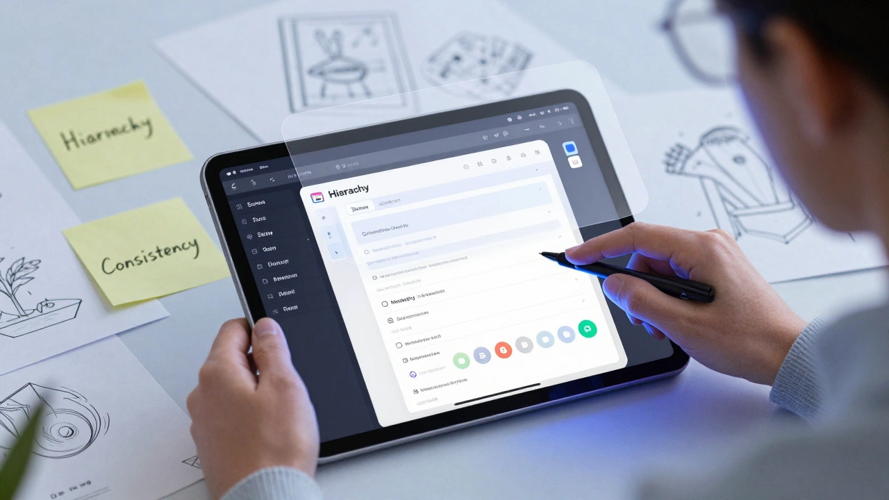
Prototyping with HIG Patterns: How to Do It Right
You can’t test HIG compliance in a final build. You have to test it early. That means prototyping - not with code, but with behavior.
Start with paper or Figma. Build a flow. Then ask yourself:
- Can someone use this without reading instructions?
- Does every action feel like it belongs here?
- Is the next step obvious after they tap something?
- Would a user who’s used Instagram, Messages, or Apple Music know how to use this?
Test with real people. Not colleagues. Not designers. Real users who don’t know your app. Watch where they hesitate. Where they tap the wrong thing. Where they look confused. Those moments aren’t bugs - they’re signals. They tell you where you broke the pattern.
Here’s a real example: A health app wanted users to log meals. The team designed a fancy form with dropdowns, calorie counters, and ingredient search. Users abandoned it. Why? Because they didn’t want to think. They wanted to tap "Breakfast" and move on. The fix? A simple list of common meals. Tap one. Done. That’s HIG in action - reduce friction by matching behavior, not forcing complexity.
What Happens When You Ignore HIG
Some teams think HIG is "Apple’s way" - not "the right way." They customize buttons. Move tabs. Invent new gestures. Then they wonder why users leave.
Here’s what happens when you ignore HIG:
- Higher support costs - users call because they can’t figure out how to go back.
- Lower retention - people uninstall because the app feels "weird."
- Slower adoption - if it takes too long to learn, they’ll stick with what they know.
- App Store rejections - Apple’s review team flags inconsistent UIs. Not because they’re rigid. Because they’re trying to protect users.
There’s a myth that following HIG makes apps look "samey." That’s false. HIG doesn’t dictate color, imagery, or tone. It governs structure, motion, and interaction. You can still make a bold, unique app. But if the back button is on the right side, or swiping does something unpredictable - you’ve broken the contract.
How HIG Helps You Build Faster
Here’s the secret most teams miss: HIG isn’t a constraint. It’s a shortcut.
When you use Apple’s built-in components - navigation bars, table views, alert sheets - you get accessibility, animations, localization, and responsiveness for free. You don’t have to code them. You don’t have to test them. They’re battle-tested. Millions of users have used them. They work.
And when you prototype with these components, you skip weeks of iteration. You don’t waste time debating whether a toggle should be on the left or right. You use the standard. You test the flow. You focus on what matters: the user’s goal.
Think of HIG as the grammar of interface design. You can write poetry without following grammar - but no one will understand it. HIG gives you structure so you can focus on meaning.
Final Thought: Predictability Isn’t Boring. It’s Comfort.
People don’t want apps that surprise them. They want apps that understand them. The best interfaces don’t stand out - they disappear. You don’t notice the back button. You don’t think about how to scroll. You just do it. That’s the goal.
Testing your UI with HIG patterns isn’t about following rules. It’s about respecting the user’s mind. It’s about building something they can use without thinking. And that’s not just good design. It’s human design.
Do I have to follow Apple HIG for all platforms?
Yes - if you want your app to feel natural on iOS, macOS, watchOS, or visionOS. Each platform has its own conventions. A button on Apple Watch shouldn’t behave like one on iPad. But the core principles - consistency, feedback, hierarchy - apply everywhere. Deviating from platform-specific patterns confuses users and risks rejection during App Store review.
Can I customize HIG components without breaking predictability?
You can change colors, fonts, and imagery - but not behavior. Don’t move the tab bar to the top. Don’t replace swipe-to-delete with a long-press menu. Don’t hide the back button. These are deeply learned patterns. Changing them breaks user trust. Customization should enhance, not replace, the structure Apple’s guidelines provide.
What if my app’s purpose is very different from Apple’s examples?
Even unique apps benefit from HIG. A finance app doesn’t need a custom gesture to delete a transaction. Use the standard swipe. A medical app doesn’t need a new way to navigate between screens. Use the built-in navigation stack. Your uniqueness should come from content, data, and function - not from reinventing basic interactions users already know.
Is HIG only for native apps?
HIG is designed for native apps built with Apple’s frameworks (UIKit, SwiftUI, AppKit). Web apps or cross-platform tools (like React Native) can’t fully replicate HIG behavior. But you can still follow its principles: use familiar patterns, provide clear feedback, group related actions, and avoid surprises. The goal isn’t to mimic Apple exactly - it’s to create predictability.
How often does Apple update HIG?
Apple updates HIG every year, usually around WWDC. Changes are often small - a new component, a tweak to spacing, or clarification on accessibility. But they matter. For example, in 2024, Apple added clearer guidance on dynamic type scaling and adaptive layouts for foldable devices. Staying current ensures your app stays usable and review-approved.
