
Apple’s Liquid Glass isn’t just another visual style - it’s a living, breathing material that responds to what’s beneath it, around it, and who’s using it. Introduced at WWDC 2025, this new design system replaces the static frosted glass of past years with something far more intelligent. It doesn’t just look like glass - it behaves like it. And the secret? Design tokens. Not just color codes or blur values, but a full ecosystem of dynamic parameters that adapt in real time.
What Makes Liquid Glass Different
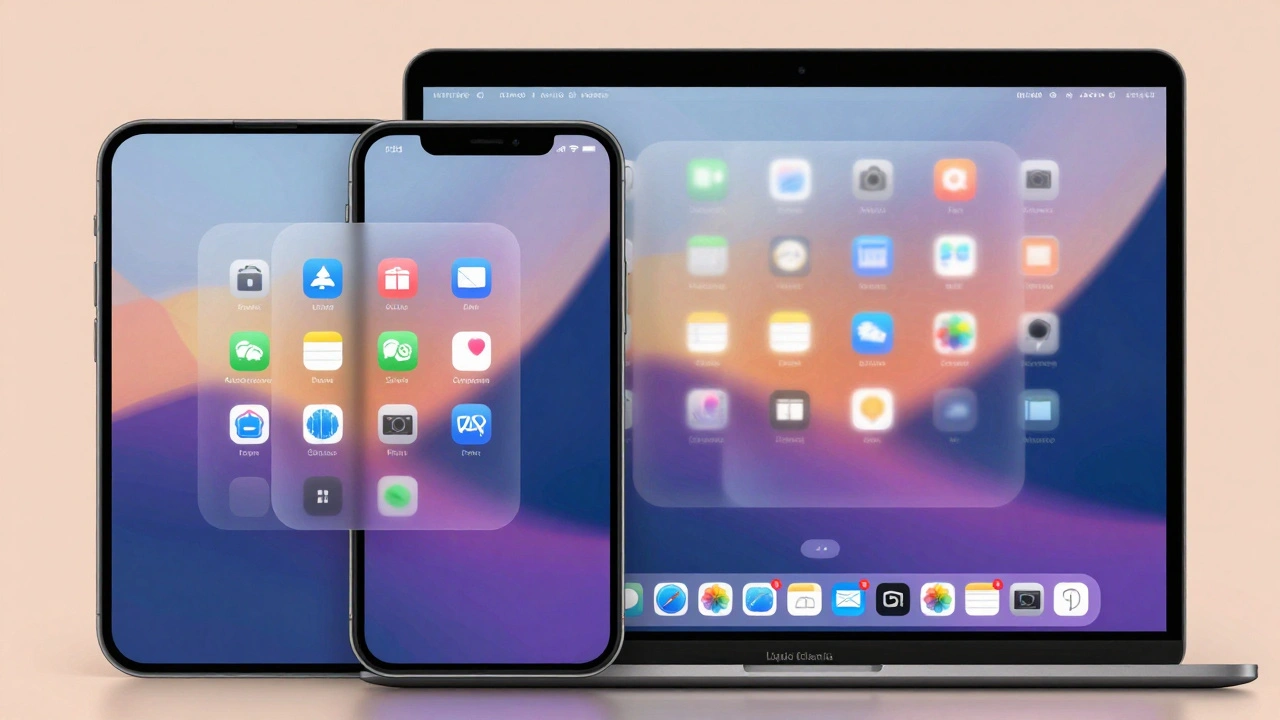
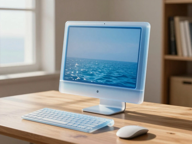
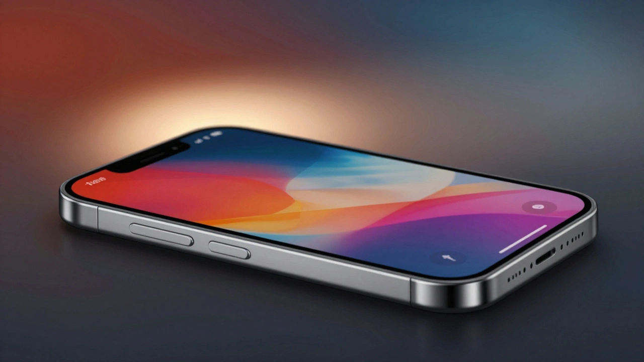
Before Liquid Glass, Apple used fixed transparency levels. A sidebar was always 70% opaque. A button had one shadow. A background blur was locked at 16px. That worked fine when screens were simpler. But today’s interfaces shift constantly - menus pop open, content scrolls under controls, dark mode toggles, and accessibility settings change how users see everything. Liquid Glass fixes that by making every visual layer responsive.Think of it like real glass. If you put a red cup behind a pane of glass, the glass looks reddish. If you put a bright photo behind it, the glass looks brighter. Liquid Glass does the same - but automatically. It reads the content underneath and adjusts its tint, blur, and lighting to keep things readable and cohesive. No manual tweaking. No broken visual harmony.
The Three Core Design Tokens
There are three pillars to Liquid Glass: color, blur, and lighting. Each one is controlled by a set of tokens - not hard-coded values, but flexible rules that scale with context.Color: Tinting That Feels Physical
Liquid Glass doesn’t use flat colors. Instead, it uses tinting. When you apply a tint, you’re not painting over the background - you’re filtering it. The system analyzes the brightness and hue of what’s behind the element and shifts the glass’s color slightly to match, while still holding onto its core identity.For example, a button with a blue tint over a dark image doesn’t just turn blue. It becomes a deep, rich teal that feels like it’s glowing from within. Over a light background? It softens into a pale sky blue. Solid fills? They break the illusion. They look like stickers glued on top. Tinted layers? They feel like they belong.
The system maps tint values across five levels: none, subtle, moderate, strong, and intense. Each level adjusts saturation and brightness based on the underlying content. Developers don’t pick a hex code - they pick a semantic token like glass.tint.moderate.
Blur: Dynamic Backdrop Filtering
The blur in Liquid Glass isn’t just Gaussian noise. It’s a multi-layered SVG filter pipeline that includes displacement, color matrix, and blending operations. This isn’t something you copy from a design tool - it’s built into the OS.Apple uses backdrop-filter in CSS and equivalent APIs in SwiftUI to apply these filters. But here’s the catch: the blur radius isn’t fixed. It changes based on the element’s role. A navigation bar might use a 24px blur. A small floating button? Just 8px. Why? Because too much blur on a tiny element makes icons unreadable.
There are two variants:
- Regular: The default. Balanced transparency and blur. Works everywhere.
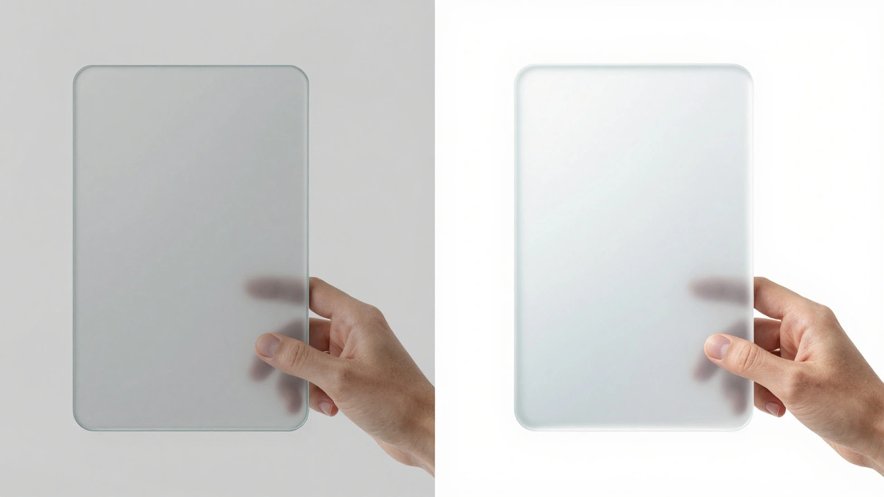
- Clear: Nearly see-through. Used only where content is rich and needs to shine - like a photo library header. But here’s the rule: Clear must be paired with a dimming layer. Otherwise, text vanishes into the background.
For small Clear elements, Apple recommends localized dimming - a subtle dark overlay only under text and icons. This keeps the background vibrant while ensuring legibility.
Lighting: One Source, One System
Lighting is where most designs fail. One card has a highlight on the left. Another has it on the right. They look like they’re in different rooms. Liquid Glass fixes this with a single, locked light source.Every glass element in an interface uses the same directional light - top-left at 35 degrees. This creates consistent edge sparkle, shadow fall-off, and highlight placement. No random glows. No conflicting reflections.
The light intensity is divided into three tiers: low, medium, and high. Low is for subtle elements like icons. Medium is for buttons and menus. High is for active states or focused elements. These aren’t brightness sliders - they’re named tokens: glass.light.medium, glass.light.high.
When a user taps a button, the lighting tier shifts from medium to high. The highlight brightens. The edge sparkles. It feels alive.
How Accessibility Changes Liquid Glass
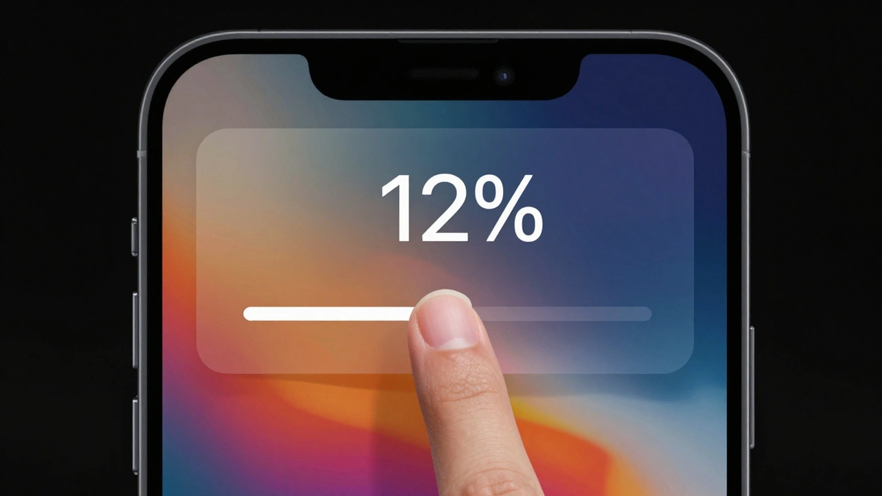
Liquid Glass doesn’t ignore accessibility - it builds it in. When a user enables system settings, the material adapts automatically.- Reduced Transparency: The glass becomes frosted, like a milk-glass window. Background content is blurred more heavily.
- Increased Contrast: Elements turn black or white with sharp borders. No tinting. No blur. Just clarity.
- Reduced Motion: The elastic bounce of menus disappears. Transitions become linear. No shimmer, no fade.
These aren’t workarounds - they’re native behaviors. If you build with Apple’s tokens, your interface respects accessibility without extra code.
Where to Use Liquid Glass - And Where Not To
This isn’t a free-for-all. Apple is strict about where Liquid Glass lives.Use it for:
- Navigation bars
- Sidebars and drawers
- Modal sheets and popovers
- Control groups (like volume sliders or playback buttons)
Avoid it for:
- Content layers (like text blocks or image galleries)
- Other glass elements (no glass-on-glass stacking)
- Small icons without enough space for legibility
Why? Because glass needs breathing room. If you put it over text, it competes for attention. If you stack it, the blur layers fight each other and create visual noise. The system is designed to be a single floating plane - not a layered cake.
Implementation: From Tokens to Code
Apple provides design tokens as part of its Human Interface Guidelines. These aren’t just visual presets - they’re code-ready variables.In SwiftUI, you access them like this:
Text("Settings")
  .font(.title)
  .background(.ultraThinMaterial)
The .ultraThinMaterial token handles tint, blur, and lighting automatically. No manual filters needed.
In web apps using CSS, you define the SVG filter once:
<defs>
  <filter id="liquidGlass">
    <feGaussianBlur stdDeviation="8"/>
    <feColorMatrix type="matrix" values="0.8 0 0 0 0  0 0.8 0 0 0  0 0 0.8 0 0  0 0 0 1 0"/>
    <feBlend mode="screen"/>
  </filter>
</defs>

...
Apple also provides a new icon format that supports dynamic lighting. Icons inside glass elements automatically flip from light to dark based on context - no manual switching required.
Why This Matters
Liquid Glass isn’t about looking fancy. It’s about consistency. Before, an iOS app might have a glassy toolbar. A Mac app had a different one. A watchOS app used a third variation. Now, they all use the same tokens. The same rules. The same behavior.Developers don’t need to guess. Designers don’t need to rebuild. Users don’t feel like they’re using five different apps.
It’s the first time Apple has treated design as a system - not a collection of styles. And that system is built on tokens. Color. Blur. Lighting. Accessibility. Motion. All connected. All adaptive.
If you’re building for Apple platforms, this isn’t optional anymore. It’s the standard. And if you ignore it? Your interface won’t just look outdated - it’ll feel broken.
Can I use Liquid Glass on non-Apple platforms?
No. Liquid Glass is a proprietary system built into Apple’s operating systems - iOS, macOS, watchOS, and visionOS. While you can mimic the look using CSS backdrop-filter and SVG filters, you won’t get the dynamic tinting, automatic accessibility adjustments, or system-level lighting consistency. The full effect only works with Apple’s native APIs and design tokens.
Do I need to use the Clear variant for all glass elements?
No. The Clear variant is meant for specific cases where you want maximum content visibility - like a photo header or a video player overlay. For most elements - buttons, menus, sidebars - use Regular. Clear requires a dimming layer to ensure text stays readable. Using it everywhere makes interfaces harder to read and visually overwhelming.
How do I test Liquid Glass with accessibility settings?
On iOS or macOS, go to Settings > Accessibility > Display & Text Size. Toggle Reduced Transparency, Increased Contrast, or Reduced Motion. Any Liquid Glass element you’ve built with Apple’s tokens will update automatically. No code changes needed. This is built into the system - not an add-on.
What happens if I put glass on top of glass?
It breaks. Stacking glass layers causes visual noise - blur artifacts, conflicting lighting, and muddy colors. Apple’s guidelines strictly forbid it. If you need depth, use spacing, shadows, or elevation tokens instead. Glass should sit on a single plane - not be layered.
Are design tokens for Liquid Glass customizable?
You can override them, but you shouldn’t. Apple’s tokens are calibrated for legibility, contrast, and harmony across all devices. Changing the blur radius or tint level risks making your interface feel inconsistent or hard to read. If you need a custom look, use a solid background instead. Liquid Glass is designed to be a system - not a palette.