
Most companies chase trends. They update logos every two years. They swap fonts because something new came out. They release UI changes every few months, hoping users will notice and care. Apple does the opposite. It waits. It refines. It sits on ideas for years. And then, when it finally moves, the whole industry shifts with it.
The Apple Way: Slow to Change, Fast to Resonate
Think about the Apple logo. The rainbow apple from 1977? It was approved in two weeks. No revisions. No focus groups. Just Steve Jobs saying, "That’s it." But that logo didn’t disappear when the world turned grayscale. It evolved. The bite stayed. The shape stayed. The meaning stayed. The color? It vanished in 1998-not because it was outdated, but because Apple had spent years deciding what simplicity meant. And when they changed it, the entire tech world noticed. Competitors scrambled to copy the clean, monochrome look. Apple didn’t rush. It waited until the change meant something.
This pattern repeats across every surface Apple controls. Typography. Icons. Buttons. Even the spacing between letters. Each change feels inevitable-not because it was sudden, but because it was inevitable.
Typography: A 30-Year Evolution
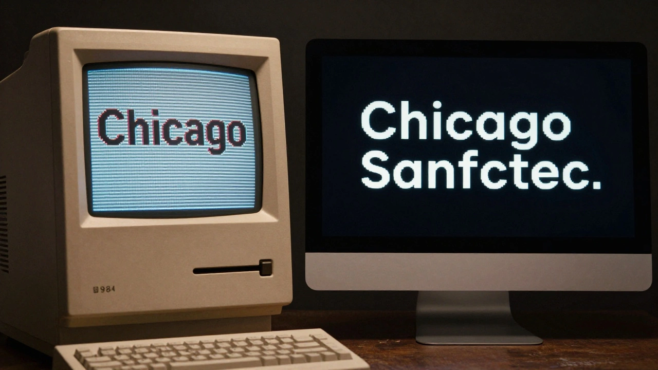
Let’s talk about fonts. On the original Macintosh in 1984, Apple used Chicago-a bitmap font designed by Susan Kare. It was blocky. Pixel-perfect. Made for screens that could barely display 72 dots per inch. It wasn’t pretty. But it was clear. And it worked.
Fast forward to 1997. Mac OS 8 brought Charcoal. Slightly smoother. Still bitmap. Still designed to fit the same grid. No radical shift. Just a quiet upgrade. Then came Lucida Grande in the early 2000s. A step toward smoother curves. Still not quite modern. Still not quite digital. Apple waited. Not because they couldn’t change. But because they were waiting for the right moment.
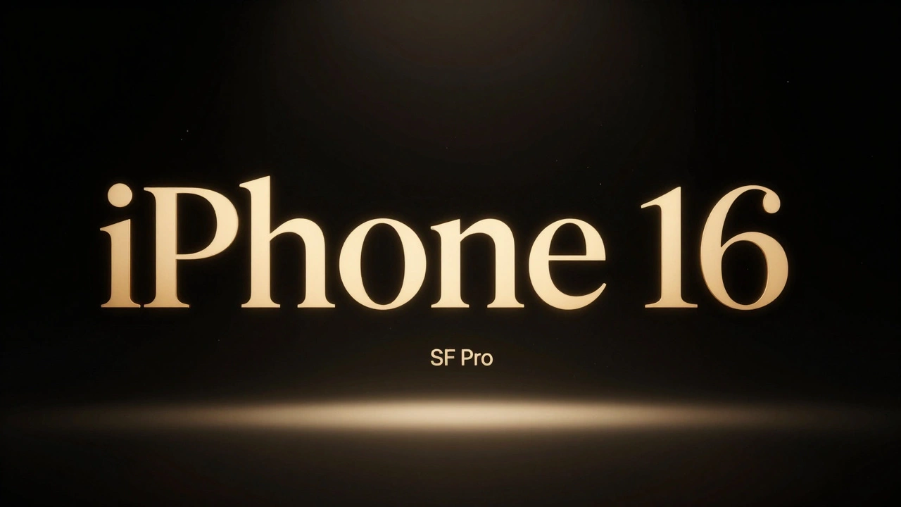
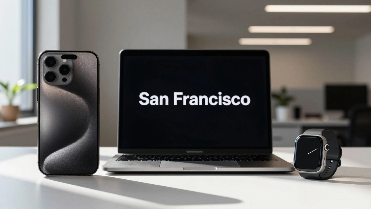
Then, in 2014, Apple rolled out Helvetica Neue across macOS. Not all at once. First in iTunes. Then in iMovie. Then in the system UI. It took months. Years, even. And then, in June 2015, at WWDC, Apple dropped San Francisco. The new system font. Built from the ground up for screens. Optimized for Retina. For watches. For iPhones. For Macs. It had variable widths. Better legibility at small sizes. Tighter spacing. And it replaced Helvetica Neue overnight across every Apple device.
That wasn’t a redesign. That was a revelation.
Why? Because Apple didn’t just pick a font. They built one. Years of research. Testing. Refinement. And when they finally launched it, every single Apple user saw the same thing. No confusion. No fragmentation. Just clarity. And suddenly, every other tech company had to ask: "Do we need our own font?"
The Logo That Changed Everything
The rainbow apple wasn’t just a logo. It was a statement. It said: "This computer is different." It was colorful. It was playful. It was the opposite of IBM’s beige boxes. But by 1998, Apple was on the edge of collapse. Jobs returned. And he didn’t want color. He wanted purity.
The shift to monochrome didn’t happen overnight. It was tested. Discussed. Scrutinized. The team tried grayscale. Then black. Then white. They looked at how it looked on packaging. On billboards. On screens. On metal. On plastic. They didn’t rush. They waited until the change felt inevitable.
When Apple unveiled the iMac G3 in 1998 with its translucent, colorful case, the logo was black. No rainbow. No shine. Just a simple silhouette. That logo didn’t just match the iMac-it defined it. And within months, every other PC maker started stripping color from their branding. The industry didn’t change because Apple announced a new logo. It changed because Apple had spent a decade perfecting the idea of simplicity.
Design Is a System, Not a Feature
Apple doesn’t design buttons. It designs systems. It doesn’t tweak fonts. It rethinks how text behaves on every screen, at every size, in every light. That’s why changes take years. Because every element must work with every other element.
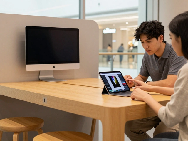
Take the iPhone. In 2007, it didn’t just introduce a touchscreen. It introduced a new language. No buttons. No stylus. No menus. Just swipes. Pinches. A home button that felt like it belonged. That wasn’t invented in a lab overnight. It was built on years of research. On the iPod’s click wheel. On the Newton’s handwriting recognition. On the Lisa’s GUI. Apple didn’t invent touch. But it perfected how touch felt.
And when it launched? The entire phone industry collapsed. Nokia, BlackBerry, Palm-they all had to rebuild from scratch. Why? Because Apple didn’t just make a better phone. It made a better way to interact with technology. And that took decades of quiet iteration.
Why Slow Iteration Wins
Most companies think speed is progress. They release updates to stay relevant. They A/B test everything. They follow data. Apple follows instinct. And it trusts that if something feels right after years of refinement, it will feel right to millions.
There’s a reason Apple doesn’t do "beta" releases for its UI. There’s no "iOS 18.1 beta 3." Apple waits until it’s done. Until every edge is smoothed. Until every icon is pixel-perfect. Until every animation feels natural. And when it finally ships? It doesn’t feel like an update. It feels like a revelation.
This isn’t luck. It’s strategy. Apple controls everything: hardware, software, typography, packaging, advertising. That means one decision ripples across every touchpoint. And that means one bad decision can cost billions. So they wait. They test. They refine. And when they move? They move with precision.
The Ripple Effect
When Apple changed its system font to San Francisco, it didn’t just affect iPhones. It affected designers everywhere. Suddenly, startups were building custom fonts. Developers were optimizing for variable widths. Web designers started matching Apple’s letter spacing. Even Microsoft and Google started refining their own system fonts.
When Apple went flat, everyone went flat. When Apple removed skeuomorphism, the whole design world stopped pretending buttons were leather-stitched. When Apple dropped the headphone jack, the industry followed. Not because Apple was loud. But because Apple was quiet-and then suddenly, impossibly, perfect.
What This Means for Design
If you’re designing something today, ask yourself: Are you chasing trends? Or are you building something that will still feel right in ten years?
Apple doesn’t design for this quarter. It designs for the next decade. It doesn’t care if you notice the change today. It cares if you notice it was missing yesterday.
The lesson isn’t to slow down. The lesson is to slow down on purpose. To wait until the idea is so clear, so simple, so inevitable that when you release it, the world doesn’t ask, "What’s new?" It asks, "How did we ever live without this?"