
When you open an Apple app - whether it’s Messages, Notes, or a third-party app like Spotify - you don’t think about the text. But you feel it. The way headlines snap your attention, how body text flows without effort, how tiny captions fade quietly into the background - that’s not luck. It’s typography hierarchy, carefully engineered to make every tap, read, and scroll feel natural.
Apple doesn’t leave this to chance. They’ve built a system so consistent, so thoughtful, that it works across every device: iPhone, iPad, Mac. And if you’re building an app, ignoring it means your users will notice something’s off - even if they can’t say why.
Start with the System Fonts
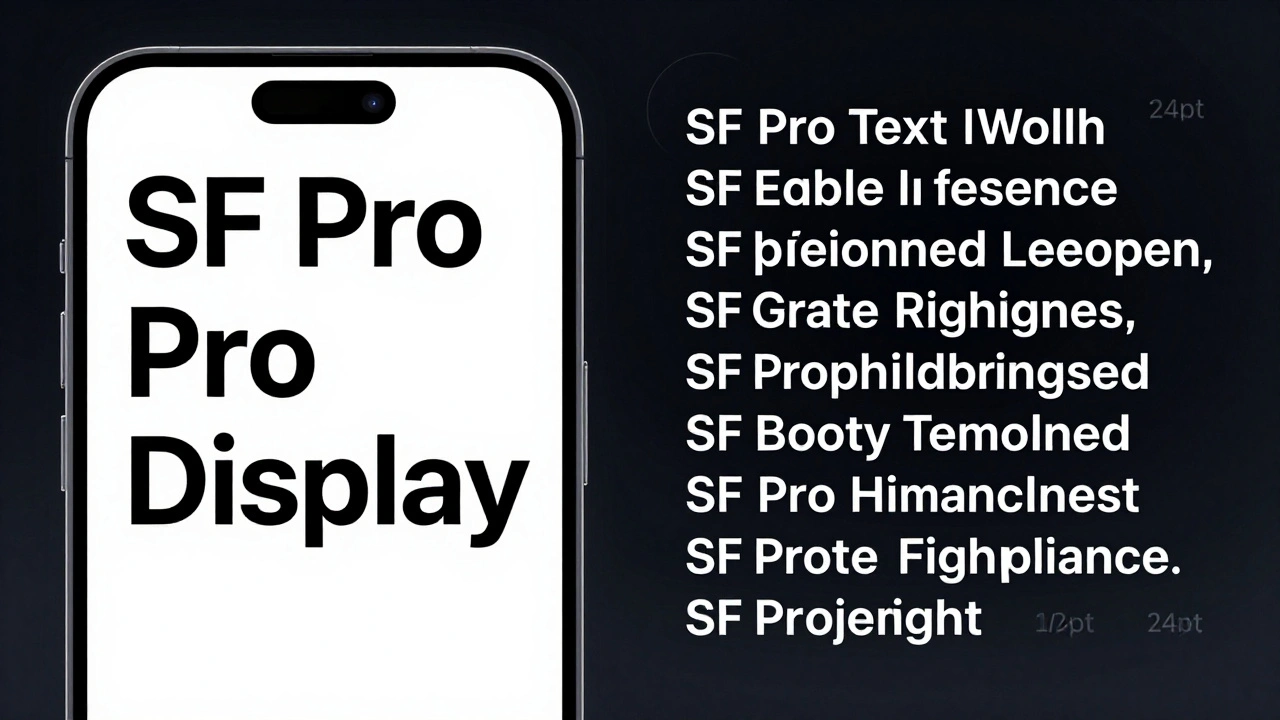
Apple’s typography system runs on two core fonts: San Francisco is the default system font for iOS, iPadOS, and macOS, designed for maximum legibility on screens of all sizes. It comes in multiple weights - from Ultralight to Black - and supports Condensed and Expanded widths for tight or spacious layouts.
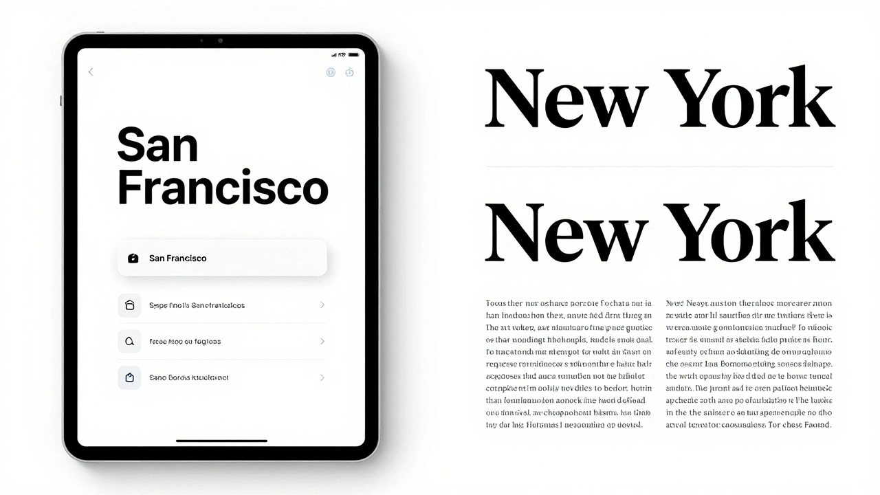
Then there’s New York - a serif font used sparingly, mostly for long-form reading like Books or Apple News. It’s not for buttons or labels. It’s for when users need to settle in, not skim.
These aren’t just aesthetic choices. They’re functional. San Francisco’s letterforms are tuned for pixel-perfect rendering on Retina displays. Its x-height is tall, its counters are open, and its spacing is calibrated for readability at small sizes. If you try to replace it with a custom font without testing it at 11pt, 13pt, and 17pt, you’re risking usability.
Minimum Sizes Aren’t Suggestions - They’re Rules
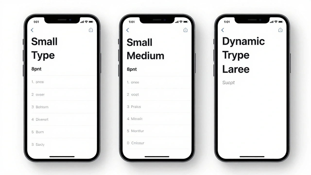
Here’s where many developers get it wrong. You might think 14pt is fine for body text. Apple says no. The minimum recommended size for body text is 17 points on iOS. That’s not a guideline - it’s a hard baseline for accessibility.
Some older docs mention 11pt as a technical minimum. That’s true for very high-resolution displays, but it’s not safe. At 11pt, even San Francisco can blur. At 17pt, it’s crisp. And if your app supports Dynamic Type (which it must), users who need larger text won’t break your layout - because the system scales everything proportionally.
Don’t just pick a size. Ask: Is this readable when someone’s holding their phone at arm’s length? If not, go bigger.
Size Alone Doesn’t Create Hierarchy
Here’s a common mistake: you make a heading 18pt and body text 16pt. That’s a 2pt difference. In practice? It’s invisible. You need more than size.
Apple’s rule of thumb: At least 4-6pt difference between hierarchy levels. So if your heading is 20pt, your subhead should be 14pt or smaller. But even then, size isn’t enough.
You need weight. Use Semibold for subheadings, Bold for primary headings, and Regular or Medium for body. A 2pt size jump with a weight change from Regular to Bold creates clear distinction.
And don’t forget color. A dark gray (#000000) and a light gray (#555555) might look subtle, but they’re powerful tools. Use darker tones for primary content, lighter ones for secondary info like dates, locations, or metadata. The contrast should be enough to pass WCAG 2.1 AA standards - no exceptions.
Leading Isn’t Just Spacing - It’s Rhythm
Leading - the space between lines - is where most apps fail. Too tight? Text feels cramped. Too loose? It breaks the flow.
Apple’s system fonts come with built-in leading values tied to each text style. A Title style uses 36pt line height, while a Footnote uses 16pt. You don’t need to calculate this manually.
If you’re using SwiftUI, you can tweak it with .leading(.tight) or .leading(.loose). But Apple warns: Only override the system if you have a very good reason. Why? Because users expect consistency. If your app’s lines are tighter than every other app on their phone, it feels wrong.
Test your text with real users. Read it aloud. Does it breathe? Does it feel calm? If not, adjust the leading - not the size.
Dynamic Type: The Accessibility Backbone
Dynamic Type isn’t a feature. It’s a requirement. When a user goes to Settings > Accessibility > Display & Text Size and turns up their text size, every app should respond - not just Apple’s.
With UIKit, you use UIFontMetrics to scale custom fonts. In SwiftUI, use @ScaledMetric to tie spacing and font sizes to text styles:
@ScaledMetric(relativeTo: .title) private var spacing: CGFloat = 10.0This line means: Keep this 10pt gap proportional to the title text size. If the user bumps up their text to Large, your spacing grows with it. No broken layouts. No clipped text.
And here’s the kicker: if your app doesn’t support Dynamic Type, it can be rejected from the App Store. Apple tests this. They don’t just check if it works - they check if it works well.
Custom Fonts? Proceed with Caution
You want your app to feel unique? You can use custom fonts. But you still need to follow the rules.
You can embed a font like Helvetica or Gotham - but you must:
- Support Dynamic Type scaling
- Test it at all sizes (11pt to 34pt)
- Ensure it passes contrast checks
- Never disable scaling with
.fixedSize()unless you’re making a specialized tool like a drawing app
Apple’s example: Text("Title").font(.custom("Helvetica", size: 17)) is fine - as long as it scales with Dynamic Type. But .font(.custom("Courier", fixedSize: 17)) breaks accessibility. Avoid it.
And remember: custom fonts aren’t free. They add to your app’s size. They slow down rendering. They break on older devices. Ask yourself: is this font worth the cost?
Alignment and Grids Keep It Clean
Typography doesn’t live in isolation. It sits on a grid. Apple apps use a 8pt grid system - everything snaps to multiples of 8: 8pt, 16pt, 24pt, 32pt.
That means:
- Padding between text blocks? 16pt or 24pt
- Margin between icon and label? 8pt
- Line height for body text? 24pt (17pt text + 7pt leading)
This isn’t about being neat. It’s about rhythm. When everything aligns, the eye moves smoothly from one element to the next. No jarring jumps. No visual noise.
Use layout guides in Figma or Sketch. Snap to 8pt. Then test on a real iPhone. If the spacing feels off, it probably is.
Contrast Is the Final Filter
Size, weight, leading - they all matter. But if your text doesn’t contrast enough with the background, none of it matters.
Apple requires a minimum contrast ratio of 4.5:1 for normal text (WCAG AA). For large text (18pt+), it’s 3:1. Use the built-in contrast checker in Xcode or the Accessibility Inspector. Don’t guess.
Here’s a real example: a light gray (#A0A0A0) on white (#FFFFFF) fails. It’s too faint. But #444444 on white? Perfect. It’s subtle, but readable.
And don’t forget color blindness. Red and green might look fine to you, but they’re indistinguishable to 8% of men. Use tools like Stark or the iOS Accessibility Display settings to simulate how your text looks to others.
What Happens When You Ignore This?
You get apps where:
- Headings look like body text - users miss key info
- Buttons have tiny labels - people tap the wrong thing
- Footnotes blend into the background - users think something’s missing
- Text gets cut off on larger font settings - users uninstall
It’s not just bad design. It’s bad UX. And Apple notices. Apps with poor typography get lower ratings. They get flagged in reviews. Sometimes, they get removed.
Good typography doesn’t shout. It guides. It doesn’t impress - it helps. And that’s why Apple’s system works: because it’s not about style. It’s about clarity.
What’s the minimum text size for body text in Apple apps?
Apple’s Human Interface Guidelines recommend a minimum of 17 points for body text on iOS. While some older documentation mentions 11pt as a technical minimum, 17pt is the safe, accessible baseline that ensures readability across all devices and user settings.
Can I use my own font in an Apple app?
Yes, but you must support Dynamic Type so your font scales with user preferences. You can’t use fixed-size fonts unless you’re building a specialized app like a drawing tool. Always test your font at sizes from 11pt to 34pt, and ensure it meets contrast standards to avoid App Store rejection.
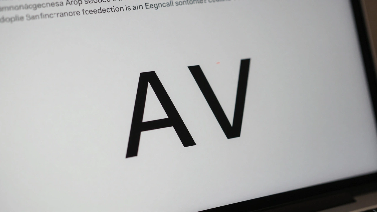
Why does Apple use San Francisco instead of Helvetica?
San Francisco was designed specifically for screens - with optimized letter spacing, taller x-heights, and better pixel rendering than Helvetica. It scales cleanly across all Apple devices, from the Apple Watch to the Mac. Helvetica, while classic, wasn’t built for Retina displays and can blur at small sizes.
How do I fix text that looks cramped in my app?
Increase the leading (line height). In SwiftUI, use .leading(.loose). In UIKit, adjust the lineHeight attribute of your attributed string. A good rule is to keep line height at 1.2 to 1.5 times the font size. For body text, 24pt line height on 17pt text usually works well.
Does Apple’s typography hierarchy apply to macOS too?
Yes. The same San Francisco font and text styles are used across iOS, iPadOS, and macOS. Apple’s Human Interface Guidelines for macOS mirror those for iOS, with slight adjustments for larger screens. Dynamic Type and contrast rules apply universally.
What’s the difference between .font(.system) and .font(.custom)?
.font(.system) uses Apple’s San Francisco font and automatically responds to Dynamic Type, system settings, and accessibility preferences. .font(.custom) lets you use a third-party font but requires you to manually handle scaling and contrast. Use .system unless you have a strong design reason to switch.