
Apple doesn’t use just one font. Not even close. If you’ve ever looked closely at an Apple ad - whether it’s a billboard in Times Square, a product page, or a TV commercial - you’ve probably noticed something subtle but powerful: the headline is in a serif, and everything else? Sans-serif. It’s not random. It’s deliberate. And it’s one of the quietest, most effective tricks in their entire design playbook.
Why Serif for Headlines?
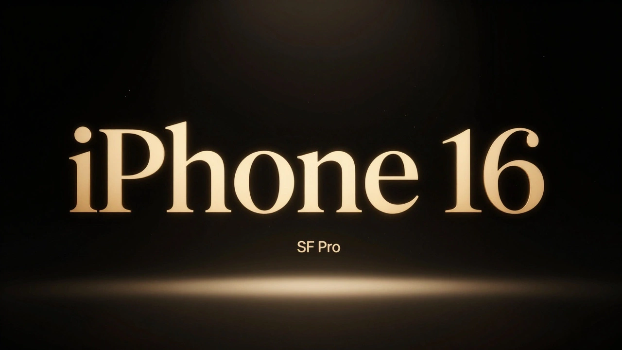
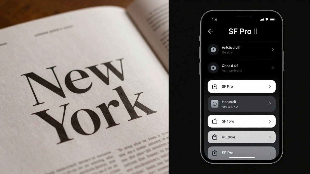
Think about the last Apple product launch you saw. The headline on the screen? Something like iPhone 16 in a clean, elegant serif. Not SF Pro. Not Helvetica. Not even a modified version of their system font. It’s New York - Apple’s own serif typeface, quietly introduced in 2021 and quietly used ever since in marketing, editorial content, and select app interfaces like Books and Reminders.
Why serif here? Because serifs carry weight. They feel human. They’re rooted in tradition - the kind of typeface you’d find in a well-printed book or a classic newspaper. In a world of sleek, digital, minimalist UIs, a serif headline doesn’t just grab attention - it adds emotional texture. It says: This isn’t just a gadget. It’s a story.
Apple’s marketing doesn’t sell specs. It sells feeling. A serif headline anchors that feeling. It makes the product feel timeless, crafted, intentional. You don’t see iPhone 16 in a cold, mechanical sans-serif because that would make it feel like a tool. You see it in New York, and suddenly it feels like something you’d pass down.
Sans-Serif UI: The Quiet Workhorse
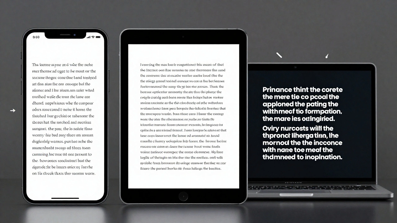
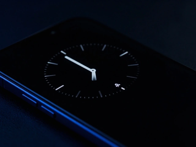
Now flip to the inside of the app, the settings menu, the product page. Everything else? SF Pro. Clean. Consistent. Optimized. SF Pro isn’t just Apple’s system font - it’s the backbone of every interaction. SF Text for small labels, SF Display for larger buttons. Each version is tuned for legibility at different sizes, on different screens, under different lighting.
This is where Apple’s genius shows. They don’t clutter the interface with visual noise. They don’t use multiple fonts just because they can. SF Pro does everything: navigation, instructions, error messages, button labels. It’s predictable. Reliable. Invisible. And that’s the point.
When you’re scrolling through your calendar or adjusting your Apple Watch settings, you don’t want to think about the font. You want to think about what you’re doing. SF Pro gets out of the way. It’s the perfect UI font because it doesn’t try to be anything more than functional.
The Contrast Isn’t Just Aesthetic - It’s Functional
Pairing New York (serif) with SF Pro (sans-serif) isn’t about style for style’s sake. It’s about hierarchy, clarity, and emotional pacing.
- The serif headline tells you what this is - emotionally, visually, and memorably.
- The sans-serif UI tells you how to use it - clearly, efficiently, without distraction.
There’s a rhythm here. The serif draws you in. The sans-serif keeps you there. It’s like reading a magazine article: the headline makes you pause. The body text makes you keep reading.
And Apple knows this works. Look at their ads. A single serif headline on a black background. Then, beneath it, a paragraph of clean, left-aligned SF Pro text. No decoration. No icons. Just words. And it works because the contrast is so sharp, so intentional.
It’s Not Just Apple - But Apple Does It Best
Other brands use serif headlines too. Luxury car ads. High-end fashion. Even some fintech startups. But most of them overdo it. They mix three fonts. They italicize everything. They add gradients and shadows.
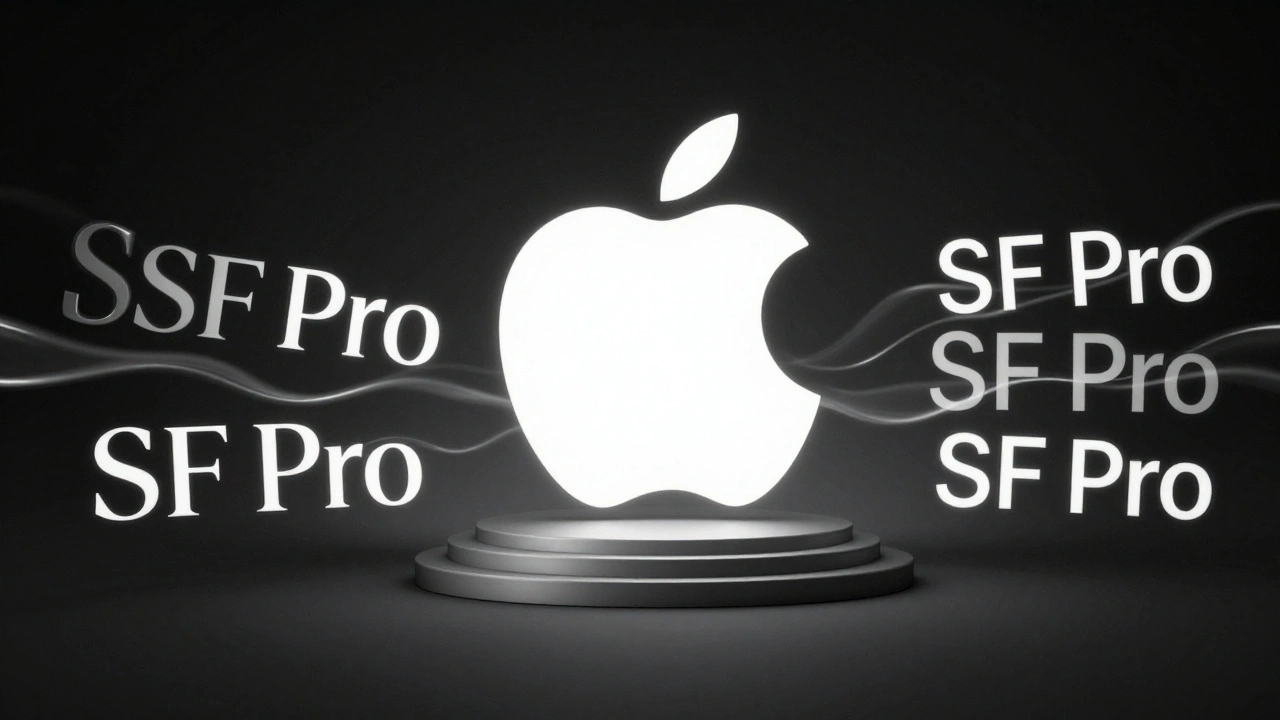
Apple doesn’t. They keep it to two. One serif. One sans-serif. And they use them with surgical precision. No exceptions. No variations. That consistency is what makes it feel like a system - not a trend.
And here’s the kicker: Apple doesn’t even talk about this. You won’t find it in their Human Interface Guidelines. You won’t see it in their developer docs. It’s not a rule. It’s a habit. A quiet standard. A design ethic.
What Happens When You Break the Pattern?
Try using SF Pro for a headline. It works - but it feels flat. It lacks gravitas. Try using New York in an app interface. It’s too heavy. Too slow. Too ornate. At 12-point size on a small screen? It’s a mess.
That’s why Apple’s pairing works: each font has a job. Serif isn’t for UI. Sans-serif isn’t for storytelling. They’re not interchangeable. And that’s why most companies fail at this kind of pairing. They treat fonts like decorations. Apple treats them like tools.
The Bigger Picture: Typography as Brand Language
Apple’s typography isn’t about being trendy. It’s about being consistent. It’s about building a language that feels familiar across every touchpoint - from a printed magazine spread to a 30-second video ad to the lock screen of your iPhone.
When you see a serif headline, you know it’s Apple. Not because of the logo. Not because of the product. But because of the way the letters sit on the page. That’s brand language. And it’s built one character at a time.
In 2026, design trends are pushing toward bold, expressive type. Condensed fonts. Hand-drawn lettering. Retro textures. Apple doesn’t follow trends. They set them - quietly, carefully, and with a deep understanding of how type shapes perception.
So next time you see an Apple ad, don’t just look at the product. Look at the letters. Notice how the serif feels like a whisper - and how the sans-serif feels like a steady hand. That’s not design. That’s storytelling. And it’s why Apple’s marketing still feels different.
Why does Apple use New York instead of a more common serif like Times New Roman?
New York is Apple’s custom serif typeface, designed specifically for their brand. Unlike Times New Roman - which was created for newspaper printing - New York has tighter spacing, more open counters, and refined stroke contrast that works beautifully at both large and small sizes. It’s not meant to mimic traditional serifs. It’s meant to feel timeless, but modern. It’s designed to be legible on screens and in print, without looking like a generic font. Apple didn’t want to borrow from history - they wanted to define their own.
Is the serif-sans-serif pairing used in all Apple marketing?
Not every single piece, but it’s the dominant pattern. You’ll see it in product launch videos, print ads, and most web banners. Apple sometimes uses SF Pro for headlines in very technical contexts - like developer documentation or spec sheets - but even there, they often switch to New York for emotional or narrative-driven content. The pairing is their go-to, not their only option.
Can I use this pairing in my own designs?
Absolutely - but don’t just copy Apple. The key isn’t the fonts themselves - it’s the logic. Use serif for emotional, high-impact headlines. Use sans-serif for functional, readable body text. Choose a serif that feels warm and human, not stiff or old-fashioned. Pair it with a clean, neutral sans-serif like Inter, Lato, or SF Pro. Keep the contrast clear. And never use more than two fonts. Apple’s power comes from restraint.
Does this pairing work on mobile screens?
Yes - but only if the serif is well-designed for screens. New York was optimized for digital use, with increased x-height and adjusted stroke weights to prevent blurring on low-resolution displays. Most serifs fail on small screens because they’re too delicate. Apple’s success here comes from custom-tailoring the serif to work in digital environments, not just print. If you’re using a serif on mobile, test it at 18px and below. If it gets muddy, it’s not the right choice.
Why doesn’t Apple use serif in their apps?
Because apps need speed, clarity, and consistency. Serifs slow down reading on small screens. SF Pro is engineered for rapid scanning - it’s optimized for legibility at 11pt, 13pt, and 16pt across hundreds of UI elements. New York works beautifully in a headline or a book cover - but not in a settings menu with 200 labels. Apple keeps serif where it adds meaning, and sans-serif where it adds function.
Final Thought: Less Is More - But Only If It’s Thoughtful
Apple doesn’t have the fanciest fonts. They don’t have the most colors. They don’t even have the loudest ads.
What they have is discipline. And that discipline shows up in how they treat type. Two fonts. One job each. No exceptions. No fluff.
That’s what makes their design feel so quiet - and so powerful.