Tag: SF Pro
Mastering SF Pro: A Guide to Pairing Text and Display Fonts on Apple Devices
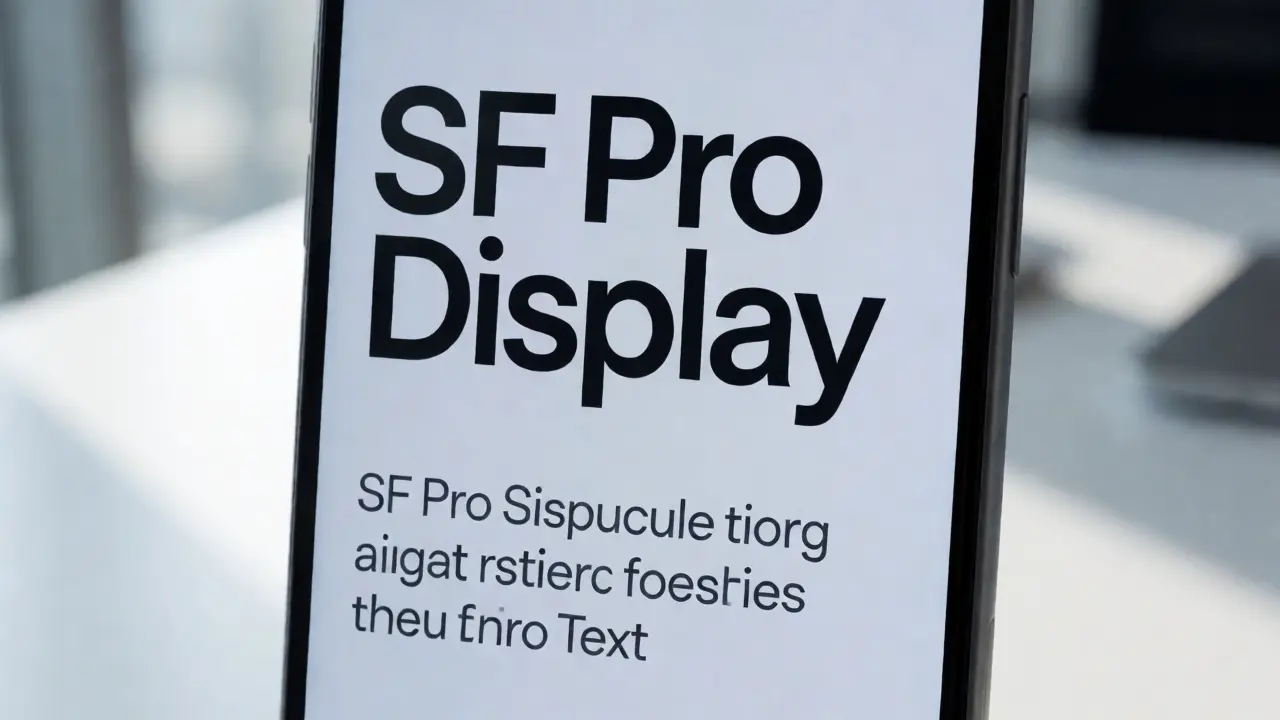

Learn how to correctly pair SF Pro Text and Display fonts on Apple devices. Discover the 20pt rule, weight strategies, and common pitfalls for better UI readability.
SF Pro Text vs. Display: Typography Scales for Apple Component Libraries
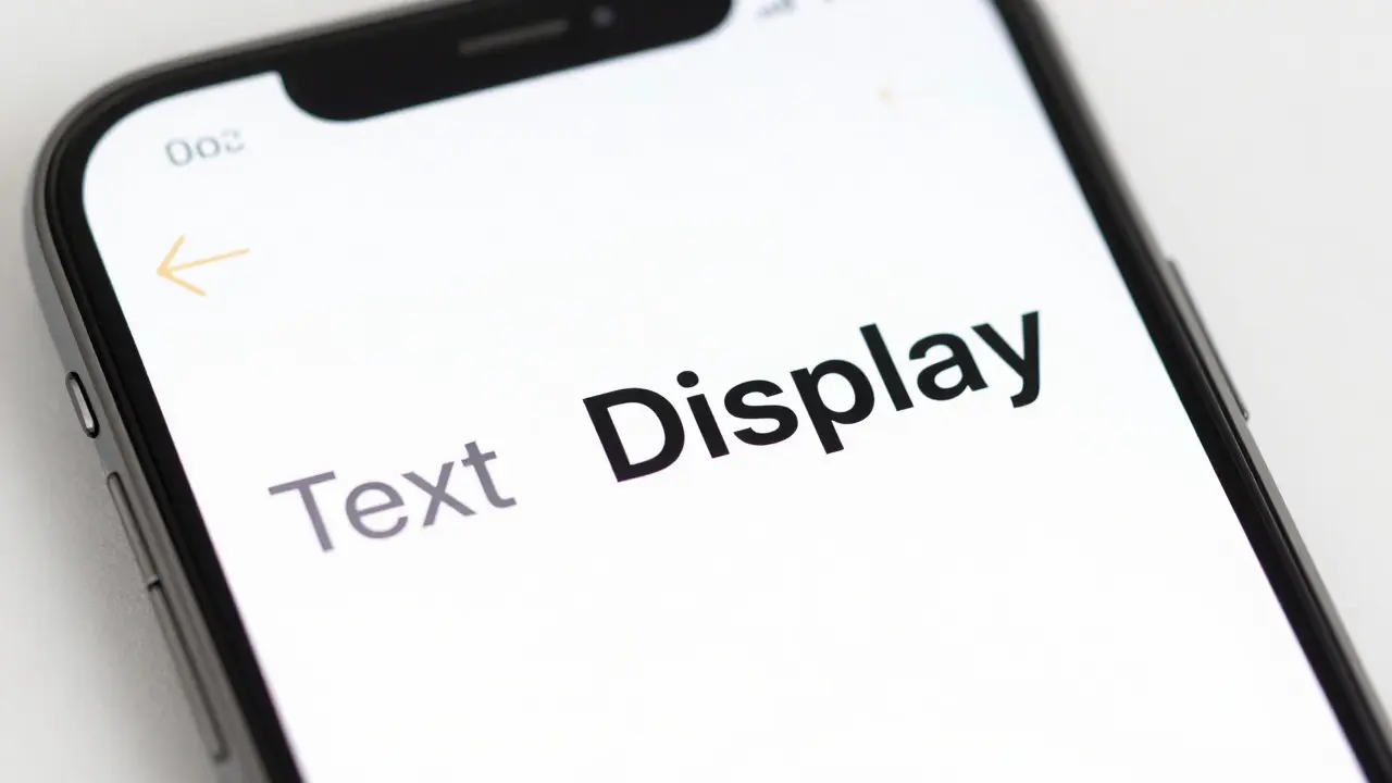
Learn how to correctly implement SF Pro Text and Display variants in your component libraries. Understand the 20pt optical size threshold and how to set up design tokens for consistent typography across Apple platforms.
Dynamic Type on Apple: Designing for Accessibility and User-Controlled Sizes

Learn how to design for Dynamic Type on Apple platforms. Discover how to use semantic text styles, test for accessibility sizes, and create flexible layouts that respect user preferences.
Design Tokens for Apple Apps: System Colors, Typography, and Material Parameters

Learn how to implement design tokens for Apple apps. Cover system colors, SF Pro typography, and material parameters to ensure consistency across iOS, macOS, and Dark Mode.
Design Tokens for the Apple Ecosystem: Colors, Type, and Motion Standards

Learn how to implement design tokens for Apple platforms. Covers semantic naming, color management, SF Pro typography, and motion standards for consistent cross-device experiences.
Icon Labels and Captions in Apple: How SF Pro Delivers Micro-Scale Clarity
Apple's SF Pro font and SF Symbols work together to make tiny icon labels readable on every device. Learn how micro-scale typography, optical alignment, and Dynamic Type create clarity you never notice-until it's gone.
Type Pairing in Apple Marketing: How Serif Headlines and Sans-Serif UI Work Together
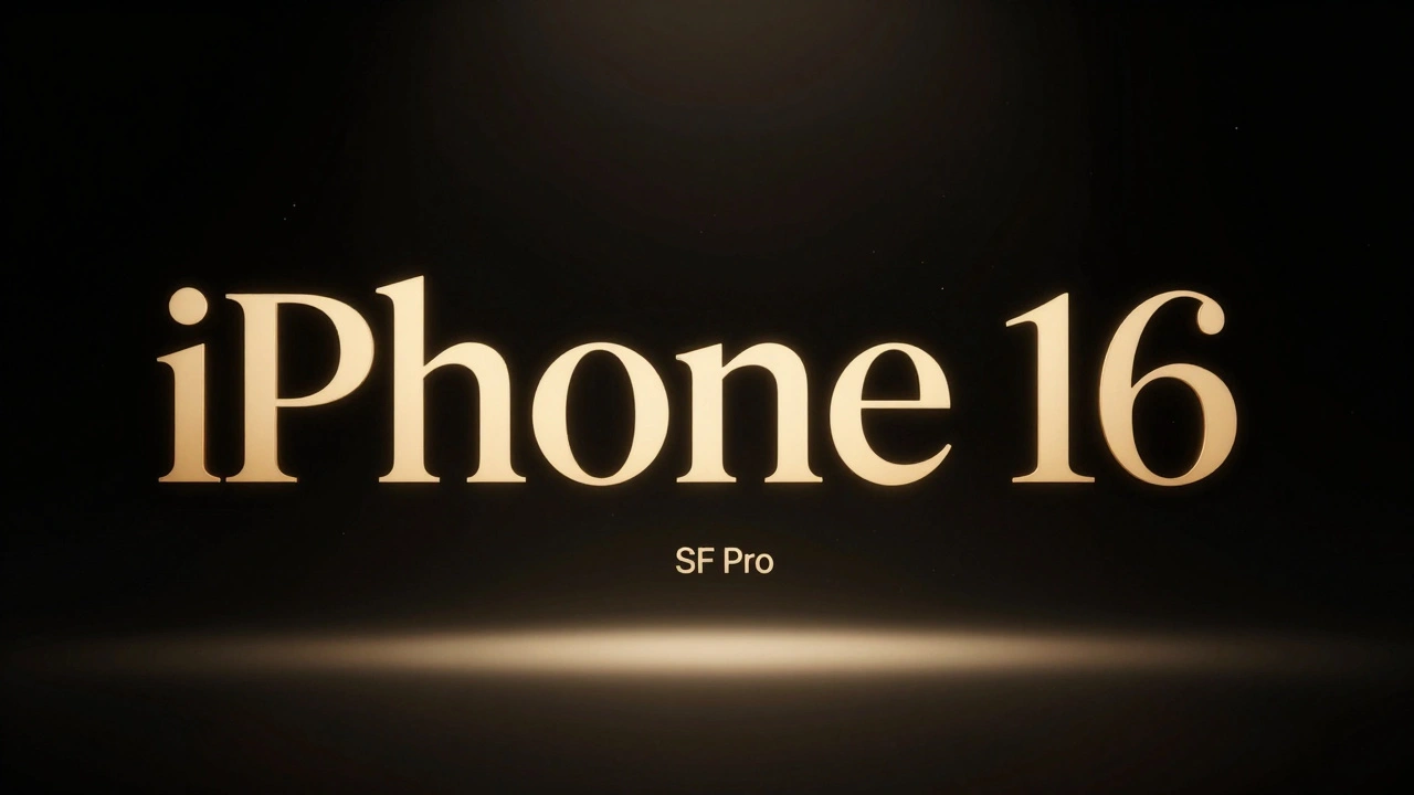
Apple uses serif headlines with sans-serif UI to create emotional contrast and clear hierarchy. New York serif for storytelling, SF Pro for functionality - a quiet design rule that makes their marketing unforgettable.