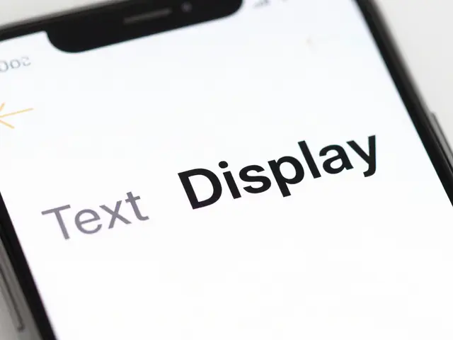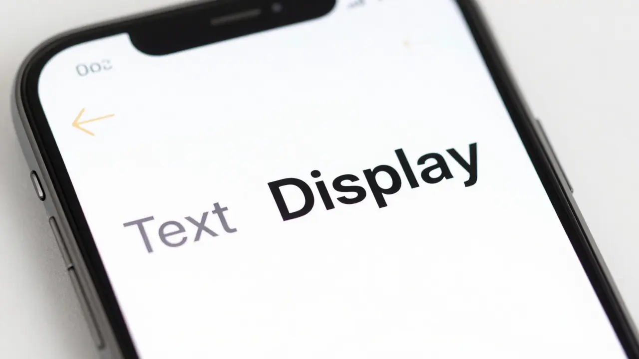

There is a subtle but critical difference between how SF Pro behaves at small sizes versus large sizes on an iPhone screen. If you have ever stared at a button label that looked slightly "off" or a headline that felt too heavy, you likely missed the distinction between SF Pro Text and SF Pro Display. For teams building robust component libraries, this isn't just a font choice; it is a structural decision that affects accessibility, visual hierarchy, and code efficiency. Getting this wrong means your designers are manually adjusting weights in Figma while developers are hardcoding font-variant settings in Swift or React Native, leading to inconsistencies across iOS and macOS platforms.
The core issue stems from optical sizing. Apple’s system font was engineered with two distinct masters: one optimized for legibility at smaller point sizes (Text) and another for aesthetic clarity at larger point sizes (Display). When you build a typography scale, you need to know exactly where that threshold lies so your components automatically switch variants without human intervention. This guide breaks down the technical thresholds, the practical implications for UI kits, and how to implement these rules using modern design tokens in tools like Figma and Sketch.
Understanding the Optical Size Threshold
Optical size adjustment is a typographic technique where letterforms change shape based on their intended reading distance and size. In the case of SF Pro, this transition happens at a specific breakpoint. Below this point, the font uses the "Text" master, which features wider spacing, taller x-heights, and thinner hairlines to prevent letters from blurring together on high-density OLED screens. Above this point, it switches to the "Display" master, which has tighter spacing, more contrast between thick and thin strokes, and a more elegant, condensed feel suitable for headlines.
The industry-standard threshold for SF Pro is 20 points. However, this number requires context. It refers to the point size of the text as rendered on the device, not necessarily the pixel value in your design file. On standard Retina displays, 1 point equals 2 pixels. Therefore, if your design tool shows a font size of 20pt, you are right at the boundary. Many designers mistakenly assume the switch happens at 24px or 32px because they are thinking in CSS pixels rather than native iOS points. To avoid confusion, always define your type scale in points within your design specifications, then map those to platform-specific units during development.
- Below 20pt: Use SF Pro Text. Ideal for body copy, captions, buttons, and table data.
- Above 20pt: Use SF Pro Display. Ideal for titles, subtitles, and large numerical displays.
- At 20pt: The system handles the blend, but for static design mocks, choose Display for a cleaner look or Text for maximum readability if the text is dense.
Why This Matters for Component Libraries
When you create a reusable button component, you might set the label to 17pt. This falls squarely in the Text range. But what happens when that same button is used in a hero section where the text scales up to 28pt? If your library doesn’t account for the variant switch, the text will retain the wide tracking of the Text master, making it look loose and amateurish compared to native Apple apps. Conversely, if you force Display mode on a 15pt caption, the tight spacing can cause collisions between characters, reducing legibility significantly.
This inconsistency erodes trust in your design system. Developers rely on component libraries to handle these nuances automatically. If the library requires manual overrides, adoption rates drop. By embedding the logic into your design tokens, you ensure that any team member-whether they are a junior designer or a senior engineer-produces output that matches Apple’s Human Interface Guidelines (HIG) without needing to memorize optical rules.
Implementing Rules in Design Tools
Modern design tools now support conditional logic through variables and styles. In Figma, you can create a variable collection for typography that includes both size and variant. Instead of creating separate styles for "Body Small" and "Body Large," you can create a single "Body" style that references a variable for weight and another for optical size. While Figma does not natively render the optical switch in real-time preview, you can simulate it by creating two parallel style sets: one for "Text Optimized" and one for "Display Optimized."
Here is a practical workflow for setting this up:
- Define Your Scale: Establish your base sizes (e.g., 13, 15, 17, 20, 24, 28, 34).
- Categorize by Variant: Mark all sizes under 20pt as "Text" and all sizes above 20pt as "Display."
- Create Dual Styles: For each size category, create a text style that explicitly selects the correct SF Pro variant. Name them clearly, such as "Type/17-Text" and "Type/24-Display."
- Document the Rule: Add a comment or description to each style explaining why the variant was chosen. This helps new team members understand the rationale behind the naming convention.
In Sketch, the approach is similar but relies heavily on shared text styles. You must be diligent about updating these styles if you adjust your scale, as changes do not propagate automatically across linked files unless you use plugins or strict version control practices.
Comparison of Variants in Practice
To visualize the difference, consider the following comparison of how the same word renders in both variants. The differences are subtle but become apparent when viewed side-by-side at high magnification.
| Attribute | SF Pro Text | SF Pro Display |
|---|---|---|
| Optimal Range | Up to 20pt | Above 20pt |
| Letter Spacing | Wider (looser) | Tighter (condensed) |
| X-Height | Taller relative to cap height | Standard proportion |
| Stroke Contrast | Lower contrast (thinner thicks) | Higher contrast (thicker thicks) |
| Best For | UI labels, body text, tables | Headlines, hero sections, logos |
Notice that the "Stroke Contrast" row is crucial. At large sizes, high contrast makes text look sophisticated. At small sizes, low contrast ensures that anti-aliasing doesn't eat away at the thin parts of the letters, keeping them crisp.
Common Pitfalls and How to Avoid Them
Even experienced designers trip up on this. One common mistake is mixing variants within a single line of text. For example, having a headline in Display mode followed immediately by a subhead in Text mode at a size close to the threshold can create a jarring visual rhythm. Ensure there is a clear size gap between elements that switch variants. A jump from 19pt to 22pt is safer than 19pt to 21pt, as the latter sits too close to the 20pt boundary where the eye might perceive inconsistency.
Another pitfall is ignoring dynamic type. iOS allows users to increase text size globally. When a user bumps their text size from Medium to Accessibility XL, a 17pt label might render at 25pt. Does it switch to Display? Yes, the system handles this automatically. However, if you are designing a fixed-layout mockup for marketing purposes, you must decide whether to show the default state or the scaled state. For component libraries, document that the system handles the switch dynamically, so designers should not worry about manual adjustments for accessibility sizes.

Developer Handoff and Code Implementation
For developers, the implementation is straightforward but requires attention to detail. In SwiftUI, you don’t manually specify "Text" or "Display." You simply use the semantic fonts provided by the system, such as `.body`, `.headline`, or `.largeTitle`. The framework automatically applies the correct optical variant based on the resulting point size. This is why relying on semantic font names in your codebase is best practice. Avoid hardcoding `Font.system(size: 24)` unless you have a very specific reason to bypass the automatic optical sizing.
In React Native, the situation is slightly more complex. You often need to specify the font family explicitly. Ensure you are using the correct font file references. If you are bundling custom fonts, make sure both the Text and Display masters are included. Most cross-platform frameworks now abstract this away, but if you are working with raw UIKit or Android equivalents, verify that the font loading logic respects the optical size parameter. Misconfigured font loading can result in the fallback system font being used, which may not have the same optical refinements.
FAQ
What is the exact point size where SF Pro switches from Text to Display?
The switch occurs at 20 points. Sizes below 20pt use the Text variant, while sizes above 20pt use the Display variant. At exactly 20pt, the system blends the characteristics, but for design consistency, treat 20pt and above as Display for headlines and 20pt and below as Text for body content.
Do I need to include both SF Pro Text and Display font files in my app bundle?
If you are using the system font via semantic styles in SwiftUI or UIKit, no, the OS handles it. If you are bundling custom fonts or using a cross-platform framework that requires explicit font registration, yes, you should include both variants to ensure full fidelity across all possible text sizes.
How does Dynamic Type affect the optical size selection?
Dynamic Type scales the point size of text. As the size increases past the 20pt threshold due to user preference, the system automatically switches to the Display variant. Designers should test their layouts at the largest accessibility size to ensure that the switch to Display doesn’t break line lengths or cause overflow issues.
Can I use SF Pro Display for small text if I want a tighter look?
Technically yes, but it is generally discouraged. Using Display for small text reduces legibility due to tighter spacing and higher stroke contrast. Reserve Display for sizes where elegance is prioritized over maximum readability, typically above 20pt.
Does this rule apply to macOS as well?
Yes. SF Pro is the system font for both iOS and macOS. The optical sizing rules remain consistent across platforms. However, because macOS screens are often viewed from greater distances, designers might lean towards Display variants slightly more frequently for interface elements that would be considered "medium" size on mobile.