Wolf and Hare

Tag: component libraries

SF Pro Text vs. Display: Typography Scales for Apple Component Libraries
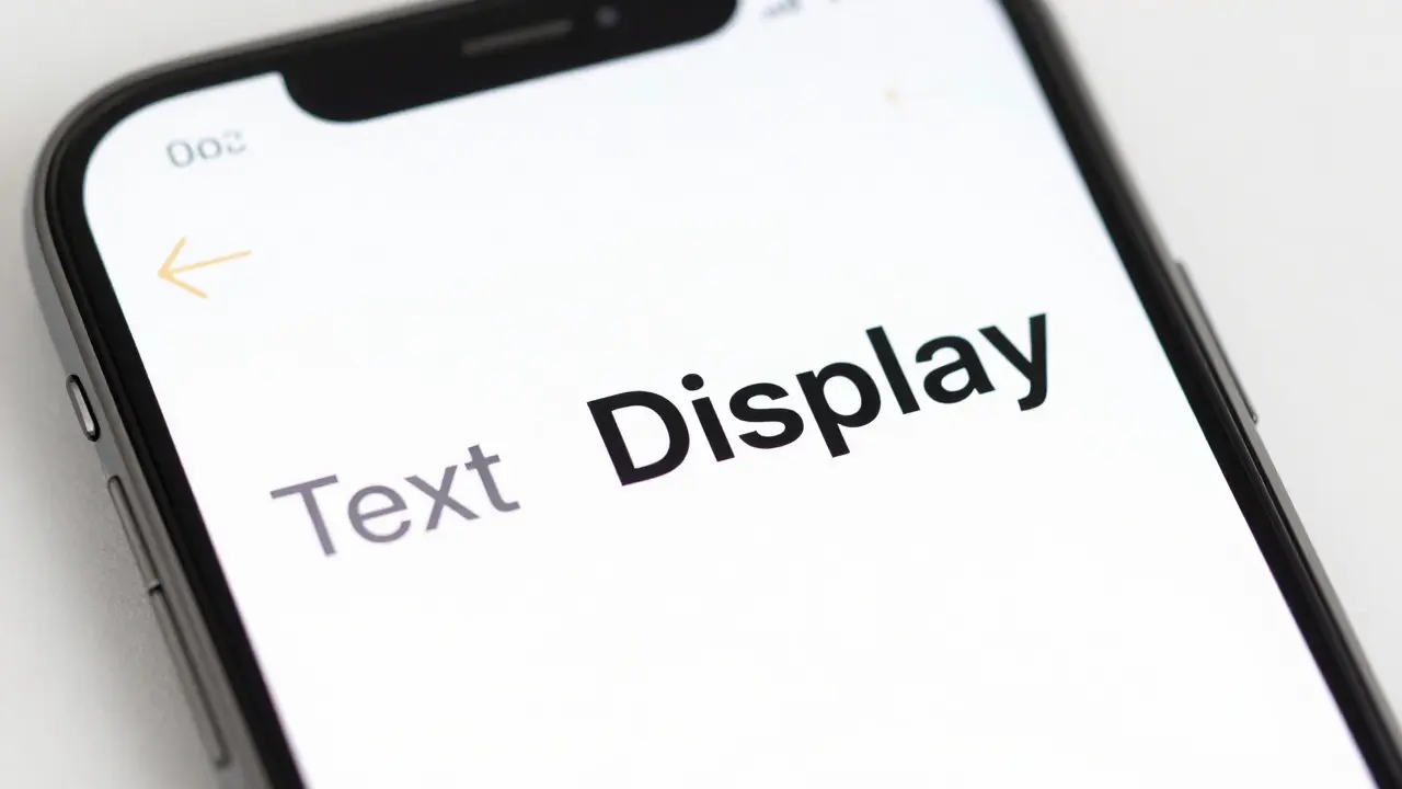
SF Pro Text vs. Display: Typography Scales for Apple Component Libraries
  • Elias Voss
  • Elias Voss

23/08
0

Learn how to correctly implement SF Pro Text and Display variants in your component libraries. Understand the 20pt optical size threshold and how to set up design tokens for consistent typography across Apple platforms.

Read More...

Categories

  • Design & Technology (264)
  • Retail Design (15)
  • Design Tools (10)
  • Technology (7)
  • Design & Development (6)

Popular Articles

Thermal Design in MacBook: How Apple Achieves Quiet Performance Without Sacrificing Thin Form

Jan 19 2026

Apple Retail Accessibility: Inclusive Navigation and Interaction Design Guide

Aug 17 2026

Water Resistance by Design: Interface Cues for Swim and Rain Scenarios

Jan 9 2026

Ecosystem-Wide Usability at Apple: Shared Mental Models Across iOS, iPadOS, and macOS

Mar 31 2026

Mastering New York (SF Serif): Using Apple's Serif Scales for Editorial Interfaces

Apr 28 2026

Tags

  • Apple design
  • Apple ecosystem
  • industrial design
  • user experience
  • Apple typography
  • Apple Intelligence
  • Liquid Glass
  • inclusive design
  • Apple design philosophy
  • Apple Human Interface Guidelines
  • Apple packaging
  • Jony Ive
  • iOS design
  • unboxing experience
  • iOS 26
  • Apple accessibility
  • sustainable packaging
  • SF Pro
  • UI design
  • San Francisco font
Wolf and Hare

© 2026. All rights reserved.