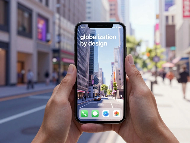

Have you ever tried to reach a "Save" button at the very top of your phone screen while walking, only to almost drop your device? That struggle isn't a lack of coordination; it's a conflict between human anatomy and digital architecture. The physical shape of the iPhone-its iPhone design form factor-dictates exactly where a user's thumb can comfortably reach and where it can't. When developers ignore these ergonomic constraints, they create "friction," making an app feel clunky regardless of how pretty the graphics are.
To build an app that feels natural, you have to stop thinking about the screen as a flat canvas and start seeing it as a physical object held in a human hand. This means balancing the strict requirements of the iOS 17 Design Guidelines the current standard for Apple's software interface and layout specifications with the biomechanical reality of how people actually grip their phones.
The Golden Rule of Mobile-First Widths
In web design, we're used to scaling down from a desktop monitor to a phone. In the iOS ecosystem, you do the exact opposite. Because height is essentially infinite (users just scroll), the only constraint that truly matters is the width. If you design for the narrowest common screen first, your layout will naturally breathe and expand as it moves to larger models.
Industry standards focus on two primary reference points: 375 points the standard width for narrower iPhone models and 430 points the width for modern, larger iPhone Pro Max models. By targeting the 375-point width first, you ensure that your content doesn't feel cramped on the base models. When that design scales up to 430 points, you aren't stretching elements-you're adding whitespace or expanding margins, which keeps the interface feeling premium rather than distorted.
Precision Timing: The 8-Point Grid and Margins
Ever notice how some apps just feel "tight" and professional, while others feel haphazard? That's usually the result of a strict grid system. Apple recommends an 8-point grid, meaning every single element-the height of a button, the padding between a photo and a caption, the gap between list items-is a multiple of 8.
This isn't just about OCD; it's about visual rhythm. When you combine an 8-point grid with a standard 16-point margin on the left and right, you create a consistent "safe zone" for your content. If your gutter (the space between columns) is also 16 points, the eye recognizes a pattern. This predictability allows the user to focus on the content rather than the interface. When you deviate from these numbers, the human brain perceives it as a mistake, even if the user can't consciously explain why.
| Element | Standard Value | Purpose |
|---|---|---|
| Grid Base | 8 points | Consistent vertical/horizontal spacing |
| Side Margins | 16 points | Prevents content from touching screen edges |
| Gutter Width | 16 points | Standard separation between layout columns |
| Primary Text | 17 points | Maximum legibility for body copy |
Solving the Thumb Reach Problem
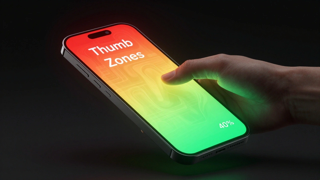
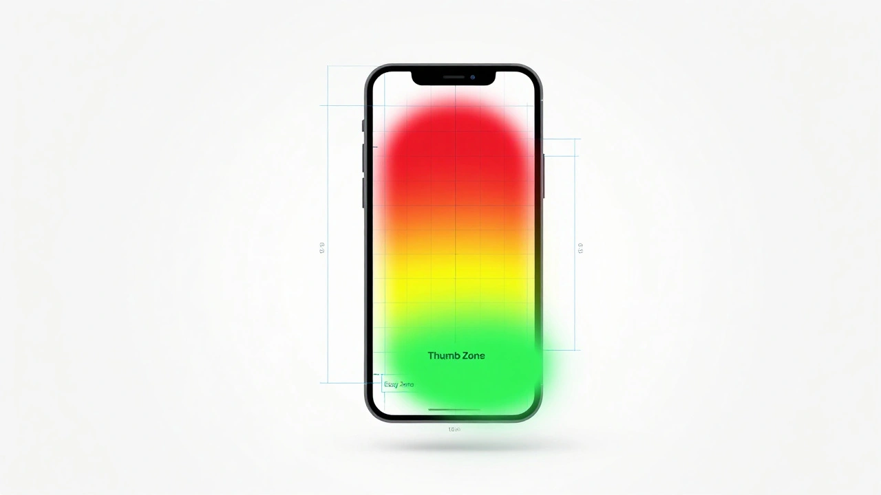
The most critical part of iPhone design is understanding the "Thumb Zone." Your thumb has a limited range of motion. The bottom of the screen is the "Easy Zone," while the top corners are the "Stretch Zone." Because our precision drops as we reach higher, the targets in those areas actually need to be different sizes.
For interactive elements in the lower regions, the target should be at least 12 millimeters (roughly 34 points). However, when you place a button in the upper region, where the thumb is extended and less stable, you need a target of at least 11 millimeters (about 31 points) but with a larger surrounding buffer to prevent accidental clicks on neighboring elements. This is why you see a trend in modern apps where primary actions-like "Next" or "Buy Now"-have migrated from the top navigation bar to the bottom of the screen.
Navigating the Safe Area and the Notch
Modern iPhones aren't perfect rectangles; they have rounded corners and the Dynamic Island the interactive pill-shaped cutout for sensors and notifications. This introduces the concept of the Safe Area the region of the screen where content is guaranteed not to be clipped by hardware.
A common mistake is trying to keep everything inside the safe area. That creates a "boxed-in" look with ugly white gaps. Instead, you should let your backgrounds and images bleed to the very edge of the glass-filling the entire screen-while keeping your functional content (buttons, text, and inputs) strictly within the safe area boundaries. This gives the app an immersive feel while ensuring the user doesn't have to fight a rounded corner to click a button.
Establishing Visual Hierarchy with Typography
You can't just make everything bold to show it's important. In iOS, hierarchy is built through a combination of size, weight, and opacity. The San Francisco the default system typeface designed by Apple for legibility on small screens font is engineered specifically for this.
- Primary Level: Large page titles start at 34 points bold. But here is the trick: as the user scrolls, that title should shrink to 17 points medium to make room for content.
- Secondary Level: Body text and list titles sit at 17 points regular. This is the baseline for readability.
- Tertiary Level: For captions or supporting info, use 13 to 15 points in gray (#3C3C43) with 60% opacity. This tells the user, "This is here if you need it, but it's not the main point."
By manipulating opacity rather than just changing the color to a light gray, the text blends better with different background colors, maintaining a native iOS look and feel.
Adaptive Architecture and Orientation
Your app shouldn't just "rotate" when the phone is turned sideways; it should adapt. Apple uses Size Classes a system that categorizes screen dimensions into Compact or Regular widths and heights to handle this. For most iPhones in portrait mode, you're dealing with a "Compact Width" and "Regular Height."
When a user flips to landscape, the width becomes "Regular." Instead of just stretching your portrait layout to fill the wide screen-which creates awkwardly long lines of text that are hard to read-you should shift to a side-by-side layout. For example, a list of emails on the left and the email content on the right. This uses the horizontal space efficiently without forcing the user to scroll excessively.

iOS vs. Android: A Different Philosophy
If you're coming from an Android background, you'll notice the ergonomics are fundamentally different. Android's Material Design Google's design system based on tactile surfaces and layered shadows often uses Floating Action Buttons (FABs) in the bottom right. iOS, however, prefers a bottom tab bar for primary navigation and places "Add" or "Edit" actions in the top right of the navigation bar.
Even the text differs. While iOS mandates 17 points for primary text, Android often uses 14 semantic pixels. These small differences reflect different philosophies on how devices are held and how information should be digested. Following the iOS-specific patterns ensures your app doesn't feel like a "port" of another platform, but like it was built specifically for the iPhone.
What is the absolute minimum tap target size for iOS?
While buttons can be visually smaller, the actual tappable area should be at least 11mm (about 31 points) in the upper screen and 12mm (about 34 points) in the lower, more reachable screen areas to ensure accuracy.
Why should I design for the 375pt width first?
Designing for the smallest common width prevents layout breaking when the app is viewed on smaller devices. It is much easier to scale a compact design upward to a 430pt screen than it is to cram a large design into a small one.
How do I handle the notch/Dynamic Island in my layout?
Use Safe Area layout guides. Let your background colors and images fill the entire screen (including the notch area), but keep all interactive buttons and critical text inside the Safe Area to avoid clipping.
What is the difference between a margin and a gutter?
A margin is the space between the edge of the screen and your content (standard 16pt). A gutter is the space between two separate columns of content within that layout (also typically 16pt).
Do I need to design a separate layout for landscape mode?
You don't necessarily need a separate design, but you should use Adaptive Layouts (Size Classes) to ensure content doesn't just stretch. Consider side-by-side views for landscape to utilize the extra width.
Next Steps for Your Layout
If you're just starting, grab a Figma template with the current iOS 17 rulers. Don't guess where the status bar ends or where the home indicator begins; use the official markers. Start by mapping out your primary actions-if they are in the top third of the screen, ask yourself if they can move to the bottom. If you're struggling with a complex screen, try stripping away the secondary and tertiary text to see if the visual hierarchy still makes sense. Finally, test your app on both a base model iPhone and a Pro Max model to see how your 375pt-to-430pt scaling actually behaves in the real world.