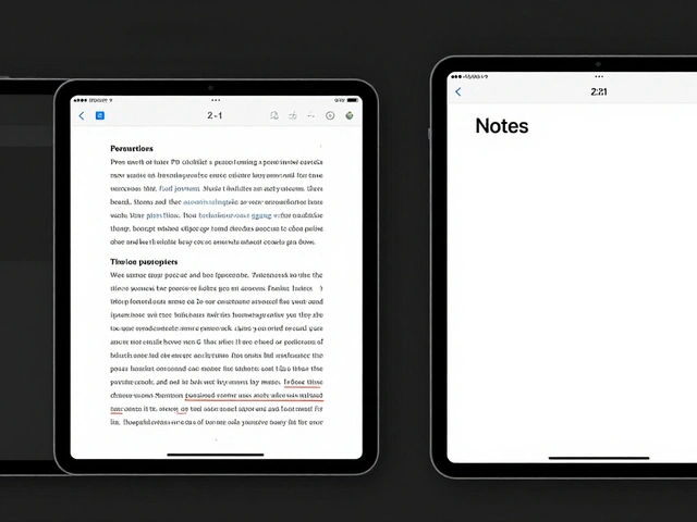

Imagine trying to use your favorite app, but your mouse just stopped working. For many, this is a temporary annoyance. For others-people with motor disabilities or visual impairments-it's a daily reality. This is where keyboard navigation is the ability to interact with a software interface using only a keyboard, bypassing the need for a pointing device. If the focus jumps randomly across the screen or the highlight disappears, the app becomes a digital maze. Getting this right isn't just about "checking a box" for compliance; it's about making sure everyone can actually use your software.
The Hidden Switch: Enabling Full Keyboard Access
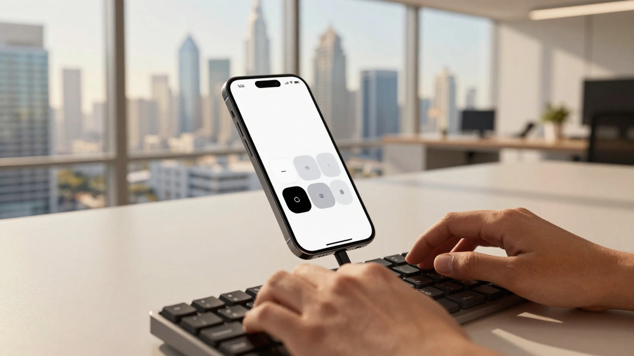
Here is the first hurdle: by default, macOS is surprisingly restrictive with its keyboard settings. Most users will find that the Tab key only moves them between text fields and lists. To unlock the full power of the system, you have to dive into the settings. If you're a developer testing your app or a user wanting a better experience, you need to head to System Settings (formerly System Preferences), find the Keyboard section, and under the Shortcuts tab, enable the option to "Use keyboard navigation to move focus between controls."
Without this toggle, many buttons, checkboxes, and pop-up dialogs remain invisible to the keyboard. It's a critical step that transforms the OS from a mouse-centric environment into one that is truly accessible. Once active, the Tab key becomes the primary engine for moving through the interface.
Understanding the Tab Loop and Focus Groups
Apple doesn't just treat every button as a flat list. Instead, it uses a system of focus groups to organize how a user moves through an app. Think of it as a map: the Tab key is for traveling between major neighborhoods, while the arrow keys are for walking the streets within those neighborhoods.
The Tab Loop is the sequence of primary focusable elements across an interface that a user cycles through by repeatedly pressing the Tab key. This flow generally follows a natural reading order-left to right, top to bottom. When you hit Tab, you move forward; hitting Shift+Tab lets you backtrack. But when you land inside a complex area-like a grid of photos or a detailed menu-the Tab key might jump you right out of that section. To explore the details inside, you switch to the arrow keys (↑, ↓, ←, →).
| Input Key | Primary Function | Scope of Movement | Best For... |
|---|---|---|---|
| Tab / Shift+Tab | Global Navigation | Between Focus Groups | Moving quickly across the main UI |
| Arrow Keys | Local Navigation | Within a Focus Group | Lists, grids, and radio groups |
| Enter / Spacebar | Activation | Single Element | Clicking buttons or triggering links |

The Psychology of the Focus Indicator
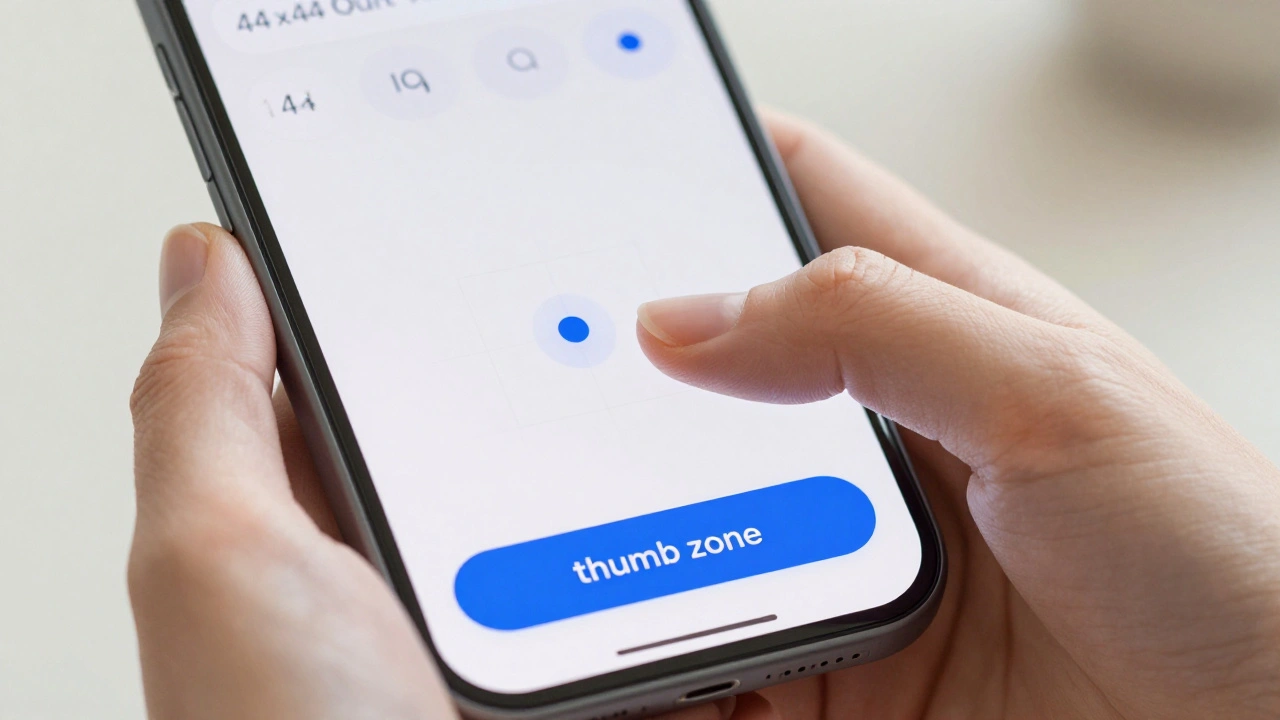
If you can't see where you are, you're just guessing. The Focus Indicator is the visual highlight (such as a blue ring or outline) that identifies which element is currently active and ready for input. For a sighted keyboard user, this is their only way of maintaining spatial awareness. If the indicator is too thin, low-contrast, or-worst of all-hidden, the user is effectively blind to their own progress.
Standards like the Web Content Accessibility Guidelines (WCAG) is a set of international standards (specifically section 2.4.3) that ensures web content is accessible to people with disabilities. These guidelines insist that the focus order must be logical. When an interface violates this, it creates a "puzzle effect." For example, if a user tabs from a header at the top of the page, suddenly jumps to a footer at the bottom, and then bounces back to the middle, it's disorienting and frustrating. The focus should always move in a way that matches the visual layout of the content.
Developer Deep Dive: Managing Focus in UIKit and Mac Catalyst
For those building apps, especially using UIKit is Apple's software framework for building user interfaces on iOS and iPadOS, which also powers Mac Catalyst apps. , focus management is more than just a setting; it's an architecture. The focus system is tied directly to the responder chain. This means that when an item is focused, it becomes the primary target for key events. If that item doesn't know how to handle a specific key press, the event travels up the chain to the parent view.
One of the most useful tools here is the selectionFollowsFocus property. In a complex data table, you don't want the user to have to Tab to a cell and then press Enter just to select it. By enabling this feature, the act of navigating to the item automatically selects it. This reduces the number of keystrokes needed to complete a task, which is a massive win for efficiency and accessibility.
Developers can also assign focus group identifiers. This tells macOS, "These five elements belong together." If a user leaves that group and then returns, the system remembers where they were. This prevents the disorientation of being dumped back at the start of a long list every time you navigate away.

Common Pitfalls and How to Audit Your App
Even experienced teams miss keyboard bugs because they rely too much on the mouse. To truly test for inclusive design, you have to put the mouse away. A manual accessibility audit should follow a strict process:
- The Tab Test: Can you reach every single interactive element using only Tab and Shift+Tab? If a button is "unreachable," it's a critical bug.
- The Logic Check: Does the focus move in a predictable direction? If it jumps from the bottom-left to the top-right unexpectedly, the focus order needs to be remapped.
- The Visibility Audit: Is the focus ring clearly visible against all background colors? If the ring is light grey on a white background, it fails.
- The Trap Check: Is there any part of the app where the user can get "stuck"? A keyboard trap happens when you can Tab into a component (like a complex calendar picker) but can't Tab back out.
When conflicts arise-such as a custom key command fighting with a system shortcut-developers can use the wantsPriorityOverSystemBehavior property. However, use this sparingly. Overriding system behavior can confuse users who expect the Mac to behave like a Mac.
Why is the Tab key not working for all buttons on my Mac?
By default, macOS limits Tab navigation to text fields and lists. To enable full navigation for all controls, go to System Settings > Keyboard > Shortcuts and check the box for "Use keyboard navigation to move focus between controls."
What is a "keyboard trap" in accessibility?
A keyboard trap occurs when a user can navigate into an element using the keyboard but cannot find a way to navigate out of it. This often happens with complex custom widgets or third-party plugins, effectively locking the user in that section of the page.
How does the focus order differ between macOS and tvOS?
macOS uses a hybrid system of Tab keys for global movement and arrow keys for local movement. In contrast, tvOS relies exclusively on directional focus (arrow keys), as it is designed for a remote control rather than a full keyboard.
What is the best way to ensure my focus indicator is visible?
Use a high-contrast color that stands out against your app's theme. Avoid relying on a single color (like blue) if your app has a blue theme; instead, use a combination of an outline and a slight color shift or a shadow to ensure it's distinguishable.
Does selectionFollowsFocus help users with motor impairments?
Yes. It reduces the physical effort required by combining two actions (focusing and selecting) into one. By removing the need to press a second "activation" key, it streamlines the workflow and reduces fatigue for the user.
Next Steps for Implementation
If you're a user, start by enabling the keyboard navigation setting in your System Settings to see how your current apps hold up. If you're a developer, your first step should be a manual audit. Turn off your mouse and try to complete a core task in your app using only the keyboard. You'll likely find gaps in your focus order that automated tools simply can't detect. From there, define your focus groups and ensure every interactive element has a high-contrast visual cue before pushing your next update.