
There is nothing more frustrating than tapping a button and staring at a frozen screen. You tap again. Nothing happens. Did the app crash? Is your internet dead? This anxiety stems from one missing element: feedback. In Apple interfaces are built on the principle that silence is failure. When an operation takes longer than a blink, you must tell the user what is happening. This is where progress indicators come in. They are not just decorative spinners; they are critical usability tools that prevent users from thinking their device has stalled.
The Psychology of Waiting: When to Show Feedback
Before picking a spinner or a bar, you need to understand how human perception works with digital delays. Usability expert Jakob Nielsen established a rule that still holds true today: if a response takes less than 0.1 seconds, it feels instantaneous. No indicator is needed. But once you cross that 0.1-second threshold, the illusion of direct manipulation breaks. Users start to feel a lag.
When a delay exceeds 1.0 second, users no longer feel like they are operating directly on data. At this point, you must provide visual feedback. If the wait goes beyond 10 seconds, you risk losing the user entirely unless you provide a detailed explanation of why the process is taking so long. For most everyday tasks-loading a feed, saving a draft, fetching weather data-you are working in that 1-to-10-second window. This is the sweet spot for standard progress indicators.
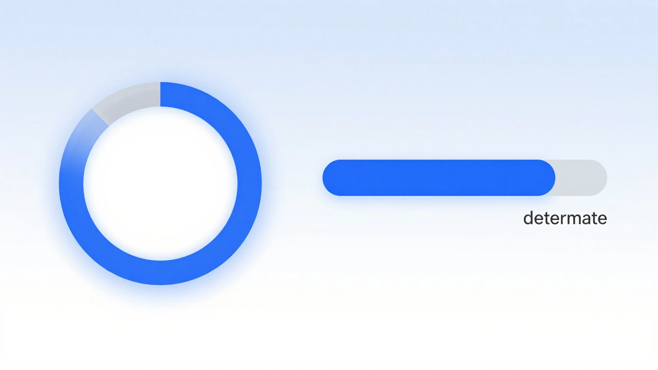
Determinate vs. Indeterminate: Choosing the Right Type
Apple’s design system splits progress indicators into two main categories based on whether the system knows how long the task will take. Understanding this distinction is crucial for choosing the right component.
- Indeterminate Indicators: These show that something is happening but do not specify when it will finish. Think of a spinning wheel or a pulsing dot. Use these when the duration is unpredictable, such as waiting for a network response or processing an image where the file size varies wildly.
- Determinate Indicators: These show specific progress, often as a percentage or a filled bar. Use these when you can calculate the completion rate, like uploading a file or installing an app update. Users prefer determinate indicators because they give them control over their time-they know exactly how much longer they have to wait.
If you can calculate the progress, always use a determinate indicator. It reduces anxiety by setting clear expectations. If you cannot predict the end time, stick to an indeterminate style to avoid misleading the user with a stuck-looking bar.
Implementing Indicators in SwiftUI
For modern iOS and macOS development, SwiftUI provides a unified approach through the ProgressView component. It adapts its appearance based on context and modifiers, making it easier to maintain consistency across platforms.
SwiftUI offers two primary styles for ProgressView:
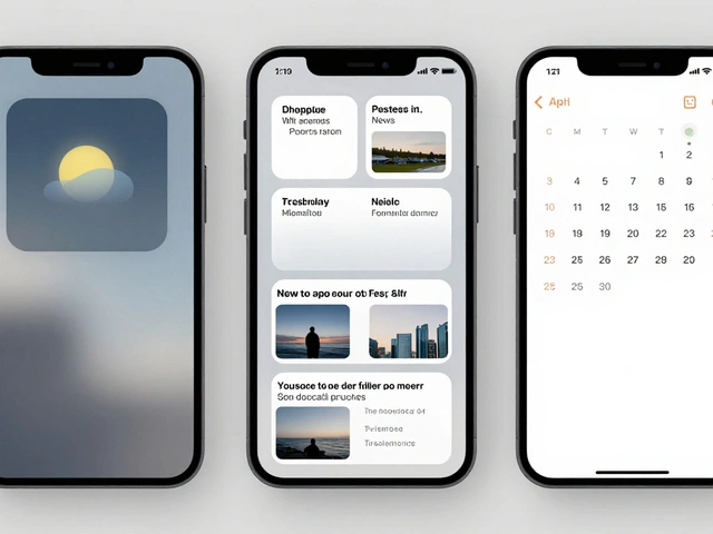
- CircularProgressViewStyle: This displays a rotating circular activity indicator. It is ideal for indeterminate states where you want to keep the user’s attention focused on a single point without cluttering the interface. For example, while a weather app fetches live data, a small circular spinner in the corner signals activity without blocking the previous day’s forecast.
- LinearProgressViewStyle: This presents progress as a horizontal bar filling from left to right. It is best suited for determinate tasks with known endpoints, such as downloading a large document. The linear style gives users a clear visual representation of how much work remains.
You can customize the color of these indicators using the .accentColor() modifier. This ensures the progress indicator matches your app’s branding while maintaining system-level accessibility standards. For advanced customization, you can create a struct conforming to the ProgressViewStyle protocol, allowing you to define entirely unique animations or shapes if the default styles don’t fit your design language.
| Style | Best Used For | User Perception | Customization Level |
|---|---|---|---|
| CircularProgressViewStyle | Indeterminate tasks (network calls) | "Something is loading" | Medium (color, scale) |
| LinearProgressViewStyle | Determinate tasks (file uploads) | "X% complete" | High (width, height, color) |
Legacy Frameworks: UIKit and AppKit
While SwiftUI is the future, many apps still rely on UIKit for iOS and AppKit for macOS. Understanding these legacy components is essential for maintaining existing codebases or building hybrid apps.
In UIKit, the standard component is UIActivityIndicatorView. It serves as the native indeterminate progress indicator. To use it effectively, you typically embed it within a view controller’s content area or overlay it on top of other elements. You start the animation with startAnimating() and stop it with stopAnimating() once the task completes. Failing to stop the animation can lead to confusing UX bugs where the spinner runs forever after the data has loaded.
On macOS, NSProgressIndicator is the core class within AppKit. It supports both determinate and indeterminate modes. Configuring a circular determinate indicator in AppKit requires careful setup. You must disable auto-resizing masks by setting translatesAutoresizingMaskIntoConstraints = false to enable Auto Layout constraints. Then, set the style to .circular and ensure isIndeterminate is set to false. Finally, call sizeToFit() to ensure the component renders at its correct dimensions. You can then assign values directly, such as setting the value to 75 to represent three-quarters completion.
Interaction Patterns: Obstructive vs. Parallel
How your app behaves while the indicator is visible matters just as much as the indicator itself. There are two main interaction patterns:
- Obstructive Indicators: These block user interaction, often appearing as a modal overlay or dimming the background. Use this pattern when the ongoing task makes the current screen invalid or when navigating away would cancel the process. For example, during a payment transaction, you should prevent the user from changing the amount or leaving the page.
- Parallel Indicators: These allow users to continue interacting with the app while the task runs in the background. This is appropriate when the task does not depend on the current screen state. For instance, while syncing photos in the background, a user should still be able to browse their gallery. A small icon in the status bar or a subtle spinner in the corner suffices here.
Choosing the wrong pattern can frustrate users. Blocking interaction unnecessarily feels restrictive, while allowing interaction during critical operations can lead to data corruption or confusion.

Accessibility and Motion Sensitivity
Accessibility is not an afterthought; it is a core requirement for any inclusive interface. Progress indicators must be usable by everyone, including those with visual impairments or motion sensitivity.
For VoiceOver users on iOS, if a screen contains only a progress indicator and no other readable content, focus should immediately shift to that indicator. VoiceOver must announce the presence of the indicator and, ideally, the status of the task. Simply having a spinning wheel without an accessible label leaves blind users guessing what is happening.
Motion sensitivity is another critical consideration. Some users experience discomfort or dizziness from continuous animations. Apple provides a Reduce Motion accessibility setting. When this setting is enabled, developers should replace animated spinners with static text labels or non-animated icons. Do not simply stop the animation; provide an alternative way to convey progress. A simple "Loading..." text that updates to "Still loading..." after a few seconds is a respectful and effective fallback.
Best Practices for Messaging
A progress indicator without context is ambiguous. Always pair visual cues with descriptive text. Start with a generic message like "Loading" or "In Progress." If the operation takes longer than expected-say, more than two seconds-update the message to acknowledge the delay. Phrases like "Still loading" or "Fetching data" reassure users that the app hasn’t crashed.
If the delay is significant, consider adding a brief apology or explanation. "Sorry for the wait. We may be working on a slow connection. Not your fault though, our bad." This human touch reduces frustration and builds trust. Avoid technical jargon like "Establishing handshake" or "Parsing JSON." Users care about outcomes, not processes.
When should I use a determinate vs. indeterminate progress indicator?
Use a determinate indicator when you can accurately calculate the percentage of completion, such as file uploads or downloads. Use an indeterminate indicator when the duration is unknown or variable, such as waiting for a network response or processing complex data.
How do I handle Reduce Motion settings in my app?
Check the accessibility settings using UIAccessibility.isReduceMotionEnabled in UIKit or equivalent checks in SwiftUI. If enabled, replace animated spinners with static text labels or non-animated icons to accommodate users sensitive to motion.
What is the difference between UIActivityIndicatorView and NSProgressIndicator?
UIActivityIndicatorView is used in iOS (UIKit) primarily for indeterminate progress. NSProgressIndicator is used in macOS (AppKit) and supports both determinate and indeterminate modes, offering more flexibility for desktop applications.
Should I block user interaction during a progress indicator?
Block interaction only if the ongoing task makes the current screen invalid or if navigating away would cancel the process. Otherwise, allow parallel interaction to keep the user engaged and productive while the task completes.
How do I make progress indicators accessible for VoiceOver users?
Ensure the progress indicator has an accessible label that describes the action. If the screen contains only the indicator, move VoiceOver focus to it immediately. Update the label dynamically if the status changes, such as from "Loading" to "Complete."
Categories
Popular Articles