
The Apple Watch didn’t just enter the market in 2015-it redefined what a smartwatch could be. Before then, most smartwatches were clunky, confusing, or just plain impractical. Apple changed that by listening. Not just to engineers or marketers, but to real people who wore watches every day and wanted something that felt like a watch first, and a computer second. Over the last decade, every change to the Apple Watch’s shape, screen, buttons, and materials came from one simple question: How do we make this easier, safer, and more useful for the person wearing it?
The First Watch: A Rectangle That Felt Right
The original Apple Watch, launched in April 2015, came in two sizes: 38mm and 42mm. That was deliberate. Competitors had mostly offered one-size-fits-all designs, ignoring that wrists vary. Apple knew that. So did users. The rectangular shape wasn’t radical-it was familiar. But the details made all the difference. The Digital Crown wasn’t just a button; it was a way to scroll without blocking the screen. The screen turned on when you lifted your wrist. No buttons to press. No confusing menus. Just a glance.It wasn’t perfect. Battery life was tight. Apps were basic. But it worked. And that was the point. It didn’t try to replace your phone. It made your phone better by putting the right info at your wrist.
Series 3: The Watch That Started Talking Back
By 2017, Apple Watch Series 3 added something users had been asking for: cellular. No more needing your phone nearby. You could leave your phone at home, go for a run, and still get calls, messages, or music. But the real game-changer? Siri on your wrist. Suddenly, you could ask for directions, start a timer, or send a text without touching the screen. For people driving, cycling, or lifting weights, this wasn’t a luxury-it was a necessity.The S3 chip made everything faster. Apps loaded quicker. Notifications came through without delay. The barometric altimeter let hikers track elevation changes. These weren’t flashy features. They were quiet improvements that made the watch feel more alive.
Series 4: Bigger Screen, Smaller Bezels
In 2018, Apple did something bold. They made the screen bigger-30% bigger-without making the watch any larger. How? They shaved off the thick black borders around the display. The edges curved gently, making the watch feel more like a traditional timepiece. People noticed. Reviews called it the most important redesign since the original.It wasn’t just about looks. A bigger screen meant you could see more at once. More health data. More map details. More messages. And for older users or those with vision challenges, that mattered. This was the same year Apple added an ECG sensor. For the first time, a consumer watch could detect irregular heart rhythms. It wasn’t a medical device-but it gave people early warnings. Thousands of users later said it helped them catch problems before they became emergencies.
Series 5: The Always-On Display That Changed Everything
The biggest complaint about the Apple Watch? You had to lift your wrist to see the time. That’s it. Just to see the time. In 2019, Apple fixed it. The Always-on Display didn’t just make the screen stay on-it made it smarter. Using LTPO screen tech, the display dropped to 1Hz when idle, using almost no power, then jumped to 60Hz the moment you moved your wrist. Battery life stayed the same. The convenience? Infinite.People didn’t just like it. They relied on it. No more fumbling to wake the screen while holding groceries. No more missing a notification because you were mid-sentence. This feature became so essential that every other smartwatch brand copied it within a year. Apple didn’t invent it-but they made it work, and made it feel natural.
Series 7: More Screen, Less Border
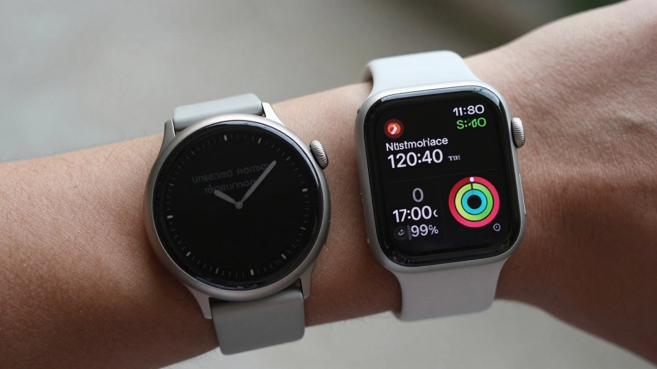
In 2021, Apple didn’t reinvent the watch. They refined it. The screen grew again-41mm and 45mm sizes replaced the old 40mm and 44mm. The bezels shrank even more. The screen now stretched almost to the edges. It looked sleeker. It felt more modern. But the real win? More space for complications. More room for health metrics. More visibility for older eyes.And the bands? Still compatible. Apple didn’t force users to buy new straps. That’s rare in tech. Most companies change connectors every year. Apple kept the system simple. You could still use your 2015 band on a 2021 watch. That kind of backward compatibility built trust.
Ultra: A Watch Built for the Real World
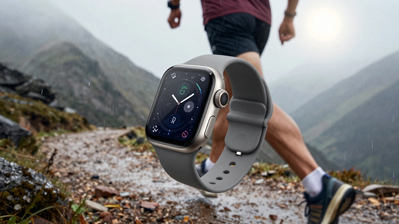
In 2022, Apple didn’t just update the Series. They created a new category: the Apple Watch Ultra. This wasn’t for everyone. It was for climbers, divers, trail runners, and outdoor pros. Titanium case. Sapphire glass. A ribbed, oversized Digital Crown you could turn with gloves on. A loud, clear siren for emergencies. A 100-meter water resistance rating. A 36-hour battery.It looked different. It felt different. And users loved it. Why? Because Apple listened to people who used watches in extreme conditions. The old crown was too small. The screen was too dim. The battery died too fast. The Ultra solved those problems-without turning the whole lineup into a rugged device. It gave outdoor enthusiasts a tool, not a toy.
Series 9 and Ultra 2: The Quiet Revolution
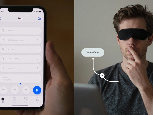
By 2023, Apple didn’t need flashy changes. They needed smarter ones. The S9 chip brought machine learning right onto the watch. That meant faster health analysis, better Siri responses, and on-device processing-no phone needed. The biggest upgrade? Double-tap.Double-tap lets you control the watch by tapping your thumb and index finger together. No screen touch. No voice command. Just a quick pinch. It was designed with accessibility in mind. People with limited hand mobility, people wearing gloves, people carrying gear-all of them could now answer calls, pause music, or check their heart rate without fumbling. It felt like magic. And it worked.
Ultra 2 pushed brightness to 3000 nits. That’s sunlight-proof. Even on a snowy mountain at noon, the screen stayed clear. The UWB chip got smarter, too. If you lost your watch, it could tell you exactly where it was-down to the inch.
Series 10 and 11: Evolution, Not Revolution
By 2024 and 2025, Apple stopped trying to shock. They kept improving. Battery life stretched. Health sensors got more accurate. Temperature sensing, fall detection, crash detection-all now standard. The design? Still rectangular. Still familiar. Still comfortable.Why not change the shape? Because users didn’t ask for it. They asked for better health tracking. Longer battery. Easier controls. Apple listened. They didn’t chase trends. They followed feedback.
Material choices changed too. The 18-karat gold models disappeared. Carbon-neutral production became standard. Sustainability wasn’t a marketing line-it became part of the design process. Every chip, every case, every battery now had environmental impact built into its development.
What Keeps the Apple Watch Winning?
It’s not the tech. It’s not the brand. It’s the pattern: Listen. Adapt. Improve.Every major change-from the Always-on Display to the double-tap gesture-started with user pain. Apple didn’t guess. They watched. They read reviews. They studied how people used the watch in real life. Then they fixed it.
That’s why, in 2026, the Apple Watch still leads the market. Not because it’s the fanciest. But because it’s the most thoughtful. It’s a device that grew with its users. Not the other way around.
Why did Apple keep the rectangular shape for over a decade?
Apple kept the rectangular shape because users associated it with the Apple Watch identity. Changing it would have alienated loyal customers. Instead, Apple improved the design by shrinking bezels, rounding edges, and increasing screen size-all while keeping the familiar silhouette. This balance of consistency and refinement built trust over time.
What was the most requested feature by users?
The most requested feature was the Always-on Display. For years, users had to lift their wrist to see the time or notifications. That small inconvenience led to millions of complaints. Apple addressed it in Series 5 with LTPO screen technology, making the display stay on without killing the battery. It became one of the most defining features of the Apple Watch.
How did Apple improve accessibility over time?
Apple added several accessibility features: the Always-on Display removed the need to lift your wrist; the double-tap gesture lets users control the watch without touching the screen; larger screens helped those with vision challenges; and the Ultra’s ribbed crown made controls usable with gloves or wet hands. Each change responded directly to user feedback from people with mobility, vision, or environmental limitations.
Why did Apple create the Ultra line?
Apple created the Ultra line because a growing number of users-athletes, divers, climbers-found the standard Apple Watch too fragile or too limited. They needed tougher materials, longer battery life, better water resistance, and controls that worked in extreme conditions. The Ultra wasn’t a replacement-it was an expansion. It showed Apple understood not all users have the same needs.
Why did Apple stop using 18-karat gold?
Apple stopped using 18-karat gold because of sustainability priorities. The production of precious metals has a high environmental cost. By removing these luxury variants and shifting to carbon-neutral manufacturing, Apple aligned its design with long-term environmental responsibility. It wasn’t a sales move-it was a values move.