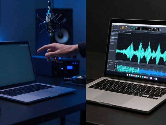

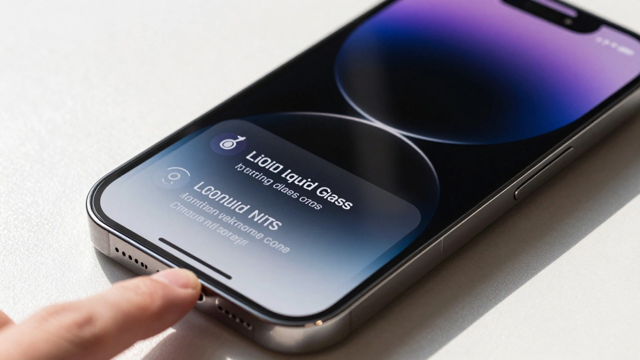
Apple didn’t just update its interfaces in 2025-it reinvented how they feel. With the release of Liquid Glass, Apple introduced a new design material that behaves like glass, moves like water, and responds like skin. It’s not a filter. It’s not a theme. It’s a living, breathing layer that adapts to every device, from the tiny screen of an Apple Watch to the sprawling desktop of a Mac.
Before Liquid Glass, Apple’s UIs were clean, flat, and predictable. Taps triggered animations. Swipes changed views. But the surfaces themselves stayed static. Liquid Glass changes that. It’s translucent, dynamic, and intelligent. It doesn’t just sit on top of content-it interacts with it. And it does so consistently across every Apple device, something no design language has ever done before.
What Liquid Glass Actually Is
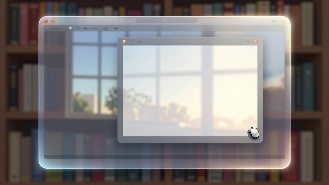
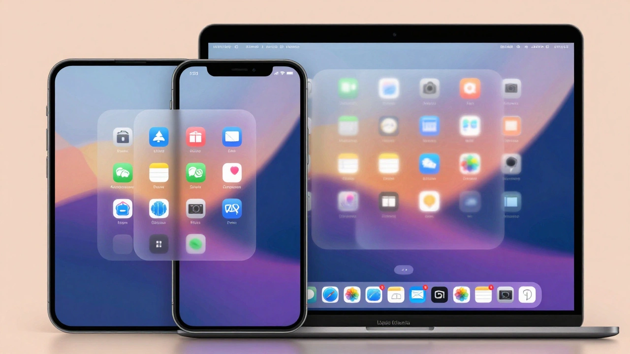
Liquid Glass isn’t a visual style. It’s a material. Apple describes it as a hybrid between glass and fluid dynamics, rendered in real time using advanced graphics processing. On iPhone, it wraps around app icons, making them glow subtly when touched. On Mac, it softens the edges of sidebars, letting the desktop peek through without losing definition. On Apple Watch, it turns notifications into semi-transparent lenses that shift hue based on the photo beneath them.
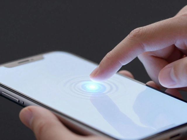
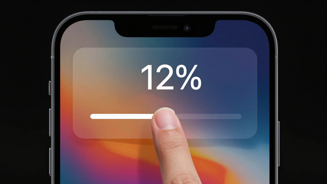
The magic lies in something Apple calls Lensing. Instead of just blurring backgrounds like older transparency effects, Liquid Glass bends light. It focuses and redirects it, so you still see what’s underneath-but clearly. When you tap a button, the glow starts under your finger and ripples outward, connecting that tap to nearby elements. It’s not just feedback-it’s a visual conversation between you and the device.
Colors aren’t fixed. A control’s tint adapts to what’s behind it. If you’re looking at a red photo, the Liquid Glass element near it shifts toward a soft coral. If you’re in Dark Mode with a black background, the same element becomes a deep charcoal. It’s not random. It’s calculated. Apple’s team spent years studying how real glass behaves in natural light to replicate that intuition digitally.
How It Works on Apple Watch
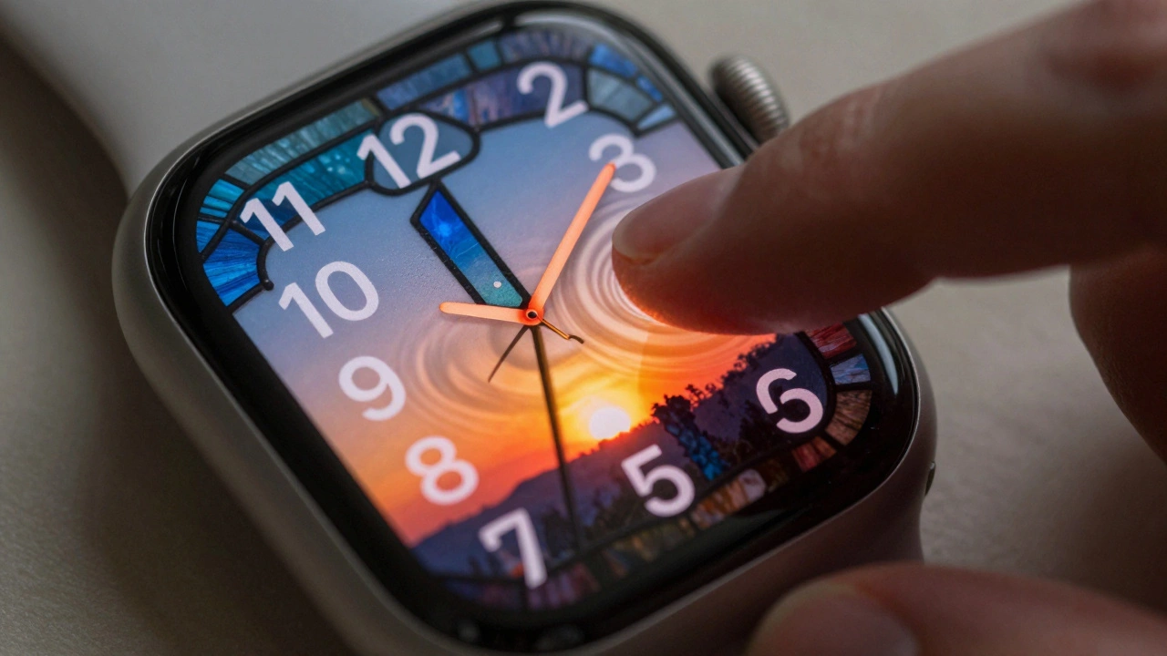
The Apple Watch was the toughest test for Liquid Glass. With screens just 40-45mm wide, every pixel matters. Notifications, Control Center, and Smart Stack widgets all use Liquid Glass. The Photos watch face? Now features numerals made of Liquid Glass, letting the image underneath show through like a stained-glass window.
But here’s the catch: early adopters noticed something odd. On the Watch, the background content shining through notifications was too distracting. A busy photo behind a notification made it hard to read the text. The glow felt overwhelming, not elegant.
Apple listened. By November 2025, iOS 26.1 rolled out a fix: Reduce Transparency. You can now turn off Liquid Glass’s glow entirely-not just on your Watch, but across all devices. Go to the Watch app on your iPhone, tap Accessibility → Vision, and toggle it off. Suddenly, your notifications are crisp again. The glow is gone. The clarity returns. It’s not a bug-it’s a choice.
This matters because Apple finally built accessibility into the core of the design, not as an afterthought. Liquid Glass doesn’t force you to see it a certain way. You control how much of it you want.
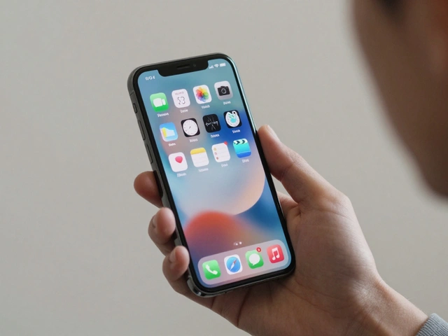
iPhone and iPad: Where Liquid Glass Shines
On iPhone and iPad, Liquid Glass is everywhere. App icons? They’re no longer flat shapes. They’re layered-like glass over glass-so they respond differently in Light Mode, Dark Mode, or when you apply a custom tint. Tap an icon, and it lifts slightly, glowing from within. Slide through Control Center, and the background subtly shifts under each toggle.
Tab bars now feel like floating panels. When you switch from Messages to Photos, the bar doesn’t just change color-it morphs. The transition isn’t a slide. It’s a ripple. Controls reshape themselves as you move between screens, keeping everything aligned on a single, invisible plane. It’s not just smooth-it’s intuitive.
And it works because the hardware can keep up. Apple’s A18 chip handles the real-time rendering without lag. Even on older iPhones, Liquid Glass runs at 60fps. No stutter. No delay. Just fluid motion that feels natural.
Mac Sidebars: The Big Screen Test
On Mac, Liquid Glass transforms sidebars in Finder, Mail, and even Xcode. Instead of solid gray panels, you get semi-transparent borders that let your wallpaper glow gently behind them. It’s subtle. But it changes how you perceive space.
On a 27-inch iMac, the effect is calming. On a 14-inch MacBook Pro, it’s functional. The material scales by adjusting its thickness and light refraction. Larger screens get slightly more opacity to avoid visual noise. Smaller screens get sharper edges to maintain clarity.
Like on Watch, you can turn it off. Go to System Settings → Accessibility → Display → Reduce Transparency. Suddenly, your sidebar is solid again. No glow. No distraction. Just function. Apple didn’t make this optional because it’s a flaw-it’s because it’s personal.
Why This Matters Beyond Aesthetics
Liquid Glass isn’t just pretty. It’s a breakthrough in design scalability. No other company has built a single material that works across devices with such different sizes, inputs, and use cases. A button on an Apple Watch is tapped with a finger. A sidebar on a Mac is clicked with a mouse. Liquid Glass responds to both-without changing its core behavior.
It also unifies Apple’s ecosystem in a way iOS 7 or Material Design never did. Before, each platform had its own visual language. Now, they all share the same DNA. Your iPhone, your Mac, your Watch-they feel like parts of the same system, not separate tools.
And it’s not just about looks. Liquid Glass improves usability. By letting content shine through, it reduces visual clutter. You don’t need as many borders, shadows, or lines. The material itself creates separation. That means faster scanning, fewer distractions, and less cognitive load.
Accessibility: The Real Win
The most impressive thing about Liquid Glass? Apple didn’t just build it. They gave you control over it.
Many design trends push for visual flair. Apple could’ve made Liquid Glass mandatory. But they didn’t. They built a toggle that works across all devices. That’s rare. It means they care more about how you use their products than how they look.
For people with low vision, motion sensitivity, or just a preference for clarity, the Reduce Transparency setting is a game-changer. It’s not a compromise-it’s empowerment.
What’s Next?
Liquid Glass is already on tvOS 26, softening menu bars on your Apple TV. Next, expect it to appear in CarPlay, HomeKit, and maybe even Vision Pro overlays. The pattern is clear: Apple is betting everything on a unified, responsive, adaptive interface.
And it’s working. Because Liquid Glass doesn’t just look good-it feels right. It responds to you. It adapts to your environment. And most importantly, it lets you decide how much of it you want.
Categories
Popular Articles