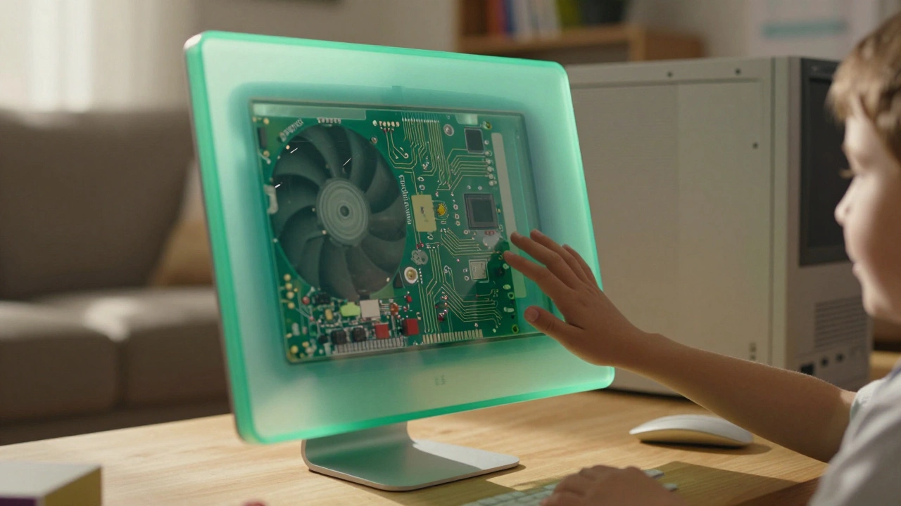

Back in 1998, Apple didn’t just release a computer. They released a conversation. The original iMac, with its sea-green translucent shell, didn’t hide its guts-it celebrated them. You could see the circuit boards, the wires, the cooling fan. It looked like a toy, but it worked like a machine. And that was the point.
People weren’t used to computers that looked friendly. Back then, PCs were beige boxes with sharp edges and blinking lights that made you feel like you needed a manual just to turn them on. Apple’s translucent plastic changed that. It said, "This isn’t scary. You can understand it. You can even play with it."
Steve Jobs didn’t care that each case cost $60 to make-three times what a normal computer shell cost. He didn’t want a cost-benefit analysis. He wanted people to feel something when they looked at it. And they did. The color shifted with the light. The plastic glowed. It wasn’t just a case-it was a mood. A personality. A little bit of joy built into the hardware.
That wasn’t accidental. Jony Ive and his team visited a jelly bean factory to learn how to make color look alive inside plastic. They didn’t just want transparency. They wanted depth. They wanted the material to feel like it was breathing. The iMac didn’t just show you its insides-it invited you to wonder about them. That’s how you make technology feel approachable: by making it visible, not hidden.
The Psychology of See-Through Design
Why does seeing the inside of a machine make it feel more human? Because we’re wired to trust what we can understand. When Apple showed the circuit boards inside the iMac, they weren’t showing off engineering-they were showing honesty. No more "black box" thinking. No more pretending that computers are magic. This was a machine made by people, for people.
Translucency created psychological safety. It said: "You don’t need to be an expert to use this." For someone who’d never touched a computer before, seeing the wires and chips wasn’t intimidating-it was fascinating. It turned complexity into curiosity. And curiosity is the first step toward connection.
The color changes were another layer of this. A blue iMac in daylight looked one way. In the evening, under a warm lamp, it glowed amber. It didn’t sit there like a statue. It responded. It felt alive. That’s why people called it "chameleon-like." It wasn’t just a product. It was a companion that adapted to its environment.
The Long Silence and the Return of Transparency
After the iMac, Apple moved to aluminum. Sleek. Cool. Professional. But something got lost. The machines became more powerful, yes. But also more distant. They looked expensive. They looked like tools for experts. Not for everyone.
For years, Apple’s design language leaned into minimalism-clean lines, muted tones, hidden internals. The message was clear: "This is premium. This is serious." And for a while, that worked. But as technology became more personal-phones in pockets, watches on wrists, tablets on laps-the need for warmth returned.
Then, in June 2025, Apple unveiled Liquid Glass.
It wasn’t just a new UI theme. It was a revival. A digital echo of the iMac’s soul.
Liquid Glass: When Software Becomes Material
Liquid Glass isn’t plastic. It’s not even physical. But it does the same thing the iMac did-it makes the digital feel tactile. It’s translucent. It bends light. It shifts color based on what’s behind it. It flexes when you tap it. It glows when you move your finger.
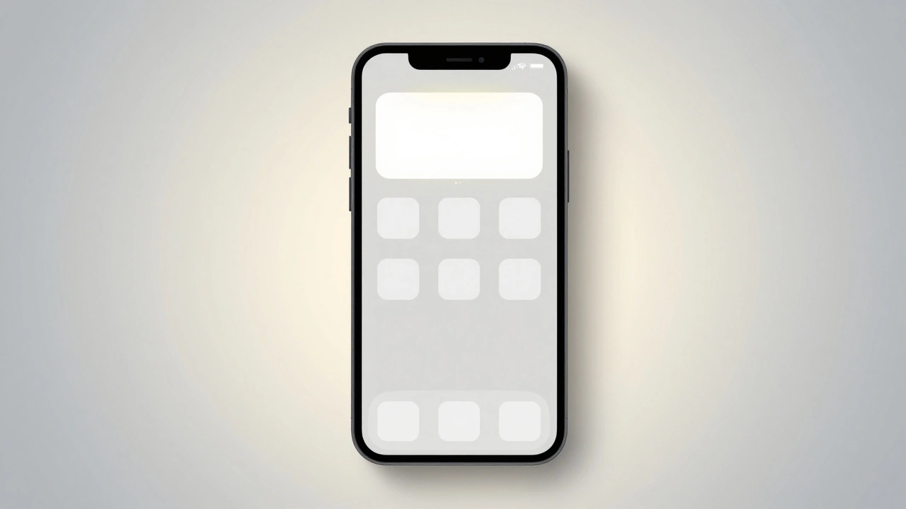
On iOS 26, your app icons now look like colored glass. They don’t just sit there-they react. Tap a button, and it pulses like a drop of water. Slide a control, and it ripples like a pond. The background content shows through, slightly blurred, slightly alive. It’s not just pretty. It’s intuitive.
Apple didn’t invent transparency in interfaces. But they perfected it. Liquid Glass layers respond to motion, lighting, and content in real time. They don’t fade. They don’t pop. They flow. That’s the key. It mimics how glass behaves in the real world-refracting, reflecting, responding.
And here’s the genius: it’s not just visual. The animations are timed to feel natural. A slider doesn’t snap-it glides. A notification doesn’t appear-it materializes, like steam rising. That’s not just design. That’s psychology. You don’t think about it. You just feel it.
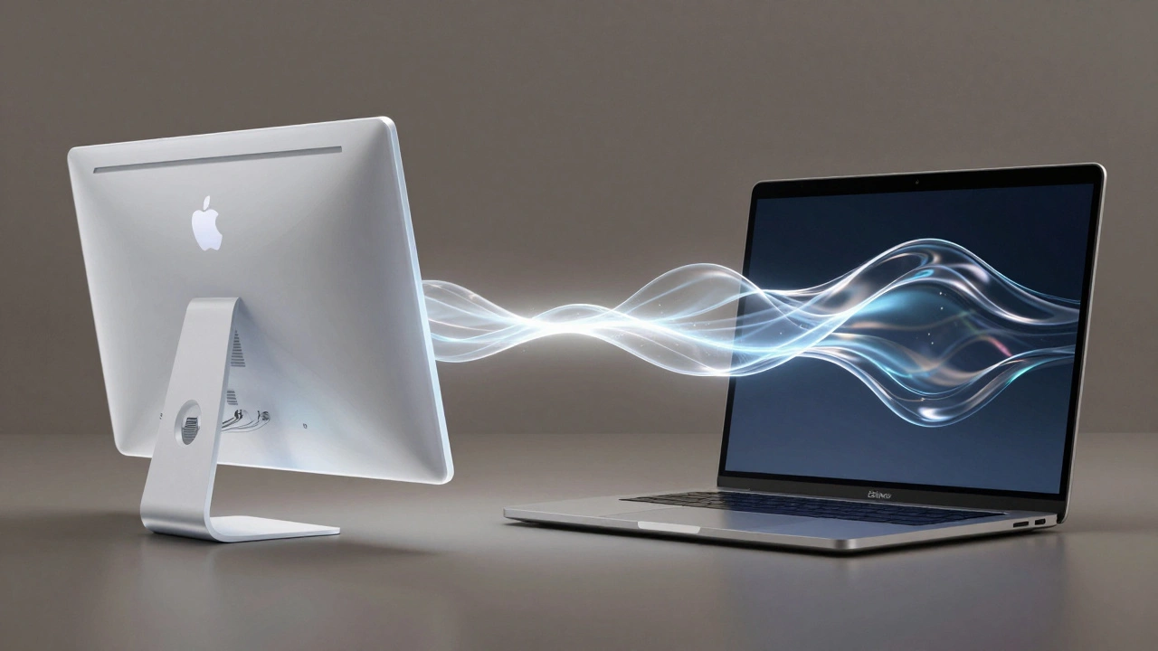
How Liquid Glass Honors the iMac’s Legacy
Liquid Glass is the iMac’s spiritual successor. Same goal. Different medium.
The iMac used physical plastic to show you the inside of a machine. Liquid Glass uses digital layers to show you the inside of an experience. Both say: "Here’s what’s happening. You’re not just using this-you’re part of it."
Alan Dye, Apple’s head of human interface design, said it best: "It combines the optical qualities of glass with a fluidity only Apple can achieve." That fluidity? That’s the same energy the iMac had. The way it changed color. The way it felt like it was breathing. Liquid Glass just moved it into software.
And just like the iMac, Liquid Glass is playful. It’s not serious. It doesn’t demand respect. It invites you in. A button doesn’t just click-it sings. A slider doesn’t just move-it dances.
Even the accessibility rules are designed to preserve that feeling. Apple recommends keeping frost levels between 10 and 25. Too high, and it turns milky-like cheap plastic. Too low, and it loses its magic. It’s a balance. Not just for clarity, but for emotion.
Why This Matters Now
Technology is getting more complex. AI, voice assistants, AR, wearables-they’re everywhere. But people are tired of feeling like they need a PhD to use their devices.
Liquid Glass, and the design philosophy behind it, answers that. It doesn’t dumb things down. It makes them feel human. It doesn’t hide complexity. It makes it beautiful.
When you open an app on your iPhone and the background glows softly through the translucent controls, you don’t think, "Oh, this is a new design language." You think, "This feels right."
That’s the goal. Not to impress engineers. Not to win design awards. But to make someone smile when they tap their screen.
The Bigger Picture: Design as Emotional Communication
Apple’s translucent materials-whether plastic or glass-are never just about looks. They’re about trust. About accessibility. About joy.
They’re saying: "We didn’t build this for power users. We built it for you. The person who just wants to call a friend, take a photo, listen to music. The person who doesn’t care about specs. Who just wants something that feels good."
That’s why Apple kept investing in this idea, even when it was expensive. Even when it was unpopular. Because they knew: people don’t buy products. They buy feelings.
The iMac made computers feel like toys. Liquid Glass makes software feel like art. Both were radical. Both were risky. Both worked.
And if you look at the patents Apple filed since 2014-for glass iPhones, glass watches, glass Macs-you’ll see this isn’t a trend. It’s a direction. A belief that the future of technology isn’t in hiding complexity, but in revealing it, beautifully.
What’s Next?
Liquid Glass is rolling out now. It’s in iOS 26, iPadOS 26, macOS Tahoe 26, watchOS 26, and tvOS 26. Developers can already use it in their apps through Figma. But it’s not just about Apple’s ecosystem.
It’s about what it teaches the rest of the industry. When a company as influential as Apple chooses transparency over opacity, playfulness over formality, emotion over efficiency-it changes the game.
Maybe next, your smart fridge will have a soft glow when it’s low on milk. Or your thermostat will ripple like water when you adjust the temperature. Maybe your car’s dashboard will pulse gently when you turn on the radio.
That’s the real legacy of translucent plastic: it proved that technology doesn’t have to be cold to be powerful. It can be warm. It can be fun. It can be alive.
Why did Apple stop using translucent plastic after the iMac?
Apple shifted to aluminum and metal materials to signal premium quality and durability, especially as they expanded into professional markets like laptops and phones. The translucent plastic design was tied to the iMac’s mission of bringing computers to everyday users, but as Apple’s audience grew more diverse, the design language evolved to match new product categories. The core idea-transparency and approachability-didn’t disappear. It just went digital.
Is Liquid Glass just a visual effect, or does it change how you interact with devices?
It’s both. Liquid Glass changes how things look, but more importantly, it changes how they feel. The way buttons flex, how light bends around controls, and how elements respond to motion all create a tactile, physical sensation-even though you’re touching a screen. This isn’t just animation. It’s material behavior designed to match how we expect real objects to move in the world.
Does Liquid Glass work on older Apple devices?
No. Liquid Glass requires the advanced graphics processing and silicon power of Apple’s M-series chips and newer A-series chips. It’s built into iOS 26 and later, so it’s only available on devices released in 2023 or later. Apple prioritizes performance and responsiveness over backward compatibility for this level of visual complexity.
How is Liquid Glass different from previous iOS transparency effects like blur or frosted glass?
Older effects were static. They applied a fixed blur or tint. Liquid Glass is dynamic. It adapts in real time to content, lighting, and motion. It doesn’t just blur the background-it bends light around it, shifts tint based on what’s behind, and reacts to your touch with fluid motion. Think of it as the difference between a photo filter and a living, breathing material.
Did Apple invent translucent materials in tech?
No. But Apple made it meaningful. Other companies had used transparent plastics or glass before. What Apple did was tie the material to emotion. They made it communicate values: openness, playfulness, approachability. That’s why it stuck. It wasn’t the material-it was the message behind it.