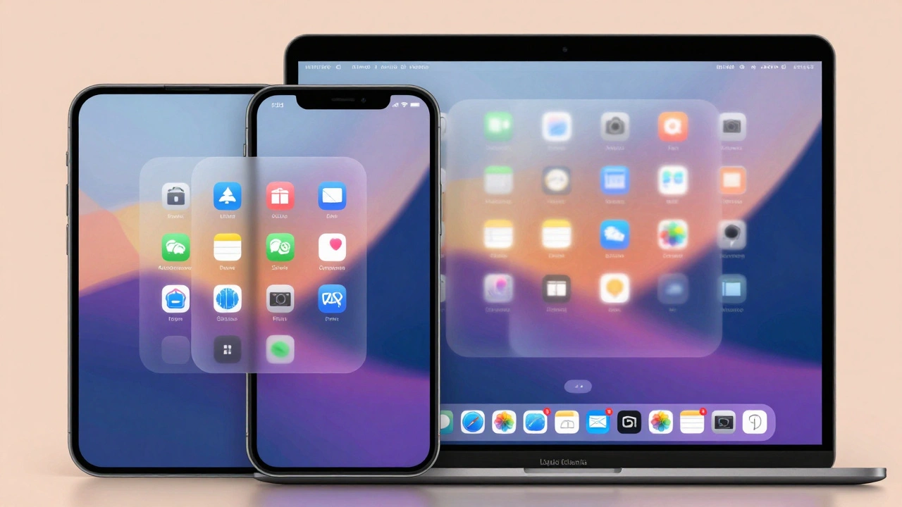

Apple’s latest iOS 26 and iPadOS 26 updates didn’t just tweak icons or change colors-they rewrote how you interact with your phone and tablet. At the heart of this shift are two quiet but powerful features: contextual menus and Peek & Pop. These aren’t flashy new buttons. They’re smarter ways to get things done without cluttering your screen. And for the first time, they work the same way everywhere-on iPhone, iPad, and even in third-party apps.
What Exactly Are Contextual Menus?
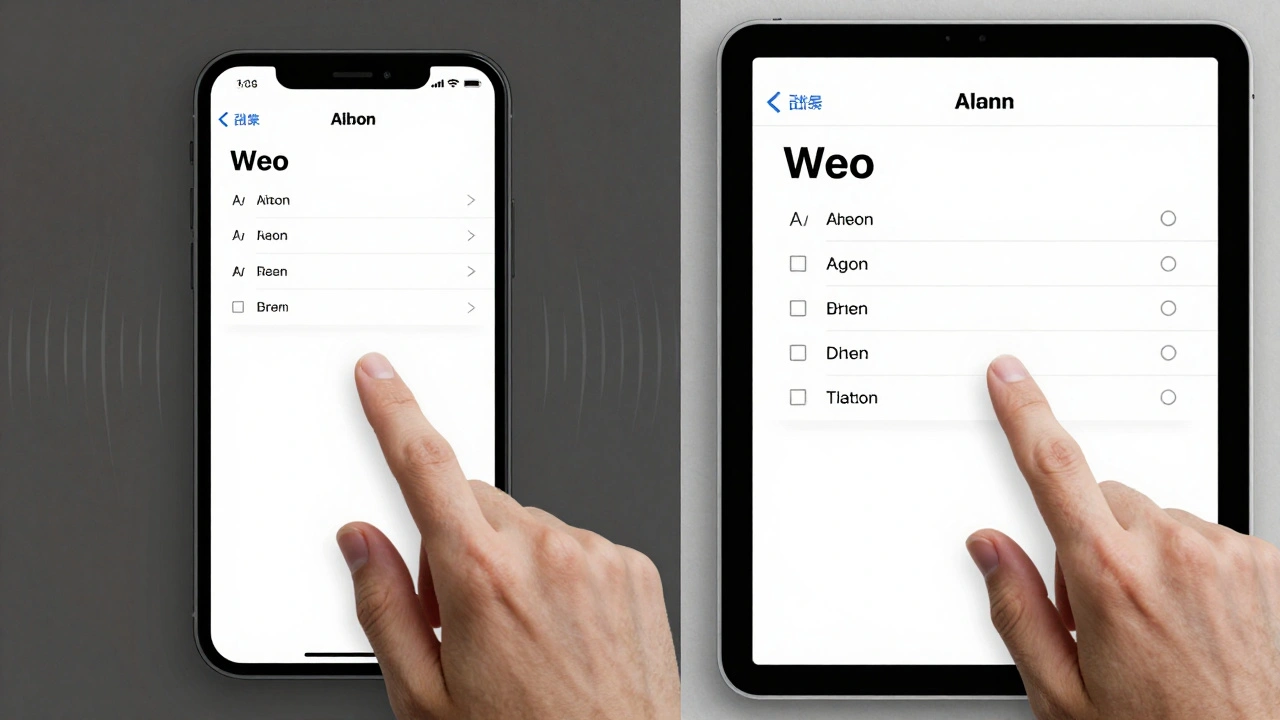
A contextual menu is what pops up when you long-press something on your screen. It’s not a menu you find in a drawer or tap through layers. It appears right where you’re touching, and it only shows options that make sense for what you’re interacting with. In iOS 26, Apple made these menus smarter, faster, and more consistent.Before iOS 26, if you wanted to format text in Notes, you had to hold down, then swipe through a long row of options. Now, the menu changes based on what you select. Highlight a sentence? It shows bold, italics, underline. Select multiple lines? It adds list controls and indentation. You don’t have to remember where things are. The interface adapts to your action.
This isn’t just about convenience. It’s about reducing mental load. Your brain doesn’t have to map out a menu structure. The phone does it for you.
Peek & Pop: Preview Without Leaving Your Place
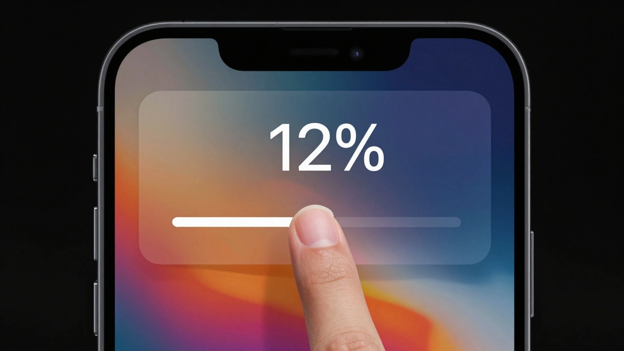
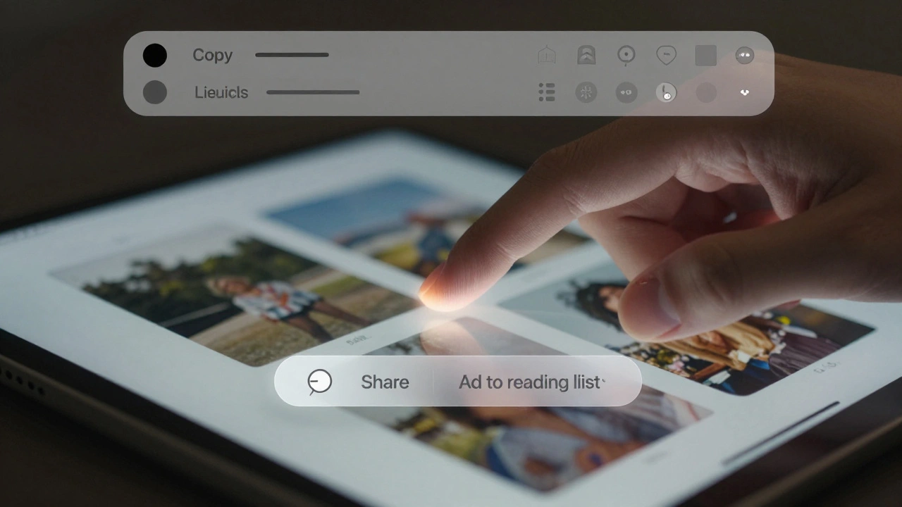
Peek & Pop has been around since iOS 9, but in iOS 26, it became essential. You long-press a link in Messages, and instead of jumping to a new page, you see a floating preview of the website. Tap it, and you go full screen. Swipe up, and you get options: copy the link, share it, or add it to your reading list-all without leaving the conversation.The same thing happens with photos. Long-press an image in your feed, and it lifts off the screen. You can zoom in, swipe up for sharing options, or tap to open it full size. No back-and-forth. No waiting. Just immediate access.
Apple’s secret? Haptic feedback. A tiny vibration tells you the preview is active. It’s subtle, but it grounds the interaction. You feel like you’re touching something real, not just tapping pixels.
How Apple Made This Work Everywhere
The real breakthrough isn’t just that these features exist. It’s that they’re the same across every app.In the Camera app, you used to see a dozen buttons for modes, filters, and settings. Now, it’s just Photo and Video. Tap either one, and a clean pop-up menu shows all the hidden options-exposure, flash, timer, Live Photo. No clutter. No confusion.
In the Health app, categories vanished from the main screen. Tap the search icon, and a menu slides in with your health data. Tap the heart icon again, and you’re back. It’s like the app remembers what you care about most.
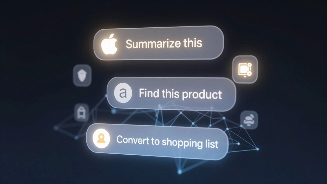
Even the Screenshot menu changed. Take a screenshot, and instead of just seeing a tiny edit button, you now get AI-powered suggestions: “Summarize this,” “Read it aloud,” or “Find this product.” It doesn’t guess blindly. It analyzes the image. If you screenshot a product label, it suggests searching for it. If you screenshot a recipe, it offers to convert it to a shopping list. This is Apple Intelligence working quietly in the background.
iPadOS 26: The Menu Bar Revolution
iPadOS 26 took contextual menus to a whole new level with the menu bar. Swipe down from the top of the screen, and a thin, translucent bar appears with all the commands for the app you’re using. No more hunting for tools in hidden menus.Developers can now customize this bar. A drawing app might show brush size, color palette, and layer controls. A code editor might show syntax options, debugging tools, and file navigation. The bar adapts to the app-but it always appears in the same place. That consistency matters. You don’t have to relearn how to use every app.
And if you’re using a trackpad or mouse? Move your cursor to the top. The menu bar appears automatically. It’s the same interaction whether you’re using fingers or a cursor. Apple didn’t treat iPad as a mini Mac. It made it better than both.
Text Editing Gets Smarter
In Notes, the toolbar isn’t always visible. It shows up only when you’re editing. Select a word? Bold and italic appear. Select a paragraph? You get bullet points, numbering, and block quote options. It’s not just convenience-it’s context-aware design.And now, you can select just part of a message in Messages. Long-press, tap “Select,” then drag your cursor to highlight only the words you want to copy. No more copying entire messages and deleting the rest. It’s a small change, but it saves time every day.
Control Center Gets Context Too
Control Center isn’t just for Wi-Fi and brightness anymore. In iOS 26, it’s a gateway to quick actions. Add a “New Reminder” button. Tap it, and you’re typing a reminder without opening the Reminders app. Add a “Quick Note” button. Tap it, and a blank note pops up with your last-used font and style.Even the Calendar app got smarter. Tap the top-right corner, and you can switch between day, week, or side-by-side two-day view. No settings menu. No scrolling. Just a gesture.
Accessibility Isn’t an Afterthought
Apple didn’t forget users who rely on different ways to interact. Eye Tracking now lets you use dwell time to select menu items. Switch users can trigger menus with a single tap or puff. The new keyboard dwell timer lets you type without accidentally hitting keys. These aren’t add-ons. They’re built into the same menu system everyone else uses.That’s the key: accessibility isn’t a separate mode. It’s the same interface, just adapted. You don’t need to learn a different system. You just use it differently.
What This Means for Developers
Apple didn’t keep these tools to itself. The API for contextual menus is now open to all developers. You can create custom menus, add previews, and even tie them to Apple Intelligence. A recipe app can show a preview of the ingredients when you long-press a dish. A finance app can preview transaction history before you tap into details.And with the menu bar on iPadOS, third-party apps can now offer desktop-like functionality without turning into a full desktop app. It’s the best of both worlds: touch simplicity and keyboard power.
The Bigger Picture
This isn’t just about menus. It’s about how Apple thinks about interfaces now. They’re not static. They’re dynamic. They don’t just respond to taps-they anticipate needs. They reduce steps, not options. They hide complexity, not power.The “Liquid Glass” design language-rounded corners, floating layers, subtle animations-is the skin. But the real innovation is underneath: a unified system where context determines action. Whether you’re on an iPhone 15 or an iPad Pro, the way you interact feels familiar. That’s harmony.
And with Apple Intelligence weaving itself into these menus-suggesting actions, summarizing content, answering questions-you’re not just using a phone. You’re using a helper that knows what you’re doing before you ask.
Do contextual menus work the same on iPhone and iPad?
Yes, the core behavior is identical. Long-pressing an item brings up a menu with relevant options on both devices. The main difference is iPadOS 26 adds the menu bar at the top of the screen, which gives you quick access to app commands without long-pressing. But the menus themselves-what appears when you press-are nearly identical across iPhone and iPad.
Can I turn off Peek & Pop?
You can’t disable Peek & Pop entirely, but you can adjust how sensitive it is. Go to Settings > Accessibility > Touch > 3D & Haptic Touch, and slide the sensitivity to “Light” or “Medium.” This makes it harder to accidentally trigger a preview. But the feature itself remains active-Apple designed it to be always available, not optional.
Do third-party apps support these features?
Yes, and many already do. Apps like Notion, Microsoft Word, and Adobe Express have updated to use the new contextual menu APIs. Developers can now add custom previews, integrate Apple Intelligence suggestions, and even customize the iPad menu bar. If an app has been updated since late 2025, it likely supports these features.
How does Apple Intelligence change contextual menus?
Apple Intelligence turns menus from static lists into smart assistants. Instead of just offering “Copy” or “Share,” a screenshot menu might say, “Add this event to Calendar” or “Find similar products.” It analyzes what’s on screen-text, images, even handwriting-and suggests actions based on your habits. It doesn’t guess randomly. It learns from how you use your device.
Are these features available on older iPhones?
No. iOS 26 requires an A15 chip or later, which means iPhone 14 and newer. Older devices like the iPhone 13 and earlier don’t support the full suite of contextual menu enhancements, especially the AI-powered suggestions and menu bar on iPad. Apple prioritizes performance and haptic precision, which older hardware can’t deliver reliably.
Why did Apple make menus pop up instead of showing them all the time?
Clutter kills usability. If every tool was visible, your screen would be full of buttons, sliders, and icons. By hiding options until you need them, Apple keeps interfaces clean and focused. The menus appear exactly where you’re touching, so you don’t have to look away. It’s called progressive disclosure: give users just enough, then reveal more as needed.