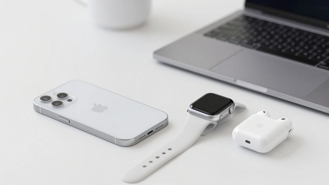

When Apple unveiled Liquid Glass at WWDC 2025, it wasn’t just another UI update. It was a full rewrite of how digital surfaces interact with light, depth, and motion. Suddenly, buttons didn’t just click-they flowed. Navigation bars didn’t just sit there-they bent the background behind them like real glass. This wasn’t a cosmetic tweak. It was a training ground for the AR era. And if you’re designing for Apple platforms in 2026, you need to test it-properly.
What Liquid Glass Actually Does
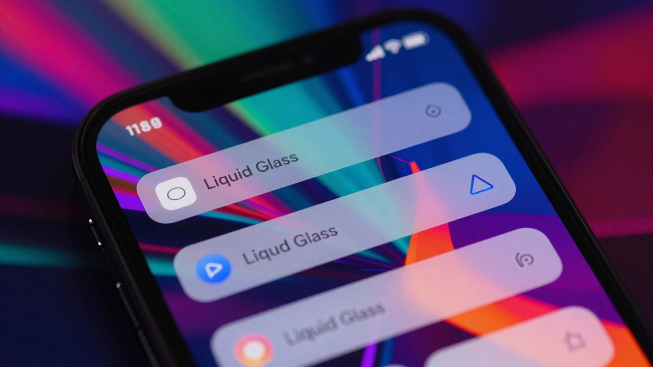
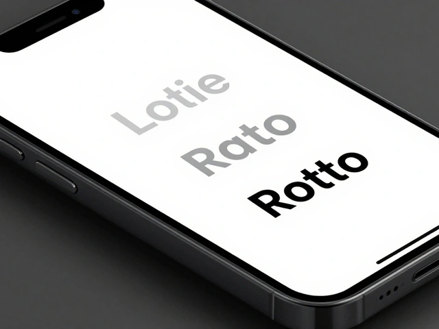
Liquid Glass isn’t just blur. It’s a combination of three things: dynamic translucency, layered depth, and ambient awareness. Apple didn’t slap a Gaussian blur on a view and call it done. They built a material that reacts to what’s behind it. The blur intensity changes based on the background color. Shadows shift subtly with motion. Light seems to refract through surfaces, making UI elements feel like they’re floating in space.
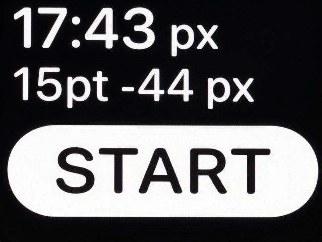
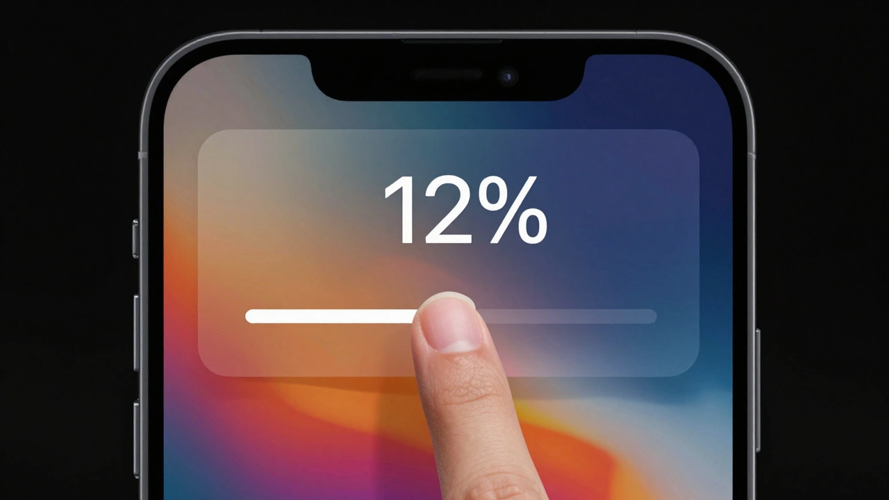
This isn’t theoretical. In iOS 26, every native control-from sliders to alert sheets-now uses Liquid Glass by default. Knobs morph into glass when you touch them. Menus slide out like sheets of frosted glass. Even the background of a modal window bends light from the app underneath. It’s not just visual. It’s psychological. Users perceive interfaces as lighter, faster, and more responsive-even when loading times haven’t changed.
Why Prototyping Matters More Than Ever
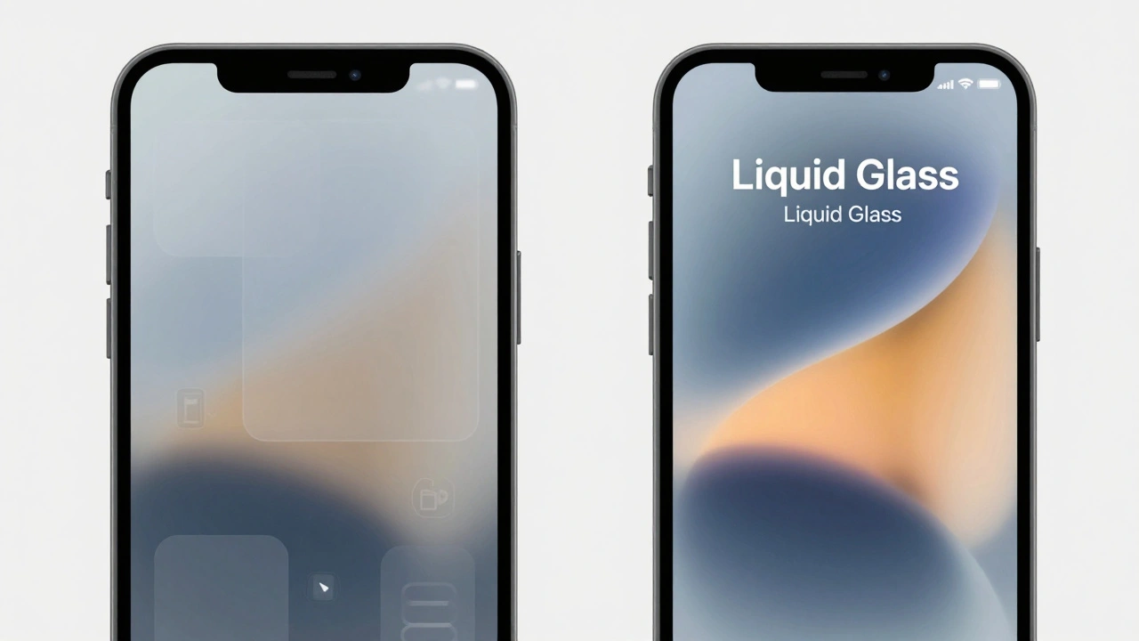
Here’s the catch: Liquid Glass doesn’t work the same everywhere. On a dark wallpaper? It glows. On a busy photo? It gets muddy. On a low-contrast background? Text vanishes. That’s why guessing isn’t enough. You need to test it in context, with real content, and with real users.
Traditional design tools like Figma or Sketch can simulate blur. But they don’t replicate Apple’s actual material. That’s where prototyping platforms like Play a design prototyping platform that supports Apple’s native Liquid Glass material with Glass Containers and system-level UI components and Chameleon a prototyping tool that enables testing Liquid Glass via Custom CSS without modifying product code come in. Play lets you apply real Liquid Glass effects directly to any object. Chameleon lets you inject Apple’s exact CSS into your prototype-no engineering needed.
You can now test a login modal with Liquid Glass over a photo-heavy background and see if the username field is still readable. You can simulate a settings screen with layered glass panels and check how text holds up under changing light conditions. This isn’t about looking cool. It’s about surviving real-world use.
Blur Layers: The Accessibility Trap
Let’s talk about the elephant in the room: accessibility.
Early beta tests by design firms found screens with Liquid Glass overlays dropping to a contrast ratio of 1.5:1. The WCAG standard? 4.5:1. That’s not just borderline-it’s unusable for millions. Text on a translucent layer over a medium-toned background can disappear entirely. And here’s the kicker: you can’t test this against one background. You have to test it against every background your users might have-wallpapers, photos, gradients, dynamic themes.
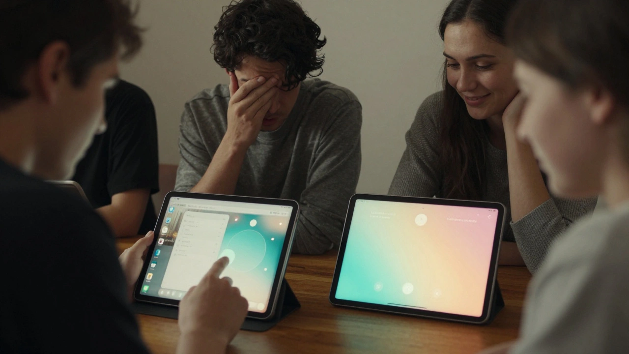
One team at a design studio in Portland ran a simple test: they asked 12 users with low vision to navigate a prototype with Liquid Glass modals. Four couldn’t read the buttons. Two gave up entirely. That’s not a design flaw-it’s a legal risk. If you ship this without testing, you’re not innovating. You’re excluding.
Here’s what works: use semi-transparent overlays with a solid background tint underneath. Apple’s own design guidelines now recommend a 10-15% opaque base layer under text-heavy glass elements. Test your contrast with tools like Stark or Color Oracle. And never assume “it looks fine on my screen.”
Parallax and Spatial Depth: Making UI Feel Real
Liquid Glass doesn’t just look like glass. It feels like it’s in space.
Parallax effects in prototypes aren’t just about movement. They’re about depth. When you scroll, the glass layer doesn’t slide-it floats. When you tap, it doesn’t just press down-it flexes. This is what Apple calls “ambient awareness.” The interface doesn’t feel pasted on. It feels placed.
One prototype tested this by replacing a standard loading spinner with a Liquid Glass orb that gently pulses and distorts light as it loads. Users reported it felt faster-even though the actual load time was identical. Why? Because their brains were anchored to the background content. The blur created continuity. The motion created anticipation.
Use this in onboarding. Use it in feature announcements. Use it in modals that overlay core content. But don’t overuse it. Too much parallax makes users feel disoriented. Too little and you lose the magic.
When to Use It-and When to Avoid It
Liquid Glass isn’t for everything. Here’s the reality:
- Use it for: Onboarding tours, feature announcements, modals that overlay content, and interfaces where aesthetic innovation gives you a competitive edge.
- Avoid it for: Task-heavy interfaces (like banking or forms), older devices (iPhone 11 and below), or when accessibility compliance can’t be guaranteed.
One company tried rolling it out across their entire app. Engagement dropped 12% in the first week. Why? Users couldn’t find the buttons. The contrast was too low. The parallax made scrolling feel sluggish. They rolled it back in 48 hours.
The winning strategy? Start small. Test one modal. Run an A/B test. Measure time-on-task, error rate, and user satisfaction. If it improves engagement, scale. If not, ditch it. No one’s forcing you to go all-in.
Tools to Get Started
You don’t need to wait for iOS 26 to test Liquid Glass. Here’s what’s available right now:
- Play 3.9.2+: Apply real Liquid Glass to any object. Use Glass Containers to group elements. Test navigation bars and tab bars with native styling.
- Chameleon: Paste Apple’s CSS into your prototype. No code changes needed. Roll back instantly if it breaks.
- Apple’s Demo Project: Download the official sample from Apple’s developer portal. It includes every component with Liquid Glass applied.
There are also open-source test apps on GitHub built by designers as playgrounds. Each tab explores a different use case: one for alerts, one for sheets, one for sliders. Use them. Break them. Learn from them.
The Bigger Picture
Liquid Glass isn’t about making things look pretty. It’s about preparing a billion users for AR glasses in 2027. Apple isn’t just updating a UI-they’re rewiring how people interact with digital space. The blur, the depth, the light bending-it’s all training. When users put on AR glasses, they won’t need to learn a new language. They’ll already know how to read glass surfaces.
But that future only works if we design it responsibly. The same people who love Liquid Glass for its elegance are the ones who get locked out by poor contrast. The same teams that see it as innovation are the ones who risk lawsuits for exclusion.
Testing Liquid Glass isn’t optional anymore. It’s your job.
Can I simulate Liquid Glass in Figma or Sketch?
You can simulate the blur effect, but not the full material. Figma and Sketch use static blur filters that don’t adapt to background content, respond to motion, or refract light like Apple’s real Liquid Glass. For accurate testing, use Play or Chameleon, which apply Apple’s actual system-level material.
Is Liquid Glass accessible by default?
No. Early implementations fall well below WCAG 4.5:1 contrast standards. Some text on glass overlays has contrast ratios as low as 1.5:1. Apple’s system defaults aren’t enough-you must add opaque background tints under text, test against multiple backgrounds, and validate with real users who have visual impairments.
Should I use Liquid Glass in my next app update?
Only if you can test it properly. Start with one element-a modal or onboarding screen. Run an A/B test. Measure engagement, task completion, and accessibility. If users perform better and no one reports readability issues, consider expanding. If not, stick with solid backgrounds until you can solve the contrast problem.
What devices support Liquid Glass?
Liquid Glass is part of iOS 26, iPadOS 18, and macOS 15. It requires devices with A12 Bionic chip or later. That means iPhone XS, iPhone XR, and newer. Older devices won’t render the effect correctly and may show blank or broken UI elements.
How does Liquid Glass relate to Apple’s AR glasses in 2027?
Liquid Glass is training. Apple is conditioning users to understand spatial interfaces-where digital elements appear to exist in physical space with depth, light, and refraction. When AR glasses launch, users won’t be confused by floating UIs. They’ll already recognize them from years of using Liquid Glass on their phones and tablets.