Category: Design Tools
Apple Design Resources for Figma and Sketch: Official Templates and Components


Discover how to leverage Apple Design Resources for Figma and Sketch. Learn installation tips, component organization, and best practices for efficient iOS and macOS UI design.
SF Symbols 7: A Developer’s Guide to Animations, Gradients, and Magic Replace

Discover how SF Symbols 7 transforms Apple app design with native animations, gradient support, and Magic Replace. Learn implementation tips, performance best practices, and workflow integration for SwiftUI developers.
Apple Icon Grid Systems: Pixel Fitting and Optical Balance Guide

Master Apple's icon grid systems to eliminate blurriness and improve visual harmony. Learn how pixel fitting and optical balance transform your UI designs.
Design QA on Apple Devices: Pixel-Perfect Checks Across iOS and macOS
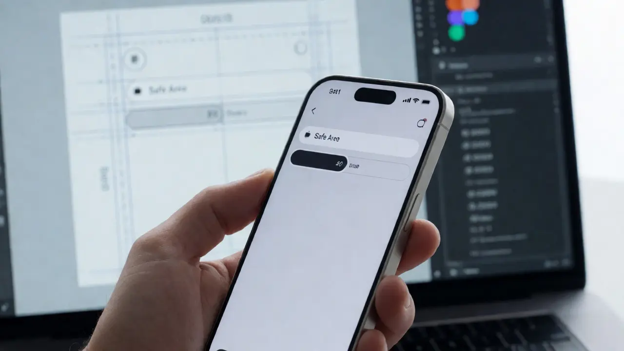
Ensure your UI matches design specs on iOS and macOS. Learn practical steps for pixel-perfect checks, handling safe areas, and testing accessibility.
SF Pro Text vs. Display: Typography Scales for Apple Component Libraries
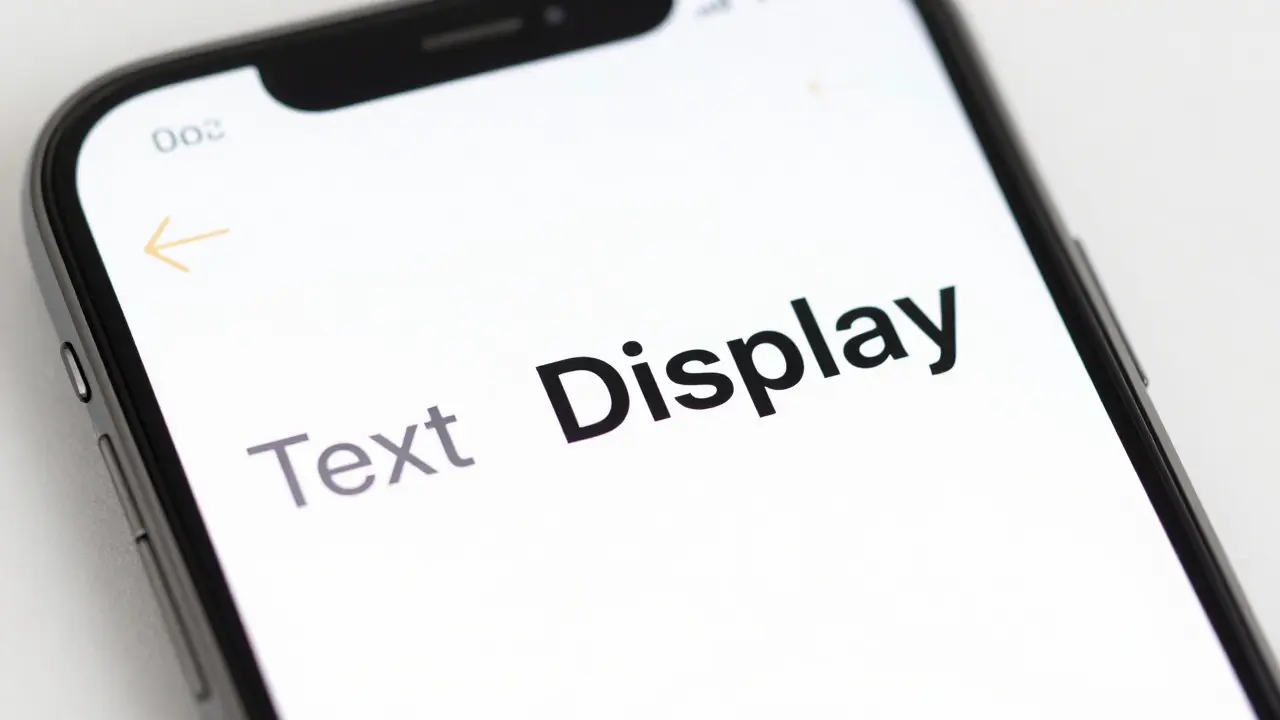
Learn how to correctly implement SF Pro Text and Display variants in your component libraries. Understand the 20pt optical size threshold and how to set up design tokens for consistent typography across Apple platforms.
Accessibility Testing Tools for Apple Apps: VoiceOver, Contrast, and Motion Checks

Learn how to test Apple apps for accessibility using VoiceOver simulation, contrast ratios, and motion checks. A practical guide for developers and designers.
Design Tokens for Apple Apps: System Colors, Typography, and Material Parameters

Learn how to implement design tokens for Apple apps. Cover system colors, SF Pro typography, and material parameters to ensure consistency across iOS, macOS, and Dark Mode.
Animating SF Symbols on Apple: Mastering Draw and Variable Rendering
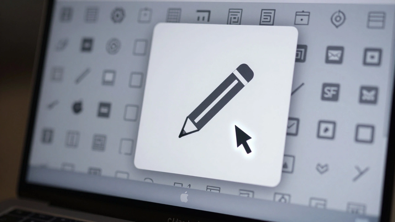
Learn how to animate SF Symbols in iOS 18 using the new Draw effect and Variable Rendering modes. Discover how to create organic stroke animations and data-driven icons with SwiftUI.
How to Use Apple’s Product Bezels and Color Guides for Accurate UI Mockups
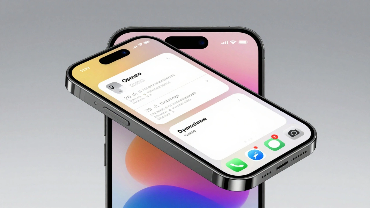
Learn how to use Apple’s official product bezels and semantic color guides to create pixel-perfect UI mockups in Figma and Sketch. Follow App Store marketing guidelines for accurate, compliant designs.
Creating Accessible Color Systems for Apple: Contrast Ratios and System Tints
Learn how to build accessible color systems for Apple platforms using WCAG contrast ratios, system tints, and the Human Interface Guidelines for iOS and visionOS.
Apple HIG Checklist: Master iOS Navigation and Gestures

Learn how to use Apple's Human Interface Guidelines as a practical design checklist. Master iOS navigation, gesture design, and the 44-point touch rule.
Exporting Apple-Ready Assets: Vector, PDF, and Symbol Best Practices

Learn how to export vector assets, PDFs, and symbols that work flawlessly on Apple devices. Avoid common mistakes and deliver clean, scalable icons for iOS and macOS apps.