
Most designers treat the Apple Human Interface Guidelines is a comprehensive set of design principles and best practices developed by Apple to ensure a consistent user experience across its ecosystem. Commonly known as the HIG, it is essentially the rulebook for anyone building apps for iPhone, iPad, Mac, or Apple Watch. But here is the problem: it is a massive document. If you try to read it cover-to-cover, you will probably get overwhelmed and go back to using a generic template. The secret is to stop treating it as a manual and start using it as a Apple Human Interface Guidelines checklist during your design sprints.
The Three Pillars of the Apple Aesthetic
Before you start picking buttons, you need to understand the philosophy. Apple doesn't just want apps to look "clean"; they want them to feel invisible. The HIG breaks this down into three core concepts:
- Clarity: Your interface should be legible and precise. If a user has to guess what a button does, you have failed the clarity test.
- Deference: The UI is there to support the content, not compete with it. This means minimizing visual clutter and letting the user's data be the hero.
- Depth: Use visual layers and motion to show hierarchy. A sheet sliding up from the bottom tells the user they are still in the same context, just performing a temporary task.
When you're auditing your Figma frames, ask yourself: "Is this UI getting in the way of the content?" If the answer is yes, you're violating the principle of deference.
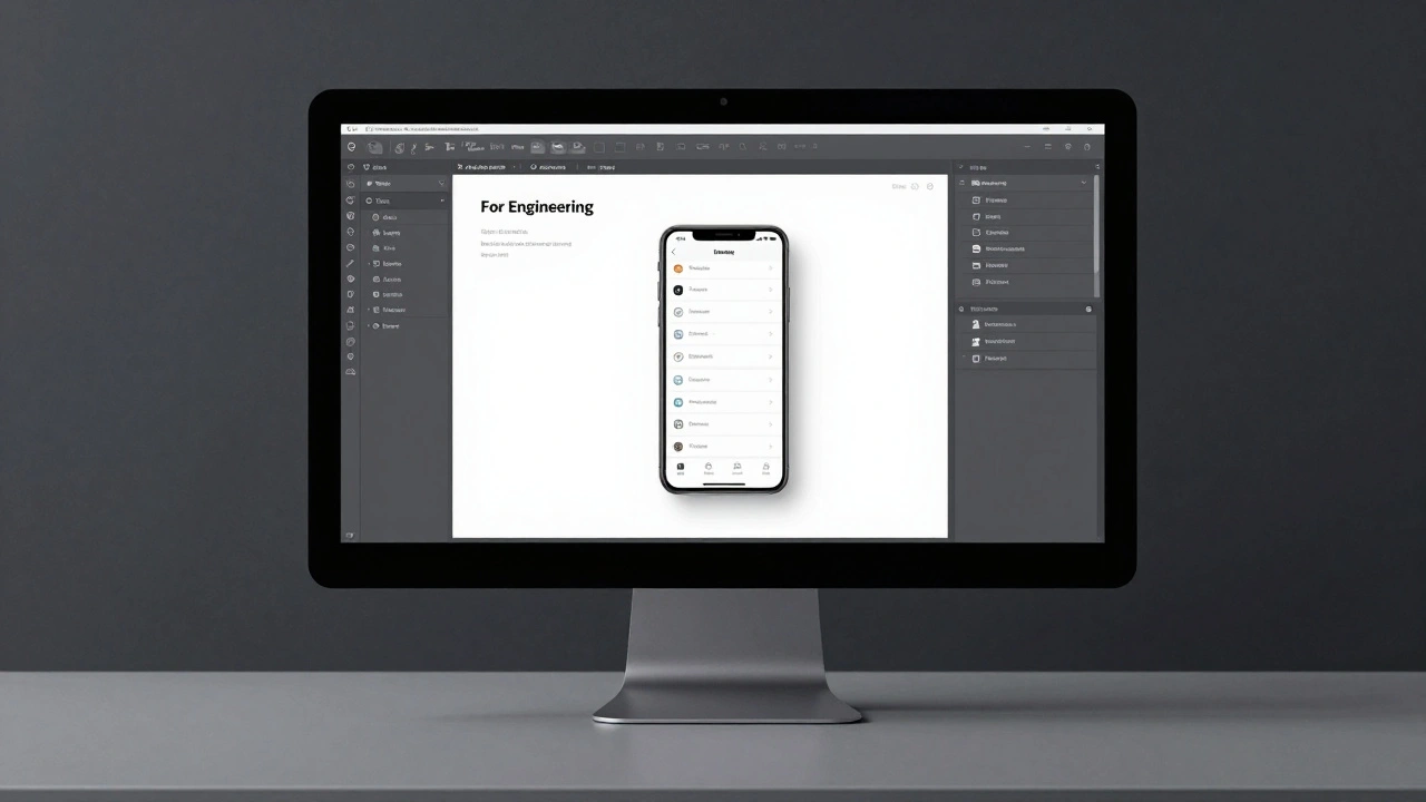
Navigation Patterns: Where Do I Go?
Navigation is where most apps fail. A common mistake is trying to copy Android patterns-like using a hamburger menu for primary navigation. On iOS, that's a cardinal sin. Instead, focus on these native structures:
Tab Bars are the gold standard for top-level navigation. They stay at the bottom of the screen, allowing users to jump between main sections instantly. Use them for persistent destinations, not for temporary actions.
Navigation Bars live at the top and provide context. They tell the user where they are and how to get back. If you have a deep hierarchy, the navigation bar is your primary tool for maintaining that trail.
For a quick reference on which bar to use, check this breakdown:
| Component | Primary Purpose | Typical Location | Best Use Case |
|---|---|---|---|
| Tab Bar | High-level switching | Bottom | Switching between Home, Search, and Profile |
| Navigation Bar | Context and Backwards flow | Top | Moving from a list to a detail view |
| Toolbar | Contextual actions | Bottom | Quick actions like "Compose" or "Share" |
Controls and the 44-Point Rule
Ever tried to tap a button and ended up hitting the one next to it? That's because the designer ignored the touch target rule. The HIG is very specific here: all interactive controls must have a minimum tap target of 44x44 points. This isn't just a suggestion; it's a requirement for accessibility.
When choosing components, avoid the urge to create custom buttons. Use standard Toggles, Sliders, and Steppers. Why? Because users have already spent years learning how these work. When you reinvent the wheel, you increase the cognitive load on your user, making your app feel "clunky" even if it looks pretty.
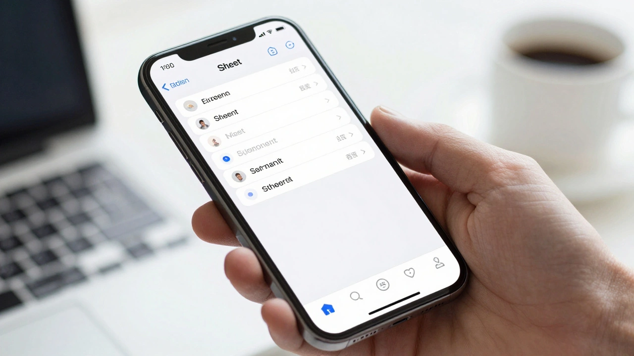
For modal interactions, use Sheets. These are views that slide up from the bottom to handle a specific task. They are perfect for things like "Add New Contact" or "Filter Results" because they don't fully remove the user from their previous screen.
Designing for Gestures and Direct Manipulation
A Gesture is a physical motion used to affect an object in an app. The goal is to make the digital experience feel like interacting with a physical object. Stick to the standards: taps, swipes, long presses, and pinches.
If you must create a custom gesture, it needs a clear affordance. For example, the swipe-to-delete pattern in the Mail app is an established convention. Users know that swiping left on a row typically reveals a destructive action. Don't change this to "swipe up to delete" unless you want your users to get very frustrated.
To make these gestures feel real, leverage Haptics. Using the Taptic Engine to provide a subtle thud when a view snaps into place or a light tap when a switch is toggled adds a layer of tactile confirmation that visual cues alone cannot provide. Just be careful-overusing haptics is like a movie with too much loud music; it becomes annoying and loses its impact.
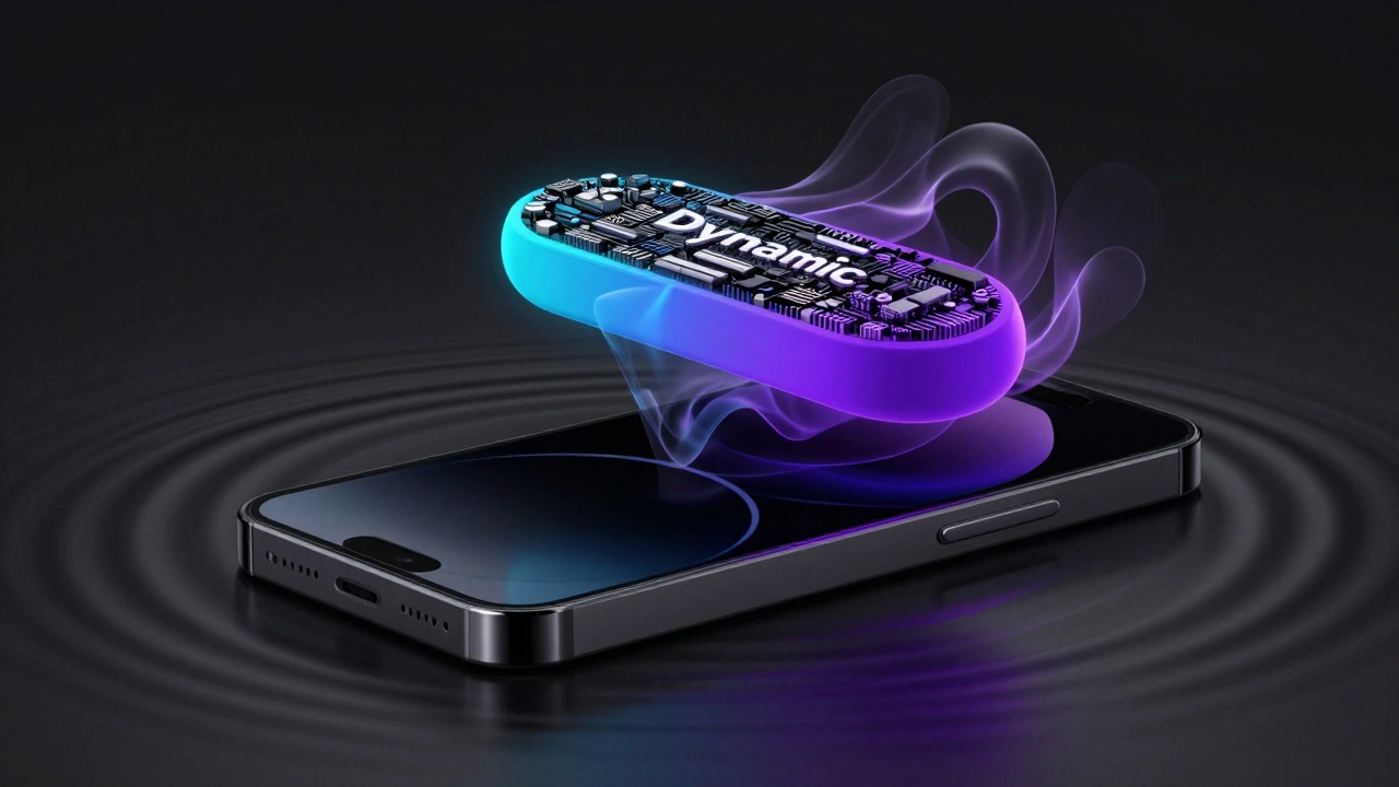
Meaningful Motion and the Dynamic Island
Motion in iOS should never be purely decorative. Every animation should serve a purpose. When you tap a list item and the next screen slides in from the right, that's not just a "cool effect." It spatially reinforces the hierarchy, telling the user, "You are moving deeper into the app."
The latest challenge for designers is the Dynamic Island. This transforms the hardware cutout into a functional UI element. When designing for the Island, you have to think in three states:
- Compact: A small view showing basic live information (like a timer or music track).
- Expanded: A larger view that appears upon interaction to show more detail.
- Lock Screen: A simplified version for quick glances.
The key here is conciseness. You have very little real estate, so every pixel must earn its place.
The Accessibility Checklist
Accessibility isn't a "phase two" task; it's a foundational requirement. If your app isn't accessible, it's broken for a significant portion of your audience. Your HIG checklist must include:
- Dynamic Type: Ensure your layout doesn't break when a user increases the system font size.
- VoiceOver: Label your elements correctly so screen readers can describe the interface accurately.
- High Contrast: Check your color ratios. Pastel-on-white might look "minimal," but it's unreadable for people with visual impairments.
Do I have to follow the HIG exactly to get approved on the App Store?
While Apple doesn't reject every app that deviates from the HIG, following them significantly increases your chances of a smooth review. More importantly, apps that ignore the HIG often feel "alien" to iOS users, which leads to higher churn rates and lower ratings.
Should I use a hamburger menu if I have a lot of sections?
Avoid it if possible. Apple recommends using a Tab Bar for primary navigation. If you have more than five top-level sections, consider grouping them or using a secondary navigation menu within one of the tabs. Hamburger menus hide navigation, which increases the effort required for the user to discover features.
What is the difference between a Sheet and a Popover?
Sheets slide up from the bottom and are the primary modal for iPhones. Popovers are anchored to a specific button or element and are more common on iPad or Mac where there is more screen real estate to float a small window without covering the entire interface.
How often should I use haptic feedback?
Sparingly. Haptics should complement visual feedback, not replace it. Use them for critical confirmations (like a successful payment) or physical-feeling interactions (like flipping a switch). Constant vibration for every single tap will lead to sensory overload and annoyance.
Why is the 44x44 point rule so important?
It is based on the average size of a human fingertip. Anything smaller than 44 points leads to "fat finger syndrome," where users accidentally trigger the wrong action. This creates a high level of frustration and makes the app feel unpolished.
Final Implementation Steps
If you're staring at a blank canvas, don't start with the visuals. Start with the hierarchy. Map out your user flow and identify where a Tab Bar is needed versus where a Navigation Bar should take over. Once the structure is solid, apply the 44-point rule to your buttons and check your color contrast for accessibility.
Finally, test your gestures on a real device. A swipe that feels natural on a mouse in Figma might feel awkward when your thumb is actually reaching for the bottom of a physical iPhone 16. Real-world testing is the only way to ensure your app truly aligns with the HIG philosophy.