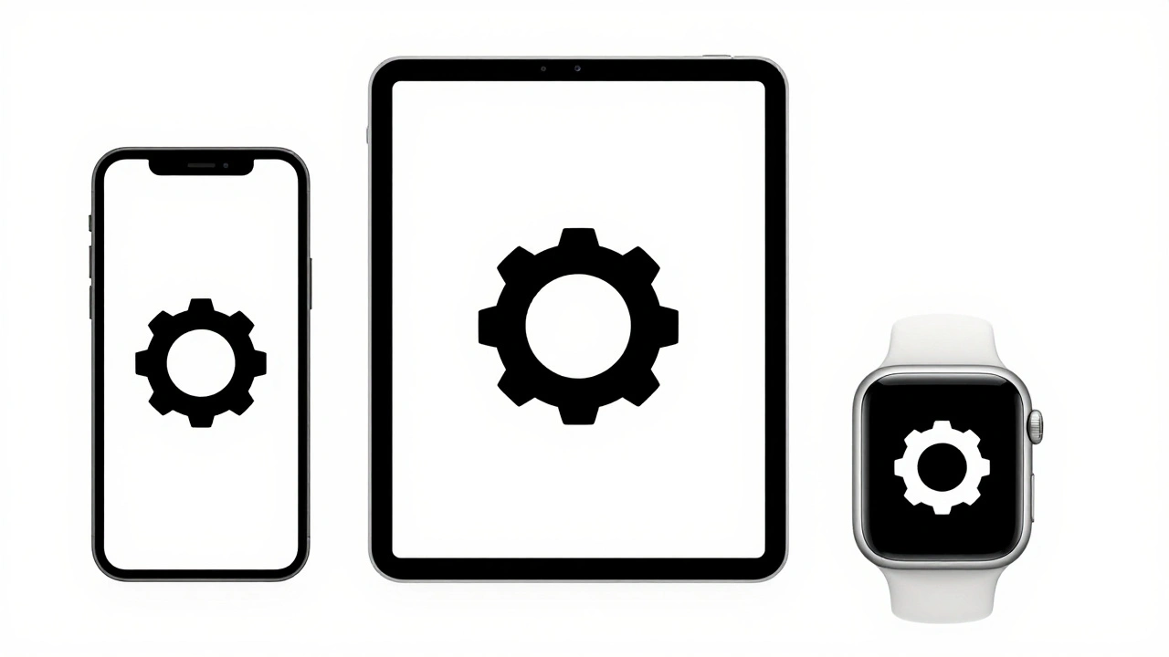

Ever opened a design file and found 50 versions of the same icon-some slightly bigger, some in different colors, others flipped left-to-right? You’re not alone. If you’re working with SF Symbols is a comprehensive library of vector-based icons from Apple, designed to scale perfectly across iOS, macOS, watchOS, and visionOS interfaces. Also known as Apple SF Symbols, it includes over 2,500 system icons that adapt automatically to text size, weight, and color scheme, you’ve probably hit this wall. The problem isn’t the symbols themselves-it’s how you manage their overrides.
Override management isn’t just about swapping icons. It’s about control. It’s about keeping your design system clean, scalable, and maintainable. When you misuse overrides, you end up with design debt: a file that’s slow to load, confusing to edit, and impossible to update without breaking ten components at once.
What Are SF Symbols Overrides, Really?
Overrides let you change parts of a symbol without touching the original. In Sketch or Figma, when you place a symbol (like a gear icon), you can override its color, size, or even swap it for a different symbol-say, from a gear to a settings panel. But here’s the catch: if you override too many things without structure, you lose track of what’s supposed to be editable and what’s not.
For example, you might have a button symbol with three override points: the icon, the text, and the background color. If you don’t label them clearly, the next designer opens the file and can’t tell which layer controls what. That’s where naming conventions save hours.
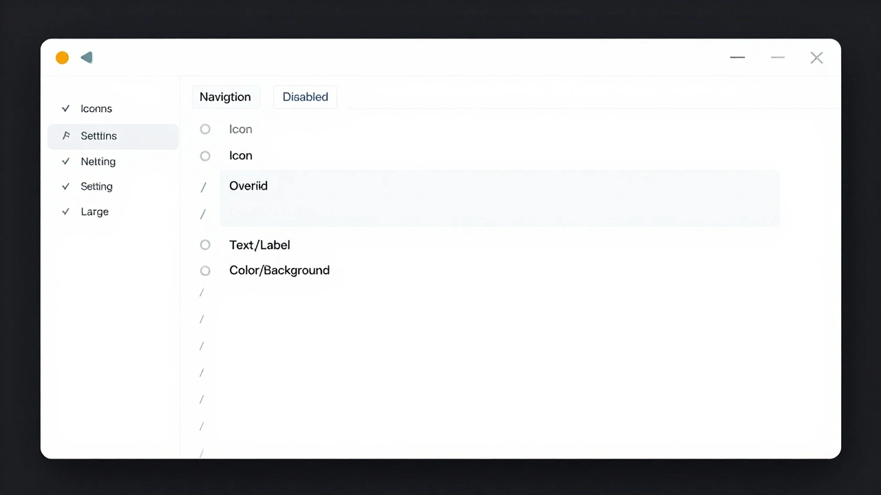
Use Forward Slashes to Organize Your Symbols Menu
Sketch and Figma let you organize symbols using forward slashes in the name. Instead of naming symbols like:
- SettingsIcon
- SettingsIconDisabled
- SettingsIconLarge
Use:
- Icons/Navigation/Settings
- Icons/Navigation/Settings/Disabled
- Icons/Navigation/Settings/Large
This creates a clean, collapsible hierarchy in the Symbols panel. You can find what you need in two clicks instead of scrolling for minutes. It’s the same logic Apple uses internally-grouping symbols by function, then state, then variation.
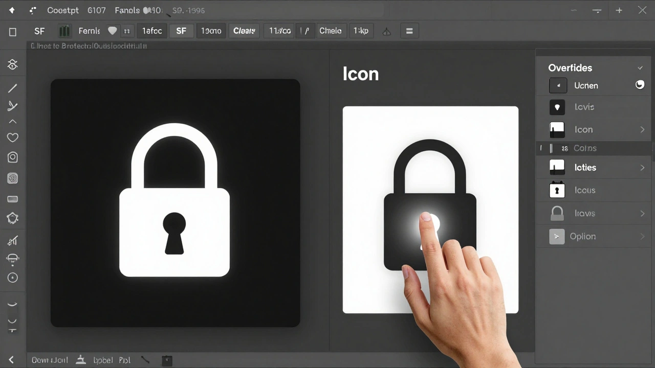
Label Override Layers Like a Pro
Every layer you want to override must have a clear, predictable name. Don’t use "Layer 1" or "Text Copy". Instead:
- Icon: Use "Icon" or "Symbol"
- Text: Use "Text/Label" or "Text/Action"
- Color: Use "Color/Background" or "Color/Stroke"
Why? Because when you open the Overrides panel, you’ll see these exact labels. If someone else (or even you, six months later) opens the file, they’ll instantly know what each override does. No guessing. No hunting.
Lock Overrides You Don’t Want Changed
Not every part of a symbol should be editable. Imagine a navigation bar symbol where the background color is fixed to match the system theme. If you leave it open to override, someone will change it to purple. And then you’ll have purple buttons on a dark mode screen.
Here’s how to lock it: hover over the layer, hold Option (on Mac), and click the lock icon that appears. The layer disappears from the Overrides panel. It’s now locked. To unlock it later, just repeat the same step.
This is especially useful for:
- Fixed spacing values
- System-aligned padding
- Icon sizes tied to text hierarchy
Locking isn’t about control-it’s about consistency.
Use Symbol Configuration for SF Symbols in Code
Designers aren’t the only ones who need organization. Developers using SF Symbols in Xcode rely on SymbolConfiguration is an API that lets developers define how symbols render-by weight, scale, point size, and color mode-using immutable configuration objects. Also known as SymbolConfiguration API, it ensures symbols adapt properly across different display settings and user preferences. You can’t change a configuration after it’s created. Instead, you combine it with another one to create a new version.
For example:
let baseConfig = SymbolConfiguration(weight: .regular, scale: .medium)
let customConfig = baseConfig.applying(SymbolConfiguration(color: .blue))
This creates a new configuration with blue color, while keeping the original weight and scale. It’s clean, predictable, and avoids hardcoding values everywhere.
How SF Symbols 3 Changed the Game
Before SF Symbols 3, every weight and scale had to be drawn manually. That meant 12 variations of a single icon: Ultralight-S, Ultralight-M, Ultralight-L, Regular-S, Regular-M, Regular-L… and so on. It was a nightmare to maintain.
Now, Apple introduced Interpolatable Symbols is a system that automatically generates symbol variations between three provided design variants, as long as they share matching paths, point counts, and structure. Also known as interpolated symbol templates, this reduces manual work by up to 80% for custom symbol creation. You only need to create three versions: light, medium, and heavy. The system fills in the rest.
For designers, this means fewer files to manage. For developers, it means faster rendering and smaller app sizes.
Custom Symbols Need Their Own Space
Apple separates system symbols from custom ones. You can’t mix them. If you create a custom icon called "home", it won’t conflict with the system "home" symbol-but only if you put it in the right place.
Custom symbols live in your app’s asset catalog, not in the system library. You load them using UIImage(named:), not the system symbol API. That separation is intentional. It prevents naming collisions and gives you full control.
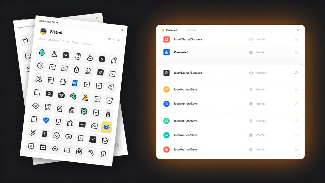
When you export a symbol template from the SF Symbols app (File > Export Template), you get an SVG with named layers. Rename those layers to match your system: "Icon/Action/Save", "Icon/Status/Success". Then import it into your asset catalog. Validate it using the SF Symbols app’s "Validate Templates" tool. If it passes, you’re good to go.
Rendering Modes Affect How You Build Symbols
SF Symbols support three rendering modes:
- Monochrome: All paths use one color. Layers can draw, erase, or hide paths.
- Hierarchical: Uses three color layers (primary, secondary, tertiary). Layers control hierarchy, not color.
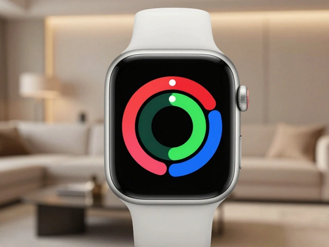
- Palette: Each layer gets its own color. Perfect for multi-color icons like emojis.
If you’re building a hierarchical icon (like a battery or progress bar), make sure each path has a clear hierarchy value. Don’t just color them-you assign them a level: 1, 2, or 3. Then, in code or design, you set the color for each level once. The symbol adapts automatically.
The "clear behind" feature in hierarchical mode is your best friend. It lets overlapping paths blend naturally without ugly color halos.
Localization Isn’t Just Translation
For right-to-left languages like Arabic or Hebrew, you don’t need to redesign your icons. Just flip them. But for cultures with different visual metaphors (like a trash can in China vs. the U.S.), you might need separate versions.
Localize your asset catalog. Assign different SVG templates to each locale. The system picks the right one automatically. No manual switching. No broken icons.
What Happens When You Don’t Organize?
Imagine you’re asked to change the color of every "success" icon in the app. You have 47 instances. But because you never labeled your overrides, you can’t tell which ones are icons, which are text, and which are background shapes. You end up manually editing each one. It takes two days.
Now imagine you had:
- Properly named symbols: "Icon/Status/Success"
- Locked background layers
- A single override point for color
You change the color once. It updates everywhere. Done in 10 seconds.
Organization isn’t about being neat. It’s about saving time, reducing errors, and making your work scalable.
Recovery Is Built In
Accidentally replaced an icon with the wrong one? No problem. Right-click on the symbol instance. Choose "Remove Image Override". It snaps back to the original. No undo needed. No backup required.
This works for text, color, and symbol swaps. It’s one of the most underrated features in design tools.
Final Rule: One Symbol, One Purpose
Don’t make a "Button" symbol that handles 12 different states. Make a "Primary Button". A "Secondary Button". A "Danger Button". Each with its own override points. It’s more work upfront-but it saves you 100x more later.
Every override you add should have a clear reason. If you can’t explain why it’s there, delete it.
Good symbol management isn’t magic. It’s just consistency. And consistency is the only thing that scales.
Can I use SF Symbols outside of Apple platforms?
SF Symbols are licensed for use only in Apple ecosystem apps. You can’t legally use them in Android, web, or Windows apps. If you need similar icons for cross-platform projects, consider using Apple’s system as inspiration but build your own set using tools like Figma’s Symbols or Adobe’s Libraries.
Do I need to use Sketch or Figma to manage SF Symbols?
No. You can manage SF Symbols directly in Xcode using asset catalogs. But for design teams working with developers, using Sketch or Figma to create reusable components with proper overrides makes collaboration smoother. Designers can mock up screens, and developers can see exactly which parts are meant to be dynamic.
How do I export SF Symbols for custom use?
Open the SF Symbols app on macOS, select a symbol, go to File > Export Template. Choose SVG format. This gives you a clean, layered file you can customize in Illustrator, Figma, or Affinity Designer. Always validate it using the app’s "Validate Templates" tool before importing into your asset catalog.
Why can’t I override a symbol in my design file?
Three common reasons: 1) The layer is locked (Option + click lock icon to unlock), 2) The symbol is nested inside another symbol without exposing the override, or 3) The symbol was imported as a raster image instead of a vector. Always check the layer structure and ensure overrides are enabled in the symbol’s definition.
Is there a limit to how many overrides a symbol can have?
Technically, no. But practically, yes. Too many overrides (more than 5-6) make symbols hard to manage and slow down your design tool. Keep it simple: one override for icon, one for text, one for color. That’s enough for 90% of cases. If you need more, split the symbol into smaller, focused components.