
When you open an iPhone app and everything feels just right-the spacing, the colors, the way buttons respond-you’re not just seeing good design. You’re seeing a design system at work. And at the heart of Apple’s consistency isn’t just a Figma file or a Sketch library. It’s a quiet, structured system built on tokens, components, and strict governance. Most companies struggle to scale design. Apple doesn’t. Here’s how they do it.
What Are Design Tokens, Really?
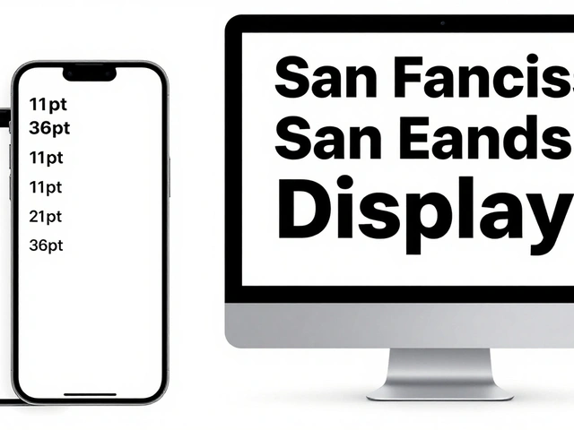
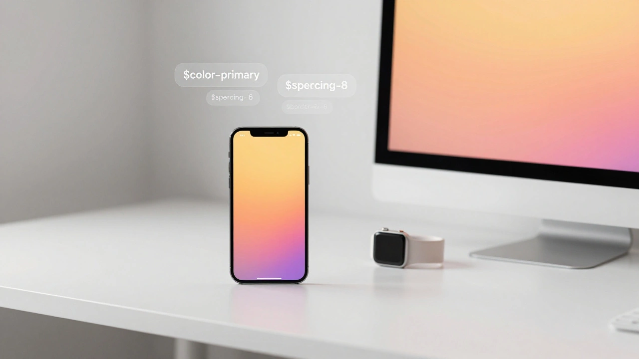
Design tokens are the smallest, most basic building blocks of a design system. Think of them as the DNA of your UI. They’re not colors or fonts. They’re the values behind those things. A token isn’t "#007AFF"-it’s $color-primary. That’s it. And that small shift changes everything.
Apple doesn’t hardcode blue into every button. Instead, they define a token like $color-system-blue that holds the value. If they need to adjust the blue across all products-say, for better accessibility-they change it in one place. Every app, every website, every watch face updates automatically. No manual search-and-replace. No missed screens. No inconsistency.
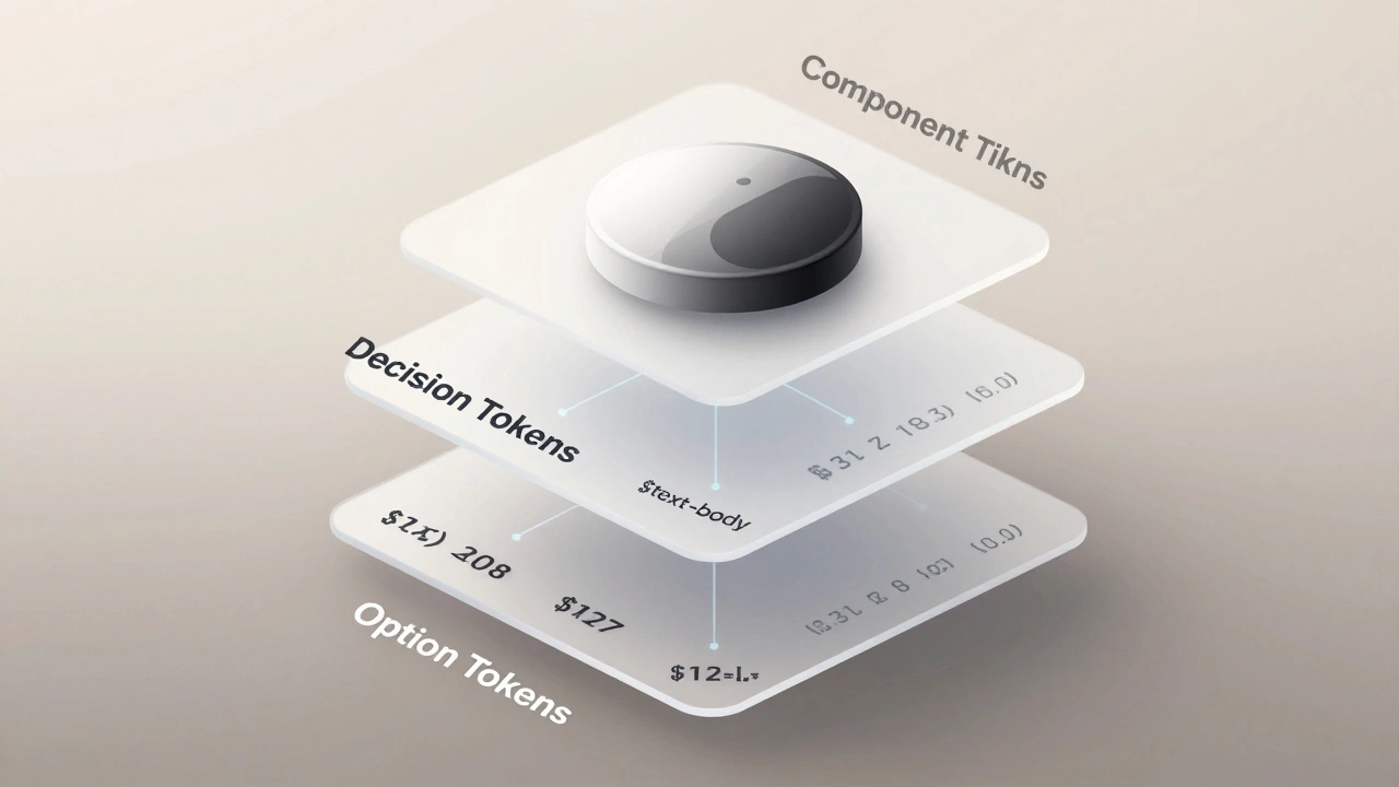
These tokens are organized in layers. The first layer is option tokens: raw values like $font-size-12, $spacing-8, $border-radius-6. These are the full menu of choices. The second layer is decision tokens: semantic labels like $text-body or $button-primary-height. These tell you what to use and why. The third layer is component tokens: specific to UI elements like $button-primary-background or $navigation-bar-shadow. These are the final outputs-what developers actually use in code.
By separating these layers, Apple keeps flexibility. Designers can tweak base values without breaking components. Developers get clear, meaningful names instead of magic numbers. And changes propagate instantly.
How Components Are Built from Tokens
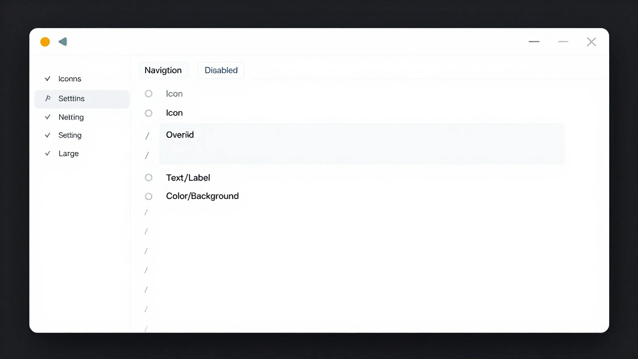
A button isn’t just a shape with text. It’s a system of states: default, hover, pressed, disabled. Each state has its own token values. Apple’s system defines these as component tokens, tied directly to their semantic decision tokens.
For example:
$button-primary-background→ uses$color-primary$button-primary-text-color→ uses$color-text-on-primary$button-primary-border-radius→ uses$border-radius-8
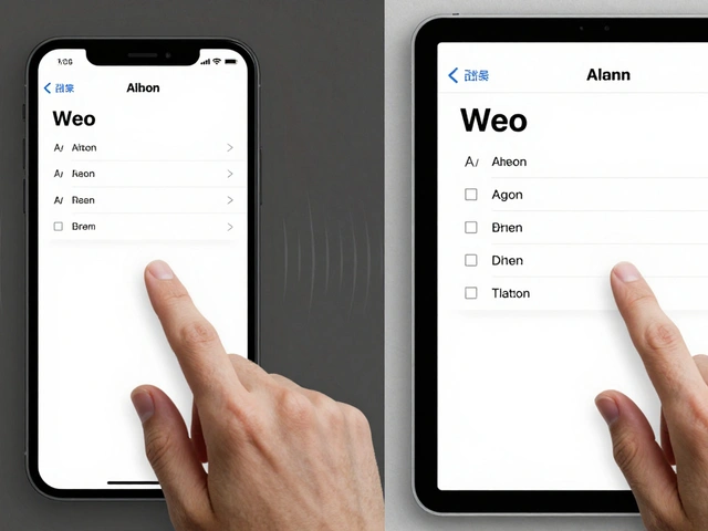
When you build a button in SwiftUI or UIKit, you don’t pick colors or sizes. You apply a pre-built component that pulls from these tokens. That’s why an iOS button looks identical to an iPad button, even if the screen size changes. The component adapts using the same underlying values.
Apple’s components are also theme-aware. The same button component works in Light Mode and Dark Mode because the tokens switch based on environment. There’s no separate button for dark mode. Just a token override: $color-primary-dark replaces $color-primary when the system theme changes.
This is where tokens become powerful. They turn design into a configuration system. One button component. Infinite appearances. All controlled by values, not code.
The Hidden Power of Semantic Tokens
Raw values like #007AFF tell you nothing about their purpose. Is it a button? A link? A highlight? Semantic tokens fix that. Instead of color codes, Apple uses names like:
$color-text-primary$color-text-secondary$color-background$color-surface
These names aren’t arbitrary. They reflect role, not appearance. A "primary text" token might be black on light mode and white on dark mode. But the name stays the same. Designers and developers know exactly what it’s for-no guessing.
This creates a kind of API for design. You don’t need to know the color. You just need to know you’re using text that’s meant to be read. Apple’s Human Interface Guidelines don’t just describe aesthetics-they define this language. And tokens make that language executable.
Compare this to a typical startup design system. They use $blue-500 and $blue-600. Who knows what those mean? Apple uses $color-text-on-surface. Clear. Predictable. Scalable.
Governance: Who Decides What Changes?
Design systems fail when they become messy. Too many colors. Too many button styles. Too many fonts. That’s where governance comes in.
Apple doesn’t let every team tweak the design system. They have a small, centralized team-likely inside the Human Interface group-that owns the core tokens. This team reviews every proposed change. Is this new shadow needed? Does this font size improve readability? Is this color accessible?
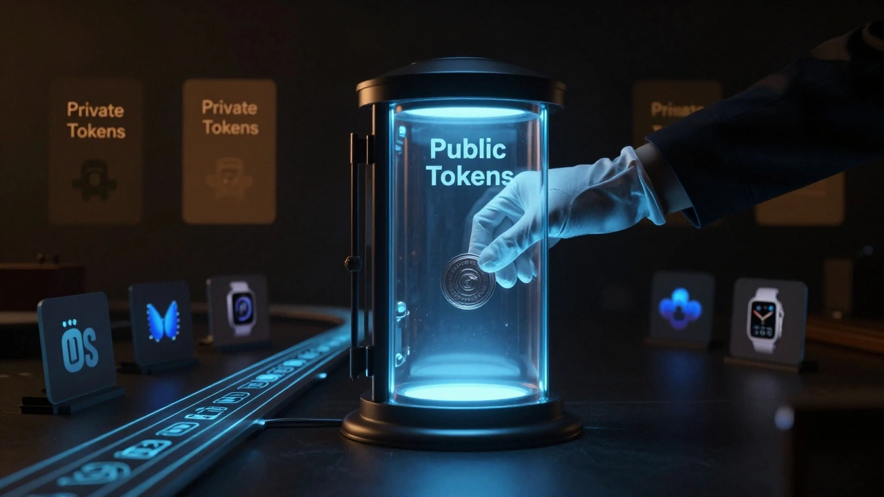
But Apple’s governance isn’t rigid. It’s smart. Teams can request custom tokens for unique cases-like a special state in a medical app on Apple Watch. But those are marked as private tokens. They live outside the public system. They don’t pollute the core. And they can be removed later without breaking anything else.
Private tokens are isolated. Public tokens are sacred. This balance keeps consistency without stifling innovation.
Changes are tracked in version-controlled repositories. Every token update has a commit message. Every change is reviewed. Every rollback is possible. This isn’t just good engineering-it’s design discipline.
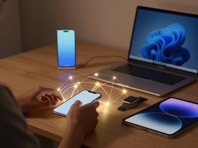
How Tokens Are Distributed Across Platforms
Apple’s design system doesn’t stop at iOS. It’s in macOS, tvOS, watchOS, Vision Pro, and even their website. How do they keep it all in sync?
They automate it.
Designers update tokens in a central JSON file. That file lives in a Git repository. A pipeline automatically converts it into:
- Swift constants for iOS
- SwiftUI styles for Vision Pro
- CSS variables for apple.com
- XML for watchOS
Each platform gets its own library. Developers pull in the version they need. They can lock to a specific version-say, v3.2.1-so their app doesn’t break when Apple pushes a new update. Or they can auto-update to stay current. It’s their choice.
This is how Apple ships updates across 10+ platforms without chaos. No more "but it looked different on my screen". The tokens are the source of truth. Everything else is just a translation.
Why This Matters for Your Design System
You don’t need to be Apple to use this approach. But you do need to stop thinking of design systems as libraries of UI elements. Start thinking of them as systems of values.
Here’s what you can steal from Apple’s model:
- Start with tokens-not components. Define your colors, spacing, and typography as data first.
- Use semantic names.
$text-heading>$font-size-24. - Separate public and private tokens. Let teams innovate without breaking the core.
- Store tokens in version control. Use JSON. Keep a history. Make changes traceable.
- Automate generation. Let your build tools turn tokens into code for every platform.
- Govern tightly. One team. One source. One rule: consistency over creativity.
Most teams spend months building Figma libraries. Apple spends months building token definitions. The difference? One takes hours to update. The other takes seconds.
What Happens When You Skip This
Without tokens, you’re just copying and pasting. You have 17 shades of blue. You have 5 types of buttons. You have a design system that’s more like a graveyard of old decisions.
When a new designer joins, they ask: "Which button do I use?" When a developer ships a feature, they say: "I thought this was supposed to be 16px padding." When the brand changes, you spend weeks fixing every screen.
Apple’s system avoids all of this. Because they treat design like code. And code is meant to be updated, tested, and scaled.
Final Thought
Design systems aren’t about making things look pretty. They’re about making things work reliably-at scale. Apple’s real innovation isn’t their UI. It’s their infrastructure. Tokens turn design decisions into something that can be versioned, tested, and deployed. Components turn those decisions into interfaces. Governance keeps them clean.
If you want to build something that lasts, don’t start with a library. Start with a token.
What’s the difference between design tokens and design systems?
Design tokens are the raw values-colors, spacing, fonts-that make up a design system. A design system is the full structure: tokens, components, guidelines, and governance. Tokens are the foundation. The system is the building built on top.
Do I need to use JSON for design tokens?
JSON is the most common and widely supported format because it’s human-readable, easy to version control, and works with almost every tool. The W3C Design Tokens specification uses JSON as its standard. While other formats exist, JSON gives you the best compatibility across design and development tools.
Can small teams benefit from design tokens?
Absolutely. Even teams of two or three benefit from tokens. Instead of saying "use blue", you say "use $color-primary". It removes guesswork. It makes changes faster. And if you ever grow, you’re already set up to scale.
How do I start building tokens for Apple platforms?
Start with Apple’s Human Interface Guidelines. Identify the core values: primary color, font sizes, spacing scales. Define them as tokens in a JSON file. Use semantic names like $color-text-primary. Then use tools like Style Dictionary or Tokens Studio to generate Swift and CSS code from them. Keep it simple. Build one token at a time.
Is Apple’s design system open source?
Apple doesn’t release its internal design system. But they do publish detailed guidelines in their Human Interface Documentation. You can use those as a blueprint to build your own system. Many open-source projects (like SwiftUI components) replicate Apple’s token structure, so you can study those as examples.