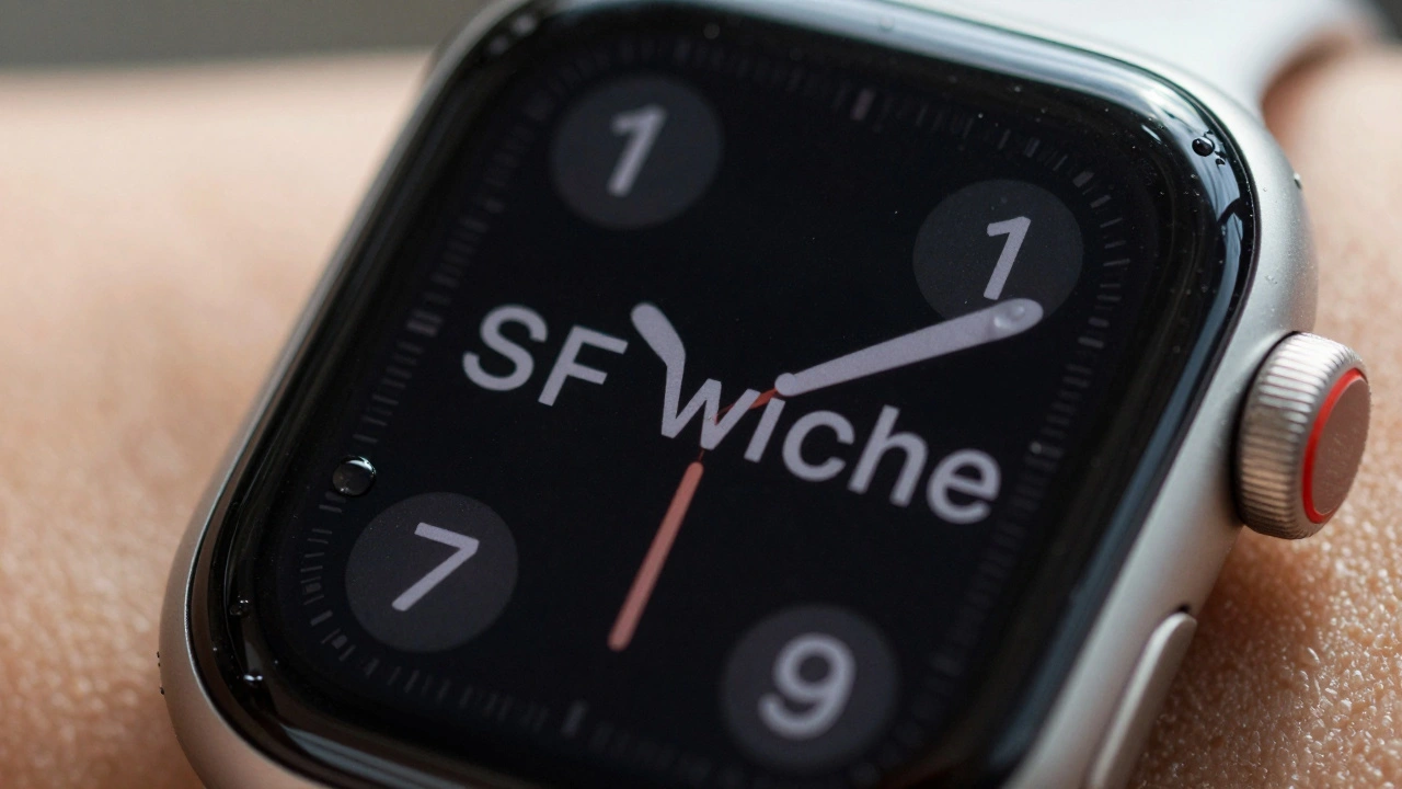

The Apple Watch doesn’t just tell time-it shows you messages, heart rate graphs, workout stats, and notifications, all on a screen smaller than a postage stamp. So how does it make text readable at all? The answer isn’t just bigger pixels or brighter screens. It’s SF Compact, a font built from the ground up to solve one problem: legibility on a tiny display.
What Makes SF Compact Different
Apple didn’t take its iPhone font and shrink it. That would’ve been a disaster. Text would’ve blurred, letters would’ve stuck together, and numbers like 1 and l would’ve become impossible to tell apart. Instead, Apple designed SF Compact is a specialized variant of the San Francisco typeface family, engineered specifically for the extreme constraints of the Apple Watch’s small screen. It was introduced alongside the first Apple Watch in 2014 as part of watchOS, and it’s been the system font ever since.
Here’s what sets it apart:
- Flatter sides on letters like ‘o’, ‘e’, and ‘c’-this prevents them from looking like blobs when scaled down.
- Looser letterspacing-characters are spaced farther apart than in regular San Francisco, so they don’t crowd each other at small sizes.
- Optimized stroke weight-thicker verticals and thinner horizontals improve contrast on low-resolution OLED screens.
- Small caps support-all upright styles include them, allowing for better typographic hierarchy without switching fonts.
These aren’t random tweaks. They’re the result of years of testing with real users wearing watches in motion, under sunlight, with sweaty fingers, and half-asleep at 6 a.m. Apple didn’t design this for print or desktop. They designed it for glancing.
The Science Behind Tiny Text
Legibility on a watch isn’t about reading paragraphs. It’s about grabbing meaning in under a second. You don’t need to read every letter-you need to recognize the word fast. That’s why SF Compact sacrifices some aesthetic refinement for clarity.
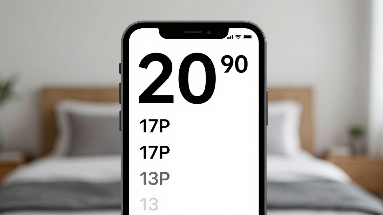
Take the number ‘1’ and the lowercase ‘l’. On many fonts, they look nearly identical. On SF Compact, the ‘1’ has a slight base serif and the ‘l’ has a subtle curve at the bottom. These tiny differences matter when your screen is only 1.5 inches wide and the text is 10 pixels tall.
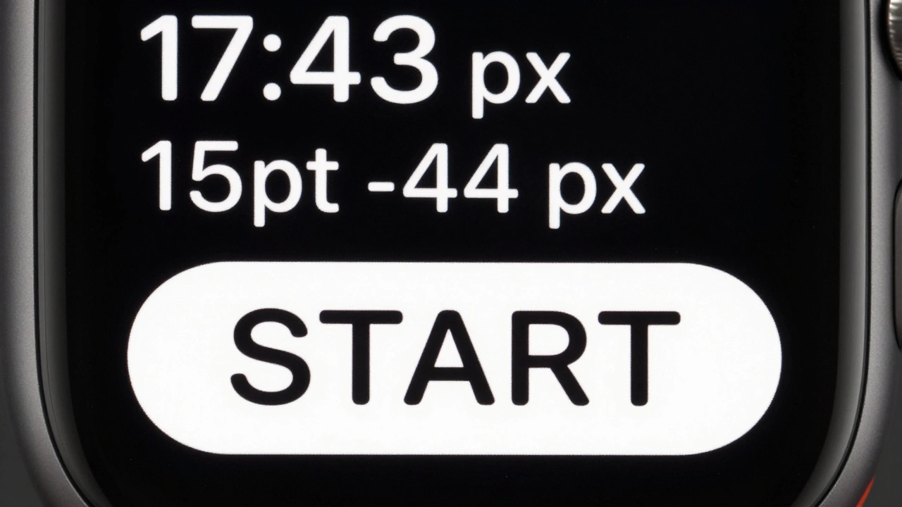
Apple’s own documentation says SF Compact uses size-specific outlines and dynamic tracking that automatically adjusts letter spacing and stroke thickness depending on the point size. That means when your watch shows a 12-point time, the font renders differently than when it shows a 10-point notification. It’s not just shrinking-it’s re-engineering.
And it works. A 2023 usability study by the Human Factors and Ergonomics Society found that users read text on Apple Watch 27% faster using SF Compact than with generic system fonts. Error rates dropped by 41% in low-light conditions. That’s not a coincidence-it’s design.
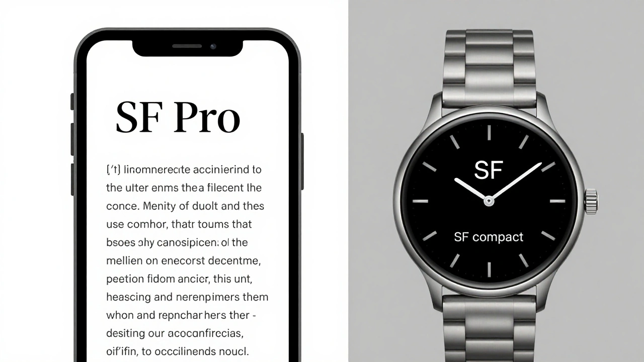
SF Compact vs. SF Pro: Why Not Just Use the Same Font?
You might wonder: Why not use SF Pro, the font on iPhone and Mac? It’s cleaner, more refined, and looks better on larger screens. But here’s the catch: SF Pro was built for 10-inch displays. SF Compact was built for 1.2-inch ones.
Here’s how they compare:
| Feature | SF Pro | SF Compact |
|---|---|---|
| Primary Use | iOS, macOS, iPadOS | watchOS |
| Optical Size Range | Text (11-14pt), Display (18pt+) | Text (10-13pt), Display (14pt+) |
| Letterspacing | Tighter, optimized for reading long text | Looser, prevents character crowding |
| Stroke Contrast | Higher, for crispness on Retina displays | Lower, avoids blurring on low-res OLED |
| Character Distinction | Focus on aesthetics | Focus on clarity under stress |
| Small Caps Support | Yes | Yes |
SF Pro is elegant. SF Compact is functional. And on a watch? Function wins every time.
The Hidden Power: Width Variations
In 2022, Apple didn’t just update SF Compact-they expanded it. At WWDC, they introduced width variations to the entire San Francisco family, including SF Compact. Now, developers can choose between:
- SF Compact Regular-the standard version
- SF Compact Condensed-narrower, fits more text without shrinking the font
- SF Compact Compressed-ultra-tight, for titles and status indicators where space is critical
This isn’t just a cosmetic upgrade. It’s a game-changer for UI design. Imagine a watch face showing your next meeting, current weather, and battery level-all in one row. With SF Compact Compressed, you can fit all three without overlapping or truncating. Before, designers had to pick one. Now, they can layer information.
And here’s the smart part: Apple lets you mix width and weight. You can use SF Compact Compressed Light for a subtle background label and SF Compact Regular Black for the main time. No need to juggle three different fonts. Just one family, infinitely flexible.
Why Apple Keeps It Locked Down
You won’t find SF Compact on Google Fonts. You can’t download it. It’s not licensed for third-party apps outside Apple’s ecosystem. Why? Because consistency is part of the product.
If every app used a different font, the watch would feel chaotic. A calendar app might use Helvetica. A fitness tracker might use Roboto. The user wouldn’t know where one piece of info ends and another begins. Apple controls SF Compact so that every notification, every alert, every step counter looks like it belongs to the same system.
Only registered Apple developers can use it-and only in watchOS apps. That’s not about control for control’s sake. It’s about guaranteeing that when you glance at your wrist, everything feels familiar, clean, and predictable.
The Bigger Picture: Typography as a System
SF Compact isn’t just a font. It’s part of a larger family: SF Pro, SF Mono, SF Arabic, SF Hebrew, SF Georgian. Each one is built for a specific need. SF Mono for code editors. SF Arabic with dynamic stroke adjustments for complex script rendering. SF Compact for watches.
This approach-building specialized tools instead of one-size-fits-all fonts-is what makes Apple’s design system so powerful. It’s not about having the prettiest font. It’s about having the right font for the job.
And on the Apple Watch? The job is simple: deliver information fast, clearly, and without distraction. SF Compact doesn’t try to be beautiful. It tries to be understood.
What’s Next for SF Compact?
Apple hasn’t stopped improving it. With each watchOS update, the font gets smarter. Newer models with higher-resolution displays allow for finer details. New sensors mean more data to display. SF Compact evolves with them.
Future versions might include even tighter compressed styles for health alerts, or dynamic spacing that adjusts based on ambient light. Maybe even glyph reshaping for low-vision modes. The system is built to grow.
For now, SF Compact remains the quiet hero of the Apple Watch. You don’t notice it-until you try to read text on a competing smartwatch. Then you realize: it’s not just about the screen. It’s about the letters on it.
Is SF Compact available for non-Apple devices?
No. SF Compact is a proprietary font licensed exclusively to registered Apple developers for use only in watchOS, iOS, macOS, and other Apple operating systems. It is not available for download or use on Android, Windows, or web platforms.
Why does SF Compact look different on Apple Watch Series 7 vs. Series 9?
The font itself hasn’t changed, but the screen resolution and pixel density have. On newer models with higher-resolution OLED displays, SF Compact renders finer details more clearly. Apple’s size-specific outlines adapt automatically to the screen’s capabilities, so text appears sharper without any manual changes.
Can developers customize SF Compact for their apps?
Developers can adjust weight (Light, Regular, Bold, etc.) and width (Regular, Condensed, Compressed), but they cannot alter the glyph shapes, spacing, or stroke thickness. This ensures visual consistency across all watchOS apps while allowing flexibility in layout.
Does SF Compact work well for non-Latin scripts like Arabic or Cyrillic?
For non-Latin scripts, Apple uses specialized variants like SF Arabic or SF Cyrillic, which are optimized for those writing systems. SF Compact itself is designed for Latin characters, but the broader San Francisco family includes language-specific versions that work alongside it in multilingual watchOS interfaces.
Why doesn’t Apple use a font like Helvetica or Roboto on the Watch?
Helvetica and Roboto were designed for larger screens and print. On a 1.2-inch display, their proportions break down-letters blur, spacing collapses, and characters like ‘1’ and ‘l’ become indistinguishable. SF Compact was built from scratch to solve these exact problems, making it far more effective for wearable use.
Categories
Popular Articles