
Ever wonder why some buttons on your iPhone disappear when you rotate the screen, or why the edit menu in Notes only shows up when you long-press? It’s not random. Every time Apple hides, shows, or removes a control, it’s making a deliberate choice based on years of research, user testing, and a strict design philosophy. This isn’t about saving screen space-it’s about controlling attention.
Clarity First: What Should Be Seen
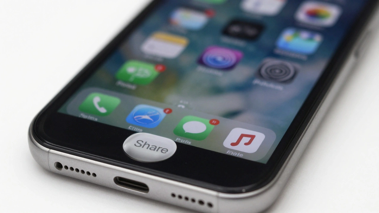
Apple’s design rule is simple: if it’s essential, it should be obvious. Clarity doesn’t mean more buttons. It means the right button, in the right place, at the right time. Think of the Photos app. The share button? Always there. The filter slider? Only appears when you tap Edit. Why? Because sharing is a core action. Editing is secondary. The system doesn’t assume you’ll need filters every time you open a photo-it waits for intent.This is the heart of Apple’s Clarity principle. Text is sharp. Icons are unambiguous. Controls stand out from content. No blending. No subtle gradients that make a button look like part of the background. If a control is meant to be tapped, it needs to feel like it’s meant to be tapped. That’s why the Home button on iPhone (and the equivalent gesture on newer models) has such strong visual feedback. It’s not just a gesture-it’s a landmark.
Deference: Let Content Breathe
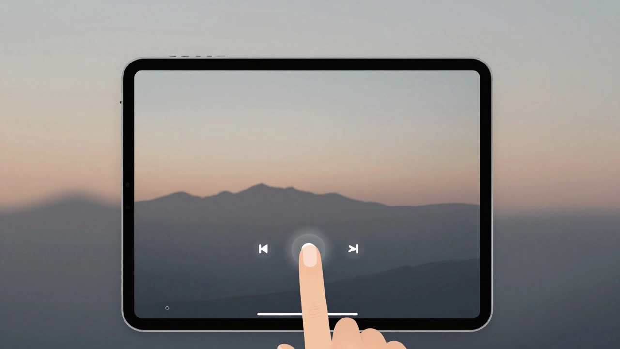
Deference is Apple’s quiet rebellion against clutter. It’s the idea that your content-not your UI-is the star. A photo app shouldn’t look like a control panel. A music player shouldn’t scream for attention with 12 buttons. So Apple hides what doesn’t need to be seen.Take the Music app on iPad. When you’re in full-screen playback mode, the playback controls shrink to a minimalist bar at the bottom. The volume slider, shuffle, repeat-gone. Not because they’re unimportant, but because they’re not the focus. Tap once, and they reappear. Tap again, and they vanish. This isn’t magic. It’s deference in action. The interface steps back so your music can take center stage.
This is why you don’t see a full toolbar in the Notes app unless you’re editing. The paper texture, the font size, the spacing-all designed to make writing feel natural. The formatting buttons? Hidden until you need them. No visual noise. No distraction. Just you and your thoughts.
Consistency: Predictability Builds Trust
If a swipe-up gesture reveals controls in one app, it should do the same in every other app. That’s consistency. It’s not about copying features-it’s about copying behavior. Users don’t want to relearn how to use your app every time they open it.On iPhone, swiping left on a message in Messages reveals options like Delete, Mark as Read, or Archive. Do the same thing in Mail? Same gesture. Same layout. Same visual language. Even if the actions are different, the pattern is identical. That’s what makes Apple’s ecosystem feel seamless. You don’t think about it. You just do it.
And it goes deeper than gestures. Color, spacing, animation speed, even the way buttons bounce when tapped-all follow strict rules. A button that appears after a delay should always appear with the same easing curve. A control that slides in from the right should never slide in from the left unless the context demands it. Consistency isn’t boring. It’s comforting.
Liquid Glass and the New Hierarchy
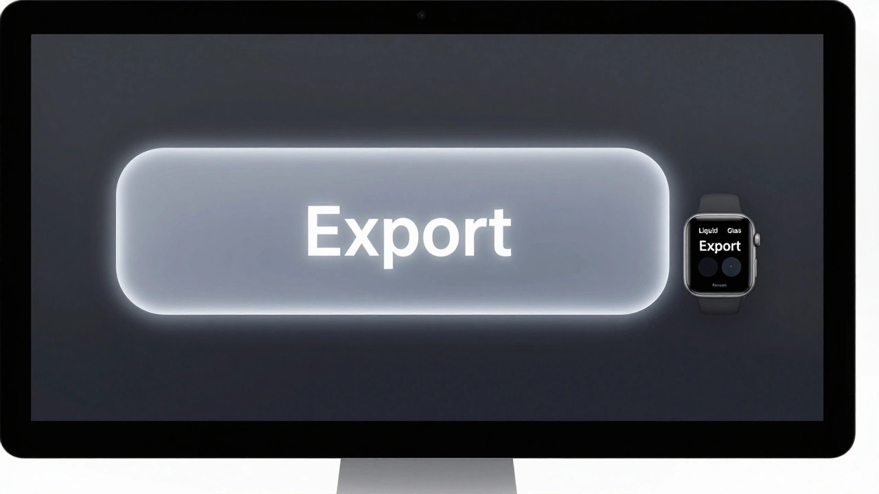
In 2025, Apple introduced Liquid Glass-a new design layer that changes how controls are treated based on space and importance. It’s not just a visual style. It’s a hierarchy tool.On a Mac with a 32-inch display, a button might be X-Large, with a soft glow and subtle transparency. On an Apple Watch, the same function might be a Mini control-tiny, but still tappable. The shape changes. The size changes. The behavior? Still consistent.
Liquid Glass doesn’t hide controls. It rescales them. A control that’s hidden on iPhone because of space constraints might be fully visible on iPad because the screen is wider. But it’s not just about screen size. It’s about context. On a split-view Mac app, the sidebar might show a full set of controls. On a single-window mode, those same controls collapse into a toolbar. The functionality is the same. The visibility adapts.
When to Remove, Not Just Hide
Hiding is temporary. Removing is permanent. And Apple removes controls only when they’re no longer useful-or worse, confusing.Remember the “Slide to Unlock” feature? It was removed not because it was broken, but because it was unnecessary. With Face ID and Touch ID, it added a step that didn’t improve security or speed. It was removed because it didn’t serve the user anymore.
Another example: the “Erase All Content and Settings” option used to sit inside Settings > General. Now it’s in a dedicated section under “Reset.” Why? Because it’s a high-risk action. It shouldn’t be buried. It should be hard to find by accident, but easy to find when needed. That’s not hiding. That’s reorganizing based on risk and frequency.
Controls are removed when:
- They duplicate another function (e.g., two ways to do the same thing)
- They’re rarely used (based on analytics and user testing)
- They create confusion (e.g., two similar buttons with different names)
- They’re tied to deprecated features (e.g., iTunes controls on iOS)
Apple doesn’t remove controls just because they’re old. They remove them when they’re no longer helping.
Accessibility Isn’t an Afterthought
Every visibility decision must pass an accessibility filter. If a control relies on animation to appear, it must also be accessible without animation. If a gesture reveals a menu, there must be an alternative-like a button or voice command.Take Reduce Motion. If a user turns this on, Apple’s systems automatically disable all unnecessary animations. That means any control that was hidden behind a swipe or a fade must now be permanently visible-or have a direct way to access it.
VoiceOver users don’t see the screen. They hear it. So if a control is hidden behind a gesture, VoiceOver can’t announce it. Apple requires that all interactive elements be discoverable through assistive tech. That’s why even hidden menus often have a label like “More Options” that VoiceOver reads aloud. You can’t hide something and expect users to find it if they can’t see it.
Layout Rules: No Zooming, No Guessing
Apple’s layout philosophy is simple: content should be readable without pinching or scrolling sideways. That means essential controls can’t be tucked away on a second screen unless the user can get there in one tap.On iPhone, the camera app doesn’t hide the flash toggle behind a menu. It’s right there. Why? Because in low light, you need it fast. On iPad, the same control might be in a slightly different spot, but it’s still visible and reachable without scrolling.
Controls that are related should stay together. If you’re editing a photo, the crop tool, brightness slider, and filter selector should be in the same panel. Splitting them across two screens forces the user to jump back and forth. That’s friction. Apple avoids friction.
Final Rule: Test, Don’t Assume
Apple doesn’t make these decisions in a boardroom. They test them. Hundreds of times. With real people. Real situations. Real frustration.They’ll watch someone use an app for 20 minutes. They’ll note where they pause. Where they tap twice. Where they look confused. If 3 out of 10 people miss a hidden button, it gets moved. If 9 out of 10 use a gesture correctly, it stays.
That’s the real secret. Apple doesn’t design for what they think users want. They design for what users actually do.
Why does Apple hide controls instead of just removing them?
Apple hides controls to keep interfaces clean while preserving access. Removing a control permanently can frustrate users who rely on it. Hiding lets users discover it when needed-through gestures, taps, or menus-without cluttering the screen. It’s a balance between simplicity and functionality.
Can hiding controls make an app harder to use?
Yes, if done poorly. Hiding essential controls-like a back button, save option, or volume control-can confuse users. Apple avoids this by only hiding secondary or advanced functions. If a control is needed more than once per task, it usually stays visible. The key is context: what’s hidden should never be critical to completing a core task.
How does screen size affect control visibility?
Larger screens like the iPad or Mac allow more controls to be visible at once. On iPhone, space is tight, so Apple prioritizes the most common actions. On Mac, you might see a full toolbar. On iPhone, those same controls might be in a menu. But the underlying logic stays the same: prioritize what’s used most, and group related controls together.
What role does accessibility play in hiding controls?
Accessibility requires that all interactive elements be reachable without relying on animations or gestures alone. If a control appears only after a swipe, there must be a button or voice command alternative. Apple’s Reduce Motion setting disables animations, so hidden controls must still be accessible through direct interaction. This isn’t optional-it’s a design requirement.
Is there a rule for when to use Liquid Glass controls?
Liquid Glass is used to emphasize controls in spacious areas-like on Mac or iPad Pro. It’s not for dense layouts. On small screens, Mini and Small controls with rounded rectangles work better. Liquid Glass helps create visual hierarchy: X-Large controls draw attention to primary actions, while smaller controls stay out of the way. It’s about matching the control’s size to the space and its importance.