
Apple didn’t just update its interface in 2025-it reinvented how digital surfaces behave. With the launch of Liquid Glass across iOS 26, iPadOS 26, macOS Tahoe 26, watchOS 26, and tvOS 26, Apple introduced a design language that doesn’t just look different-it moves, breathes, and reacts like something alive. This isn’t another tweak. It’s the third major shift in Apple’s interface philosophy in less than two decades, and it’s trying to fix the biggest flaws of both skeuomorphism and flat design.
What Was Before: The Two Extremes
Before Liquid Glass, Apple’s interface lived in two opposing worlds. The first was skeuomorphism, the design style that ruled from 2007 to 2012. Back then, your Notes app looked like a yellow legal pad with stitched edges and paper texture. The Calendar app had a leather-bound cover and real-looking page curls. It was familiar, almost comforting. But it was also heavy. Every texture, shadow, and highlight took up screen space and processing power. It made the interface feel cluttered, even when it wasn’t doing much.
Then came flat design with iOS 7 in 2013. Apple stripped away the fake leather, the glossy buttons, the 3D effects. Everything became clean lines, bold colors, and thin fonts. It was fast. It was minimal. It looked modern. But something was missing. Without depth or texture, buttons felt like invisible ghosts. You couldn’t tell what was tappable. Scrollable areas blended into backgrounds. The interface became efficient but impersonal. It looked like a PowerPoint slide.
Liquid Glass isn’t trying to go back to either. It’s building a bridge between them.
What Liquid Glass Actually Is
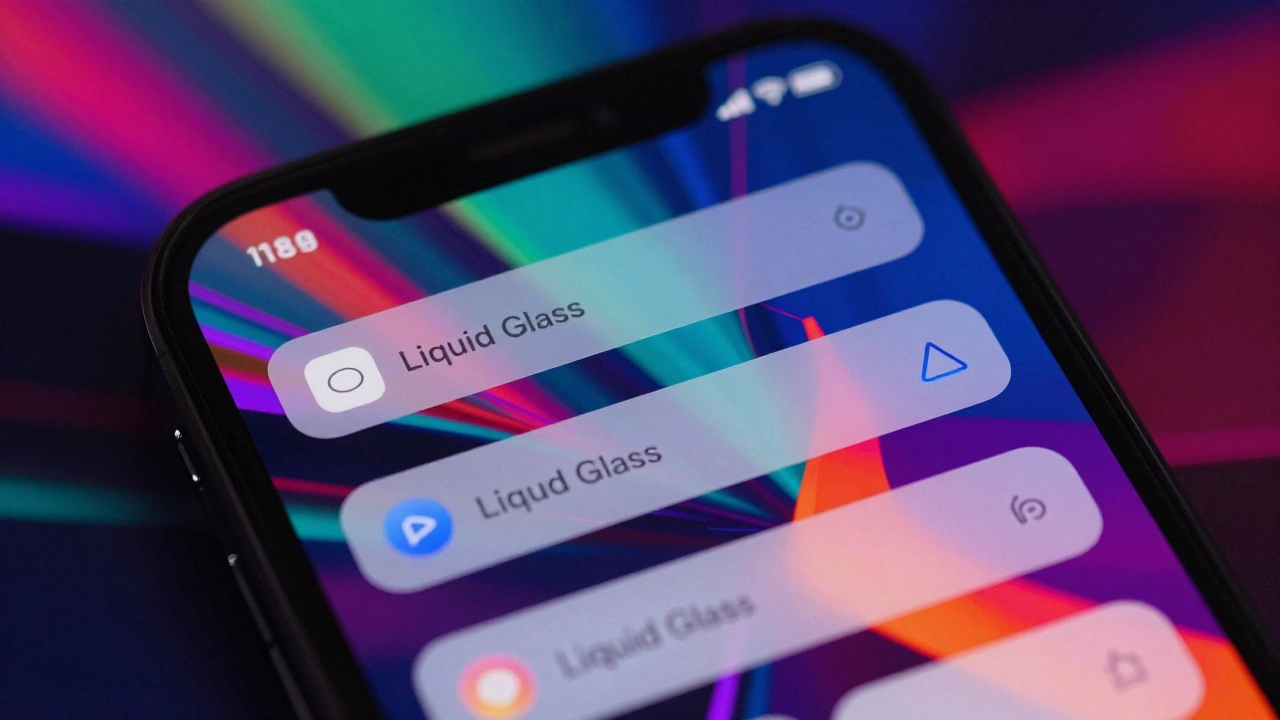
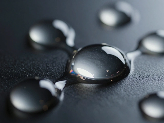
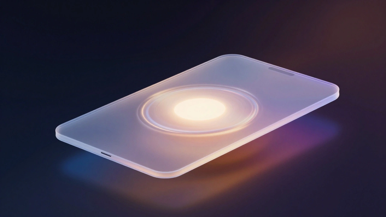
Liquid Glass isn’t glass. It’s not even a material you can touch. It’s a digital meta-material-a set of rules for how light, color, and motion behave in an interface. Apple describes it as "translucent, reflective, and dynamically transforming." That means every button, panel, or notification doesn’t have a fixed appearance. It changes based on what’s behind it.
Here’s how it works in practice:
- When you open Control Center, the background blur doesn’t just soften-it lenses. Light bends slightly around the edges, creating a subtle glow that makes the panel feel like it’s floating.
- Sliders and toggles don’t just change color. They shift their tint to match the content underneath, so a blue photo behind a slider makes the slider glow faintly blue, while a dark wallpaper makes it appear deeper and more opaque.
- When you swipe up to close an app, the interface doesn’t fade out. It modulates-light intensity decreases gradually, shadows soften, and the surface seems to melt into the background without losing its shape.
This isn’t animation for the sake of animation. It’s physics-based motion designed to feel intuitive. Apple’s designers studied how liquids move-how they ripple, flow, and settle-and applied those principles to every interaction. A button doesn’t just press. It flexes. It energizes. It responds.
Why It’s Better Than Flat Design
Flat design killed clutter, but it also killed clarity. You couldn’t tell what was part of the interface and what was content. Liquid Glass fixes that without bringing back the visual noise of skeuomorphism.
Take the Dock on iPadOS 26. In iOS 7, it was a flat, semi-transparent bar with no depth. Now, it has layered light bending. As you move your finger toward it, the edges sharpen. The shadow beneath deepens slightly, creating a clear separation from the app window behind it. You don’t need a border or outline. The light itself tells you where one layer ends and another begins.
Even small elements like toggles and sliders behave differently. In flat design, they were just colored shapes. Now, they react to motion. When you slide a volume control, the handle doesn’t just move-it pulls a trail of light behind it, like a droplet of water leaving a shimmering wake. It’s subtle, but it makes the interaction feel more connected to your hand.
How It Differs from Skeuomorphism
Skeuomorphism tried to mimic real-world objects. Liquid Glass doesn’t try to be anything real. It’s abstract, but it feels real because of how it behaves.
Remember the old Calendar app with its stitched leather? It looked like a physical object, but it didn’t change. It was always the same, no matter what time of day it was or what wallpaper you used. Liquid Glass adapts. It knows if you’re in light mode or dark mode. It knows if you’re looking at a bright photo or a dark video. It adjusts its transparency, tint, and shadow depth in real time.
And it’s not just static. On iPhone and iPad, the entire interface responds to device movement. Tilt your phone, and the glass panels tilt slightly with it-like light reflecting off a real glass surface. It’s not a gimmick. It’s a way to make the interface feel alive without adding visual clutter.
The Hardware Behind the Magic
Liquid Glass doesn’t run on old chips. It requires Apple silicon. That’s not an accident. Apple designed this system to push the limits of what its processors can do. The real-time light bending, adaptive tinting, and motion modulation require constant GPU calculations. On an M1 iPad, it’s smooth. On an A12 iPhone, it’s still functional-but you’ll notice the effects are less refined.
This is intentional. Apple is using Liquid Glass as a way to show off the power of its own hardware. If you want the full experience, you need a device from 2020 or later. It’s not just a design upgrade-it’s an upgrade incentive.
Is It Really Better? The Criticism
Not everyone is sold. In February 2026, the Nielsen Norman Group published a report titled "Liquid Glass Is Cracked, and Usability Suffers in iOS 26." Their main concern? Cognitive overload. The constant shimmering, shifting, and glowing might be beautiful, but it’s distracting. When your brain has to track changing light patterns just to find a button, it slows you down.
They’re not wrong. Early adopters reported moments of confusion-especially in low-light environments where the interface became too translucent. Apple responded by scaling back the intensity of the effects between the beta and final release. That’s typical Apple behavior. They always dial back the flashiness after real-world testing.
But here’s the thing: the same criticism was leveled at iOS 7 when flat design launched. People said it was too sterile. Too cold. Too hard to use. And within a year, everyone got used to it. Liquid Glass might follow the same path.
What This Means for the Future
Liquid Glass isn’t just a new look. It’s Apple’s answer to a deeper question: How do you make digital interfaces feel both alive and effortless? The answer isn’t more detail. It’s not less detail. It’s intelligent adaptation.
By unifying this design language across all five operating systems, Apple is saying: consistency matters. Whether you’re on a 4-inch Apple Watch or a 27-inch iMac, the interface should feel like the same system. Liquid Glass adapts its depth, shadow, and transparency based on screen size-something no previous design system could do.
Third-party apps are already adopting it. Developers using SwiftUI can apply Liquid Glass to custom buttons, menus, and panels with a single line of code. That’s how you know it’s here to stay.
Apple’s design history shows a pattern: every major overhaul takes 5 to 8 years to fully settle. Skeuomorphism lasted until 2013. Flat design lasted until 2025. Liquid Glass is now the standard. It won’t be replaced soon. It’ll be refined. Smoothed. Made more subtle. But it’s the new baseline.
For users, that means interfaces that feel more responsive, more alive, and more connected to the real world-not because they look like it, but because they move like it.
Is Liquid Glass just a visual effect, or does it change how apps work?
It’s both. Liquid Glass changes how interfaces look and how they behave. It doesn’t add new functions, but it makes interactions feel more natural. Buttons respond to touch with subtle light shifts, panels adjust their depth based on content, and transitions feel smoother because they’re guided by motion physics. It’s not about adding features-it’s about making existing ones feel better.
Do I need a new iPhone to use Liquid Glass?
You can run it on devices with A12 chips or later, but the full effect only appears on Apple silicon devices (M-series chips). Older iPhones and iPads will still show the interface, but the light bending, motion responsiveness, and adaptive tinting will be less pronounced. Apple designed it to showcase the power of its latest hardware.
Can third-party apps use Liquid Glass?
Yes. Apple released updated SwiftUI tools that let developers apply Liquid Glass to custom buttons, panels, and controls. Many popular apps, including Spotify, Notion, and Twitter, have already updated their interfaces to use it. It’s now part of Apple’s official design system.
Why did Apple abandon flat design?
Flat design made interfaces fast and clean, but it also made them feel flat-literally. Without depth cues, users struggled to tell what was interactive. Liquid Glass solves that by using light and motion to create depth without adding clutter. It keeps the minimalism of flat design but adds the clarity of physical materials.
Will Liquid Glass come to Android or other platforms?
No. Liquid Glass is a proprietary system built specifically for Apple’s hardware and software stack. It relies on Apple silicon’s processing power and deep integration with iOS, iPadOS, and macOS. Other platforms may borrow ideas, but they won’t get the same implementation. It’s an Apple-only experience.