
Before Apple became synonymous with sleek, minimalist tech, it was just another company making beige boxes. In the early 1980s, computers looked like office equipment-dull, boxy, and forgettable. Then came Snow White a revolutionary design language created by Hartmut Esslinger and his firm frogdesign that transformed Apple from a niche tech startup into a global design icon. This wasn’t just a new color or a rounded corner. It was a full-blown philosophy. And it started with a handshake in the Black Forest.
The Beige Problem
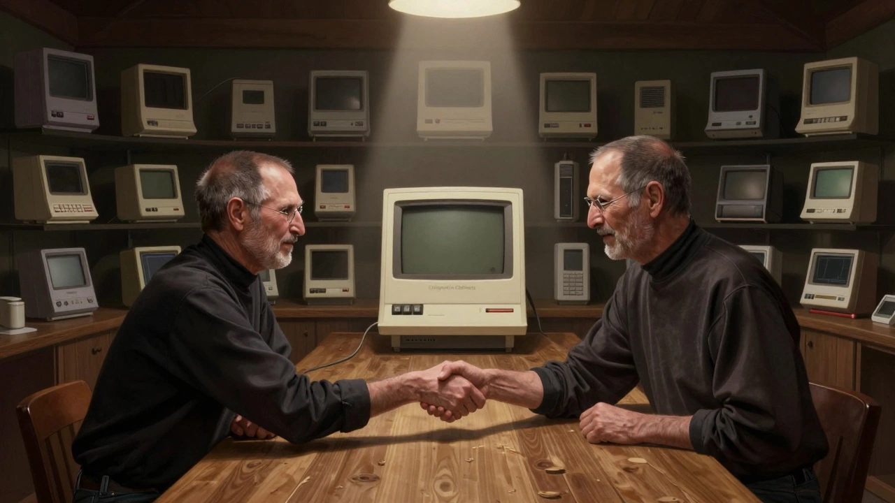
By 1982, Apple’s products-like the Apple IIe-looked like they’d been designed by engineers who didn’t care what they looked like. They were made of gray plastic, had sharp edges, and looked like they belonged in a bank vault, not a living room. Steve Jobs knew this was a problem. He didn’t just want to sell computers. He wanted to change how people felt about them. "We’re not selling machines," he told Hartmut Esslinger. "We’re selling desire."
At the time, most tech companies treated design as an afterthought. Apple was no different. But Jobs had a hunch: if a product looked beautiful, people would trust it more, use it longer, and tell others about it. He didn’t want to compete on specs. He wanted to compete on emotion. So he launched a secret project-codenamed "Snow White." Not because of fairy tales, but because it was a reference to the seven dwarves: seven product categories that needed a new look. Eight design firms submitted proposals. Only one got the job.
The German Who Saw What Apple Needed
Hartmut Esslinger wasn’t a household name. He ran a small design studio in Altensteig, Germany, where he’d worked with Sony and WEGA, turning electronics into objects people wanted to touch. He didn’t have a big office. He didn’t have a fancy portfolio. But he had something rarer: clarity. When Jobs flew to Germany to meet him, he didn’t just see a designer. He saw someone who understood design as storytelling.
Esslinger showed Jobs 40 different models-not just variations, but full concepts for how an entire product line could feel cohesive. Jobs looked at them, paused, and said: "That’s it."
The Snow White design language wasn’t about being flashy. It was about being intentional. Esslinger called it the "California Global Look." He wanted Apple to feel like it came from the same place as surf culture, Hollywood, and rock music-a place where technology didn’t have to be cold. He took inspiration from car design, movie props, and even album covers. The result? A visual identity that felt alive.
The Details That Changed Everything
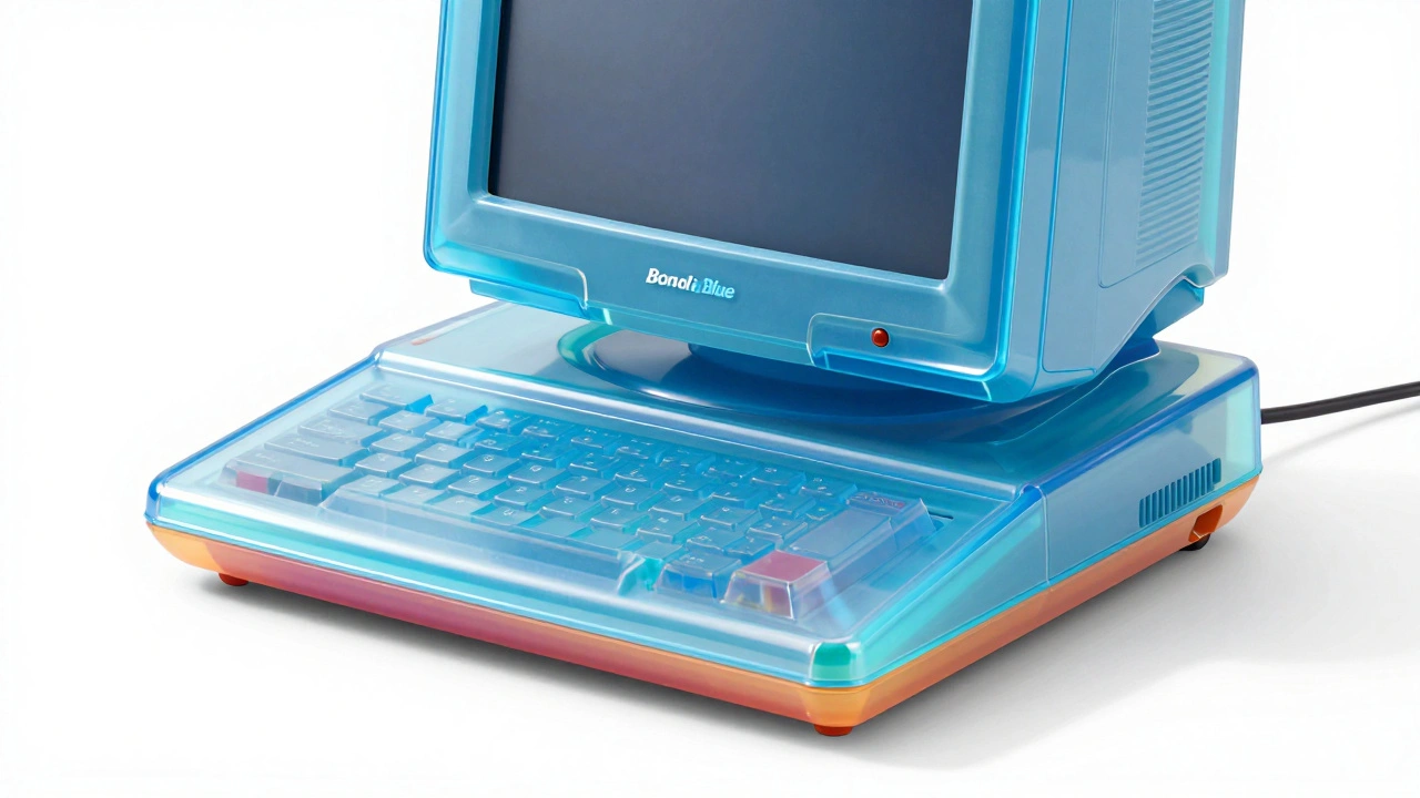
The Snow White design had five unmistakable traits:
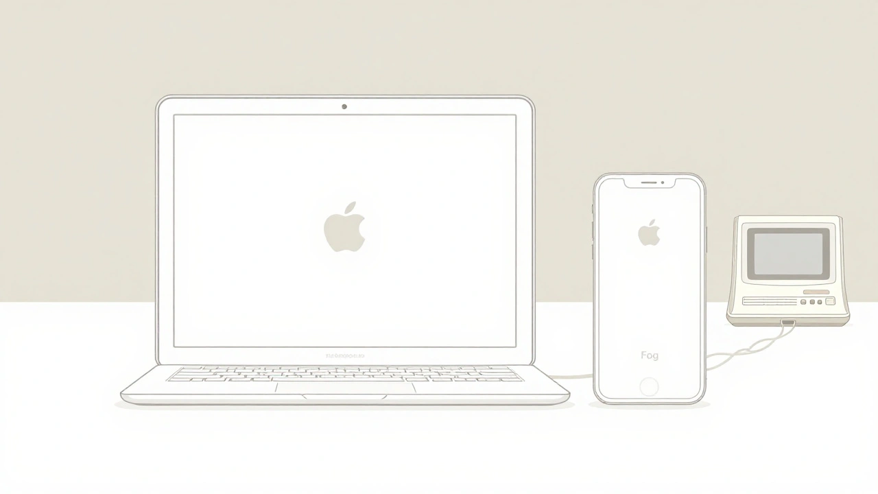
- Off-white enclosures-not pure white. Apple called it "Fog," a soft, warm tone that hid fingerprints and felt more human. Later, it evolved into "Platinum," a light gray that became standard for nearly a decade.
- Thin, even ventilation stripes-vertical and horizontal lines that weren’t just for airflow. They were graphic elements, turning a functional need into a signature pattern.
- Three-dimensional Apple logo-inlaid into the casing, not printed. It gave the logo depth, making it feel like part of the product, not a sticker.
- "Designed in California"-printed right under the logo. It wasn’t just a location. It was a brand promise. This phrase made Apple feel like a cultural force, not just a tech company.
- Rounded edges-no sharp corners. Everything felt softer, more approachable.
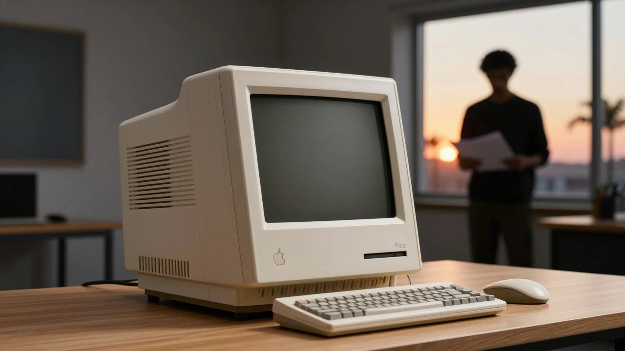
The first product to wear Snow White was the Apple IIc in 1984. It looked like nothing else on the market. It didn’t scream "computer." It whispered "future."
Soon, the Apple III, the original Macintosh, and even peripherals like keyboards and mice all followed the same language. For the first time, Apple’s products looked like they belonged together. That consistency built trust. People didn’t just buy one Mac-they bought into the whole system.
Why Snow White Lasted
Most design trends fade in a few years. Snow White lasted six. Why? Because it wasn’t just a style-it was a system. Esslinger didn’t just design shapes. He designed rules. Every curve, every stripe, every material had a reason. That made it scalable. When Apple added new products, they didn’t need to reinvent themselves. They just followed the blueprint.
It also won awards. Everywhere. From the Industrial Designers Society of America to European design journals. Suddenly, Apple wasn’t just a computer company. It was a design house. And that reputation stuck.
The Jobs-Esslinger Bond
Jobs and Esslinger didn’t just work together-they understood each other. Jobs was obsessive. Esslinger was relentless. They shared the same belief: design wasn’t decoration. It was the soul of the product.
Esslinger reported directly to Jobs and a handful of executives. No middlemen. No committees. That meant decisions moved fast. If Jobs liked something, it happened. If he didn’t, it got scrapped. That speed was rare in big companies. It’s why Apple’s design output during this time was so sharp.
When Jobs left Apple in 1985, everything changed. The new leadership tried to cut ties with frogdesign. They wanted to bring design in-house. But they didn’t know how to replicate what Esslinger had built. Without him, the design language started to drift. Colors got muddy. Details got sloppy. By 1987, the "Platinum" tone was still being used, but the precision was gone.
From Apple to NeXT: The Legacy Continues
Jobs didn’t forget Esslinger. After founding NeXT, he reached out. In 1986, the two reunited. The result? The NeXT Computer. It had a matte black case instead of white, but the DNA was unmistakable: thin seams, clean lines, no unnecessary details. The logo was still inlaid. The branding still said "Designed in California."
This wasn’t a reboot. It was an evolution. Esslinger proved the Snow White principles could work in any context. The same rules applied-simplicity, clarity, emotional connection. NeXT’s design became a cult favorite. It was the same philosophy, just darker.
The Ripple Effect
When Apple returned to prominence in the late 1990s under Steve Jobs’ return, they didn’t start from scratch. They looked back at Snow White. Jony Ive didn’t copy it-he absorbed it. The clean lines, the emphasis on material, the belief that design should be felt, not just seen-all came from Esslinger’s foundation.
Today, you can see Snow White in every Apple product. The way the MacBook’s edge curves. The way the logo is recessed. The way the vents on the iMac look like they belong. These aren’t accidents. They’re echoes.
Esslinger’s work taught the world that technology doesn’t have to feel mechanical. It can feel human. That’s why, decades later, people still talk about Snow White. Not because it was pretty. But because it was purposeful.
What Made Snow White Different?
Other companies tried to copy Apple’s look. They added rounded corners. They used white plastic. They printed "Designed in California" on their boxes. But none of them worked. Why?
Because Snow White wasn’t about the surface. It was about the thinking behind it.
- It treated design as a system, not a style.
- It made functional elements part of the beauty.
- It connected products to culture, not just specs.
- It trusted the user to feel the difference, not just read about it.
That’s why it lasted. And why it still matters.
What was the Snow White design language?
Snow White was a unified design language created by Hartmut Esslinger and frogdesign for Apple between 1984 and 1990. It featured off-white enclosures, thin ventilation stripes, an inlaid Apple logo, "Designed in California" branding, and rounded edges. It transformed Apple’s products from utilitarian machines into cohesive, emotionally resonant objects.
Why did Apple choose Hartmut Esslinger over other designers?
Apple ran a design competition called "Snow White," and Esslinger stood out because he didn’t just offer a look-he offered a full system. He presented 40 detailed models showing how every product in Apple’s lineup could feel connected. His vision aligned with Steve Jobs’ ambition to make Apple a design-led brand, not just a tech company. His German precision and Californian aesthetic made the difference.
Did the Snow White design language influence later Apple products?
Yes, profoundly. When Jony Ive took over Apple’s design team in the late 1990s, he didn’t invent a new style-he refined Esslinger’s principles. The emphasis on material quality, clean lines, and hidden functionality all trace back to Snow White. Even today’s MacBook and iPhone designs carry its DNA, just in a more minimalist form.
What happened to frogdesign after Apple stopped working with them?
After Apple reduced its reliance on frogdesign in the late 1980s, Esslinger continued to work with other major brands, including Sony, HP, and later NeXT. The firm expanded globally and remained a respected design consultancy. But the Apple project remained its most influential work. Esslinger himself called it "the most consequential collaboration in industrial design history."
Why did Apple switch from white to platinum gray?
The original off-white "Fog" color was hard to keep clean-it showed fingerprints and dust easily. By 1987, Apple switched to "Platinum," a lighter gray that still felt premium but was more practical for everyday use. The change was subtle but important: it showed Apple was listening to real-world feedback while keeping the same design language intact.