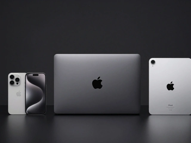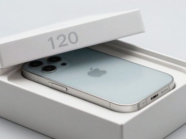

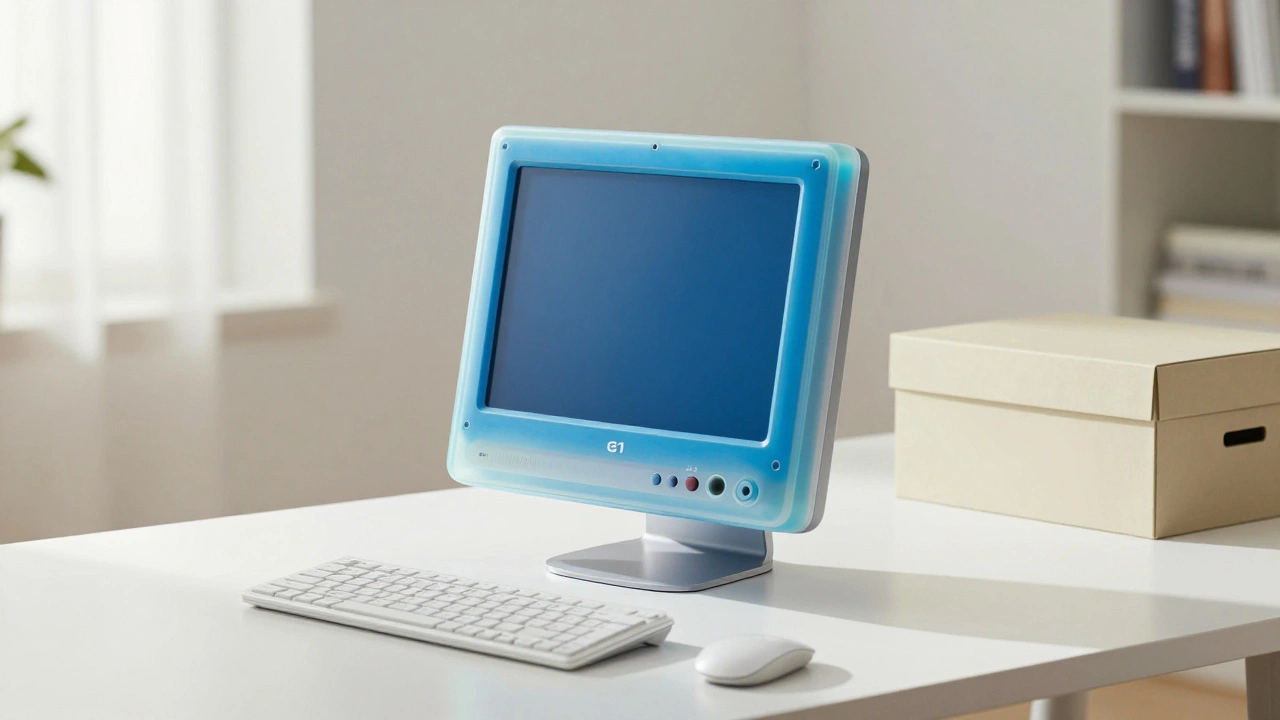
When you pick up an iPhone or unbox a MacBook, you’re not just holding a piece of technology-you’re holding a design philosophy that started decades ago in a small German factory. The clean lines, the quiet surfaces, the absence of logos, the way everything just works-none of this happened by accident. It was inherited. From the 1950s to today, the DNA of Apple’s design came straight from Dieter Rams and his work at Braun.
Dieter Rams Wasn’t Just a Designer-He Was a Philosophy
Dieter Rams didn’t design products to look cool. He designed them to disappear. To become invisible in the best way possible-so you didn’t think about the design at all. You just used the radio, the calculator, the shaver, and it felt right. That’s the core of his thinking: less, but better.
He didn’t invent minimalism, but he codified it. In 1977, Rams laid out his 10 Principles of Good Design. They weren’t suggestions. They were rules. Good design is innovative. It makes a product useful. It’s aesthetic. It’s unobtrusive. It’s honest. It’s long-lasting. It’s thorough. It’s environmentally friendly. And above all, it’s as little design as possible.
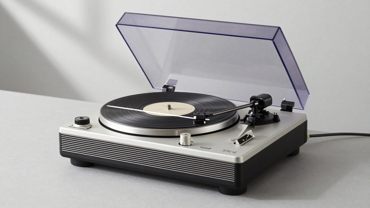
At Braun, where he worked from 1955 to 1995, those principles became law. No chrome trim. No fake wood veneers. No unnecessary buttons. If it didn’t improve function, it got cut. That meant products like the SK4 Radio and Phonograph a 1956 record player with a transparent acrylic lid that revealed the spinning vinyl, breaking the norm of hidden, bulky designs. Or the T3 Pocket Radio a 1958 device with a square body, a single circular speaker, and a tiny tuning knob-no flashy branding, no extra colors, just pure function. These weren’t just radios. They were quiet statements: you don’t need noise to be good.
Braun’s Design Was a Blueprint for Apple
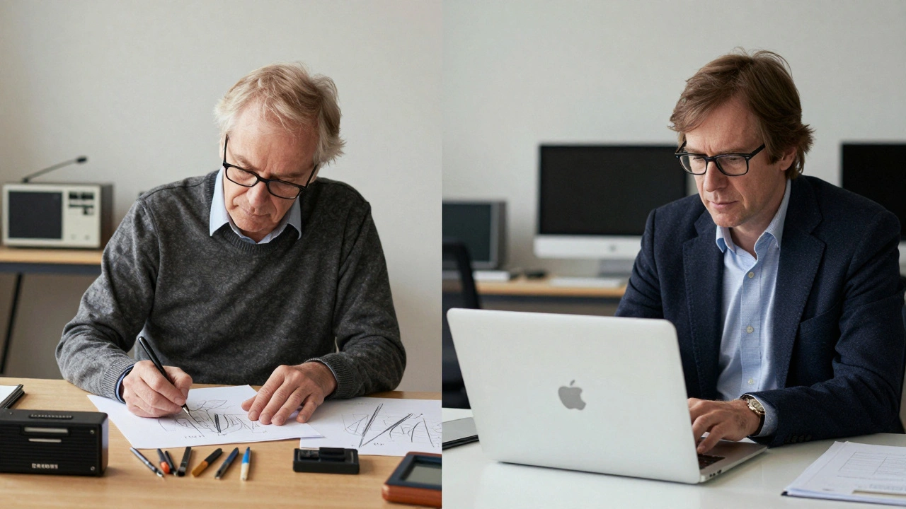
Steve Jobs didn’t just admire Dieter Rams-he studied him. Jobs saw Braun’s products in design books, in museums, in people’s homes. He didn’t just like how they looked. He loved how they made you feel. Confident. Calm. In control.
When Apple began designing its early Macs in the 1980s, they didn’t look like computers. They looked like Braun products. Clean white casings. Simple shapes. No screws visible. No logos screaming for attention. Even the original Macintosh mouse, with its single-button design and smooth curve, echoed the tactile simplicity of the Braun TP1 a 1959 record player and radio combo with no manual needed-everything was intuitive, from placing the record to adjusting the dial.
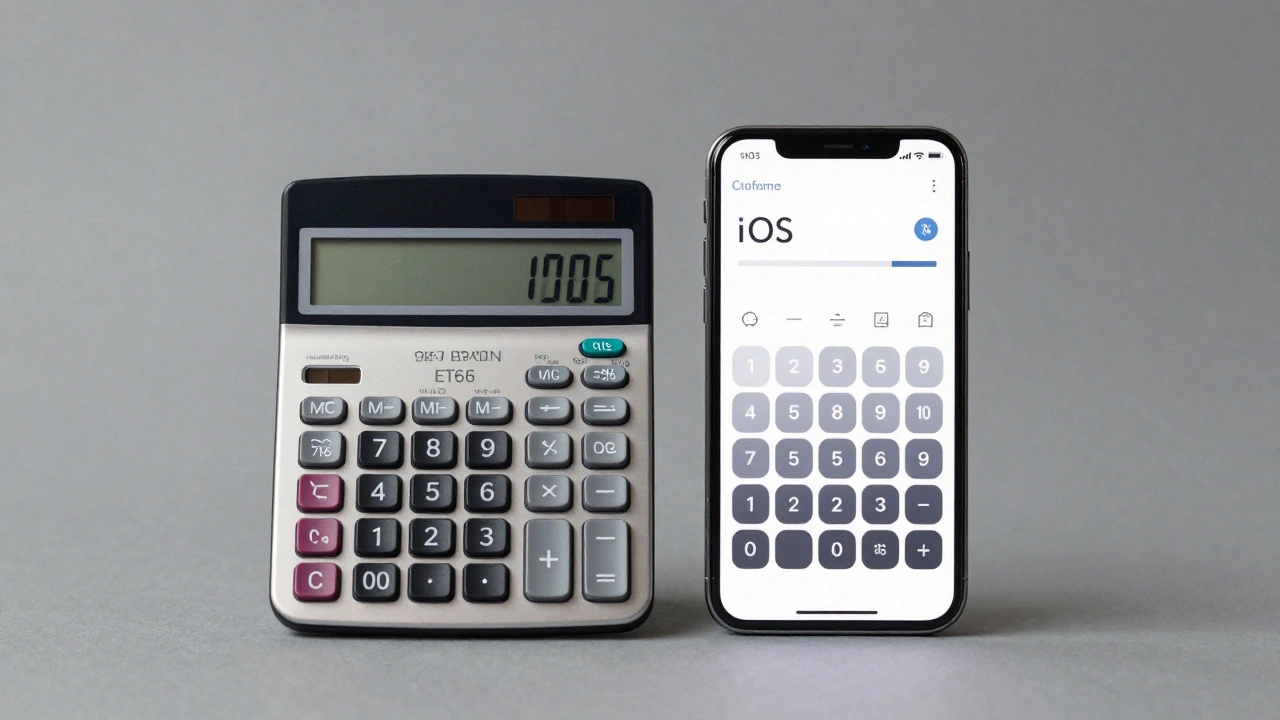
The ET66 Calculator released in 1987, with its soft rounded buttons, clean screen, and no extra functions is one of the clearest links. Look at the iOS calculator today. Same layout. Same spacing. Same lack of clutter. It’s not a coincidence. It’s a lineage.
Form Follows Function-But Only If Function Is Clear
Both Braun and Apple believe the same thing: if you have to read a manual, the design failed.
Braun’s radios didn’t have ten dials. They had one knob to tune, one to turn it on. The buttons were labeled clearly, in plain type. No icons, no symbols. Just words. Apple took that further. They didn’t even need words. The iPhone’s home button? A single, tactile circle. The volume buttons? Two small, perfectly spaced ridges. You feel them before you see them.
That’s not magic. That’s design discipline. Rams called it unobtrusive. Apple calls it intuitive. Same thing. When you’re not thinking about the interface, you’re thinking about what you’re doing-listening to music, taking a photo, writing a note. That’s the goal.
Materials That Last, Not Just Look Fancy
Braun didn’t use plastic because it was cheap. They used it because it was durable, and they painted it matte so it wouldn’t scratch or show fingerprints. They used brushed aluminum because it aged gracefully. No gloss. No shine. Just substance.
Apple did the same. The first MacBook didn’t have a plastic shell. It had aluminum. The iPhone didn’t have a plastic back. It had glass and metal. Not because they could afford it, but because they believed the material should reflect the quality of the experience.
Look at the difference between a 2005 Braun shaver and a 2025 iPhone. One is 70 years old. The other is brand new. But if you blindfolded someone and handed them both, they’d feel the same weight, the same precision, the same care. That’s not luck. That’s inheritance.
Why This Still Matters Today
Today, most tech companies add features like they’re trying to win a contest. More buttons. More apps. More notifications. More colors. More everything.
Apple still resists. Why? Because Rams was right. Complexity isn’t progress. Simplicity is.
The iPhone 16 doesn’t have 15 cameras. It has one, well-placed, with software that makes it feel smarter than a dozen. The AirPods don’t have touch controls on every surface. They have one, reliable tap. The Apple Watch doesn’t show 50 widgets at once. It shows what matters, when it matters.
That’s not innovation for the sake of innovation. That’s restraint. That’s discipline. That’s the Braun legacy.
And it’s working. People don’t buy Apple products because they’re the most powerful. They buy them because they’re the most calm. The most quiet. The most honest. The same things Dieter Rams fought for in the 1960s.
The Quiet Revolution
Dieter Rams never designed a smartphone. He never met Steve Jobs. But he shaped the way the world interacts with technology today.
His work at Braun wasn’t about trends. It was about truth. About removing what’s unnecessary. About letting the product speak for itself. Apple didn’t copy Braun. They understood it. And they made it global.
Every time you use a product that feels effortless, that doesn’t ask you to learn how to use it, that just works-you’re experiencing a design philosophy born in a small German factory, refined by a quiet designer who believed less was more. And you’re seeing why Apple still leads-not because of marketing, but because of a design language that’s lasted longer than any trend ever could.
Did Apple directly copy Dieter Rams’ designs?
No, Apple didn’t copy. They internalized. Rams’ designs were physical products-radios, calculators, shavers. Apple applied his principles to digital interfaces, touchscreens, and ecosystems. The resemblance isn’t in exact shapes, but in the philosophy: simplicity, clarity, honesty, and function-first thinking. Jony Ive said it best: "We’re not trying to make something that looks like Rams. We’re trying to make something that feels like him."
Why did Braun’s design philosophy fade after Rams left?
After Rams retired in 1995, Braun shifted toward cost-cutting and mass-market appeal. New owners prioritized volume over craftsmanship. Products started using cheaper plastics, louder colors, and more buttons. The brand lost its identity. Apple, by contrast, doubled down on Rams’ principles under Jony Ive. While Braun faded into obscurity, Apple made minimalism mainstream.
Is Apple’s design still influenced by Rams today?
Yes. Even after Jony Ive left in 2019, Apple’s design team continues to follow the same rules. The iPhone’s camera bump? Minimal. The MacBook’s keyboard? Gone, replaced by a single, smooth surface. The Apple Watch’s interface? No clutter, no extra menus. These aren’t accidents. They’re deliberate choices rooted in Rams’ 10 principles-especially "good design is as little design as possible."
What’s the biggest difference between Braun and Apple’s approach?
Braun designed for function in a mechanical world. Apple designs for function in a digital one. Braun’s radios had physical dials. Apple’s iPhones have gestures. But the goal is the same: remove friction. Make it feel natural. The difference is scale-Apple took Rams’ quiet elegance and made it the standard for billions of people.
Why do people still care about Dieter Rams in 2026?
Because the world is louder than ever. We’re drowning in notifications, ads, apps, and features. Rams’ message-"less, but better"-isn’t just design advice. It’s a lifeline. People don’t just admire his work. They crave it. That’s why Apple’s minimalism still sells. That’s why people pay more for a product that feels calm. Rams didn’t predict the future. He gave us the tools to build one worth living in.
Categories
Popular Articles