
Apple doesn’t make products that look simple because they’re easy to build. They make them look simple because every piece of complexity has been ruthlessly removed-except the parts that actually matter. You can’t just paint a device white, cut off corners, and call it minimalism. That’s decoration. Apple’s real minimalism is a systems thinking approach where hardware, software, packaging, and even the unboxing experience are designed as one connected system. And that’s why it lasts.
It Starts With the Idea That Form Follows Function-But Only After Emotion
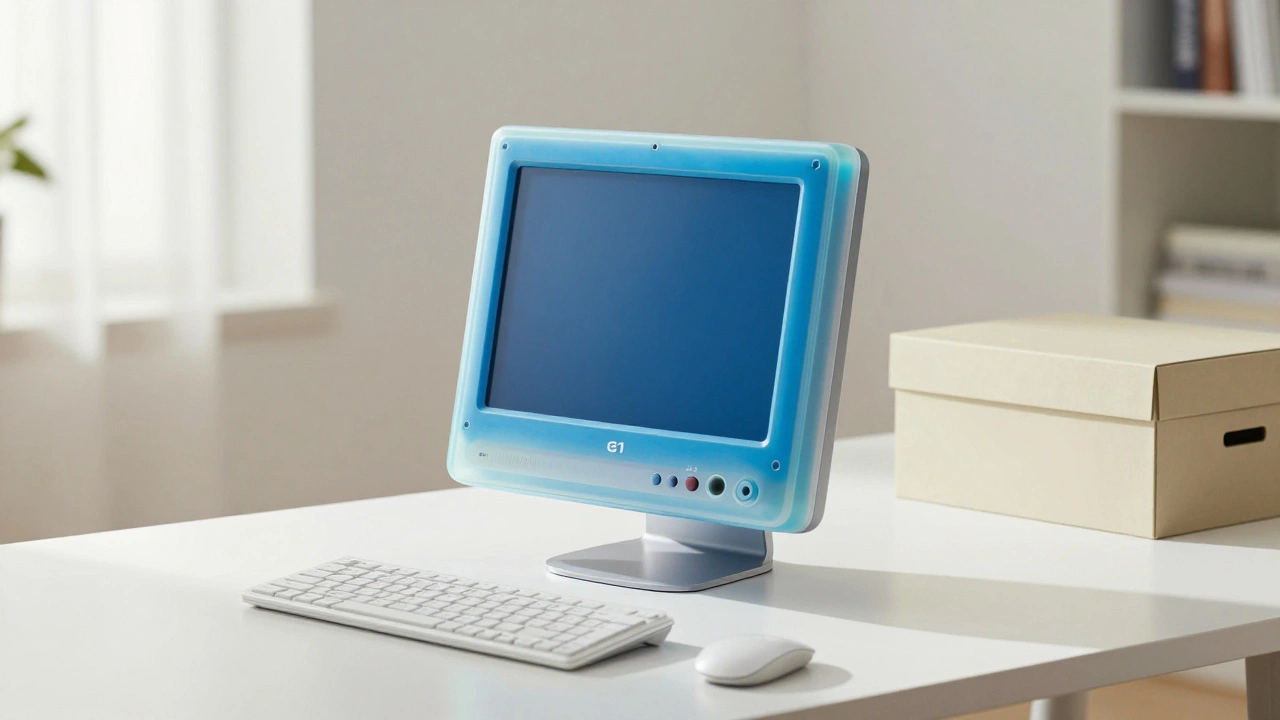
Most companies design by asking: "What can we fit in here?" Apple asks: "What should this thing feel like when you touch it?" Steve Jobs didn’t just want things to work. He wanted them to feel inevitable. That’s why the original iMac didn’t look like a computer. It looked like a piece of fruit. The colorful, translucent shell wasn’t a gimmick-it was a statement. It said: "This isn’t a machine you hide under your desk. This is something you want to leave out on your desk." This wasn’t about trends. It was about redefining what a computer could be. Jobs studied Dieter Rams’ work for Braun-clean lines, no unnecessary buttons, no plastic cladding. He didn’t copy it. He absorbed it. He saw that Rams’ best designs didn’t scream "designer." They whispered, "I belong here." That’s the difference between style and systems thinking.The Magic Is in the Integration
Think about the iPod. Before Apple, music players were clunky. You had to transfer files manually. You needed separate software. You couldn’t buy songs easily. Apple didn’t just make a better player. They built a system: the hardware, the iTunes software, the store, the syncing protocol-all designed together. No compromises. No licensing. No third-party middlemen. Compare that to Windows Mobile phones. Different manufacturers. Different software versions. Different interfaces. The experience was broken. Apple’s system didn’t just connect parts. It made them depend on each other. And that dependency created a kind of purity. If one piece didn’t fit perfectly, they didn’t ship. Jobs famously rejected designs where the screen didn’t sit flush with the bezel. "Why have a flat display if you’re going to glom all this stuff on its back?" he asked. That’s systems thinking. Not aesthetics. Not cost-cutting. It’s about the relationship between every element.Hardware Doesn’t Just House Software-It Defines It
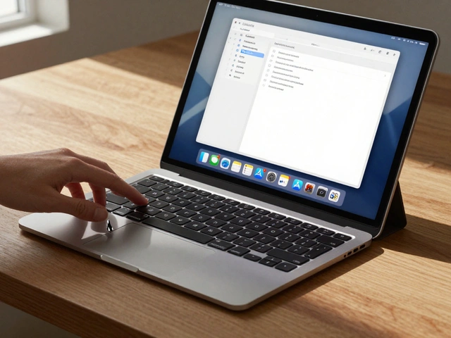
Most companies treat hardware as a container for software. Apple treats hardware as the foundation of the software experience. The Magic Mouse isn’t just a mouse with a touchpad. Its entire surface is a sensor. The way it detects taps, swipes, and pressure wasn’t added after the fact. It was designed from the ground up with the operating system. The same goes for the T2 chip in Macs, the H1 chip in AirPods, the M-series chips in iPhones and iPads. These aren’t just processors. They’re enablers of seamless behavior.When you swipe up on an iPhone, the animation isn’t just smooth because the GPU is fast. It’s smooth because the software was written to match the physical movement of your finger. The delay between touch and response is less than 10 milliseconds. That’s not luck. That’s engineering and design working in lockstep. You don’t get that by having a design team hand off a sketch to engineers. You get it when designers sit in engineering meetings, when engineers sit in design reviews, and when both sides refuse to settle.
Packaging Isn’t Just Protection-It’s the First Interaction
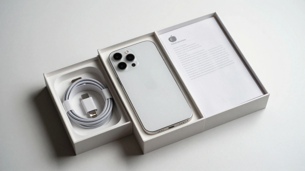
Look at how Apple packages its products. No plastic clamshells. No zip ties. No layers of foam. Just a single box. The product sits centered. The power cord is neatly folded. The instructions? A single sheet of paper. No manuals. No QR codes. No ads. This isn’t about saving money. It’s about signaling. The packaging says: "We didn’t cut corners. We didn’t throw in junk. We didn’t overthink this. We got it right." And when you open it, you feel it. That’s intentional. Jobs insisted on this. He once said, "We’re going to make them beautiful and white, just like Braun does with its electronics." He wasn’t talking about color. He was talking about trust.From Art to Architecture: How Tim Cook Changed the Direction
After Steve Jobs died, Apple didn’t lose its design soul. It changed its expression. Under Jony Ive, design became more refined, more geometric. Textures disappeared. Colors became monochrome. The focus shifted from emotional surprise to quiet reliability. The iPhone 6 didn’t feel like a revolution. It felt like an evolution. And that was the point.Jobs designed for wonder. Cook designs for trust. The difference isn’t in the tools. It’s in the intent. Jobs wanted you to say, "I didn’t know this was possible." Cook wants you to say, "I didn’t know I needed this." That’s why the HomePod doesn’t have a flashy screen. Why the AirTag doesn’t have a battery compartment you can open. Why the Apple Watch doesn’t have a physical button. Every feature is stripped down to its core function. No extras. No noise. Just clarity.
Why Competitors Can’t Copy It
Samsung, Google, Microsoft-they all try. They all release sleek devices. They all use white plastic and thin bezels. But none of them feel like Apple products. Why? Because they’re trying to copy the surface. They’re not building systems.Google’s Pixel phones have great cameras. Samsung’s Galaxy phones have the best screens. But their software doesn’t feel like it was built with the hardware. The animations lag. The settings are scattered. The updates are slow. Apple’s ecosystem isn’t just a list of products. It’s a single language spoken across all devices. When you unlock your iPhone, your Mac wakes up. When you answer a call on your AirPods, your Apple Watch vibrates. That’s not magic. That’s systems thinking.
Minimalism Isn’t Empty-It’s Full of Hidden Depth
The most misunderstood thing about Apple’s design is that it’s "simple." It’s not. It’s reduced. The iPhone has over 1,000 components. The M2 chip has 20 billion transistors. The operating system has millions of lines of code. But you never see any of it. You see a screen. A button. A swipe. That’s the trick. Apple doesn’t remove complexity. It hides it behind perfect clarity.That’s why Apple’s minimalism lasts. It doesn’t go out of style because it’s not about trends. It’s about truth. A well-designed door doesn’t need a handle if you can push it. A well-designed app doesn’t need a tutorial if you can use it without thinking. Apple’s products don’t ask you to learn them. They let you live with them.
| Aspect | Apple’s Approach | Typical Industry Approach |
|---|---|---|
| Design Process | Design leads engineering | Engineering drives design |
| Integration | Hardware and software co-developed | Software adapted to existing hardware |
| Packaging | Minimal, recyclable, experience-focused | Protective, cluttered, cost-driven |
| User Interface | Intuitive, no instructions needed | Feature-heavy, requires manuals |
| Design Philosophy | Deep simplicity: reduce complexity, not features | Surface simplicity: hide complexity behind aesthetics |
What Apple’s Minimalism Teaches Us
You don’t need to make iPhones to learn from Apple’s approach. If you’re building software, designing a website, or even organizing your workspace, the lesson is the same: Complexity is easy. Simplicity is hard. It takes years to understand what to remove. It takes courage to cut something beautiful if it doesn’t serve the whole.Apple’s real innovation wasn’t the iPhone. It was the belief that every part of a product-from the box it comes in to the way it charges-should feel like one continuous experience. That’s systems thinking. And that’s why their minimalism isn’t just style. It’s strategy. It’s science. It’s silence in a world full of noise.
Is Apple’s minimalism just about looks?
No. Apple’s minimalism is a systems-level philosophy. It’s not about removing decoration-it’s about removing unnecessary complexity from the entire experience. The white casing, the thin bezels, the lack of buttons-all serve a deeper purpose: to make the interaction between user and device feel effortless. This only works because hardware, software, packaging, and even the charging cable are designed as one connected system.
Why do Apple products feel more intuitive than others?
Because Apple designs the interface to match human behavior, not technical capability. The way an iPhone responds to a swipe, the haptic feedback on the Home button, the way your Mac wakes up when you open your AirPods case-all these are engineered to feel natural. Competitors often add features first and then try to make them usable. Apple starts with how a person would naturally use it, then builds the tech to support that.
Did Apple invent minimalism in tech?
No. Dieter Rams for Braun and the Bauhaus movement laid the groundwork. But Apple was the first to apply it at scale across an entire ecosystem. Before Apple, minimalism was mostly in industrial design. Apple made it the standard for consumer electronics, software interfaces, packaging, and even retail stores. They didn’t just adopt it-they elevated it into a complete operating system for design.
Why did Apple stop using colorful designs like the original iMac?
The colorful iMac was about breaking the mold-making technology feel fun and approachable. Once that message was received, Apple shifted focus from shock value to consistency. The move to monochrome wasn’t about losing personality-it was about refining it. The goal became making products that felt timeless, not trendy. That’s why today’s iPhones, MacBooks, and iPads look like they’ve always existed.
Can other companies replicate Apple’s design success?
Not by copying the look. You can’t buy Apple’s design philosophy. It requires total vertical integration, a culture where designers have real power over engineering, and leadership that refuses to compromise on experience. Most companies rely on outsourcing, licensing, and third-party software. Apple controls everything. That control is what lets them achieve true minimalism-where every detail serves the whole.
What Comes Next?
Apple’s minimalism isn’t frozen in time. It’s evolving. The next phase might be invisible interfaces-devices that respond without screens, that adapt without settings, that anticipate without asking. The goal remains the same: remove the friction between human and technology. Not by adding more intelligence-but by removing the need to think about it at all.That’s the real legacy of Steve Jobs and Jony Ive. They didn’t just make beautiful products. They made products that made life feel a little simpler. And in a world that keeps getting noisier, that’s the most powerful design of all.