
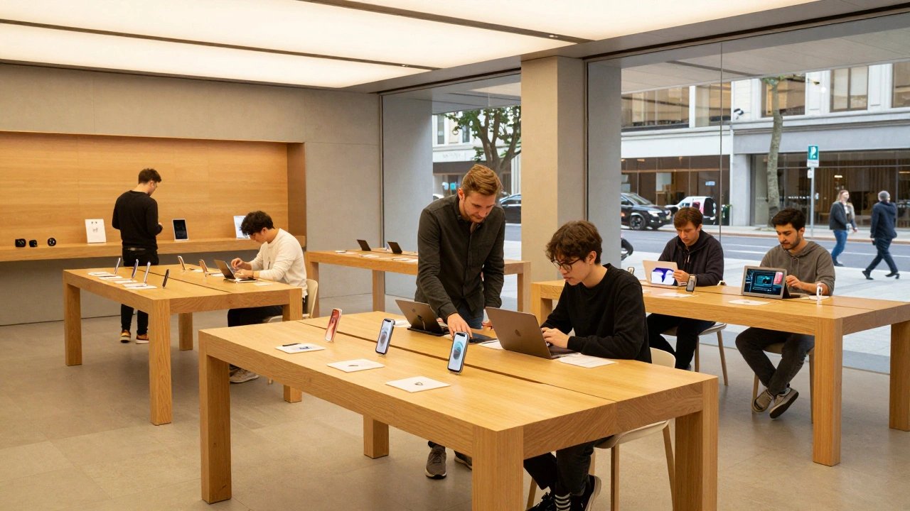
When you walk into an Apple Store, you don’t just walk into a shop. You walk into a space designed to make technology feel human. Not every Apple Store is the same. Some are quiet corners in malls. Others are bold, architectural statements that stop people in their tracks. Three stores stand out as landmarks: Marina Bay Sands in Singapore, Regent Street in London, and Via del Corso in Rome. Each one reflects its city, its culture, and Apple’s evolving vision for retail as experience.
Apple Marina Bay Sands: A Dome Over Water
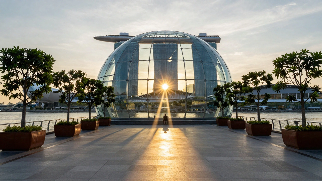
Open since September 2020, Apple Marina Bay Sands isn’t just a store-it’s a spectacle. Perched on the edge of Marina Bay, it looks like a floating glass sphere. The dome is 30 meters wide and 17 meters tall, built from 114 individual glass panels. Only 10 thin steel mullions hold it together. No columns. No supports. Just glass and air.
The design draws from the Pantheon in Rome, but instead of stone, it uses glass and steel. Sunlight pours through the central oculus at the top, casting a moving beam of light across the floor like a sundial. At night, the same spot glows softly, turning the space into a lantern. The glass gets darker as it rises, reducing heat while keeping views clear. It’s not just beautiful-it’s smart.
Inside, twelve trees sit in leather-lined planters along the edges. They’re not decoration. They’re part of the climate control system, shading the space and softening the light. The ceiling is lined with custom fabric baffles that twist upward like ribbons. They absorb sound, block glare, and even help direct airflow. The floor is polished stone, reflecting the sky and water outside.
Visitors enter through a 45-meter-long tunnel from The Shoppes at Marina Bay Sands. The transition is intentional: from crowded mall to open, calm space. Escalators lift you into the dome, revealing the bay and skyline in one sweeping view. There’s no checkout counter. No aisles. Just open space for exploring products, attending Today at Apple sessions, or sitting quietly with a coffee and a view.
Downstairs, hidden beneath the waterline, is Apple’s first underwater Boardroom. It’s where developers, entrepreneurs, and creators meet Apple engineers for hands-on training. The room is soundproofed, lit with warm LED strips, and surrounded by glass that lets in natural light from the bay. It’s not a conference room. It’s a sanctuary for creation.
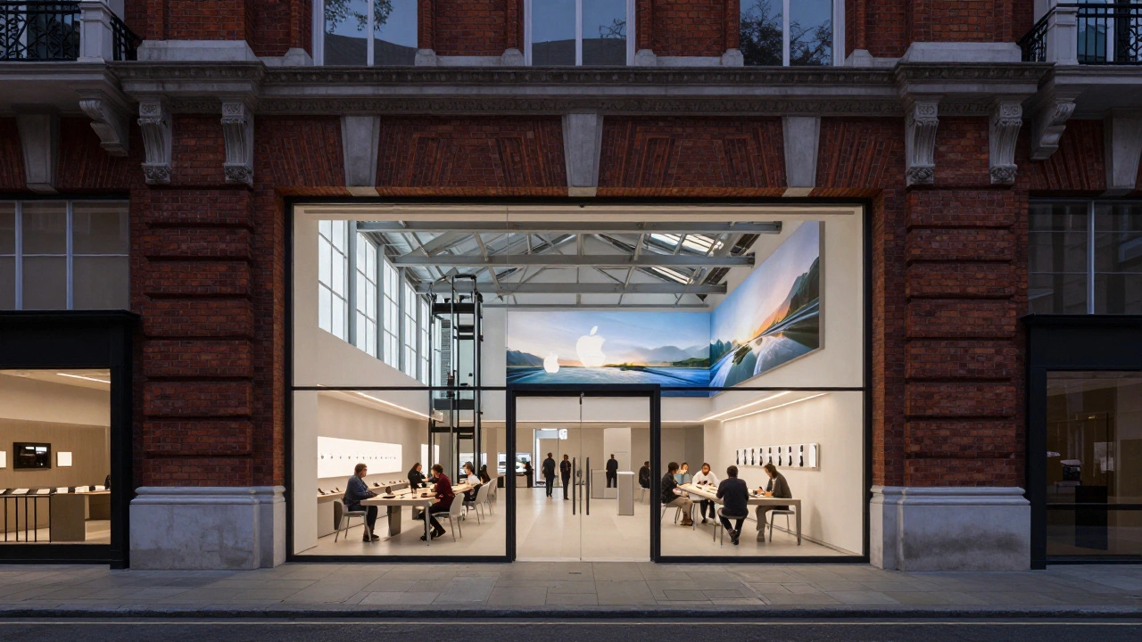
Apple Regent Street: Classic London, Modern Touch
Regent Street in London has been a shopping destination since the 1800s. When Apple opened its flagship there in 2004, it was one of the first major tech brands to set up shop in a historic European shopping district. The store sits in a restored 19th-century building, originally a department store. Apple didn’t tear it down. They preserved the facade-brick, cornices, and all-and carved out a modern interior.
The entrance is a wide, glass-walled corridor leading into a two-story space. The floor is polished concrete, the walls are white, and the ceiling is exposed steel beams. A large video wall runs along one side, showing looping videos of Apple products in use. Unlike Marina Bay, this store doesn’t hide its history. It celebrates it.
The Genius Bar is tucked into a corner, surrounded by low seating. People sit here for hours, learning how to edit videos or fix their iPads. The store has a dedicated Today at Apple room with a stage, lights, and a sound system. Local photographers, musicians, and coders host weekly workshops. You’ll see teens editing music, retirees learning photo editing, and small business owners building websites.
Lighting is key. During the day, natural light floods in through tall windows. At night, recessed LEDs mimic daylight, keeping the space bright but calm. The store doesn’t need to shout. It lets the city speak for itself. Regent Street is busy. The Apple Store is quiet. That contrast is the point.
The store also has a unique feature: a glass elevator that connects the ground floor to the upper level. It’s not just functional-it’s a design element. You can ride it just to see the products from above. No one forces you to buy. But you leave feeling like you’ve been part of something.
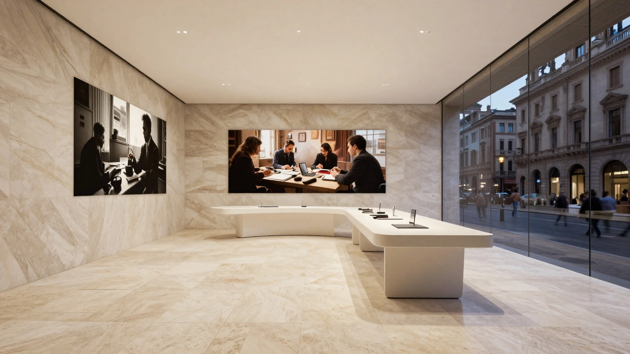
Apple Via del Corso: Rome’s Modern Heart
Via del Corso is Rome’s main pedestrian street, lined with cafes, boutiques, and centuries-old buildings. When Apple opened its store here in 2016, it was a bold move. The building is a 19th-century palazzo with marble floors, high ceilings, and ornate moldings. Apple kept the original structure but stripped away the interior walls to create a single open volume.
The floor is travertine stone, the same material used in ancient Roman temples. The ceiling is white, with recessed lighting that mimics daylight. The Genius Bar is set into a curved wall of white oak, blending into the architecture. Around the edges, glass display cases hold iPhones, Macs, and Apple Watches. No glass doors. No locks. Just open access.
At the back of the store, a large video wall plays short films of Roman artists, designers, and storytellers. It’s not just marketing-it’s cultural. Apple doesn’t just sell products here. It showcases local talent. You’ll find workshops on Italian photography, Roman history through digital storytelling, and even lessons on how to use Apple tools to preserve ancient manuscripts.
One of the most striking details? The lighting. At night, the store glows from within, casting soft shadows on the stone floor. The glass panels along the street side reflect the passing crowds, making the store feel alive. It’s not a temple. It’s a living room for the city.
The store has no escalators. No tunnels. No floating domes. But it has something deeper: connection. People come here not just for tech, but to be near the rhythm of Rome. The store doesn’t compete with history. It joins it.
Why These Three Matter
Marina Bay, Regent Street, and Via del Corso aren’t just stores. They’re experiments in how retail can belong to a place. Each one responds to its environment:
- Marina Bay is about scale and light-a structure that feels weightless, connected to nature.
- Regent Street is about respect and contrast-a modern space in an old city, quiet amid the noise.
- Via del Corso is about integration and heritage-tech that doesn’t erase history, but honors it.
They all use the same products. The same staff. The same software. But the spaces? They’re different because they’re designed for different people, different rhythms, different stories.
Apple doesn’t build stores to sell phones. It builds them to create moments. A child looking up at the oculus in Singapore. A musician tuning up on the stage in London. A tourist pausing to take a photo of the glowing stone floor in Rome. These aren’t accidents. They’re intentional.
What Makes a Great Retail Space?
These three stores share a few key principles:
- Architecture as experience-the building itself is the product.
- Light as a design tool-natural and artificial light shape how people feel.
- Local culture as content-workshops and displays reflect the city, not just Apple.
- Minimal barriers-no fences, no locked cases, no pressure to buy.
- Space for stillness-you can sit, watch, think, and just be.
Most retail spaces try to push you to spend. Apple’s best stores make you want to stay. Not because you have to. But because it feels right.
What’s Missing? The Bigger Picture
There are over 500 Apple Stores worldwide. Most are functional. A few are beautiful. Only a handful become landmarks. Marina Bay, Regent Street, and Via del Corso are among them because they don’t just fit into their cities-they elevate them.
They prove that retail design isn’t about square footage or product placement. It’s about emotion. About light. About history. About giving people a place to feel something.
Next time you walk into an Apple Store, look up. Look around. Ask yourself: does this place belong here? Or is it just another store?
Why does Apple design stores that look like art galleries?
Apple designs stores like art galleries because they want people to experience technology as something beautiful, not just functional. The goal isn’t to push sales-it’s to create moments of wonder. A well-lit space, natural materials, and open layouts help people relax, explore, and connect with products on their own terms. This approach has been proven to increase dwell time, engagement, and customer loyalty.
Do these stores make more money than regular Apple Stores?
Yes. While Apple doesn’t release individual store revenue, industry analysts estimate flagship stores like Marina Bay Sands and Regent Street generate 2-3 times more sales per square foot than average locations. That’s not because they’re bigger-it’s because they attract more visitors, longer stays, and higher engagement. People come for the experience, and they leave with more than just a phone.
Why does Apple use so much glass in its stores?
Glass creates transparency-both literally and metaphorically. It removes barriers between the product and the person. It lets in natural light, which improves mood and reduces energy use. It reflects the outside world, making the store feel connected to its surroundings. And in places like Marina Bay, glass becomes part of the landscape, turning the store into a mirror of the city.
Are there any other Apple Stores like Marina Bay Sands?
No. Marina Bay Sands is unique. It’s the only Apple Store built directly on water, with a fully self-supported glass dome, underwater Boardroom, and custom baffled ceiling. While other flagship stores borrow elements-like open layouts or natural materials-none match its scale, engineering, or location. It’s a one-of-a-kind experiment in retail architecture.
What can other retailers learn from Apple’s store design?
Stop treating stores like warehouses. Focus on emotion, not just inventory. Let people move freely. Use light and materials to create mood. Invite local culture into the space. Don’t force sales-create reasons to stay. Apple’s best stores don’t feel like stores. They feel like places you want to return to. That’s what builds loyalty.
Next Steps: Where to Go From Here
If you’re interested in retail design, visit these stores if you can. Don’t just shop-observe. Notice how light moves. How people sit. How silence is used. If you can’t travel, watch the official Apple videos of each store. Look for the details: the curve of a step, the angle of a light, the way glass reflects water.
And remember: great design doesn’t shout. It whispers. And if you listen closely, you’ll hear it.
Categories
Popular Articles