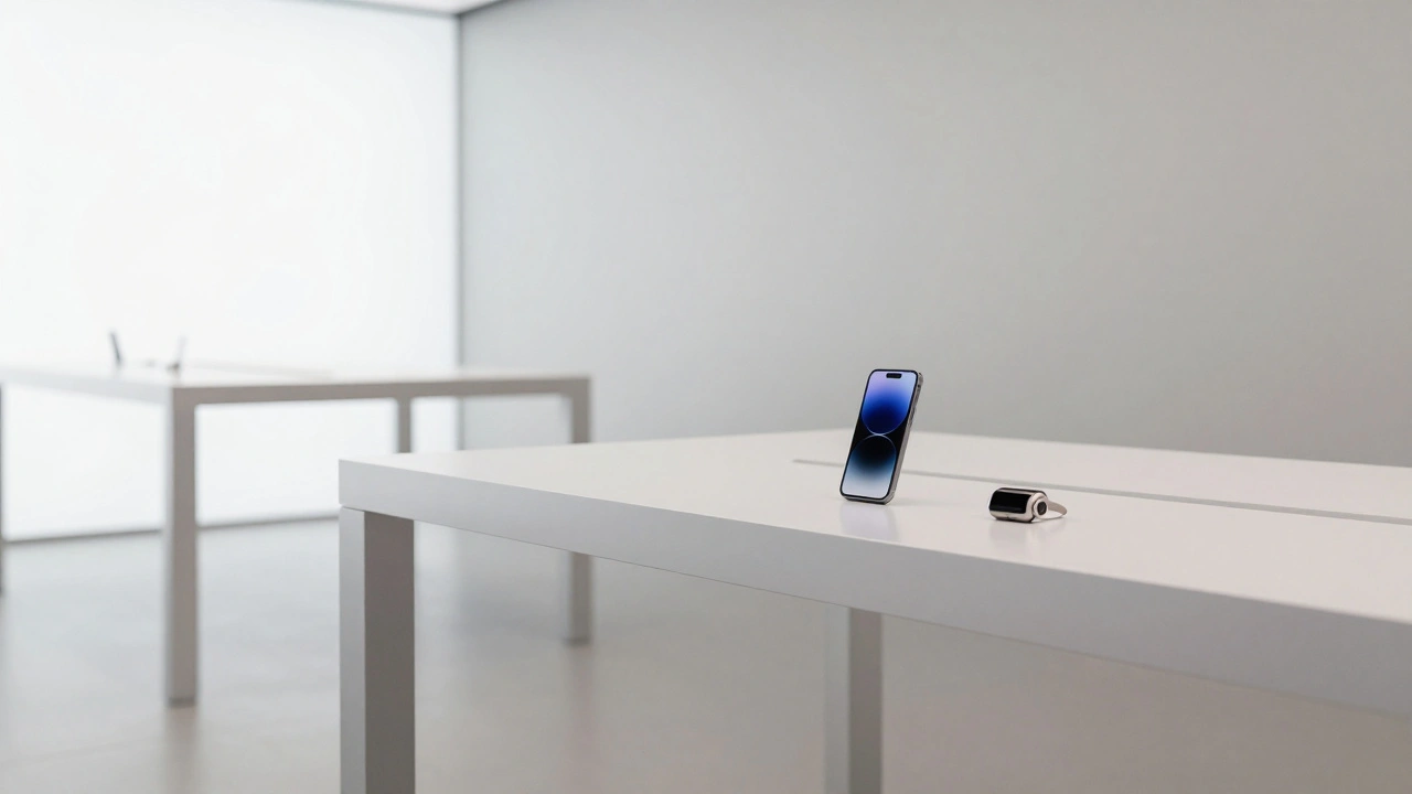

Apple doesn’t just make products. It makes ecosystems that feel like they were born from the same mind. An iPhone, a Mac, an Apple Watch, even your AirPods - they don’t just work together. They look like they belong together. The buttons feel the same. The icons breathe the same way. The animations have the same rhythm. This isn’t accidental. It’s the result of a rare, tightly controlled system called design governance - and it’s built on centralization.
Why Centralization Works for Apple
Most tech companies organize around products. One team does the phone. Another does the laptop. Another does the software. They compete for budget, resources, and attention. That’s logical. It’s also messy. Products start to drift. Buttons change size. Colors shift. Animations get clunky. Users notice. They feel it - even if they can’t explain why. Apple flipped that model. Instead of letting each product team decide its own rules, Apple put design authority in one place: the top. Under Steve Jobs, every major design decision went through him. After his passing, Tim Cook kept the structure but gave more autonomy to functional leads - not product teams. Design, engineering, software, and marketing each have their own VP. But none of them control the final look or feel of a product alone. This isn’t about control for control’s sake. It’s about coherence. When every screen, button, sound, and texture is judged against the same standard, everything feels connected. That’s the power of centralization. It doesn’t mean one person designs everything. It means one set of rules governs everything.The Functional Matrix That Keeps Design Unified
Apple’s structure looks like a spoke-and-wheel. At the center is the CEO. Radiating out are the functional departments: Design (led by Jony Ive’s successors), Hardware Engineering, Software Engineering, Services, and Marketing. These aren’t silos. They’re interconnected layers. A designer on the iPhone team doesn’t report to the iPhone product lead. They report to the Head of Design. Same for the Mac team. Same for the Watch team. This means a designer working on AirPods has the same design language, same typography, same animation principles as the person designing the Home Screen on iOS. They’re not copying each other. They’re speaking the same language. This setup forces collaboration. When a new feature is built, the software team can’t just slap it on the interface. The design team has to approve it. The hardware team has to say if it’s physically possible. The accessibility team has to weigh in. All of them answer to the same leadership. That’s why Apple’s interfaces feel so smooth - every change is reviewed through multiple lenses before it ships.Governance Built Into the System, Not Added Later
Apple doesn’t rely on post-production reviews to enforce design rules. It builds them into the foundation. Think about how iOS controls permissions. You can’t access a user’s contacts unless the system says yes. You can’t run background audio unless you follow Apple’s audio framework. You can’t animate a transition unless you use the built-in animation library. These aren’t suggestions. They’re constraints baked into the operating system. This is what Apple calls "entry governance." Instead of catching bad design after it’s made, Apple prevents it from ever being made. Every app, every feature, every interaction has to work within Apple’s system rules. That’s why third-party apps on iPhone still feel like they belong. They’re not designed by Apple - but they’re forced to play by Apple’s rules. Compare that to Android, where manufacturers and developers have near-total freedom. The result? A fragmented experience. Some apps feel modern. Others feel like they’re from 2012. Apple’s approach eliminates that noise. The system itself becomes the enforcer of consistency.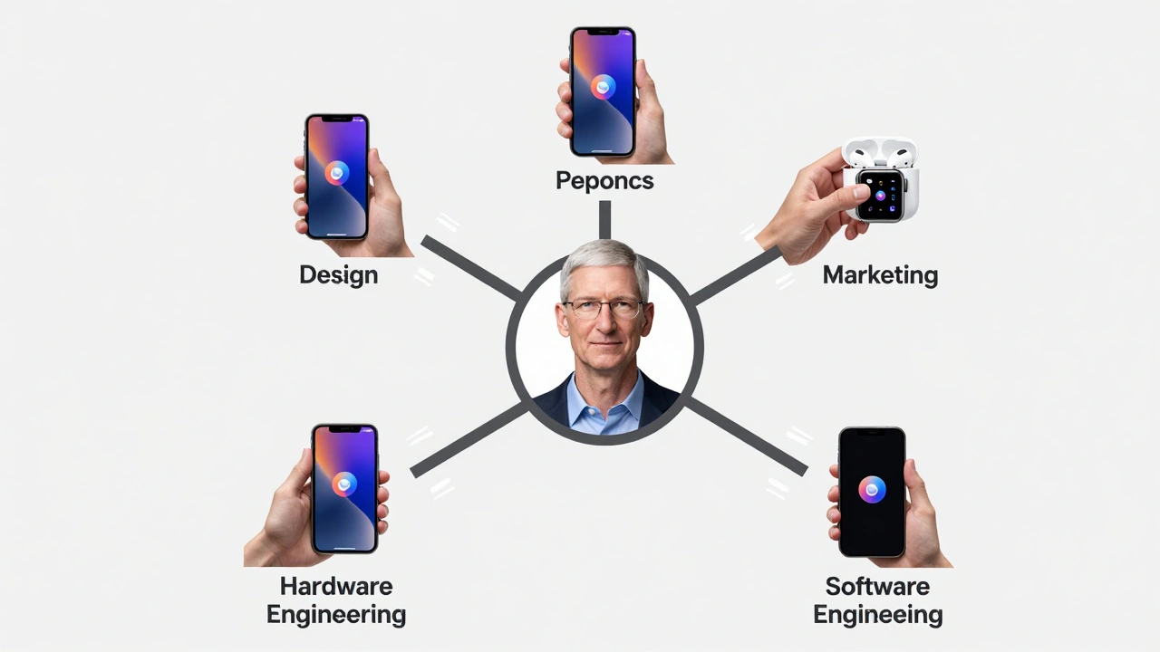
The Trade-Off: Speed vs. Flexibility
Centralization isn’t magic. It comes with costs. When a market trend shifts - say, foldable screens or AI assistants - Apple can’t move fast. No product team can act independently. Everything has to go through the top. That means innovation can feel slow. A new product might take years to develop because every detail must be approved by multiple executives. That’s why Apple releases so few products. It doesn’t chase trends. It waits. It refines. It obsesses. That’s why the iPhone 15 Pro and the MacBook Air M3 feel like natural extensions of each other - they were designed together, not separately and patched later. Critics say this makes Apple rigid. And they’re right. But that rigidity is intentional. It’s the price of cohesion. You can’t have a perfectly unified experience if you’re constantly changing direction.How This Shapes the User Experience
The result? Users don’t have to learn new interfaces. They don’t have to guess how things work. If you’ve used an iPhone, you already know how to use an Apple Watch. The same gestures. The same icons. The same feedback. That’s not luck. It’s design governance in action. Apple doesn’t have a design team for each product. It has one design language, one set of principles, one team that owns them all. The consistency isn’t just visual. It’s emotional. Apple products feel calm. Controlled. Thoughtful. That’s because every pixel, every sound, every animation was chosen with intention - not by committee, but by a single, deeply aligned vision.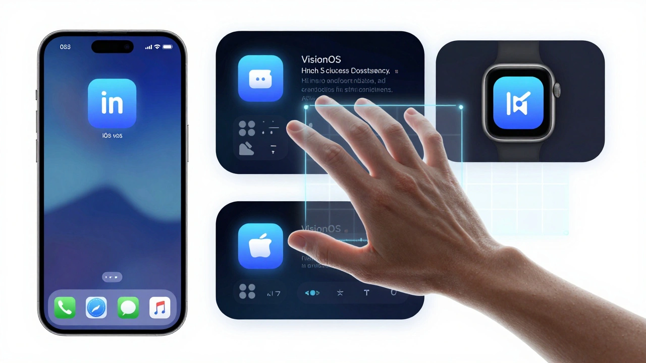
What Happens When Apple Expands?
Apple’s ecosystem is growing. It’s no longer just phones, tablets, and computers. It’s home automation, health monitoring, car interfaces, and even AR glasses. Each of these adds complexity. Can the same centralized system handle a smart thermostat, a visionOS app, and a fitness tracker? The answer so far is yes. But the pressure is mounting. Third-party services - like Spotify, Netflix, or banking apps - now live inside Apple’s ecosystem. Apple can’t control their design. But it can control how they integrate. That’s why Apple’s system-level governance is more important than ever. If a third-party app can’t access your health data without following Apple’s privacy rules, then it’s forced to behave. If it can’t use animations outside Apple’s library, it can’t break the rhythm. The future of Apple’s design governance won’t be about controlling every pixel. It’ll be about controlling the rules. The platform itself becomes the design cop.Why Competitors Struggle to Copy This
Google, Samsung, Microsoft - they all have great designers. They all have deep pockets. But none of them have built a system like Apple’s. Why? Because centralization goes against how most companies are organized. Departments fight for power. Product teams want autonomy. Investors want speed. Design gets diluted. Apple’s model only works because of one thing: absolute trust in leadership. Tim Cook doesn’t micromanage. But he holds the line. He doesn’t let design drift. He doesn’t let teams make exceptions. And because of that, millions of people wake up every day using products that feel like they were made by one person - even though thousands worked on them. It’s not about talent. It’s about structure.Does Apple’s centralized design model still work as its product range grows?
Yes, but it’s evolving. Apple no longer controls every pixel of every app. Instead, it controls the rules. Through system-level governance - like strict APIs, permission frameworks, and design libraries - Apple forces third-party developers to play by its rules. This lets new products like Vision Pro and HomePod coexist with older ones like the iPhone without breaking the unified feel. The system itself enforces consistency, not just human reviewers.
Why don’t other companies use Apple’s model?
Most companies are built for scale, not cohesion. They need to launch dozens of products a year to satisfy investors. Apple’s model requires patience. It’s slow. It’s expensive. It demands that leaders understand details three levels deep - something few CEOs are willing to do. Most companies prefer decentralized teams that can move fast, even if it means inconsistent experiences. Apple bets on quality over quantity - and that’s rare.
How does Apple prevent design teams from becoming too rigid?
Apple doesn’t eliminate flexibility - it channels it. Teams are free to experiment within the system’s rules. A designer can propose a new animation, but it must pass through multiple reviews: usability, accessibility, performance, and brand alignment. This creates a feedback loop that improves ideas, not kills them. Innovation happens, but it’s filtered through the same standards that made Apple’s design iconic in the first place.
Is Apple’s design governance only about aesthetics?
No. Aesthetics matter, but Apple’s real strength is functional consistency. The way you unlock your phone, the way notifications appear, the way you switch between apps - these are all governed by the same logic. This isn’t about making things look pretty. It’s about making them predictable. Users don’t have to think. That’s the ultimate goal.
What happens if Apple’s top leadership changes?
The system outlasts individuals. Apple’s design governance isn’t tied to one person - it’s embedded in its structure. Even if Tim Cook leaves, the functional teams, the system rules, and the design language will remain. New leaders inherit a machine, not a vision. The challenge won’t be maintaining consistency - it’ll be deciding whether to change it. So far, Apple has chosen to evolve slowly, not revolutionize.