
Apple widgets aren’t just pretty little boxes on your home screen. They’re carefully engineered pieces of interface that have to work across iPhones, iPads, and even VisionOS headsets - all while staying readable, usable, and consistent. If you’re building or customizing widgets, you need to understand the rules. Not the guesswork. The real, documented structure behind how Apple makes these things snap into place, scale, and stay legible no matter the device.
Widget Sizes Are Fixed, Not Flexible
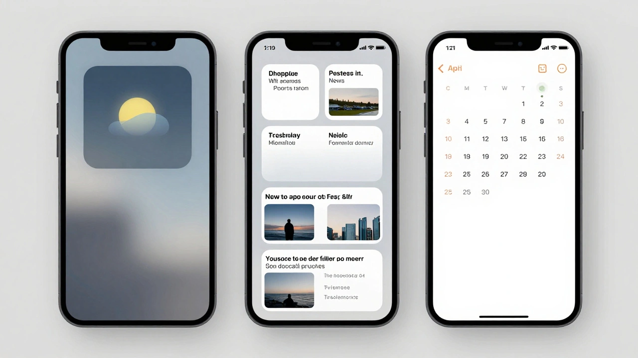
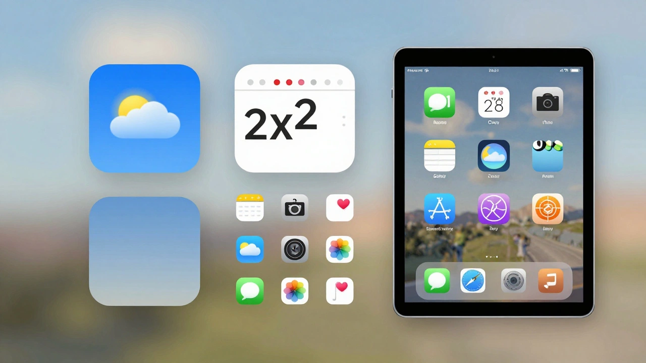
You can’t make a widget any size you want. Apple gives you three standard sizes: small, medium, and large. These aren’t suggestions - they’re hard boundaries built into the system family framework. Each size maps to a specific grid cell count, and it’s the same across all platforms.- Small: 1x1 grid cell. Used for StandBy, CarPlay, and compact info like battery or weather.
- Medium: 2x2 grid cells. The most common size for daily-use widgets like reminders, news, or calendar.
- Large: 2x4 or 4x4 depending on device. Used for rich content like photo galleries, music controls, or detailed analytics.
On iPhone, the small size is often the only option for the Today View. On iPad, you get all three, but the grid changes depending on whether widgets are active. For example, an iPad Pro without widgets uses a 6x5 grid (30 icons). Add one medium widget, and the grid collapses to 6x4. That’s not a bug - it’s intentional. Apple sacrifices icon density to give widgets breathing room.
And here’s the kicker: you can’t override these sizes. Even if your design looks better at 3x3, the system will force it into the nearest approved size. Developers who try to cheat the system with custom layouts end up with widgets that break on updates or get rejected from the App Store.
Grids Change Based on Device and Mode
The grid isn’t static. It shifts depending on what you’re using and how many widgets you’ve added. On iPadOS 15 and later, the home screen grid is dynamic. If you have no widgets, you get the full 5x6 or 6x5 grid (depending on model). But as soon as you drop a widget on screen, the grid reorganizes. Icons get pushed to other pages. Empty space appears below. It’s not random - it’s calculated.Take the 11-inch iPad Air. Without widgets: 6x5 = 30 icons. Add one large widget? It becomes 6x4 = 24 icons. The widget takes up 8 grid cells (2x4), and the system removes 6 icon slots to make room. That’s a 20% reduction in app icons just for one widget. Apple’s philosophy here is clear: widgets deserve space. If you want them on your home screen, you give up some icons.
On iPhone, the grid stays mostly fixed because widgets live in Today View, not the home screen. But even there, Smart Stacks change how content is presented. You can stack three widgets, and iOS will show the most relevant one based on time, location, or usage. The stacking logic isn’t user-controlled - it’s algorithmic. And that matters for legibility. If your widget is buried in a stack of three, it needs to communicate its value in under 2 seconds.
Legibility Isn’t Optional - It’s Built In
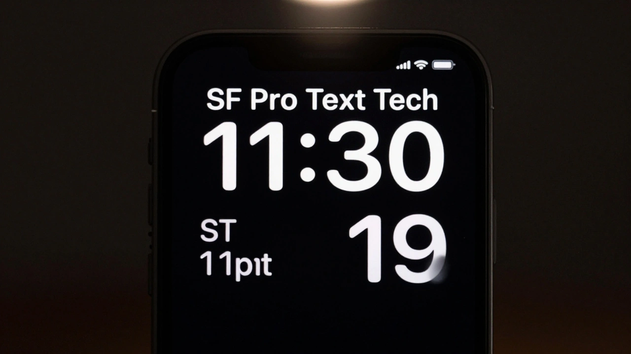
Apple doesn’t leave text readability to chance. There are hard standards for font size, contrast, and spacing - even if they’re not always spelled out in public docs.On iPhone and iPad, the minimum font size for widget text is 11 points. Anything smaller gets clipped or ignored. The system uses SF Pro Text, Apple’s default sans-serif, and it scales automatically based on device resolution. You don’t get to pick a custom font. Why? Because system fonts are optimized for clarity at small sizes and low contrast.
Contrast ratios? Apple follows WCAG 2.1 AA standards. That means text must have at least 4.5:1 contrast against its background. If you’re using a semi-transparent widget background, the system applies a subtle blur and darkens the text automatically to maintain legibility. You can’t override this. Even if your brand color is pastel pink, the system will darken the text so it’s readable on bright or dark wallpapers.
And spacing? The gap between icons on iPadOS 14 was 12mm. In iPadOS 15, it dropped to 4mm - but only when no widgets were present. Add a widget, and the spacing expands again. Why? Because users complained that icons looked “squished.” Apple listened. The takeaway? Legibility drives spacing. If users can’t tell one app apart from another, the design fails.
visionOS Changes Everything - But Not Completely
VisionOS isn’t just another screen. It’s a 3D space. Widgets here float, snap to walls, and can be duplicated. You can have five copies of the same weather widget, each showing different data - one for home, one for work, one for the cabin. That’s multi-instance support, and it’s unique to visionOS.But the grid? It’s still there. When you pin a widget to a wall, it snaps into a 4x4 grid. The same sizes apply: small, medium, large. The difference is depth. Apple uses material layers - translucency, blur, and ambient lighting - to help users perceive which widget is in front. A widget with a clear background might look like it’s floating. One with a dark material looks anchored.
CarPlay and StandBy use the small system family widget too. No background. No borders. Just pure data. That’s because they’re meant to be glanced at, not interacted with. The font size is the same as on iPhone - 11pt minimum - but the contrast is cranked up. White text on black. No exceptions.
What Apple Won’t Tell You (But You Need to Know)
There are hidden rules that aren’t in the official guidelines. For example:- Don’t use animated elements. Widgets refresh every 15-30 minutes. Animations that run constantly drain battery and break consistency.
- Don’t rely on color alone to convey meaning. A red dot for “urgent” won’t work for colorblind users. Always pair it with text or an icon.
- Don’t use icons without labels. On small widgets, an icon alone is useless. Users need context.
- Test on real devices. Simulator previews lie. A widget that looks fine on a 12.9-inch iPad Pro might be unreadable on a 10.9-inch model.
And here’s a pro tip: if you’re designing for iPad, and you want more breathing room between icons, don’t fight the system. Add a transparent “spacer” widget - like a blank note from the Notes app - to force the grid back to its wider spacing. It’s not official, but thousands of users do it. Apple knows. They don’t block it.
Why This Matters Beyond Aesthetics
Building widgets isn’t about making something look cool. It’s about making something that works for millions of people, on different devices, in different lighting, with different abilities. Apple’s standards exist because they’ve seen what happens when designers ignore them.Imagine a weather widget with tiny text on a bright screen. A user with aging eyes can’t read it. Or a financial widget with low-contrast numbers that blend into the background. A diabetic checking glucose levels misses a warning. These aren’t edge cases - they’re real risks.
Apple’s grid system, size limits, and legibility rules aren’t restrictions. They’re guardrails. They ensure that your widget doesn’t just look good - it actually helps someone, somewhere, make a decision faster.
Can I make a custom-sized widget for my app?
No. Apple only allows three widget sizes: small (1x1), medium (2x2), and large (2x4 or 4x4). Custom sizes are not supported and will be rejected during App Store review. The system forces your widget into the nearest approved size, so design within those boundaries.
Why do my icons look smaller after adding a widget on iPad?
They aren’t smaller - the spacing between them changed. iPadOS 15 reduced horizontal gaps from 12mm to 4mm when no widgets are present. Adding a widget forces the grid to expand spacing again, but the total number of icons drops. The visual effect makes icons seem crowded, but it’s a layout shift, not a size change.
Do I need to design separate widgets for iPhone, iPad, and VisionOS?
You can use the same widget code across all platforms, but you should tailor the content. A large widget on iPad might show a full calendar, while on iPhone it should show just the next event. On VisionOS, you can enable multi-instance widgets so users have different versions on different walls. The design system is consistent, but the content should adapt.
What’s the minimum font size for widget text?
The minimum is 11 points. Anything smaller will be clipped or ignored by the system. Apple uses SF Pro Text, and it scales automatically based on device resolution. Don’t try to use custom fonts - they’re not supported and may break on updates.
Can I use custom colors or transparency in widget backgrounds?
You can use transparency, but Apple applies a system blur and auto-contrasts text to ensure readability. You can’t override this. Even if your brand color is light, the system will darken text to meet WCAG 2.1 AA contrast standards (4.5:1). Color alone can’t convey meaning - always pair it with text or icons.