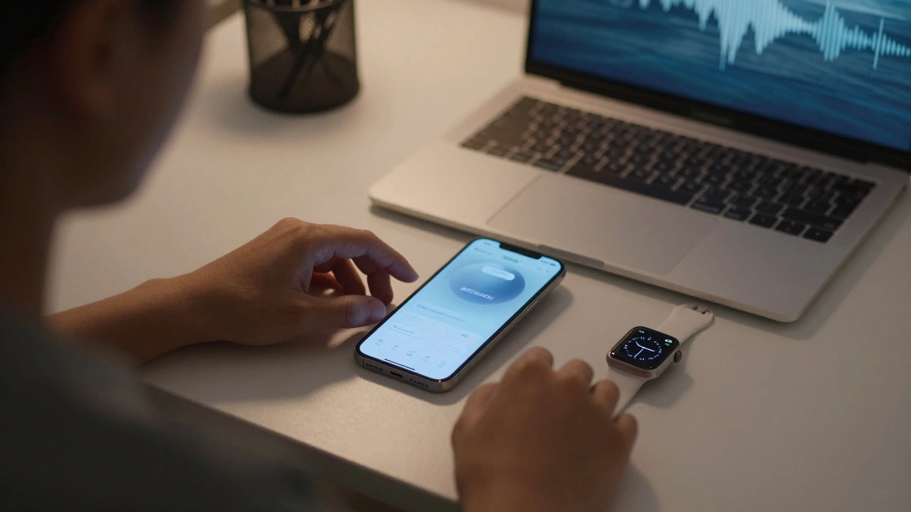

When you tap a button in an app and suddenly a full-screen sheet pops up, blocking everything else - that’s not design. That’s panic.
Apple’s platforms - iOS, iPadOS, macOS, and visionOS - rely on alerts and sheets to communicate with users. But too often, developers misuse them. They turn simple choices into interruptions. They drown users in modal windows. And that’s not how it should work.
Alerts Are for Urgent Needs, Not Just Any Info
An alert isn’t a pop-up. It’s a last-resort signal. According to Apple’s Human Interface Guidelines, alerts should appear only when the app absolutely needs your attention - like when you’re about to delete a file, lose unsaved progress, or need to confirm a payment. Anything less, and you’re just annoying the user.
On iOS and iPadOS, alerts can include buttons, text fields, and even pickers. On macOS, they’re more restrained - usually just a message and two buttons. VisionOS uses spatial alerts that appear subtly in the environment, not as blinding overlays. The key? They’re modal. That means they stop everything else until you respond. That’s powerful. But power without restraint is chaos.
Think about it: if your app shows an alert every time someone opens a folder, or changes a setting, or even taps a button twice - you’ve turned a helpful tool into a nuisance. Users start ignoring them. Or worse - they uninstall the app.
Action Sheets Are for Choices You Already Asked For
Here’s the rule: if the user initiated the action, use an action sheet. Not an alert.
Imagine you’re in a photo app and you long-press a picture. A menu slides up with options: Share, Copy, Delete, Cancel. That’s an action sheet. It’s not interrupting your flow - it’s extending it. You started the action. The app is just helping you complete it.
Action sheets are context-aware. They appear where you expect them - at the bottom of the screen on iPhone, near the button you tapped on iPad, or as a dropdown on macOS. They’re temporary. They fade away when you pick an option or tap outside. No panic. No disruption.
Compare that to an alert that pops up in the middle of the screen with the same options. Suddenly, you’re forced to stop. You have to reorient. You feel like you’ve been interrupted. That’s the difference between good design and bad.
Sheets Are for Extended Tasks - Not Quick Choices
Sheets are the big cousins of alerts and action sheets. They take over a big chunk - sometimes all - of the screen. They’re great for complex tasks: editing a document, selecting multiple items, or browsing a catalog.
But Apple’s guidelines are clear: if you can solve the problem with an alert or action sheet, don’t use a full sheet. Why? Because sheets change the user’s mental context. They break immersion. They make you feel like you’ve left the app.
Take the Share Sheet. It’s perfect for sharing - you tap share, a sheet slides up with contacts, apps, and options. You pick one, and you’re back where you were. No panic. No confusion.
But if you use a sheet to ask, “Are you sure you want to delete this?” - that’s wrong. That’s an alert. Don’t make users scroll through a full-screen panel just to confirm a simple choice.
Half Sheets: The Smart Middle Ground
Introduced in SwiftUI with WWDC 2022, half sheets changed how we think about screen space.
Before half sheets, if you needed more room than an action sheet offered - say, to pick from a long list - you had two bad options: a full sheet (too disruptive) or a tiny popover (too cramped). Now, you can show a sheet that covers just half the screen. It’s enough room to browse, but it still leaves context visible.
On iPhone, a half sheet might show a list of contacts while the main view stays partially visible behind it. On iPad, it might slide up from the bottom but leave the sidebar intact. This gives users control. They can see what they were doing while making a choice. No reset. No panic.
Half sheets aren’t just a visual tweak - they’re a psychological one. They say: We respect your focus. We’re not taking over.
SwiftUI Makes It Easier - But Doesn’t Excuse Bad Choices
SwiftUI’s declarative syntax lets you define alerts and sheets with just a few lines:
@State private var showingAlert = false

var body: some View {
    Button("Delete") {
        showingAlert = true
    }
    .alert("Delete this item?", isPresented: $showingAlert) {
        // Action
    } message: {
        Text("This cannot be undone.")
    }
}
It’s clean. It’s simple. But simplicity doesn’t mean you should use it for everything.
Too many developers use .alert() because it’s easy. But ease shouldn’t override clarity. If you’re showing a list of options - use .actionSheet(). If you’re asking for input - use a text field inside the alert. If you need space - use a half sheet.
SwiftUI gives you tools. It doesn’t give you permission to be lazy.

The Real Goal: User Control, Not Just Functionality
Apple’s design philosophy isn’t about making things look pretty. It’s about making users feel in control.
When you use alerts, action sheets, and sheets correctly, users don’t feel like they’re fighting the app. They feel like they’re guiding it.
That’s why Apple’s guidelines emphasize brief and purposeful interactions. Every time you show a modal interface, you’re asking the user to pause their task. That’s a cost. You need to justify it.
Ask yourself:
- Did the user ask for this?
- Is this information urgent?
- Can I solve this with less than a full screen?
- Will this feel like an interruption - or an extension?
If the answer to any of those is no - rethink it.
There’s no such thing as a harmless alert. Every modal window steals attention. Every sheet changes context. Every choice you make as a designer either builds trust… or erodes it.
Use alerts for emergencies. Use action sheets for choices. Use sheets for deep tasks. Use half sheets when you need room but not total takeover. And always - always - ask: Is this helping, or just getting in the way?
What Happens When You Get It Wrong?
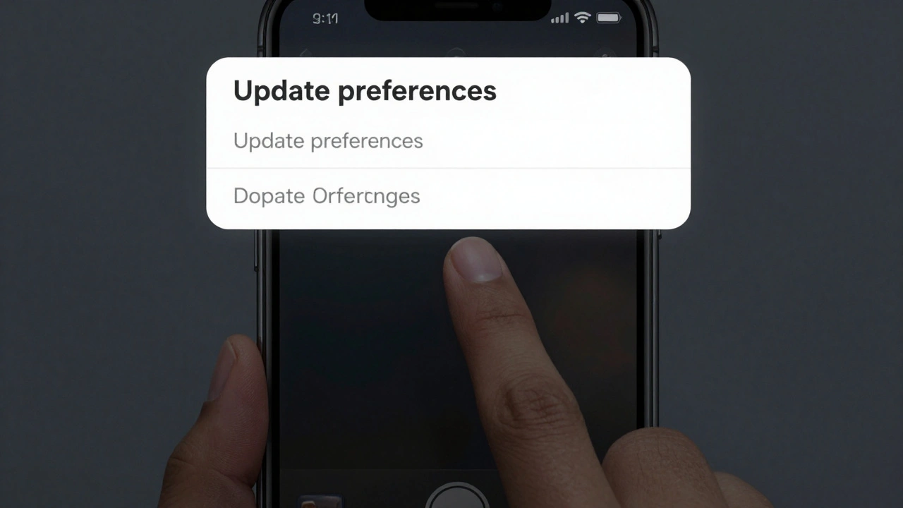
Think about the last time an app popped up a full-screen sheet asking if you wanted to "update your preferences." You hadn’t touched settings. You didn’t ask for this. You just tapped a button to share a photo - and suddenly you’re staring at a form.
You tapped away. You closed it. You didn’t read it. And now you’re frustrated.
That’s not a bug. That’s bad design. And users don’t forgive it.
Apps that overuse alerts and sheets see higher uninstall rates. Lower retention. Worse ratings. People don’t say, "This app is too flashy." They say, "It keeps interrupting me."
Apple’s tools are built to prevent this. But they can’t stop you from misusing them.
The best interfaces don’t shout. They whisper. They wait. They offer. And they disappear when they’re done.